Looking Outwards 07

For this week’s exploration of data visualization I picked Ebb and Flow and I am particularly going to look at their project for Pitch Interactive Inc called “Covid-19 Daily Cases Across the US”.

This is a line graph that has every state available and you can mouse over and get even more information on total cases and compare it to the overall US

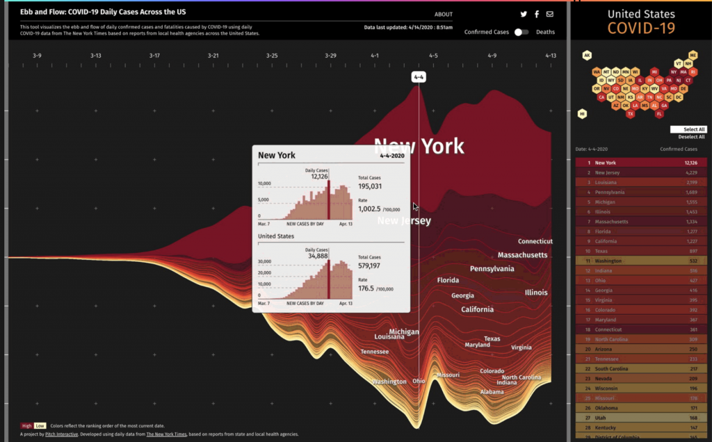
I really admire this tool because I feel like this is a great example of when data visualization is needed the most. It is an important tool for educating the public in a clear way especially when stress is high and misinformation is rampant. This project started while the concept of flattening the curve was spreading.

This graph uses the steam graph methodology and the data was extracted from the New York Times. This graph allows you to look at certain states and be able to compare them. The y-axis shows confirmed cases and deaths and the x-axis represents time starting March 7th.

Overall, I think this tool is very cool because it seems like this tool is constantly evolving even while the pandemic is currently winding down in the US. I think visualizations like this are so important and I think this team did really well at making it clear and concise while also informational.

Link://www.pitchinteractive.com/work/EbbandFlow/

LO: Information Visualization

Dr. Kirell Benzi is a data artist and researcher. Kirell holds a Master of Science in Communication Systems from ECE Paris and a Ph.D. in Data Science from Ecole Polytechnique Federale de Lausanne. In 2017, he started his studio, Kirelion, around information design, creative technology, data visualization, and software engineering. He has collaborated with the likes of the EU, Stanford, Princeton, Cornell, Berkeley, UCLA, and more. He creates art that is exceptionally beautiful, pieces that one wouldn’t assume is based off of data points. Some of my favorites are; “The Dark Side and the Light” (2015), which is built upon the interactions between more than 20,000 characters from the Star Wars universe. The blue nodes represent those associated with the light side of the Force, including the Jedi, the Republic, and the Rebellion. The dark side is represented by the red nodes, which includes the Siths and the Empire. Yellow nodes represent criminals and bounty hunters, which mostly connect to the red nodes. The most influential characters are Anakin and Emperor Palpatine. I also really enjoy “Scientific Euphoria” (2014), which is about how in July 2012, CERN physicists found evidence of a new elementary particle, predicted by Peter Higgs in 1964. The graph shows the flow of retweets as people discussed the discovery. The network splits into two with European tweets concentrated in the center and U.S. tweets at the bottom.

https://www.kirellbenzi.com/art

“The Dark Side and the Light” (2015).
“Scientific Euphoria” (2014).

LO: Information Visualization

A video loop which cycles through all sets of data of the Project Ukko data

Immediately, I was intrigued by Moritz Stefaner’s work, specifically his Project Ukko: a visualization of seasonal wind prediction data. Project Ukko presents a thematic map of wind data using lines of varying opacity (prediction accuracy), thickness (wind speed), tilt and color (trend of wind speed). Stefaner outsources his computational data from clients, which is processed by another group called RESILIENCE, so unfortunately I cannot find much about the algorithm behind his work, but I can tell that Stefaner put a lot of effort into the process of his visualization. He asks questions like “What are the main views?”, “What needs to be available immediately, what on demand?”, and “How important is each part?”. I admire that he keeps the design process, that I myself have to go through in my major, central to his work. Furthermore, the final piece is both beautiful and highly functional. For someone not entrenched in the data, it is still an easy visualization to process; but it can easily become a deeply detailed source. It is minimalistic in that it includes only the necessary parts, yet it still feels so rich.  

Moritz Stefaner, Project Ukko

Looking Outwards: Unnumbered Sparks

The project I chose to look at this week was Aaron Koblin’s Unnumbered Sparks, when I first visited his website I was immediately drawn to the striking visuals of the piece. On a surface level, it looks like a massive, ethereal, floating structure reminiscent of a net. But it isn’t just so, as the colors and striking visuals that are displayed across this structure are all controlled in the background by a single website. I really admire how it is an artwork that engages its viewers and promotes interactions between viewers themselves, as well as, between viewers and the artwork. By logging onto a website, people are enabled to draw their own distinct patterns or visuals which are then projected up onto this sculpture.

It was impressive the amount of thought given into the piece, not only from a computational standpoint. There were also considerations of how the sculpture would interact with the environment and environmental factors such as the wind. It also looked at the different experiences it would create for people depending on the distance at which they view the sculpture. Behind all these considerations, is the computational aspect itself which lent itself not only to the aesthetic of the final artwork but also the ideation and planning of the artwork too. Koblin described the process in where they built the whole 3D modeling environment itself directly in Chrome through WebGL, using that as a tool to help them sample light from the virtual sculpture and project that onto the real life object.

LO 07: Information Visualization

Flight Patterns by Aaron Koblin

Aaron Koblin’s Flight Patterns Visualization exhibits strings of colorful lines, representing the movement and compactness of flight pathways. Koblin uses data values from Processing programming environment to map and plot certain routes of air traffic occurring over North America. For areas where there prevails high overlapping air traffic, the intersection points have an intense white color and a slight shine, whereas the other lines seem to relatively fade out into the dark background. I found his particular style of generating art really intriguing with the capability to control the vivid light as well as its quality of glowing effect, and I really love the overlapping colors of lines that produces this mesmerizing illumination. I admire how he used algorithms as well as loop or conditional functions to create such entrancing artwork and I believe his artistic sensibility emerges from his interest in science visualization.

Reference: http://www.aaronkoblin.com/project/flight-patterns/

Looking Outwards 07 – Data

https://ocean.rachelbinx.com/coral-map (can’t embed :<)

This happens to be an ongoing project, but I looked into Rachel Binx’s “Ocean Vis” collection of maps.
Binx is a data visualization specialist who bridges locational data with
She’s created maps of the oceans and their various biomes and species (coral specifically).
It caught my eye because I’d never seen a map that highlighted the oceans and was honestly initially confused as to the orientation.
I also began to feel more critical about my internalized definition of a map – I always saw them as land-oriented before (if someone asked me to draw the contour of an ocean I’d be really lost).

Map of various biomes in our oceans
Map of coral species distributions (interactive)

LO 7

Fleshmap Listen

Fernanda Viegas and Martin Wattenburg

This data visualization maps the frequency of references to specific body-parts within different musical genres. I think this gives some interesting and entertaining insight into how the body is talked about in music. This data visualization probably required some type of AI to recognize and categorize words that refer to specific body parts. I think this is an example of data visualization being used creatively to get at an unusual question.

http://hint.fm/projects/listen/

LO7

For this weeks looking outwards I chose to look at Aaron Koblin’s flight patterns. Together with colleges from UCLA, Koblin developed a Processing program to analyze and visualize flight patterns over North America. Koblin does’t elaborate on the mechanics of his algorithm, but from the images he has up on his website it looks like he made color and thickness a function of flight frequency, which makes the final product look like a colored pencil-like piece, with webbed spots around airports. This obviously makes for a really effective depiction of the flight patterns in question as it makes really clear where and from large chunks of flights go, but it’s also really visually appealing as a work of pure art.

<href="http://www.aaronkoblin.com/project/flight-patterns/" target='_blank'>flight patterns<\href>

LO: Information Visualisation

For this weeks blog, I chose to analyze a project called “Melting memories – Drawing neural mechanisms of cognitive control” by Refik Anadol Studios. This project revolves around visualizing brain activity of participants when they were asked to recall a specific childhood memory. This childhood memory is not mentioned but it’s really interesting to think how different elements of these memories will have visually different representations. The technical workings of how these memories were displayed in a visual way are quite complex and it was hard for me to understand but the basics is that researchers took EEG data from the participants brains and converted that data into 3D models that we see. This sort application of data visualization can have en enormous on our society in different fields like healthcare, education etc.

Link to the project – https://www.creativeapplications.net/vvvv/melting-memories-drawing-neural-mechanisms-of-cognitive-control/

Visualization of brain activity

Looking Outwards 7

This week I am looking at a YouTube video called “SEIZURE WARNING Pushing Sorts to their Limits”. Hyperbolic name aside, it is an hour long video where YouTuber Musicombo visualizes 79 different sorting algorithms. All the arrays sorted just contain integer values, up to either 2^14th (roughly 8 thousand) or 2^15th (roughly 16 thousand), in a completely random order. All the algorithms are doing is comparing two number values and seeing which one is larger than the other, until eventually the array is sorted correctly from 1 to their max number. However, how each algorithm goes about where in the array it chooses to compare a pair of numbers is where the variety and artistry comes in. Some are very simple, such as starting in the middle and going down, then starting in the middle of the rest of the unsorted section, so on and so forth, while some are much more intricate. The intricate ones are not always the fastest, but they create the more interesting patterns and visuals for sorting. Additionally the creator adds fun, arcade, Pac-Man esk sounds that make the entire process very pleasant as the cluttered noise becomes closer to a solid sequence, culminating when the final check runs successfully. The idea is relatively simple but the execution is so remarkable that it is just so satisfying to watch, so much so that the video has over 1.6 million views.

Musicombo