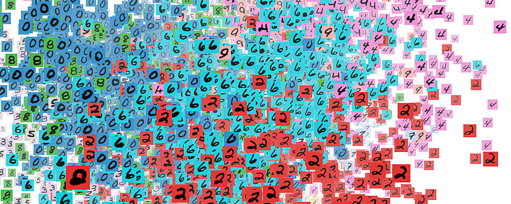
One of the projects I found very interesting has to be the ones done by “Martin Wattenberg” to help better visualize the information being processed by machine learning. One of the scariest things about machine learning is the idea of separating the human from the machine. In a way, the concept of “self-learning” machines is a scary one too many people, and often is portrayed as the end of humanity in various movies and TV shows. However, using the visualizations by Wattenberg, we are able to better understand what goes on inside the machine learning code and what kinds of decisions are being made. On top of helping us better understand the inner workings of machine learning code, Wattenberg also created a way for engineers and scientists to learn about machine learning systems. The future of automation and the tech industry seems to revolve around machine learning; however, it takes a lot of prior computer science knowledge to fully understand it. With this visualization, Wattenberg has made it much easier to visualize and conceptualize the powers of machine learning.
Juan Francisco Saldarriaga’s CitiBike Rebalancing Study is a investigation and subsequent data visualization to assist CitiBike with maintaining the equilibrium of their bike stations throughout different locations and times of day. The matrix is organized on those two axes, location and time of day, to establish patterns of usage. The imbalance of bikes is demonstrated by color, blue and orange, while the overall usage is characterized by the brightness of the color. This visualization makes it immediately apparent which stations are consistently depleted or overloaded daily. The analysis of this data will allow CitiBike to partially automate their system of organization, significantly cutting labor and expenses from the inefficient old system, which was based almost randomly on urgent need.
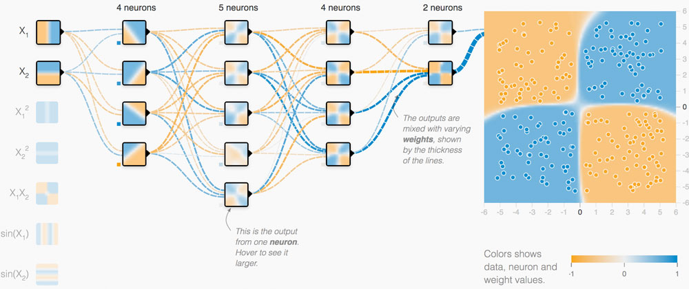
Maps and globes always intrigue me because there are so many different versions of them, visualizing and emphasizing different categories of information. This version of a digital globe by UnstableGround that shows the temperature rise due to climate change came to me as a very strong example that appropriately uses color and dimensions to convey information to the viewer.
UnstableGround (2021)
Before taking this course, I had no particular thoughts about how these projects would be created, but now I wonder what kind of code would be used to create this. The algorithm for color would surely be associated with the data of climate change (the higher the temperature, the darker the shade of red), but I wonder how the 3D aspect of the project would be coded, and if it would be possible with p5.js.
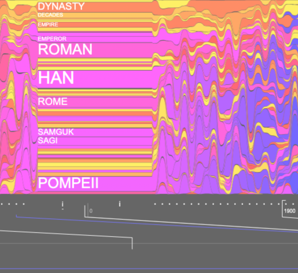
I looked at Santiago Ortiz’s work for this week’s blog, and I admired his History Words Flow project. John B. Sparks’s Histomap in 1931 inspired Ortiz to create this interactive project. The project depicts a colorful background and a timeline at the bottom; when users move the cursor horizontally along the timeline, words that describe that period in history will pop up. Also, when the viewer moves the cursor up and down, the text size changes. I think these features create a more interactive learning experience instead of just reading raw text and data. Ortiz did not share much about his process, except that he selected the words based on Wikipedia’s article list, organized in chronological order. I love how the project is in conversation with previous historical visualizations, which allowed me to see how advancements in technology made different ways of representing information possible. Ortiz’s research in information visualization is an excellent example of how various academic fields can benefit from clear and interactive visualizations.
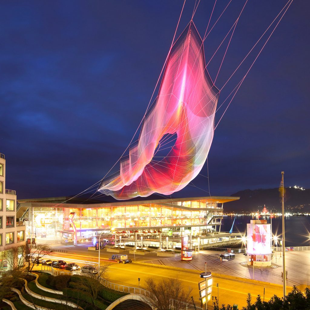
In 2018, Aaron Koblin and Janet Echelman created Unnumbered Sparks, an interactive net sculpture in the sky as a canvas for users to interact with. Aaron Koblin worked on the Google Data Arts Team and Janet Echelman is an artist who specializes in large-scale textiles.
The installation is made of braided fibers stronger than steel. Users act as co-creators as they connect through their phones and can draw with light. Their drawings are projected onto the sculpture. Additionally, every interaction creates a sound.
As the user moves from left to right, the data becomes more specific.
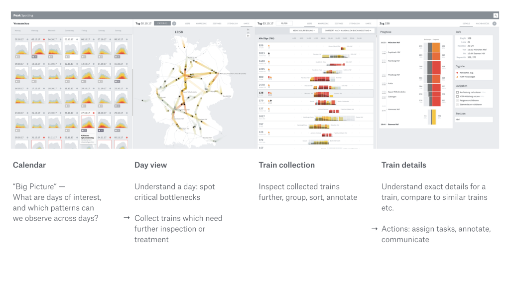
This project is an application that integrates data points which allows users to inspect data on custom developed visual tools, such as animated maps. I admire this project because it provides actionable information that can be used to make improvements with regards to passenger loads in trains; for example, there are features that allow users to spot traffic bottlenecks. I admire the aesthetics, because it is coherent and straight to the point. I admire this because the data is readable with distinct colors and organization is such that the process of finding information is streamlined. I know that the creator did some prototyping with Tableau to see what forms would be useful for each specific feature. Then Stefaner began prototyping with d3 and through this was able to compare different rendering techniques to select the most effective representation. The creator’s work is focused on balancing analytical and artistic aspects to support data-driven decision making. The final form of Peak Spotting perfectly encapsulates such sensibilities; it is largely due to his creative prioritization that the data is able to be as useful as it is. He aims to create work that draws people’s attention quickly, and this does just that by drawing people into the graphics and then keeping them interested with the content.
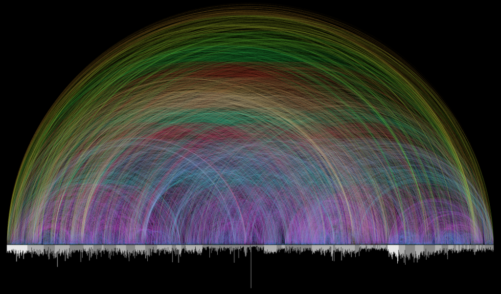
Visualization of Bible Cross References by Chris Harrison
For this week’s LO, I will be talking about a Visualization of the Cross References found in the Bible by Chris Harrison.
Chris Harrison is an Associate Professor of Human-Computer Interaction. And as the writeup for this week’s LO states, he is here at CMU as well. Some of his work deals with Data Visualization.
This one specifically caught my eye because I am a Christian and with some Bible study under my belt, I am astounded by the references within the Bible. I have also seen this work before, but to now realize that a CMU Professor made this has made me amazed as well. So beyond my own personal beliefs, I just find it beautiful and simplistic in a good way.
As for its creation, a Pastor (Christoph Romhild) and Dr. Harrison began work in 2007. They used the arcs as the connections between chapters (individual bars on the x-axis) that are grouped in alternating light and dark gray sections (they represent books of the Bible). The colors show the length of the connection – with the shortest being dark blue and the longest being what seems to be dark orange. They used the already available 63,000 Cross References and probably separated it by chapter. And using an algorithm(s) of some kind involving the Chapters, created this work.
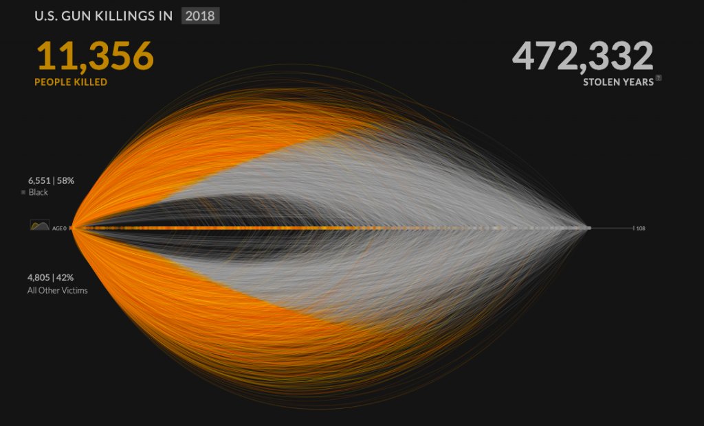
The project I have chosen for this blog post is Kim Rees’s data visualization, “Revealing the overwhelming magnitude of loss from U.S. gun deaths.” This project used data from the FBI’s Uniform Crime Report to map every individual gun murder victim from a given year at once. I find this type of data visualization to be extremely important because it gives a more realistic perspective to viewers who would not otherwise be able to grasp the magnitude of impact by simply looking at the raw numbers. In this project, Rees includes a visualization of what she labels as “Stolen Years”, or the number of years that each murder victim is estimated to have likely lived had they not been shot. The website allows viewers to use filters with can show the proportion of gun murder victims who fall into a specific category or demographic. For example, using the race and age group filters, I am able to see that 433 black children were killed at the hands of gun violence in 2018. As put by Rees, this project reveals “a massive collection of human emotion hidden within rows and rows of numbers.”
The project I choose for this week LO is the Unnumbered Sparks by Janet Echelman in 2014. The reason I find this interesting is that the form and color of this installation catches my attention immediately after I glimpsed it on the project website. After my research on it, I’m amazed by its scale and the audience controlled display. Instead of having fixed light beams, the creator actually pass the control over to the audiences so that it creates a connection between people and their surroundings. The way Janet Echelman put this installation together is inspiring as well. In order to create a canvas in such scale, he looked for the right material and decided to go with Honeywell Spectra fiber, a lightweight, durable material 15 times stronger than steel by weight. This project embodies the infusion of art and technology, expanding people’s understanding of art and material density, form, and flexibility.
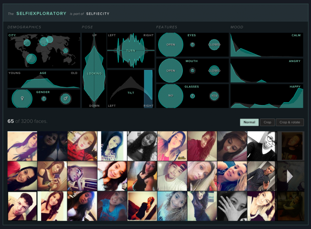
The project that I chose for this week’s Looking Outwards is called “Selfiecity” and it was coordinated by Dr. Lev Manovich. Selfiecity is an interactive project that analyzes the way people take selfies: in 5 different cities – Bangkok, New York, Moscow, Berlin, and Sao Paulo – the data of people’s selfies was collected to find many different patterns such as who smiles the most, who has more reserved looks, do angry people tilt their heads more strongly or what is a characteristic mood for people in Moscow.
I admire this project because it focuses on different cities all around the world instead of focusing on just specific ethnicity, culture or gender which shows more inclusion and diversity.
Selfiecity used different theoretic, artistic, quantitative, computational and data visualization methods to collect all the data. For example, Manovich’s team created an algorithm called Imageplots that assembled thousands of selfies to reveal interesting patterns and the team also created an interactive application called Selfiexploratory which allowed them to navigate the whole set of 3200 photos for the project. Selfiexploratory took into consideration matters such as location (1 of the 5 cities), age, gender, pose of looking up or down, tilt or turn of a head left or right, eyes and mouth open or closed, glasses or no glasses, calm, angry or happy. It’s fascinating how the team was able to create an application to take into consideration all of those things from just a simple selfie!
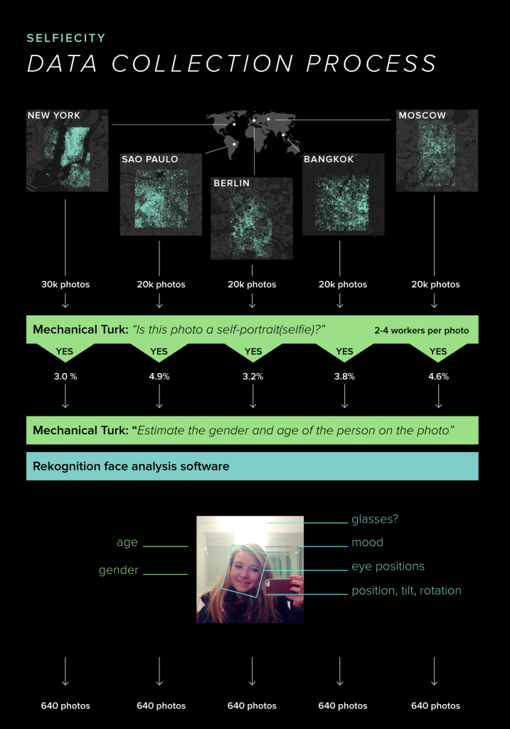
“This project is based on a unique dataset we compiled by analysing tens of thousands of images from each city, both through automatic image analysis and human judgement.” Manovich’s team randomly selected 120,000 photos, approximately 20,000-30,000 photos per city, from a total of 656’000 Instagram posts. After the selection, the team made 2-4 Amazon’s Mechanical Turk workers tag each photo by answering the simple question of “Does this photo show a single selfie?” The next step was to choose the top 1000 photos for each city and submit them to Mechanical Turk again to more skilled workers to guess the age and gender of the person in the selfies. With the top image selection, the team ran Selfiexploratory app to analyze the details. Finally, one or two members of Manovich’s team examined all these photos manually to find any mistakes and rounded the photos down to only 640 selfies per city.
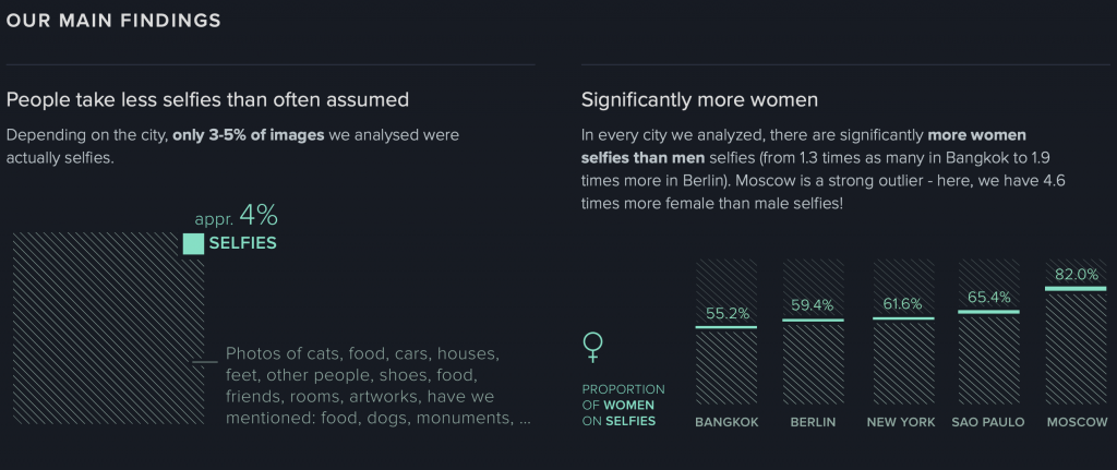
The creator’s artistic sensibilities manifest in the final form by finding out many interesting facts about selfies. For example, Manovich’s team found out that only 3-5% of images they analysed were actually selfies. The other 95-97% were pictures of cats, food, houses, artwork, other people like friends, etc. We always assume that people, especially Gen Z, take a lot of selfies lately, however only 3-5% of the photos analyzed were actually selfies. Moreover, the team found that in Moscow 82% of selfies were taken by women rather than men and Moscow has the least smiling selfies.
I think this project is very interesting because it focuses on the idea of a selfie and analyzes things such as tilt of a head or having glasses on. Many people wouldn’t even think that any data can be collected from a selfie, however data collected from a selfie in different cities can be used to find many cultural differences and lifestyles.
![[OLD SEMESTER] 15-104 • Introduction to Computing for Creative Practice](https://courses.ideate.cmu.edu/15-104/f2021/wp-content/uploads/2023/09/stop-banner.png)