![[OLD SEMESTER] 15-104 • Introduction to Computing for Creative Practice](../../../../wp-content/uploads/2023/09/stop-banner.png)
Project Title: Peak Spotting
Year of Creation: 2017
Artists: Moritz Stefaner
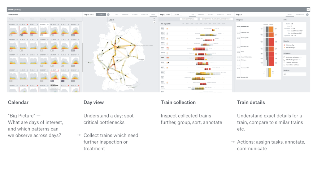
This project is an application that integrates data points which allows users to inspect data on custom developed visual tools, such as animated maps. I admire this project because it provides actionable information that can be used to make improvements with regards to passenger loads in trains; for example, there are features that allow users to spot traffic bottlenecks. I admire the aesthetics, because it is coherent and straight to the point. I admire this because the data is readable with distinct colors and organization is such that the process of finding information is streamlined. I know that the creator did some prototyping with Tableau to see what forms would be useful for each specific feature. Then Stefaner began prototyping with d3 and through this was able to compare different rendering techniques to select the most effective representation. The creator’s work is focused on balancing analytical and artistic aspects to support data-driven decision making. The final form of Peak Spotting perfectly encapsulates such sensibilities; it is largely due to his creative prioritization that the data is able to be as useful as it is. He aims to create work that draws people’s attention quickly, and this does just that by drawing people into the graphics and then keeping them interested with the content.