Stefanie Posavec is a designer, artist, and author. Her mission is to push different ways in which data can be communicated to a diverse range of ages and audiences. What especially intrigued me about her is that her projects are “wearable or danceable, be found in hospitals, museums, or on television.”
An example of the wearable aspect of her work is “Air Transformed: Better with Data Society Commission”. This series is a collection of wearable air quality data, initiating a conversation about air pollution. My favorite piece is “Seeing Air”. The projects consists of 3 pairs of glasses, each pair demonstrating the levels of air pollution on a different day in Sheffield in 2014. Each pair of sunglasses also signifies a different type of pollutant: nitrogen dioxide, small particulates, and large particulates.
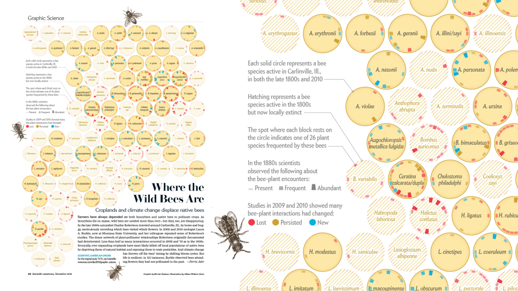
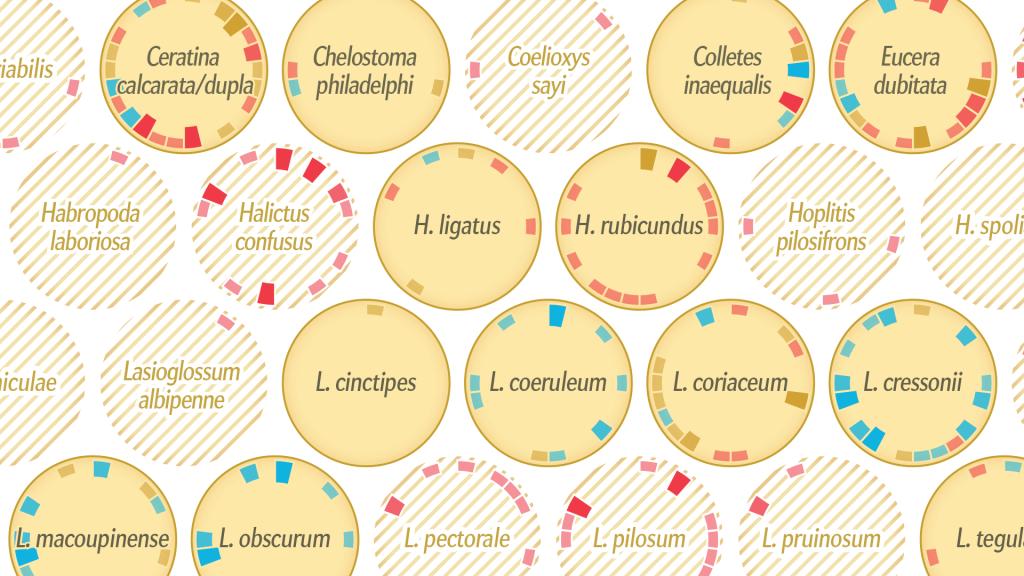
Where the Wild Bees Are Moritz Stefaner (+ Jen Christiansen + Jillian Walters) Nobember 28, 2013
Where the Wild Bees Are – Scientific American
Please discuss the project. What do you admire about it, and why do you admire these aspects of it? What do you know (or what do you suppose) about the algorithms that generated the work? It what ways are the creator’s artistic sensibilities manifest in the final form?
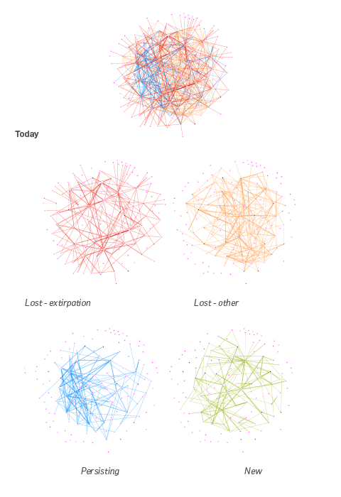
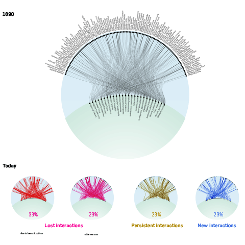
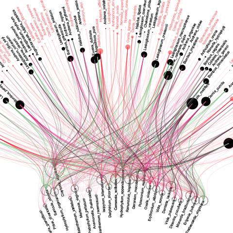
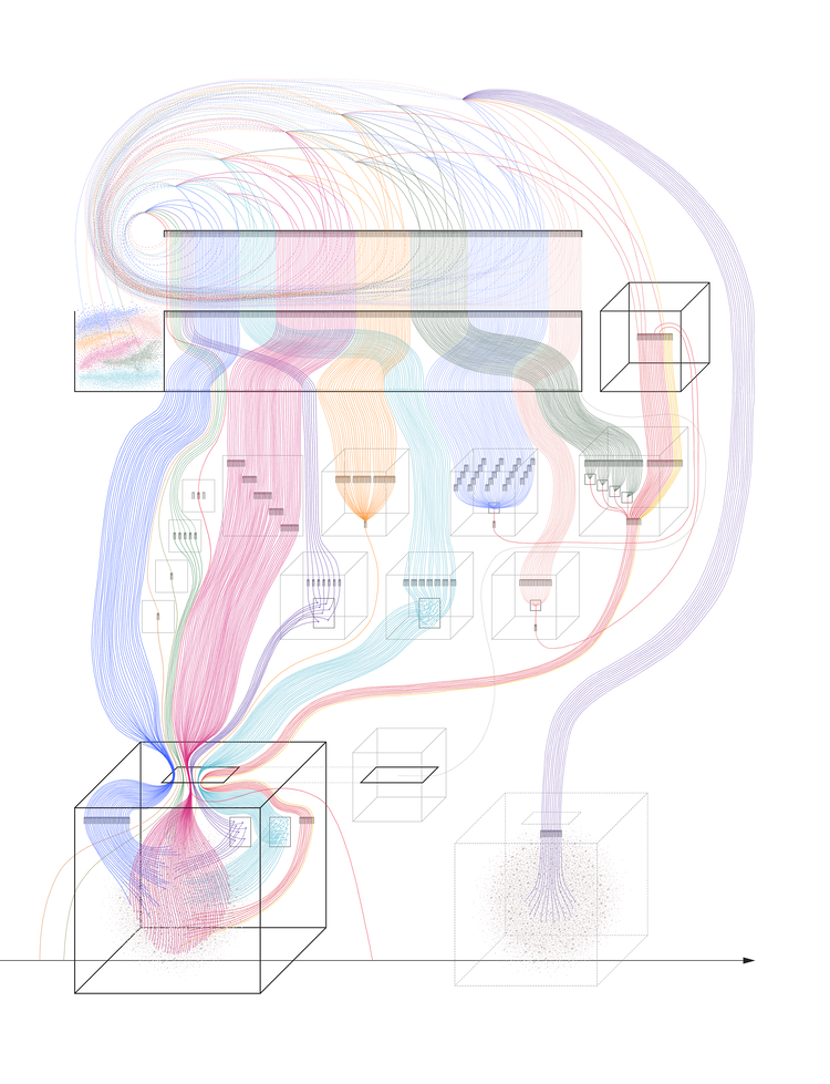
The project I have chosen to discuss is ‘Where the wild bees are” by Mortiz Stefaner (+ Jen Christiansen + Jillian Walters). It is an information graphic showing the status of various bee species and the relationship between each bee species the plant species they frequently interact with. One thing I admire is the sheer quantity and complexity of data the graphic is able to succinctly and clearly communicate on a single page. Great care has also been put into establishing a visual language of circular charts, each representing a single bee species, that is reminiscent of the hexagonal bee comb structure to emphasize the bee theme, allowing the graphic to feel clean and coherent. A short explanation of the various visual elements and their meaning can be found on the left, but it is split into short sentences that are easy to parse.
Original data visualization
Initial matrix view in Tableau
gephi explorations
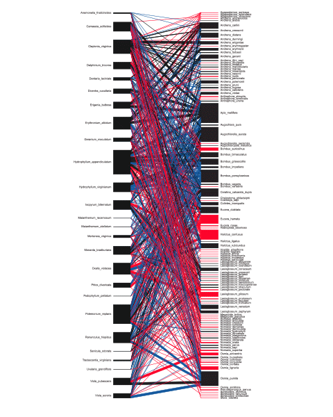
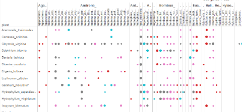
According to Stefaner’s blog post detailing their progress, the first and most crucial step was understanding the feel of the texture of the data – “understanding what can be done with it, and which views seem to generate the most interesting insights.” They first entered the data into a spreadsheet-style program called Tableau and produced a matrix view, which allowed to them to judge the denseness of connectivities between different network links and identify connection patterns. They then investigated the topology of the network (via gephi, an open graph visualisation platform), trying to see if there were any emergent commonalities between bee species that had gone extinct.
Matrix organisations
Organising the plants on the ‘ground’ and the bees in the ‘air’, they then connected the different data sets. However, it became complicated very quickly and difficult to read, prompting them to adopt a more general ‘plant visitation profile’ that highlighted each bee species individually.
“In this case, shifting the view from the macro-patterns to the micro-level… was crucial to untangle the mess and make sure the basic statistics about the bees – the main story = came across well.”
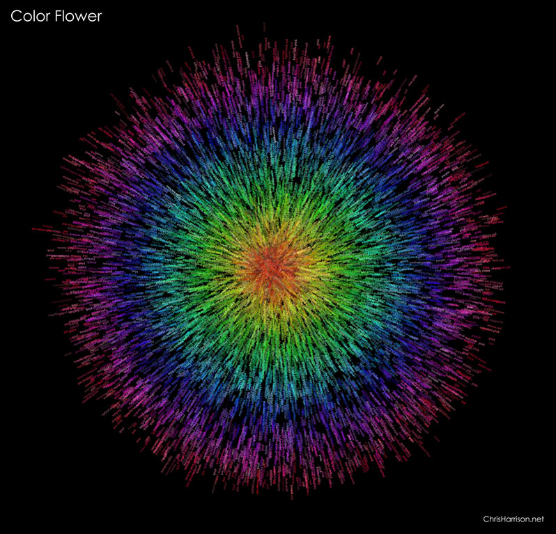
I really admire how Chris Harrison did his color flower, and the way he made his algorithm to create these sets of patterns is amazing and visually satisfying to look at. Although he didn’t specify how he made his algorithm, I can still guess a few of the steps that he took to make this work of art. First he made a set of point data within a boundary of a circle, and assigned values of those points based on the distance of them towards the center of the circle. Then, he used the points and the center of the circle to create vectors from the points and go away from the center of the circle. Eventually, based on hue value stored on each circle, they grab the name of the named color and list them on the vector using the color with the corresponding hue value, making this image a colored and worded art piece. Also, I love that he’s able to use the same algorithm to generate images not just circular but other shapes, such as spirals and others.
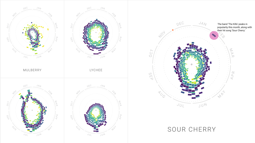
For this week’s blog post about information visualization, I picked the work by Moritz Stefaner “The Rhythm of Food”. It is a project that analyzes different food seasonality. He gathers the information we learn about food culture by looking at Google search data. The project collaborates with Google News Lab, and sheds light on the many facets of food seasonality, based on twelve years of Google search data. In order to investigate seasonal patterns in food searches, the team developed a new type of radial “year clock” chart to reveal seasonal trends for food items. The way it works is each segment of the chart indicates the search interest in one of the weeks of the past 12 years, with its distance from the center showing the relative search interest, and the color indicating the year. I admire the way Stefaner turns a huge amount of data into an easily visualizable graph. It was interesting to see how cultural and social influence has on the data result.
different types of fruits during different seasons
Creative direction, data visualization, design: Moritz Stefaner Design and development: Yuri Vishnevsky Illustration: Stefanie Weigele
For this week’s Looking Outwards, I looked at the works of Stephanie Posavec. I was intrigued by her works simply by the color visuals I saw when first opening up her website. Her goals are set around visualizing and communicating data in new ways. The project of hers I chose to focus on was Data Murmurations: Points in flight. This project visualized data samples, but connected them back to the people who actually donated samples. The title murmuration comes from a group of birds in the sky following a path. They converge and diverge in their journey. One thing lacking from Posavec’s description of her work is a description of the more technical tools she used to create her work. She uses sorting algorithms to sort all of her data and then visualize it, but I am not too sure about the specifics. I could assume there are some simple if statements about the data, such as if it is one thing it goes somewhere and if it is another it goes somewhere else.
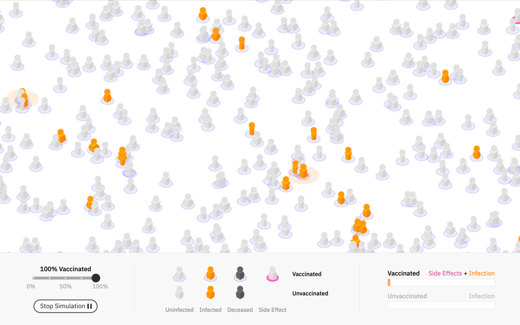
This program collected various data sets concerning COVID and its transmission. Studio NAND created this software to bring into perspective the true impact of COVID without false information or exaggerations. Using this application people can understand not only how quickly COVID can spread and how it spreads, but they can also see its effects on those who are vaccinated against those who are not. Users also have the option of choosing the vaccination rate to allow them to observe the influences of such a rate in a population. Overall, I think this software is a great tool that allows people to understand COVID transmission and the importance of vaccination. With so much misinformation involved in this pandemic, along with those who are apathetic, I believe simulations such as this can bring light to how important it is to understand how much of an effect the decisions a single individual can have on the population.
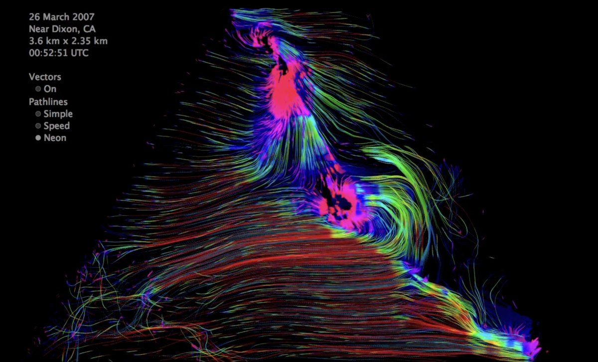
Jen Lowe, an artist and researcher, through her creative technology studio Maximal Expression, creates artistic data visualizations and looks at new ways to represent data that could open up brand new paths in data visualization. For example, her work “early particle flow lidar wind visualization,” is an incredibly smooth wind flow visualization. From the current wind flow diagrams in Architecture, which are static and more general wind visualizations, Lowe’s work opens up a new world for wind flow diagrams. The brightly colored work was made by taking raw, remotely sensed lidar data, filtering it, and putting it through an algorithm that creates wind vectors. The switch from static to animated flow fields inspires lots of new possibilities, personally, about integrating dynamic data visualizations with architecture to make it easier to read. I love how smoothly the colors and lines change, different from the usual static data visualizations. Lowe’s creativity in data visualization is seen all throughout her projects, but this one specifically sparked my interest due to its possible implementations in architecture.
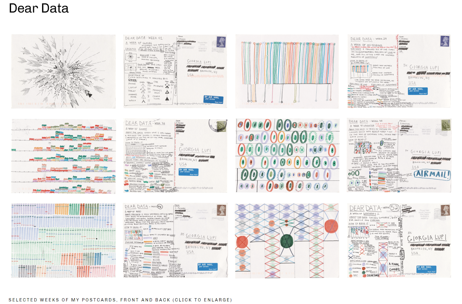
Stefanie Posavec is an artist, designer, writer, teacher, and data visualizer who finds satisfaction in representing large amounts of data in physical and experiential artworks. Her artistic practice involves collecting data manually and gradually, and although laborious, I personally really admire artists who enjoy working manually in conjunction with digitally produced components, in contrast to those who find the quickest (often fully digital) approach. Posavec’s process is extremely experimental and takes many forms, whether that is through dance, hopscotch, fine art, sculpture, auditory or wearable art, she never is tied down to one singular style or medium. However, her overarching goal, woven into each project, is to make the layperson understand and connect to data, even if they have never had an interest or experience with any data previously.
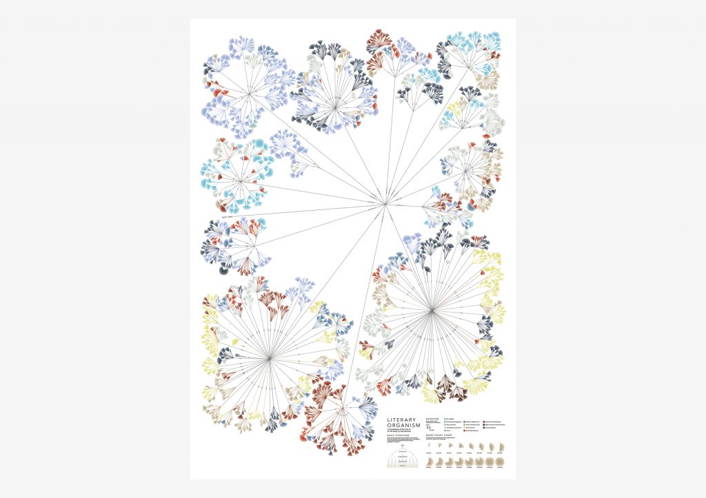
Stefanie Posavec is an artist and designer experimenting and researching ways to visualize and communicate computational data to all ages and audiences. What I like and find most special about Stefanie’s work is that it is very colorful, fun, and visually appealing. Usually when I think of computational data, I don’t necessarily imagine something animated, cartoon-like, or age friendly. Stefanie’s visualizations deliver themselves like artwork in a children’s book. In her work, “Drawing the Dictionary,” Stefanie responds to a theme of collections including parts of speech, syllables, first letter of the words, and alphabet. The words in the collection are specifically the 1000 most frequently used words. And used 1000 different colored index cards for each word. The words paper colors were organized by part of speech, background shape by syllables, placement by how frequently they are used, pattern by part of speech, and the pen color by first letter in word. In her work, “Writing without words,” Stefanie visually showcased text in order to highlight the similarities and differences in writing styles when comparing different authors. She wanted to create a data visualization that was straight forward and one with a subject that was emotionally connecting to humans. To create this, she focused on a book called “On the Road,” by Jack Kerouac and its themes. She did not want to use expressive typography or imagery but rather a subjective representation of information. She wanted the graphics to be quantifiable. She gathered data related to the english language structure.She wanted to visualize the novel as a living element full of energy and thus the novel is split into chapters, paragraphs, sentences, and words like a plant structure. Shorter sentences mean a choppy text and stiff writing style while longer sentences mean they are more free and leisurely. She gathered all data by hand and used math and a calculator to find final sums. Finally she used a computer graphics program instead of a data information one to watch the data generate bit by bit.
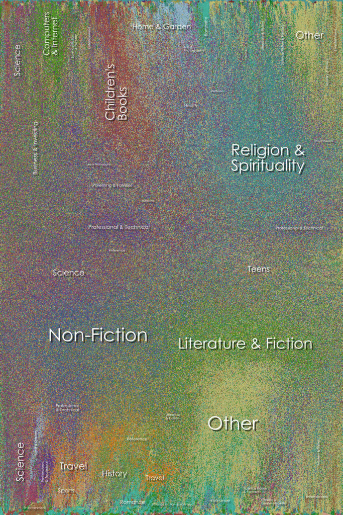
I really admired Chris Harrison’s project named Amazon Book Map. Which is basically a synthesis of the type of book data available on amazon. Every genre of book is color coded and displayed in a map format which looks more or less like a gradient. I really like the fact that the data is clustered on the map in the form of many small mosaics. I also enjoyed reading about the various approaches Harrison took in order to get to his final form, like making mosaics of the book covers. The fact that the map took 140 hours to be generated on wikiviz is also astonishing as it managed to map out more than 700,000 books on Amazon’s interface. The books began to cluster together because of their respective color codes, turning them into clusters of similar natured color dots and binding the entire map together. I do not know much about the algorithms that generated this synthesized piece of art representing a particular data set, but I do admire the intricate details it depicts. In my opinion, the artist himself is confused whether the piece manifested his ideals and motives as he claimed it to be ‘hard to read’ however, I feel that it is a wonderful piece to look at which amalgamates an unconventional data set.
![[OLD SEMESTER] 15-104 • Introduction to Computing for Creative Practice](../../../../wp-content/uploads/2023/09/stop-banner.png)