Information Visualization

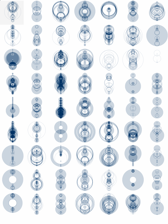
One of the projects where an artist created software to visualize data is called “The shape of the song”. Martin Wattenberg created this because he wanted to be able to see music. The arcs go between two sections of notes that are repeated. The software analyzes MIDI files, files that get the notes from a piece, which can be found on the internet. However, since these files are handmade, each file can have different contents even though it might be of the same song, which in return might produce different sequences in arcs. Since the arcs are translucent when they overlap it creates a variety of different opacities within the piece and depending on how big the section that is being repeated the stroke of the arcs are also varied. Wattenberg has an interest in how technologies can provide insight into things that are often overlooked in everyday life. Visualizing different patterns in music shows us a deeper understanding of music and might provide insight into why some people like certain songs compared to others. Additionally, this project reminded me of one of the other projects I looked into for Looking Outwards – Milkdrop. Milkdrop used shapes, curves, and colors to help visualize music. Milkdrop was a more organic, conceptual way of visualizing music, while The Shape Of Song is a more logical structured way of visualizing it. With The Shape Of Sing, it is easier for the audience to see how the music generated the artwork.

https://www.bewitched.com/song.html

LookingOutward 07

Link: https://www.bewitched.com/song.html

\I’ve investigated the data visualization software, Shape of Music, created by Martinez Wattenberg. The software detects rhythm similarities in a piece of lyrics and diagrams similar parts by creating a connection with half discs.

What I really admire about this program is the brand-new way of representing musical rhythms, where instead of noting musical notes through sheet music, the program diagrams patterns. This helps visualize patterns in music, where instead of looking through sheet music to find a similar rhythm in a song, one can look at the connections through the lines, and see what parts of the song are most frequently repeated.

The software is entirely written in java and uses MIDI files to analyze the rhythm, where, unlike other common file types, a MIDI file contains a description of the notes which makes the analysis of the letters much more amendable. The MIDI files can also be separated into different tracks and analyzed separately. The algorithm I suppose is programmed to look for similar patterns in a range of note descriptions and create a connection through an arc diagram as a connection to map the similarities.

It is obvious that the author is keen on simplicities in diagraming, and he has also said on his website that he has taken inspiration from other arc diagrams, which is a simple yet effective form of diagraming to communicate information.

Looking Outwards 07 – Information Visualization

Work Title: The Atlas of Emotions for the Dalai Lama & Paul Ekman — Visualizing the science of emotions

Artist: Stamen Design

http://atlasofemotions.org/#introduction/ (Live data)

This project intrigues me in its aspect of collecting and visualizing relatively intangible data, which are represented by feelings and emotions. In collaboration with social scientists and data designers, the initial idea of creating a single map grew into a collection of maps that analyze different emotions individually (anger, fear, sadness, disgust, and enjoyment). Because there are no preexisting data models of emotions, researchers and designers worked together to draw out many rounds of visualizations on paper first and translated those onto the actual model. 

This project’s primary goal was to resolve the gap between academic findings and personal experiences. The methodology of solving these questions is through data visualization that first had to begin with sketching discussions and first-hand data collection.

Blog – 07

The work of Jonathan Jennings Harris most inspires me. He is an artist and technologist who often works with data. One piece of work that I found particularly interesting was “I Want You To Want Me” which he created in 2008. It is an interactive portrait illustrating the search for love(and self) through online dating. In this project, Harris and his team gathered data from hundreds of dating sites and displayed them in a series of interactive ways. On a touchscreen panel, many balloons are displayed in various colors. Pink for women and blue for men. The balloons also vary in value, with younger people having lighter-colored balloons and older people having darker-colored balloons. Inside the balloons lie animated silhouettes of people trapped inside looking for love. These balloons are then algorithmically matched on the screen based on what people said in their profiles. The user is able to click on a balloon to learn more about each person.

https://jjh.org

Project-07-Curves

Astroid

sketch
//Brody Ploeger
//Section C
//jploeger@andrew.cmu.edu
//Project-07


var nPoints = 150
function setup() {
    createCanvas(480, 480);
    background(220);
    //text("p5.js vers 0.9.0 test.", 10, 15);
}

function draw() {
    background(0);

    push();
    translate(width/2,height/2)
    //astroid 1
    stroke('orange')
    noFill()
    astroid(0,0);
    //astroid 2
    stroke('lightblue')
    noFill()
    astroid2(0,0);
    pop();
}

function astroid(x,y,q,w){
    //https://mathworld.wolfram.com/Astroid.html
    var x;
    var y;
    

    var q = map(mouseX,0,width,0,5);
    var a = constrain(mouseX,0,width/2);
    var b = constrain(mouseY,0,height/2);
    var w = constrain(mouseY,0,height);

//shape
    beginShape();
    for (var i = 0; i<nPoints; i++){
        var t = map(i,0,nPoints,0,TWO_PI)
        
        x= a*pow(cos(t*w),3)
        y= b*pow(sin(t*w),3)
        rotate(radians(q))
        vertex(x,y);
    }
    endShape(CLOSE);


}
function astroid2(x,y,q,w){
    //https://mathworld.wolfram.com/Astroid.html
    var x;
    var y;
    

    var q = map(mouseX,0,width,0,5);
    var a = constrain(mouseX,0,width/2);
    var b = constrain(mouseY,0,height/2);
    var w = constrain(mouseX,0,height);

//shape
    beginShape();
    for (var i = 0; i<nPoints; i++){
        var t = map(i,0,nPoints,0,TWO_PI)
        
        x= a*pow(cos(t*w),3)
        y= b*pow(sin(t*w),3)
        rotate(radians(q))
        vertex(x,y);
    }
    endShape(CLOSE);


}

anabelle’s blog 07

http://manovich.net/index.php/exhibitions/on-broadway

One work I found inspiring was Lev Manovich’s “On Broadway.” It resonated with me for two reasons: one, I’m writing this blog while in NYC (hence, Broadway) and two, I appreciate the lack of numbers and traditional data in the project. Overall, I’m not too big on STEM and mathematics, so this feels like a unique approach that tries to broaden the statistical audience to the average math hating person. I also think this approach was generally successful — anyone who views this gains a comprehensive survey of Manhattan even without the physical data (I mean, I find that when I’m reading actual statistics, I generally gloss over the figures and take away the big idea more than anything else anyways). I also liked this project because I felt as if it was something even I could recreate (albeit on a smaller scale). It seems like a lot of data storage (and we’ve learned about NUMEROUS ways to represent and store data already) and visual representation (and this is a creative computing class!). It’s inspiring to think large projects like this are within my reach

LookingOutwards-07

This week I am looking at the work of Lev Manovich. Manovich is a digital culture theorist, writer, and artist. A lot of his work looks at media and technology. His project On Broadway, is an interactive application and pubic installation piece. The piece looks at data from Broadway in New York City, however, the data is not presented in a normal way with maps, numbers, and charts. In this project numbers are secondary to data in the form of images grabbed from social media and the internet. These images were taken from six months in 2014. The project showed how the city can be represented through the view of the hundreds of thousands of people posting images.

http://manovich.net/index.php/exhibitions/on-broadway
http://on-broadway.nyc/

Looking Outwards-07

Wind Map is a living portrait of the wind currents over the U.S., where it conveys the movement of the air through visual motion. The creators, Fernanda Viégas and Martin Wattenberg, wanted the artwork to reflect the real-world and how its “emotional meaning” changes on a daily basis. For instance, on calmer days with little to no wind, it can can represent the “soothing mediation” of the environment, whereas days that are more rampant (e.g. hurricanes) the visuals are much more sporadic and ominous. I can see how the artists’ creative sensibilities have manifested into their work as they have used their project for artistic exploration within dramatic patterns and delicate tracery of wind, combining weather elements and art together.

Wind Map: Tracery of Wind Over the U.S.
Data Visualization of Hurricane

The two artists created this work through surface wind data collection of the National Digital Forecast Database, which are near-term forecasts revised once per hour. Further, the technique is implemented entirely in HTML and JavaScript, which is another facet of what I like about the piece because it is what we are learning right now!

Project 07 – Curves

Using a rose curve function I created two overlapping shapes. Moving the cursor to the left side of the canvas decreases the petal count and changes its rotation direction to counterclockwise; to the left, the petal count increases, and the rotation direction is clockwise. Clicking the canvas will pause its motion.

sketch
// Emily Franco
// Section C
// efranco@andrew.cmu.edu
// Project-07
 
//num of petals
var n=3;

//track move clickes
var state = 0;
//tracks when petals function runs
var petalState =0;

//store x and y cordinates of petal
var petalPointX = [];
var petalPointY = [];

function setup() {
    createCanvas(400, 400);
 }

function draw() { 
    background (0);

    //move origin to center canvas
    translate(width/2,height/2);

    //outter rose
    fill(167,1187,232,120);
    rose(n,200,5);

    //inner rose
    fill(252,219,3,120);
    rose(-n,120,3);


    petals();
} 

//only call petals mouse house is clicked    
function mousePressed(){
    if(petalState == 0){
        state = 1;
    }

    if(petalState == 1){
        state = 0;
        petalState = 0;
    }
}

//make rose shape
function rose(n,radius,rate){
    var x; 
    var y;
    var newRad;
    //make rose shape
    beginShape();
    for (var a=0; a<=360; a++){
        newRad = radius*sin(n*radians(a));
        x = newRad*cos(radians(a)); 
        y = newRad*sin(radians(a)); 
        petalPointX[a] = x;
        petalPointY[a] = y;
        vertex (x,y);
    }
    endShape();
    petalLines(rate);
}

//draw lines at determine increments from center to petal coordinate
function petalLines(rate){
    stroke("black");
    for(var i=0; i<=petalPointX.length;i = i+rate){
        line (petalPointX[i],petalPointY[i],0,0);
    }
            
}

//add or subtract petal depending on mouse location
function petals(){
    if(state==1){
        if(mouseX>=width/2){
             n=n+0.01;
        }if(mouseX<width/2){
             n=n-0.01;
        }
        
        petalState=1;
    }   
}


Project 07

logarithmic spirals!

sketch
// Sowang Kundeling skundeli Section C Project 07

var theta; // angle from x-axis
var r; // dist from the origin
var nPoints = 700;

function setup() {
    createCanvas(480, 480);
    angleMode(DEGREES);
}

function draw() {
    background(28+mouseY, 74, 55+mouseX); // green

    strokeWeight(2);
    startAngle = constrain(mouseY, 100, 100);
  
    // spirals
    stroke(110, 53, 140); // dark purple
    logSpiral(mouseY, startAngle);
    stroke(199, 129, 227) // light purple
    logSpiral(mouseY, startAngle+20);
    stroke(76, 63, 152) // dark blue
    logSpiral(mouseX+25, startAngle+40);
    stroke(136, 128, 224) // light blue
    logSpiral(mouseX+50, startAngle+60);
    stroke(176, 69, 149) // pink
    logSpiral(mouseX+75, startAngle+85);
    stroke(224, 110, 196) // pink
    logSpiral(mouseX, startAngle+95);

}

function logSpiral(r, theta, color) { // logarithmic spiral
    noFill(); // use noFill or else only one line is shown
    var a; // arbitrary constant
    var b; // arbitrary constant
    
    beginShape();
    for (i=0; i < nPoints; i++) { // apply nPoints onto spirals
        a = (width/2) + (r+i) * cos(theta+3*i);
        b = (height/2) + (r+i) * sin(theta+3*i);
        vertex(a, b);
    }
    endShape();
}