Realized this was stuck in my drafts since the assignment failed and was iterated into my second crit, the toaster. Putting this here for posterity, but most of it is available in my Crit #2 – Grumpy Toaster.
For this post:
Making Things Interactive
Realized this was stuck in my drafts since the assignment failed and was iterated into my second crit, the toaster. Putting this here for posterity, but most of it is available in my Crit #2 – Grumpy Toaster.
For this post:
Premise
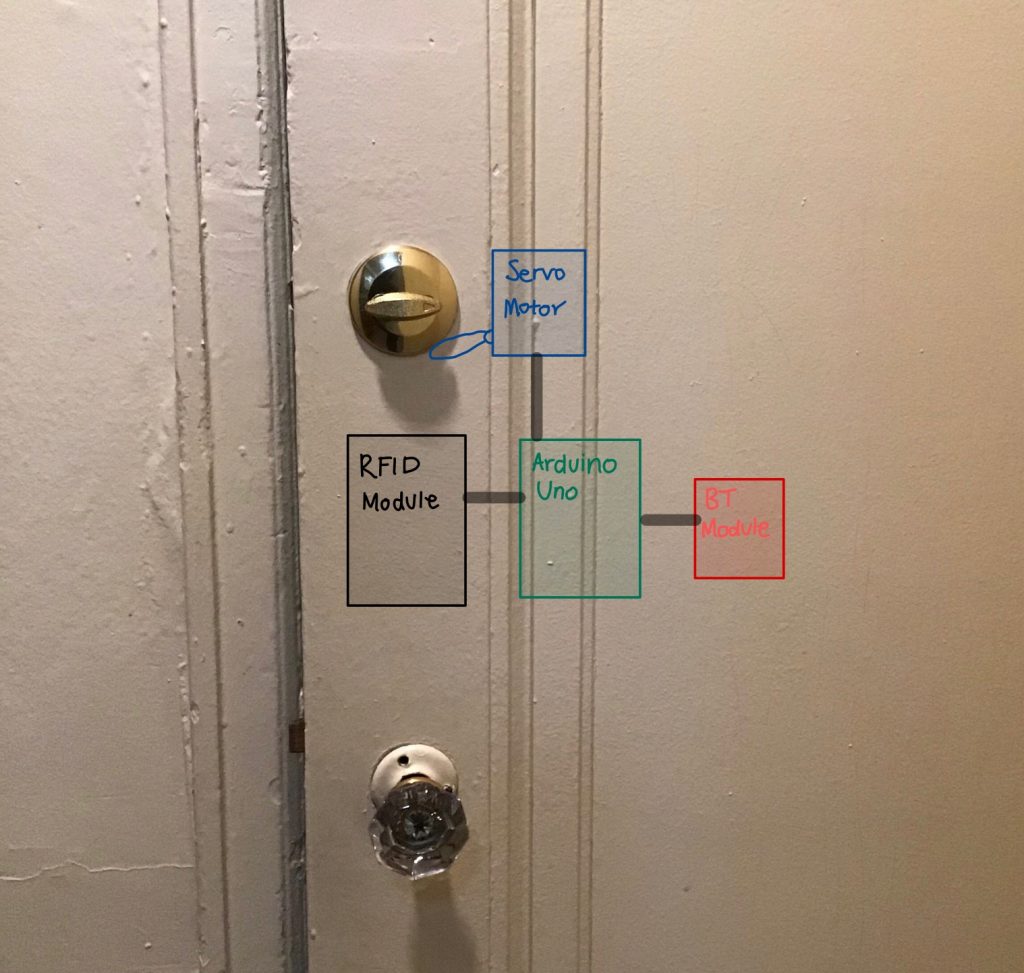
On most newer campus housing door are fitted with modern electronic access locks which use pin codes and HID’s – which allow identification using cards with embedded RFID systems. This means students do not need to carry around additional key and can access their rooms using their student ID. Additionally, these locks are also connected to the internet which means students can login on their phones and add request a temporary pin to access their room.
Unfortunately, the Fairfax community has a traditional locks (picture below). I wanted to make a project which could be retro-fitted onto my existing lock and have many of the features modern locks do. I also wanted to add some additional features which tells me more information about whether my door is locked and who is in the room.
Note: This project is an extension of my Kinetic Critique which you can find here
Solution
I used combination of servo motors, a bluetooth module and a RFID module to create a low-cost door lock which can be added to a mechanical lock. Since the project is bluetooth enabled I can connect my Android phone to it and send and receive data about my door lock. There are a few permanent users which can use their CMU university ID to unlock the door.
I created temporary card access feature. The owner of the door lock can send RFID codes via bluetooth to give someone temporary access to the door. The owner can also revoke access at any time by sending an ‘!’ over bluetooth. Additionally, the status of the door can be checked by sending a ‘+’. The user will receive a ‘y’ or ‘n’ back. The user can also lock the door at anytime by sending an ‘?’ .
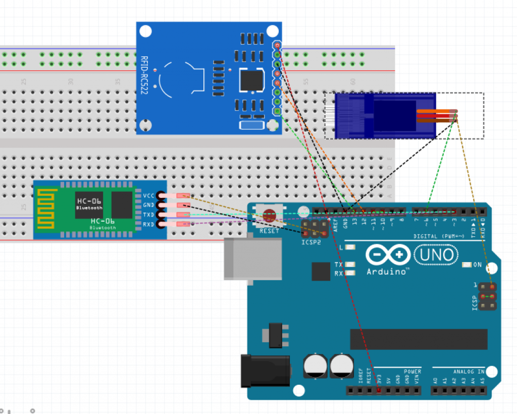
Proof Of Concept
I used an Arduino Uno, RFID MFRCC522 Reader, HC05-Bluetooth Module and an Android Phone with the Bluetooth Terminal App.
Below is a video of me testing out a few of the features from my lock.
Notes
I wanted to discuss write a little not section so that if someone wanted to recreate this project – they would be able to understand the limitations in terms of modifying my current code and hardware.
If I was to extend my project, I would try to add a capacitive fingerprint reader or use a Raspberry Pi and a Pi Camera Module for face recognition. Additionally, I would replace my bluetooth module with a wifi module.
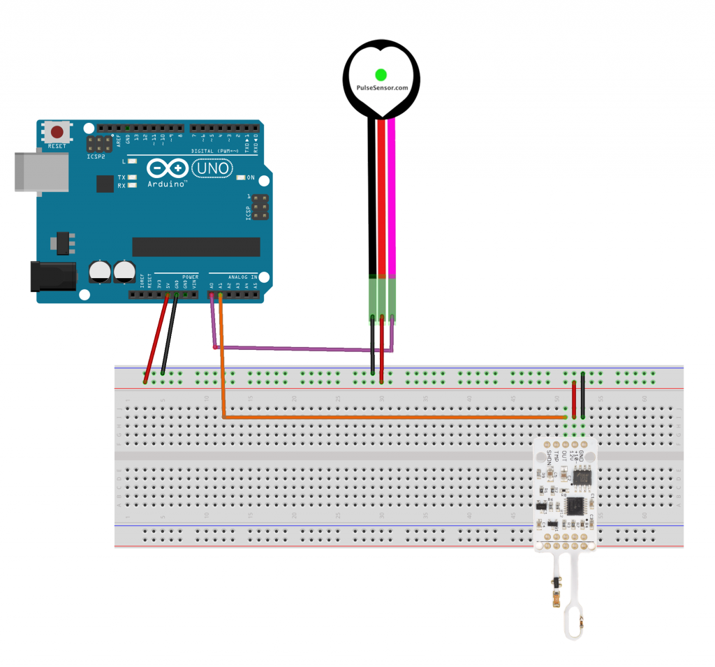
I wanted to create a smart watch interface for someone with anxiety and panic disorder. It reads someone’s pulse and breath rate and can detect when someone is having a panic attack. I used real-time biometric data from a pulse sensor and a wind sensor and hooked it up to an ardiuno, then I used serial communication to send the data and trigger & display different calming graphics using p5.js. I will go through the project interface and design first, then I will show you how I went about doing it.
Depending on the kind of panic attack you are having, there are 3 modes/techniques. The good thing is that any of these techniques would work during a panic attack. I weighted certain techniques to be triggered based on someone’s sensor data. But for the purpose of the scope of this project, and because this requires more knowledge, time and research, I used keyboard keys to to demonstrate the different interfaces.
These techniques and methods were based on my research on medical articles here, here, and here.

“Recently I found that trying to focus on something else such as counting numbers… works, because it requires concentration.”
Melanie Luxenberg
Testing the pulse sensor and how it communicates using the p5.js serial port:
Testing the wind sensor and how it communicates with the p5.js graphics:
Going through all the different types of interfaces and how they react to the user’s biometric sensor data and interactions:
I used the step by step guide provided by NYU’s physical computing department here to learn how to use ardiuno and p5.js together. If you follow that guide, you can know how to download and run the project. You will need to download the P5.js complete library, the P5.serialserver, and the ardiuno software.
You can download all the files you need to run the project here: galsanea_FinalProject_allFiles
In recent weeks, workplace safety standards have come under scrutiny, after an incident where an Amazon employee suffered a fatal heart attack while on the floor with no one around to help for twenty minutes after the fact. The labor sector of the economy can cause a variety of health risks, caused by falls, drops, and repetitive stress. Additionally, accidental misuse of heavy machinery, or lack of awareness of ones surroundings can lead to fatal consequences. There are a variety of technologies that can tackle workspace related injury, this experiment covers responding and communicating physical stress.
An suite of auditory and visual feedback systems would allow workers to maintain there safety in an intuitive fashion. The first device is a fingerless glove wearable that reads the temperature of an object, and indicates that temperature to the user in the form of color. Green implies handilability, red implies heat, and blue implies cold. If the object is not handleable, the wearable will vibrate as a warning.
The second device is a stress sensor. If the user is physically stressed, or if the user is experiencing and irregular heartbeat, the sensor will begin playing a patterned noise, indicating to others that they are either performing a laborious task, or that they need assistance.
The third device is a personal alarm, embedded into a vest or article of clothing. It requires two distinct buttons to be pressed at the same time. If the user feels that they are having a serious medical event, or are injured, or see another person that is in need of assistance, the user can press these buttons, which will trigger an alarm.
The first device was prototyped using the onboard neopixel from a redboard turbo, an I2C OLED, and a tactor motor. The I2C OLED stated the current temperature, read from an MLX non contact temperature sensor. The neopixel and tactor perform as noted above.
The second device prototype utilizes an electromyograph sensor, which reads signals from muscle impulses. When the rating reaches a threshold, a piezo speaker plays a tune.
The third device uses two force sensors as push buttons, and uses a speaker to play an alarm.
“Until now, we have always had to adapt to the limits of technology and conform the way we work with computers to a set of arbitrary conventions and procedures. With NUI(Natural User Interface), computing devices will adapt to our needs and preferences for the first time and humans will begin to use technology in whatever way is most comfortable and natural for us.”
—Bill Gates, co-founder of the multinational technology company Microsoft
I think that gesture control interface could have great potential to help people interact with computing devices naturally because gestures are inherently natural. Gestures are a huge part of communication and they contain a great amount of information, especially the conscious or unconscious intentions of the gesture-doers. They sometimes communicate more, faster, and stronger than other communication methods.
In this perspective, I want to design a gesture user interface for a computer. When people are sitting on a chair in front of a computer, their body gesture (including posture or movement) shows their intentions very well. I did some research and I could find a few interesting gestures that people commonly use in front of a computer.
When people are interested in something or when they want to see something more closely, they lean forward to see something in detail. Reversely, when people lean backward on a chair with two hands on their heads staring at somewhere, it is easy to guess that they are contemplating or thinking on something. When they swing a chair repeatedly or shake legs, it means that they are losing interests and become distracted.
The same gestures could have different meanings. For example, leaning forward means the intention to see closer when people are looking at images, but it could mean the intention to see the previous frame again when they are watching a video.
I am going to build a gesture interaction system that could be installed on computers, desks, or chairs to recognize the gestures and movements of a user. According to a person’s gestures and surrounding contexts (what kind of contents he/she is watching, what time is it, etc), the computer will interpret the gestures differently and extract implicit intentions from them. This natural gesture user interface system could leverage user experience(UX) of using computing devices.
I am also considering to add haptic or visual feedback to show whether the computer understood the intention of the gestures of the user as input.
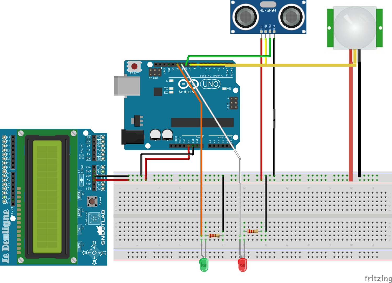
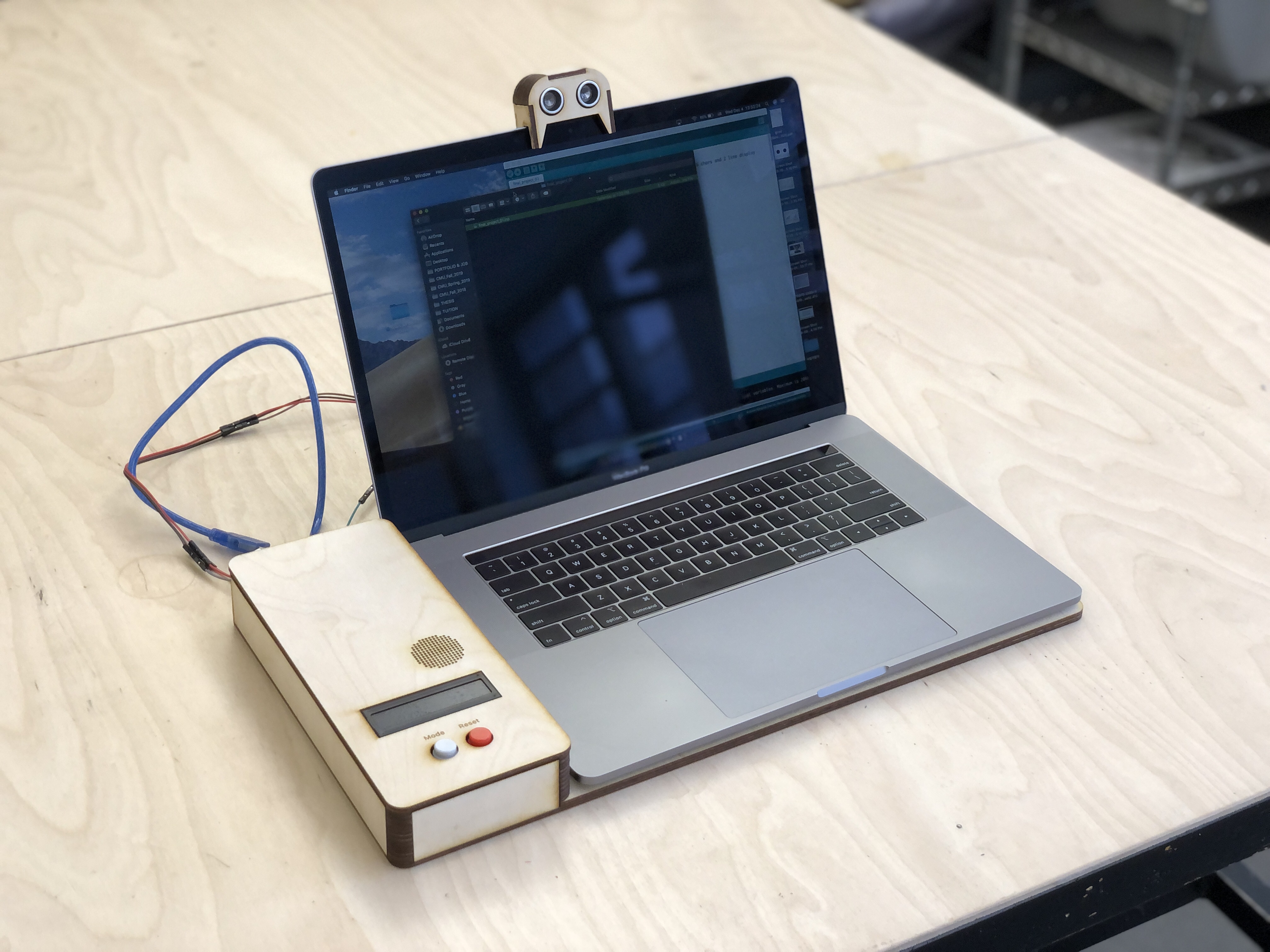
The system is composed of two main sensors. The motion sensor is attached under a desk so that it could detect the movements of legs. The ultrasonic sensor is attached to the monitor of a laptop so that it could detect the posture of a user, like an image below.
The lean forward gesture could be interpreted differently based on the contexts and the contents that a user is watching at that time. I conducted research and found correlations;
Based on this intention and the contexts, the system I designed responds differently. For the first case, it zooms in the screen. For the second case, it rewinds the scene. For the last situation, it shows all windows.
Also, the system could detect the distraction level of a user. The common gestures when people lose interest or become boring are shaking legs or staring at other places for a while. The motion sensor attached below the desk could detect the motion and when the motion keeps being detected more than a certain amount of time, the computer turns on music that could help a user focus.
(PW: cmu123)
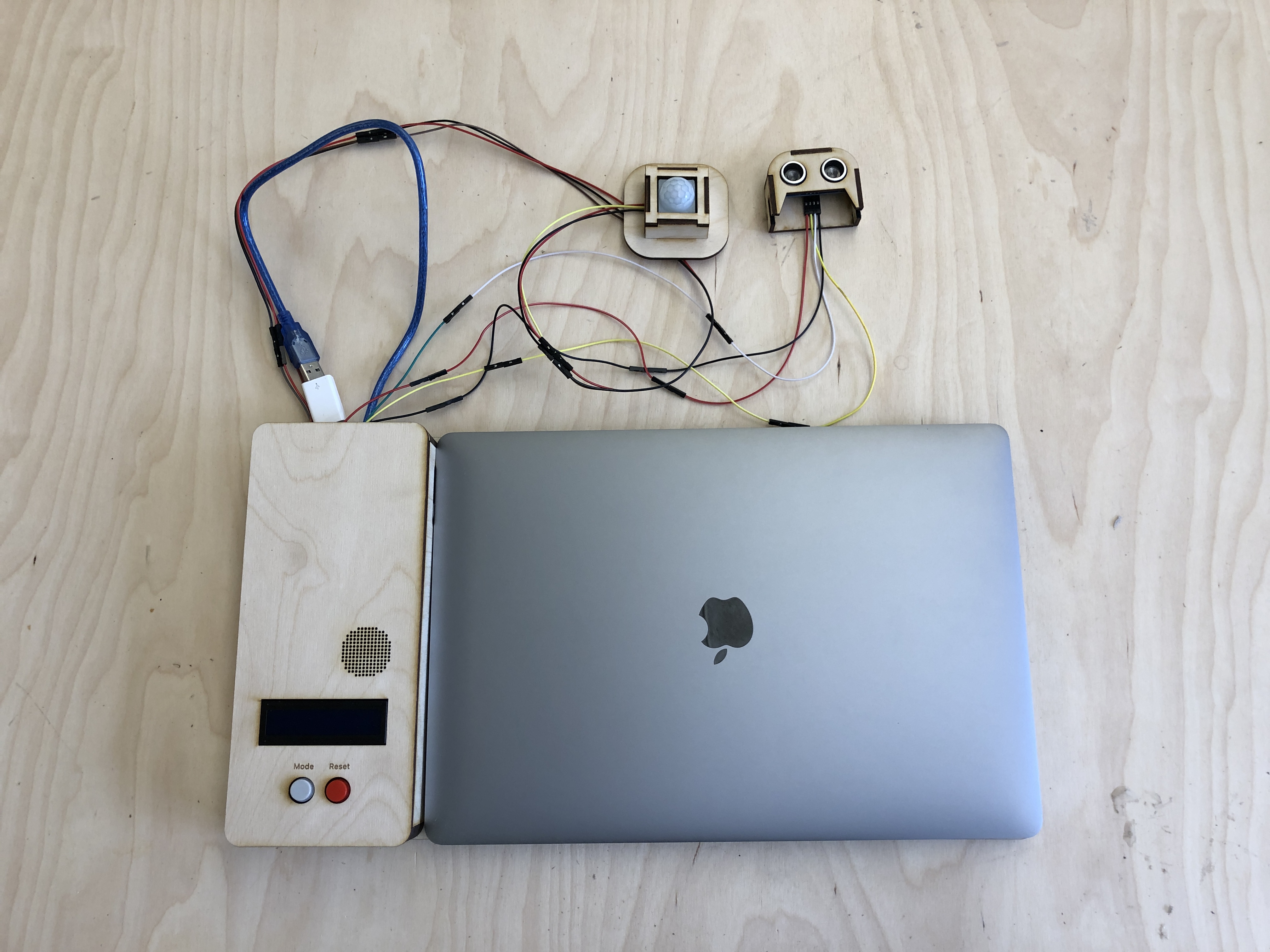
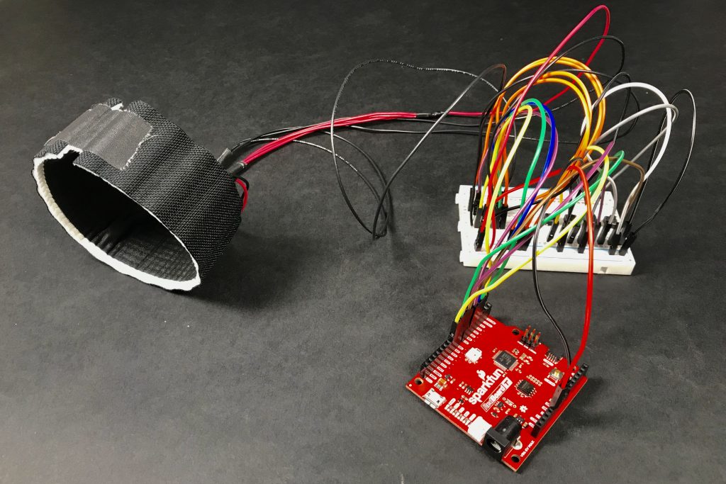
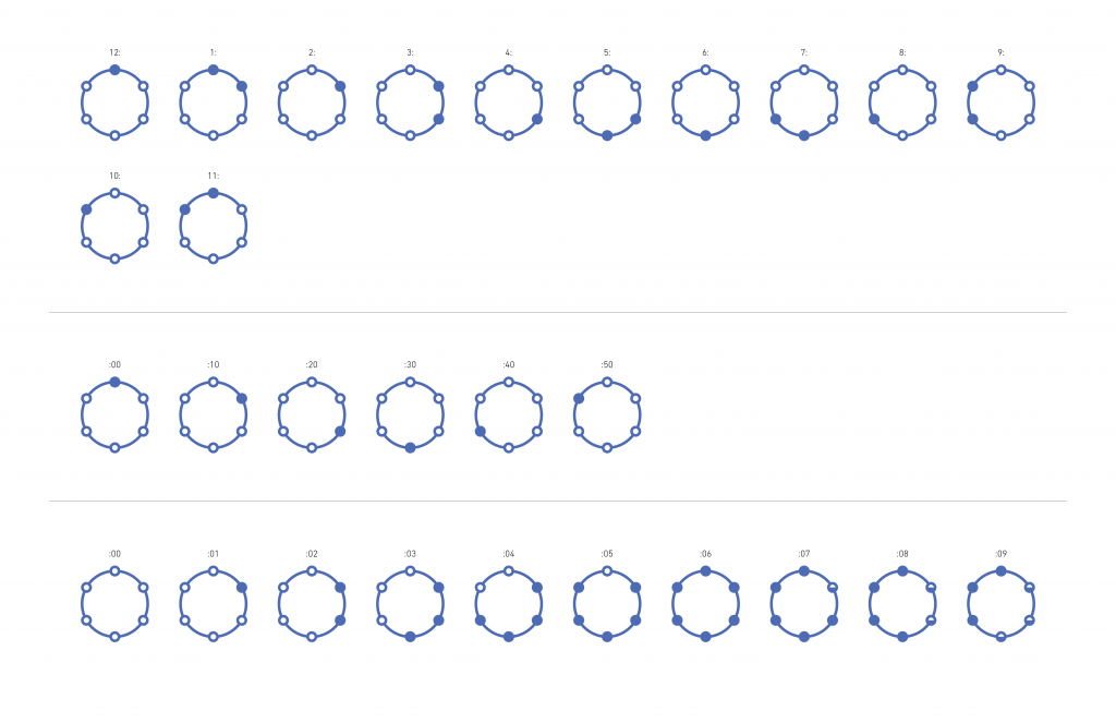
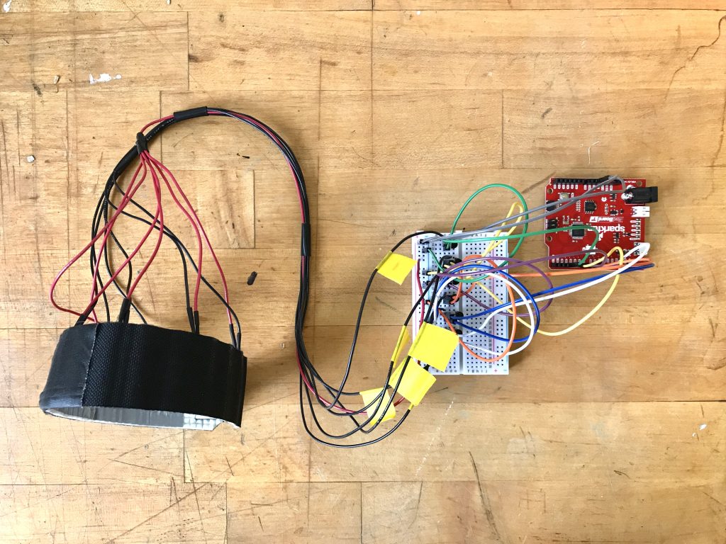
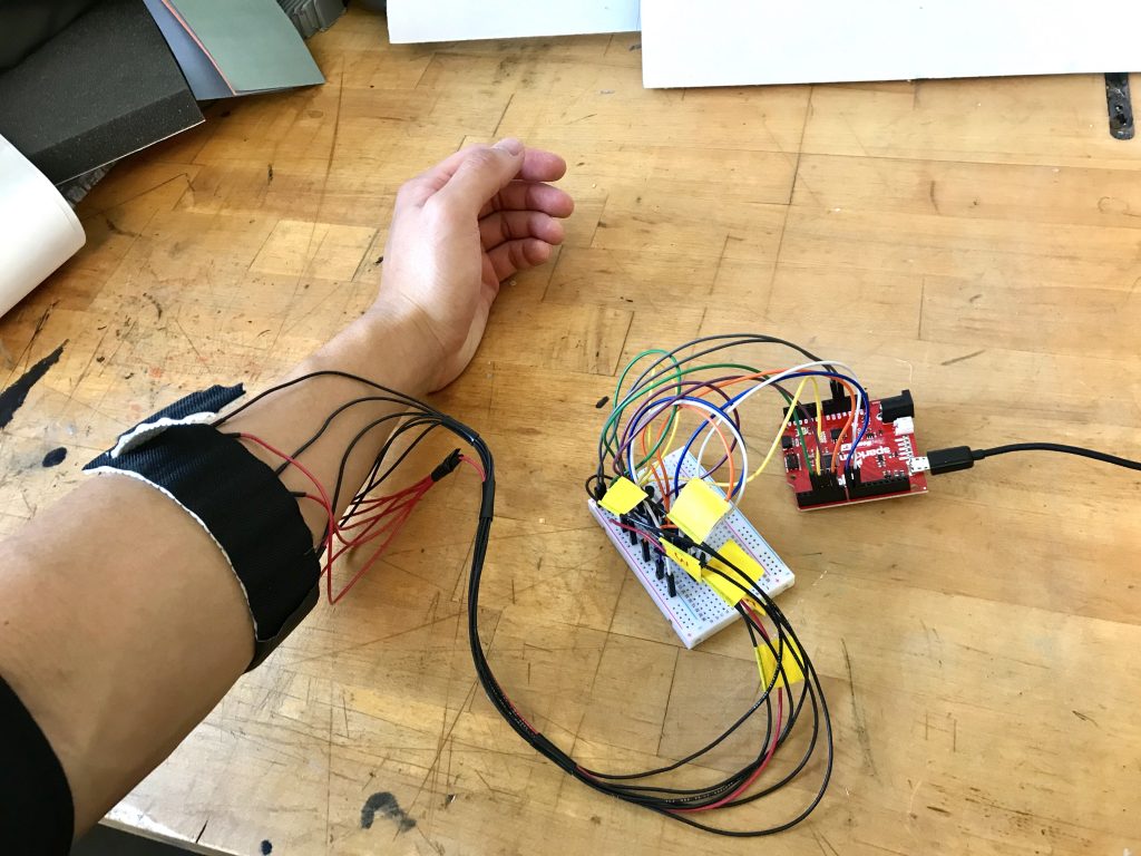
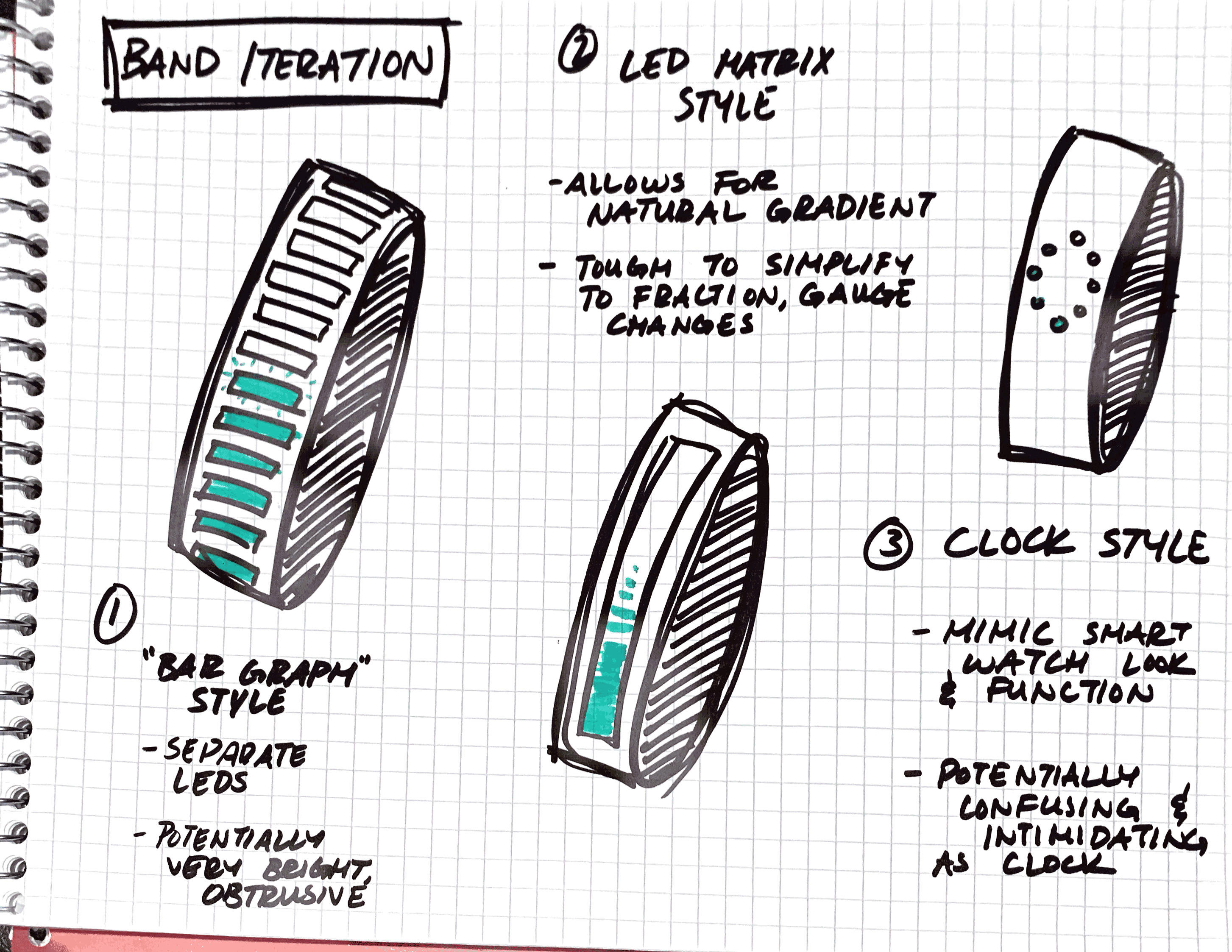
For my final project, I decided to draw from my work from the kinetic critique, and further explore how a radial array of vibrating motors can not only serve as a feedback device for the blind and hearing impaired, but also how different patterns can carry various meanings and emotions. While the original concept remains similar to that of the previous critique, I completely revisited the context, physical construction, and code structure of the device. In addition, I wanted to really flesh out a specific use case for the device, so I created a robust language and alert system specifically revolving around the act of time keeping.
The previous iteration of the haptic armband consisted of four vibrating motors arranged in a circle around the forearm. One thing I learned from that process is that four manipulation points isn’t quite enough to convey the feeling of rotation and feels more like four separate actuators (which they are). In constructing the improved version, I decided to use six vibrating motors arranged in a similar manner for a couple reasons: first, this fixed the problem of feeling like the device was only separate actuators rather than a radial array; second, having six manipulation points made developing a time keeping language feel much more natural since it more closely parallels the indices on an analog clock. However, any more points and it would become difficult for users to distinguish sensations between adjacent motors. Finally, I made this version adjustable as to create a more comfortable feeling for users.
Since I wanted this device to not only be able to convey emotion, but also information, I went into more depth by creating a haptic language that parallels telling time with an analog clock. Two buzzes are used to indicate the hour, one buzz for the ten minute, and a series of buzzes to describe the exact minute. While I considered foregoing the exact minute since knowing the approximate time is often sufficient, I did not want to sacrifice content for clarity, and instead chose to communicate time down to the minute. In addition, I prototyped several other patterns such as tap, stroke, and grab to be used in different scenarios requiring varying levels of urgency.
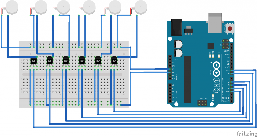
Arduino Code and Fritzing Sketch
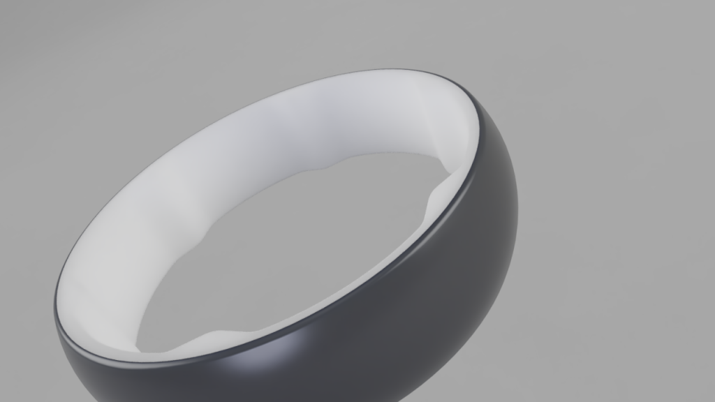
As a student of industrial design, I would like to further explore the form and aesthetics of this object through CAD renderings and other physical prototyping means. In addition, while I did use a great deal of trial and error to define the haptic language I created, I would like to further refine it to add clarity and efficiency for the user. Finally, I’d like to think of even more ways that this device can embody intelligence and become truly interactive such as being able to sync with Google calendar and responding to changes in users’ patterns.
Problem:
For people who work at desks, it can be hard to track when one is tired or needs a break. In these scenarios, they might be inclined to push themselves too hard and damage their health for the sake of productivity. When one is in a state of extreme exhaustion, it is very easy to make simple mistakes that could’ve otherwise been avoided or be unproductive in the long-run. With a cloudy mind, it can be difficult to make clear, thought-out decisions as well. In essence, knowing when to get rest vs. when to continue can be impossible in certain work situations.
A General Solution:
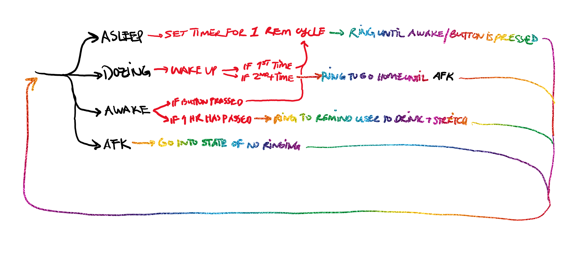
A device that would be able to detect if someone is awake, dozing off, asleep at their desk, or away from the desk. In the case that the person is awake, they will get a periodical reminder to get up, stretch, and hydrate. If the person refuses to take a break, the alarm escalates in intensity, but eventually stops either at the push of a button, or after 3 ignored reminders. In the case that the person is dozing off, the alarm will try to wake them up and encourage them to take a nap. In the case that the person is asleep, the device will set an alarm to wake the person up after a full REM cycle. This can also be triggered using a button to signify that the person will begin taking a nap which will set a timer to wake the person up after a full REM cycle.
Proof of Concept:
An Arduino connected to a speaker as a communicative output which utilizes p5.js and ml5.js to ascertain the state of the user (awake, dozing, asleep, or away from keyboard (afk). The system uses a machine-learning model looking through a laptop’s camera to detect the four previously mentioned states. The system should have two type of states, one in which the Arduino is looking for whether the person is in an asleep state or is planning on going to sleep and another in which it acts as a timer, counting down to sound an alarm.
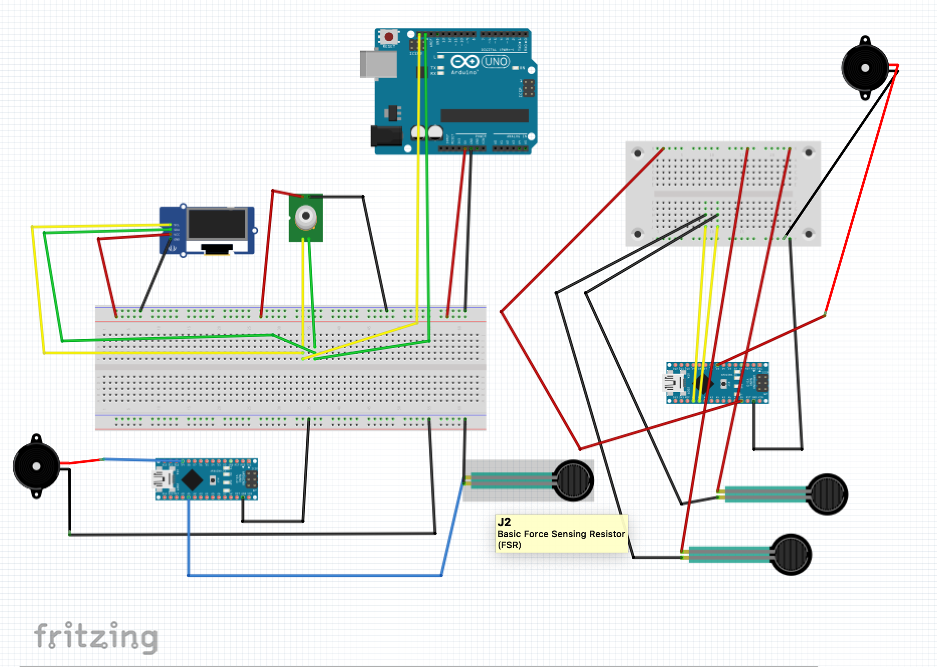
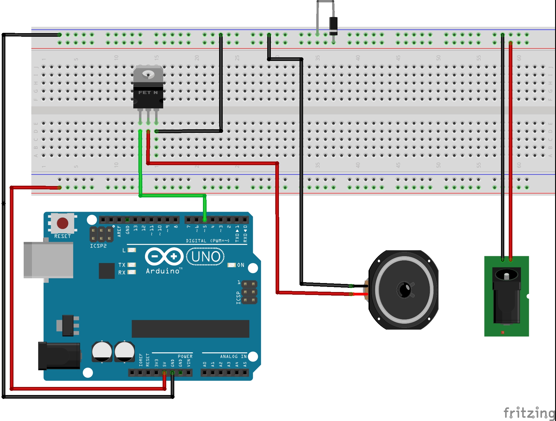
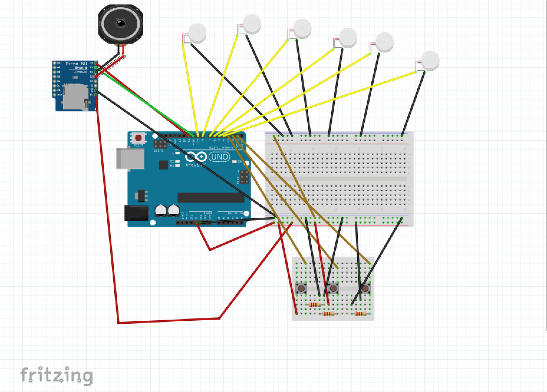
Fritzing Sketch:
The Fritzing sketch shows how the speaker is hooked up to the Arduino to receive outputs. Not pictured, is that the Arduino would have to be connected to the laptop which houses the p5.js code and webcam. The power source pictured allows for various sizes of speakers with different power requirements to be implemented.
Proof of Concept Sketches:
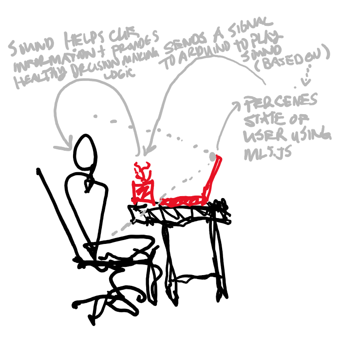
The user’s pitch (or their perceived state) is sensed using a webcam that feeds live footage to a machine learning model which then informs the device of whether the person is awake, dozing off, asleep, or afk. The computer then sends a signal to the Arduino to play music to cue the user to act accordingly.
Process/Challenges:
This system could absolutely be further improved to take into account one’s schedule, sleep data, etc. to begin making other suggestions to the user. Additionally, this system could be implemented into another table top feature, for example a plant, a sculptural element, or a lamp so that it functions as more than an alarm clock.
Throughout this project, I ran into a couple of initially unforeseen issues. In trying to implement a connection to Google Calendar data as another aspect of the project, I quickly found myself hitting a wall in terms of the depth of my p5.js coding experience and skill level in realizing the feature. I also initially intended to use recordings to humanize “Bud” to make it more relatable and friendly, but both the p5.js and the DF Player Mini were extremely challenging to implement. Both only worked using the 9600 baud rate serial on my Arduino and the DF Player Mini was not supported by the Sparkfun Redboard Turbo board due to a library that wasn’t compatible. I scaled back to use the Volume library to generate simple tunes and sound effects to represent the messages instead.
Lastly, one of the more difficult problems to address was the connection between the Arduino and p5.js. Because the machine learning model was checking through the webcam for the state of the user quite often (at the set/standard frame rate) all of the data was being sent to the Arduino which then was backed up with all of the data, causing it to lag far behind what was happening in real time. I tried a couple of interventions, making it so that p5.js wouldn’t send the same status twice in a row and reducing the frame rate as much as possible, but if the machine learning model isn’t taught very carefully, the system is still susceptible to failure. Ideally, the system would be able to address that concern by ensuring that it constantly deletes old data and only uses the most updated data, but I wasn’t able to figure out how to ensure that.
The logic of the system, however, is present in the Arduino, so it might be possible, and more practical, to use an accelerometer (or other sensors) to send a more direct and controlled flow of data to the Arduino. The system might also utilize data from a smart watch or phone to send data to the Arduino in a later iteration.
Proof of Concept Video:
Files:
Final Project: Theme Park Wearables
Target Audience: Children and adults on the Autism Spectrum attending theme parks
Background: A recent trend in the theme park industry has been making experiences and attractions more accessible to guests of all backgrounds and abilities. Whether it be physical and mental considerations, theme parks are making efforts to give all guests the chance to experience all of the emotions they hope to evoke within the park. Some rides and experiences have gone so far to be retrofitted to allow wheelchairs onboard or guests can get closed caption devices throughout the park so they can pick up various cues that they may not be able to hear. Lots of the current attempts to make parks more accessible, though, only focus on the rides and experiences themselves; very few solutions approach the time spent not on rides… which makes up almost 90% of the guest’s day. One specific demographic that struggles with the non-ride time are those on the autistic spectrum. There are a few major reasons for these struggles, two of which I will start to focus on. Firstly, waiting is very difficult. One of the documented struggles those with autism face is the keeping of time (https://www.ncbi.nlm.nih.gov/pubmed/25078724, https://www.spectrumnews.org/opinion/for-people-with-autism-time-is-slippery-concept/). Time management and understanding passage of time calls on various parts of the brain depending on short-term vs. long-term memory formation; however, those with ASD call upon both parts of the brain at all times, causing a mix-up in a person’s perception of time. Considering you spend most of your time at a theme park waiting in line, if it is hard to keep an accurate track of that throughout the day, it can be very frustrating and exhausting which are not the feelings that should be evoked while waiting for a roller coaster. In conjunction with that, since theme park lines and long and theme park designers know this, they go to extreme lengths to keep people entertained while they are in line. Whether with mobile games or physical activities and interactives, more and more line queues are trying to be interactive to keep people happy in line. While a great idea, a lot of these interactive installations can provide sensory overload to guests (https://iancommunity.org/challenging-behaviors). They are often loud, filled with flashing lights and have elements of surprise within them. Coping with sensory overload is another well-documented struggle of those with ASD and combining that with already-present waiting frustration can trigger even more intense negative reactions.
General Questions:
General Solutions:
Proof of Concept:
Done in two parts:
Potential Down the Road:
With the success of RFID-driven wearables and interactive props and items, theme parks will likely begin exploring more ways to use them and potentially use them for more than just driving revenue. As sensors get smaller and smaller, more of them could be added to the bands to provide different levels of feedback both to and from the guest. If an attraction calls for guests to be cold, a smaller and less dangerous Peltier plate could evoke that feeling OR if a guest’s heart-rate gets to be too high in a simulator or other experience, their family members of maybe even staff can be notified if it gets into a dangerous territory. The slippery slope then presents itself of “how much data/sensor activity is too much?” and we can argue about that as the day is long, but there is the opportunity for more technology to be implemented in these devices. the potential addition of AI-driven “tracking/status monitoring” could also prove to be beneficial, having machines learn trends in line queues and wait times based on previous day/week/month riders or ride break-down similar or the like. At any rate, these pieces of technology are here to stay and people will expect more and more out of them during these fantastical experiences, they should be able to do more for everyone.
Intro: A close friend of mine has mostly unobtrusive Duane syndrome, meaning their right eye cannot turn outward, causing double vision, etc. whenever they look to the right. They always like and relate to chameleons or owls because of this. That relation got me thinking about how this syndrome could be experienced by others to help empathize. I brainstormed a game with their approval that is more or less a first person I, Spy starring a chameleon. Each of the players’ first person “eyes” are controlled independently, and the goal is to focus on certain objects you find. This would be controlled by two 3-axis trackballs, matching each eyes pitch, roll, and yaw. For this assignment, I prototyped this trackball, and in five years time, can see this alternate input method making a truly unique mark on a game.
Proof of Concept
The Trackball
Normal mouse trackballs often use a single optical sensor to read one plane of data, or, the XY coordinates of a screen. Optical sensors typically do this by comparing pixels between two images taken at a high frame rate. I figured it would be easy to harvest two optical sensors from two mice to get the XY data from one and rotate the other 90 degrees to get only the Z from it. This pair of a mouse and one orthogonal to it would give me all 3 axes.
I was wrong in how difficult it would be to find mice with documented pinouts, since I am not good enough yet to deduce them on my own. After going through seven or eight or so different mice, nearly all with different chips, I ordered two PS/2 mice. I would not access these optical sensors directly, but knew I could communicate with the PS/2 port as a backup. So, the project now had two mice talking to my Arduino effectively.
The ball would need to be very close to the mice, since they’re quite old (being PS/2 and all) and not that great at detecting motion. I used ball transfers and PVC pipe to allow the ball to rest over a mouse at its bottom with 3 points of contact, and a small elevated platform for the orthogonal mouse to get its third axis.

After going through a number of balls, a soccer ball was large enough to use the complete mice. I attempted disassembly of the PS/2 mice, but was too scared of breaking them and missing the deadline by having to order more, so kept them whole, leading to a foam molding housing.
The Game
I used a simple program Udino to talk to Unity, a game engine. Unity could read any port on the board, and use the data accordingly. To render first person double vision, I wrote a screen space shader that blended the views of two different cameras a few units apart in the world. The closer their forward vectors, the closer the cameras would also move to each other, effectively rendering the same “view” and making blending seamless. The less similar their forward Vectors, the more it would blend, and cause dissociation. Udino successfully controlled each camera separately. A view of the cameras working can be found here:
Unfortunately, I could not connect the working trackball to Unity to successfuly modify game state with the soccer ball. I am guessing it has to do with Udino using serial communication, and the PS/2 library I am using also needing to write calls to the mice over the serial port. In the future, I hope to get proper optical sensors instead of whole mice to make this project more compact and use less unnecessary protocols.
Conclusion
Overall, I am disappointed with failing to connect the trackball to Unity, but satisfied that all of the individual parts of the pipeline still work separately. Based on playtesting, the ball itself is a fun toy and easy to let people play with, which I think is important because it sets a base level of engagement. To even try to understand someone else’s experience, its important to want to in the first place, and I feel like this project is a good step in the right direction of this.
To users unfamiliar with building and who may be visually impaired, exiting a building during an emergency can be hazardous and confusing. Most of the time, exits are signaled by glowing “EXIT” signs with symbols next to them. How can users exit a building in a calm and organized fashion?
A tactile and auditory guidance system based on sensing user location would afford the visually impaired and those unfamiliar with there surroundings a sense of direction in the case of an alarm going off. Sequenced vibrations would lead users to speakers, which would continue to give users instructions, leading to the building exit.
 Proof of Concept
A series of sensors (or pushbuttons in this case) indicate checkpoints that trigger the exit path. An array of tactors allow the users to feel directioned vibrations in there feat (or arms if it were attached to something akin to a guiderail). At a checkpoint, a speaker would play a prerecorded message, instructing users as where to go next.