Hunan-Loop

Yes, I forgot about the rect requirement. I don’t think it’s possible to refactor this with rect so you just have to live with it.

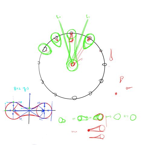
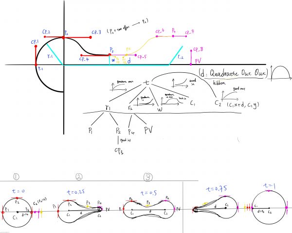
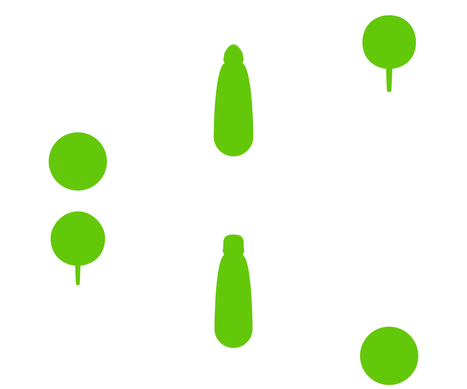
I made this bobbing thing in the hope that it will make a nice loading icon and a switch (with slight modification.)  The idea came from the motion of two water droplets combining in a weightless environment. It presented some very interesting control challenges and still has some issues (especially fine-tuning the parameters and having more customer shaping functions)  that I would like to fix when I have the time.
oppr.org/s/UUYDaNND


starry – LoopResearch

I thought the gif of the MTV logo was successful because even though there were a lot of brightly colored shapes moving in different directions, the artist was able to keep the attention at the center. I also like how there are a mix of individual parts that are looping (ex. The blue triangles) as well as hand-drawn animations.


View this post on Instagram


A post shared by Andreas Wannerstedt (@wannerstedt)

I really like how surreal this gif feels because of the combination of complicated and simple forms, as well as the variety of textures (grass, stone leaves); the color palette is pretty cohesive as well. I also like the tension between the swinging pillars and the intricate statues and I think the looping aspect is pretty successful at maintaining such a feeling.


View this post on Instagram


A post shared by Dave Whyte (@davebeesbombs)

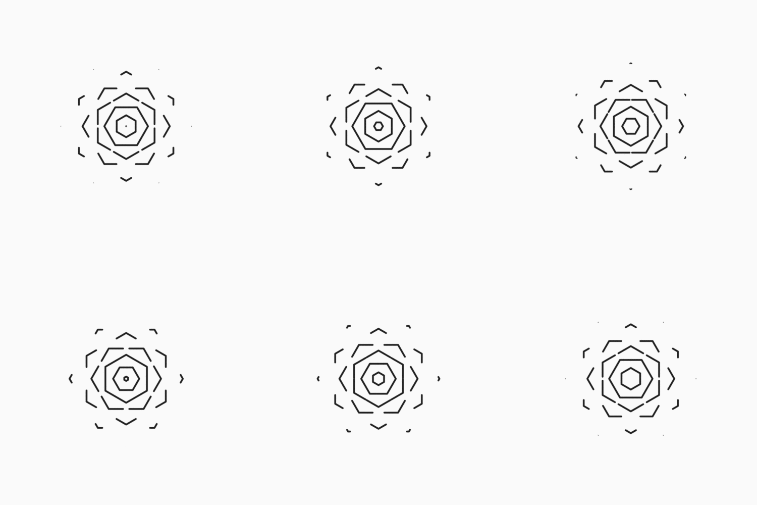
I like the simplicity and quietness of this project, and was especially drawn to the colors and circular composition which helps it feel stable and complete. I also like how can evoke contrasting imagery because of how abstract it is, since I thought both of the phases of the moon as well as eyeballs without pupils.

Dr. Mario – Timepiece

This is my project time keeper: https://openprocessing.org/sketch/1470380

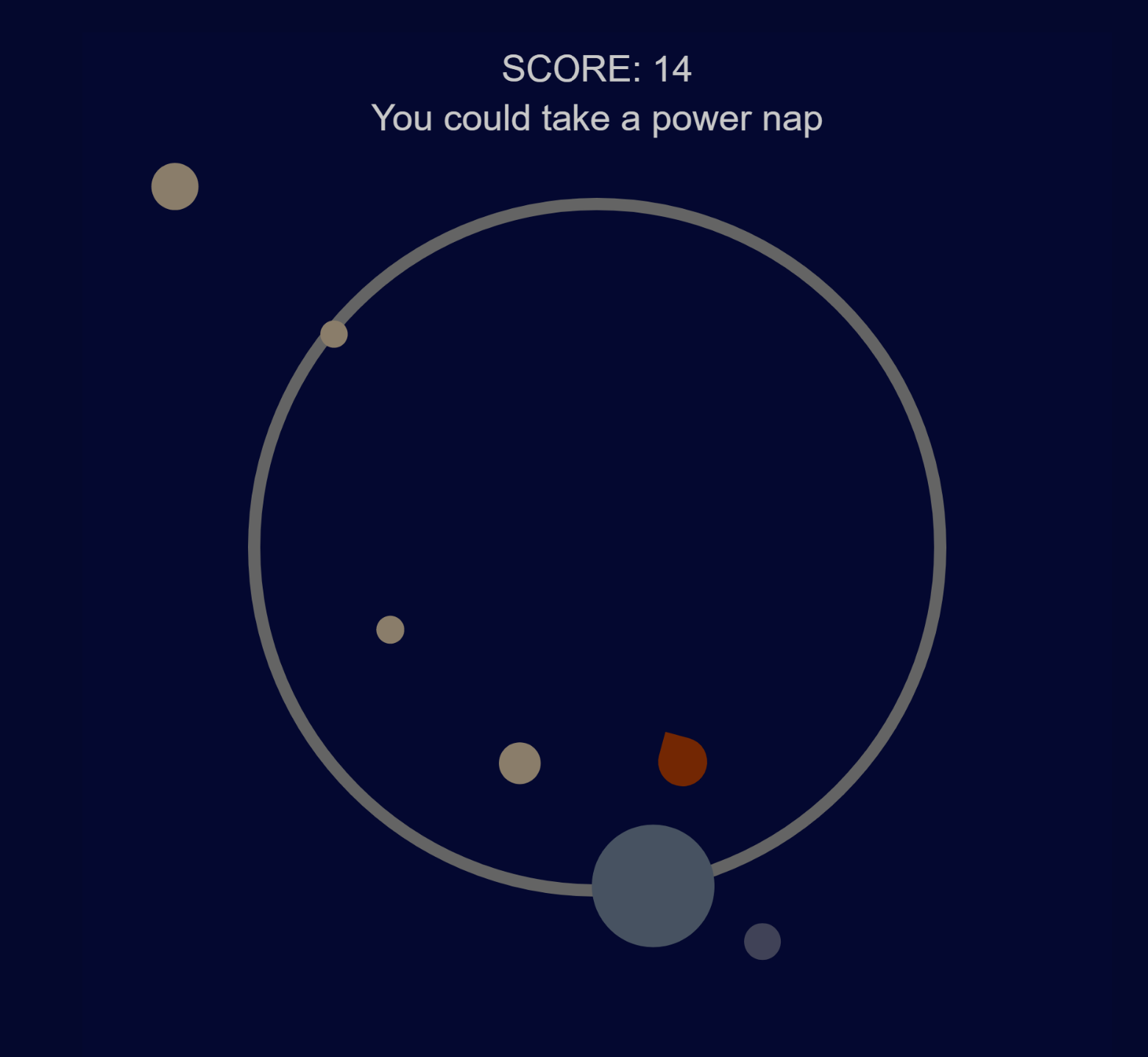
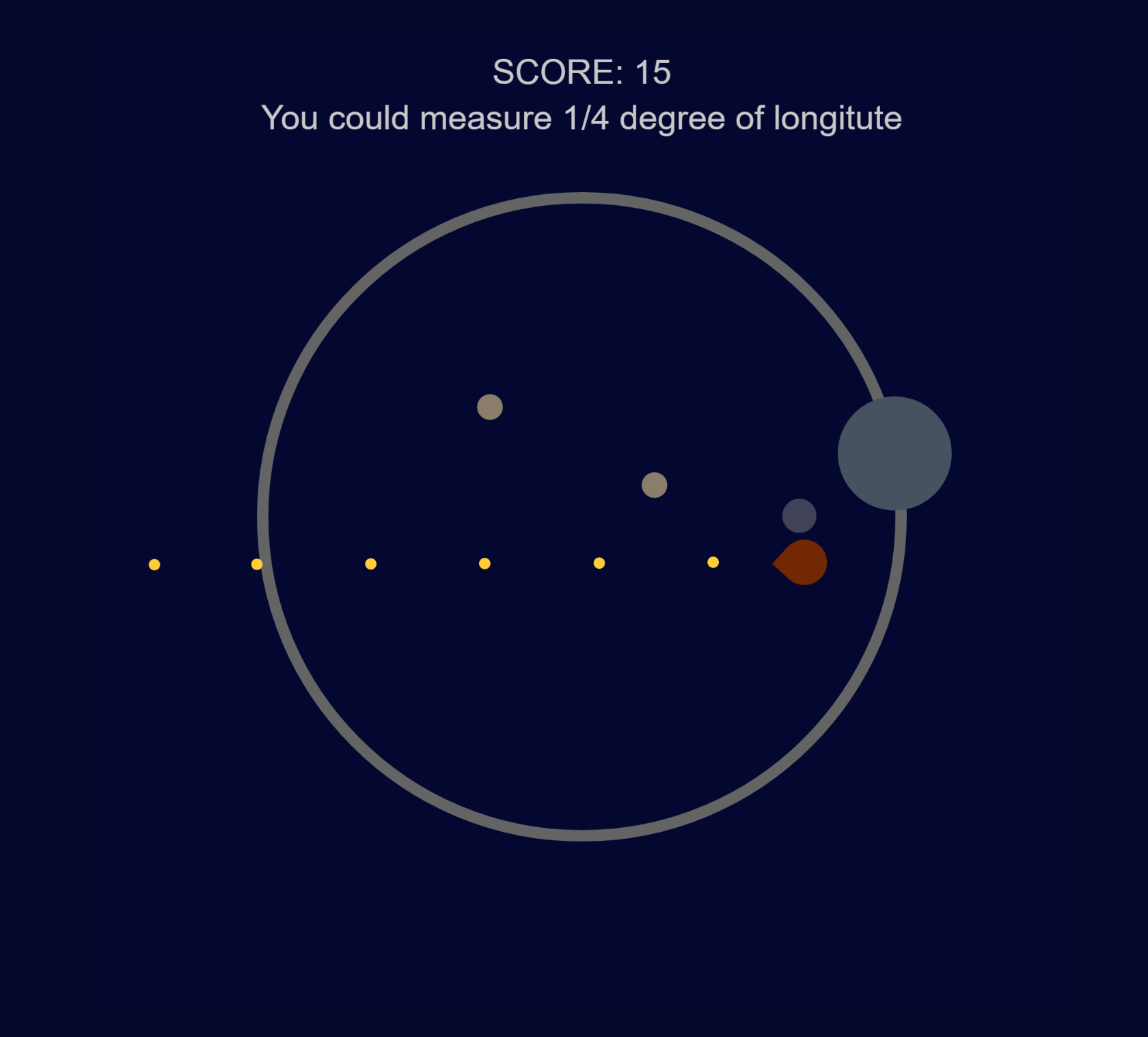
This is a base defence game called Time Keeper, your goal is to fend off asteroids hurling towards your planet that has a one minute orbit, with a self defence moon with an orbit of one second. The asteroids are also spawned on a one second timer. There is also a reminder at the top of the play space that changes every 15 minutes telling you what you could be doing instead of playing the game.

I think the biggest issue with my piece was that I was revolving too much around making a game and not enough on getting it to be an actual time piece. There isn’t much to show people that it’s time based and I tried to change that in the most recent changes but I still feel like I messed up on that part and I will keep it in mind for future projects that the theme comes first and my ego comes second.


Sneeze-timepiece


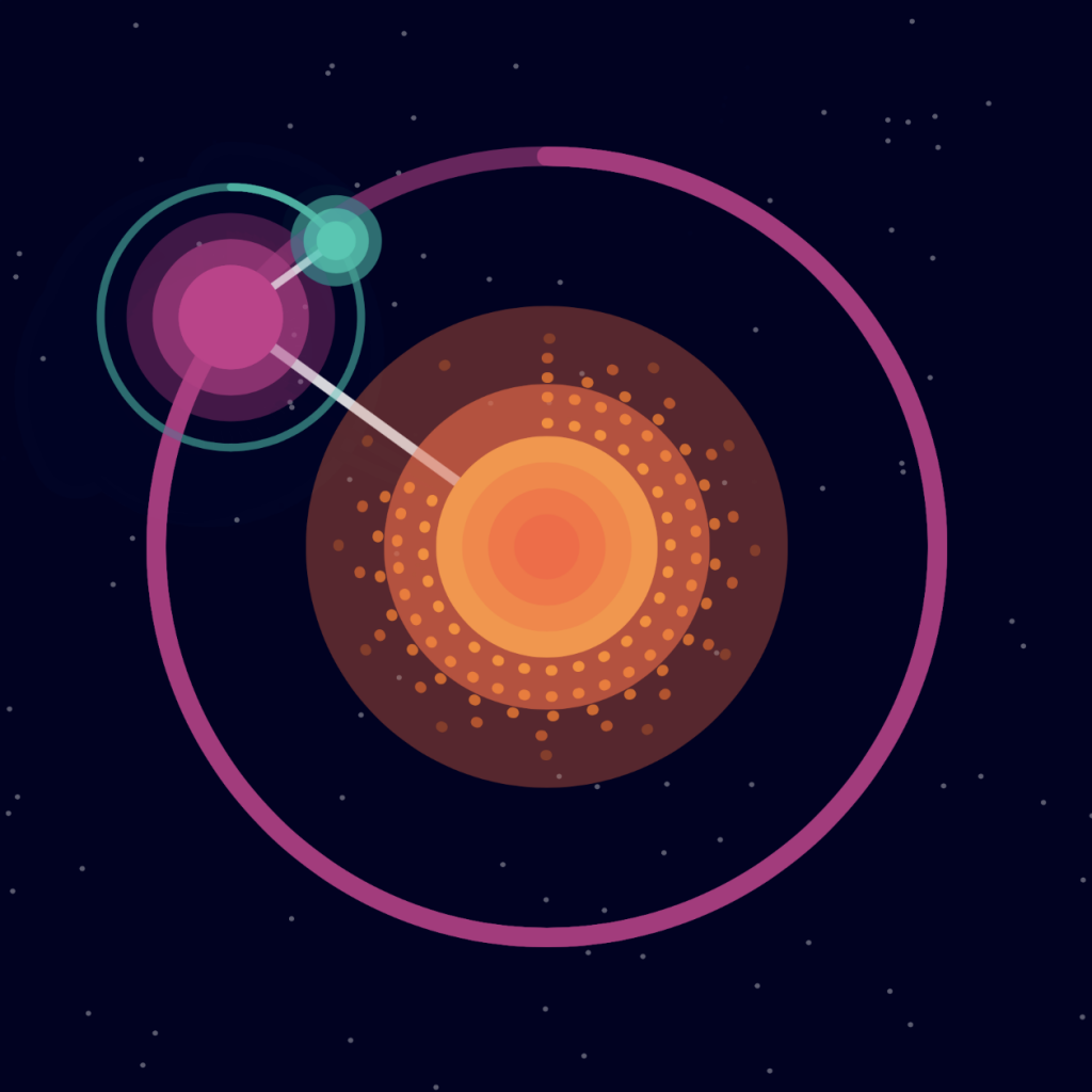
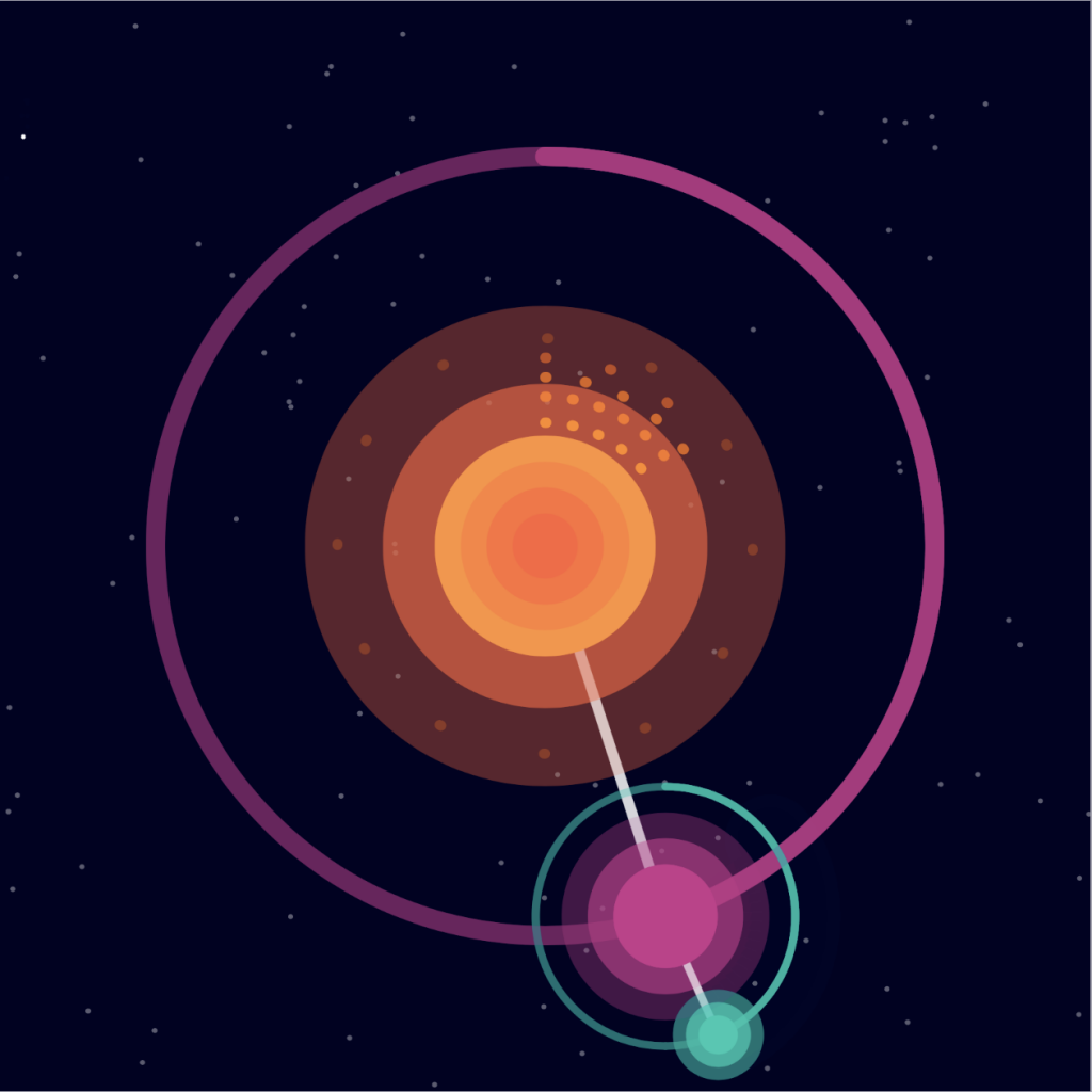
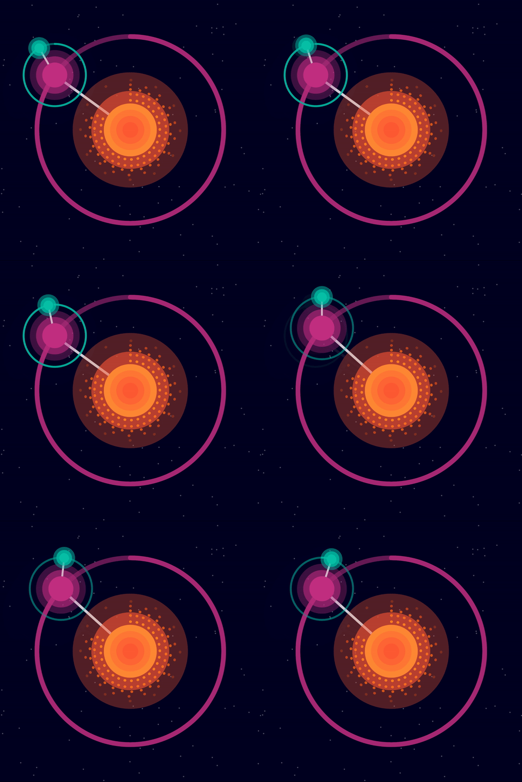
The concept of this time piece is a galaxy clock.  The rays of dots expanding from the center of the sun indicate to the viewer the hour of the day, and there are 12 indicator dots of the hours for easier viewing and understanding. Moving on the the minutes, a planet revolves around the hour sun and the distance from the top to the planet is the number of minutes that has past. The minute planet has a moon that represents the number of seconds that has past. The planet and the moon has an orbit that indicates the time and lets the viewer grasp the orientation of the starting point to tell the time.

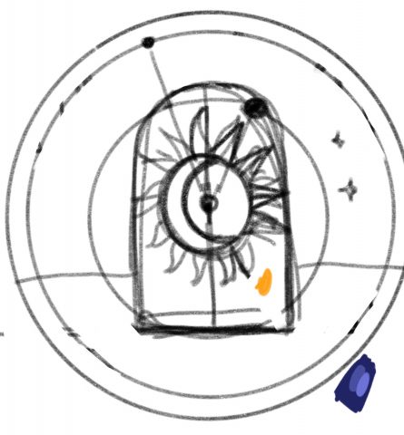
I wanted this to be sort of mechanical in nature, as if the clock was built in real life and conformed to the effects of gravity, so I put supporting lines in-between the planetary objects. However, I think that this concept is not clear because the graphics are vector like and not similar to things we view in real life. I was also planning on having a door open to reveal the sun, but decided to take it out since it seemed out of place, which could help in describing the concept more to the viewer.

Link to project in OpenProcessing

bumble_b-Loop

Sketch on OpenProcessing

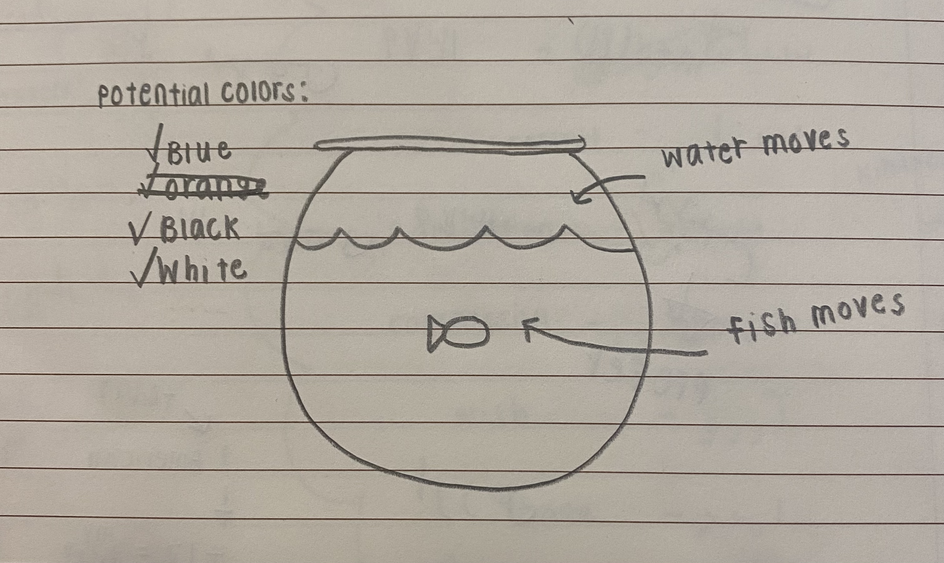
Last year, I made a looping gif of a bee circling a jar of honey. I originally wanted to do something similar for this project, with a fish swimming around in a fish tank. Unfortunately, I didn’t have a whole lot of time, so I gave up and decided to quickly just make a circle (or rect, rather, but you get what I mean) that gets bigger and smaller. Once I made it, I felt it was a little TOO easy and plain, so I just made the colors switch every time the rectangle reached its minimum and maximum size.

The loop definitely works seamlessly, but it is very boring and plain, which I’m a little sad about! I did the best I could with the very limited time I have though, so I’m glad it at least meets the requirements! One of my goals was to make the loop seamless without using animLoop, which I did do!

(An obviously outdated original sketch)

duq – timeresearch

I found it interesting that the idea of the seven day week came from the lunar month. I hadn’t realized that all other large divisions of time (days, months, seasons, years) all directly track to a natural event, but weeks have drifted from their original meaning.

duq – Loop


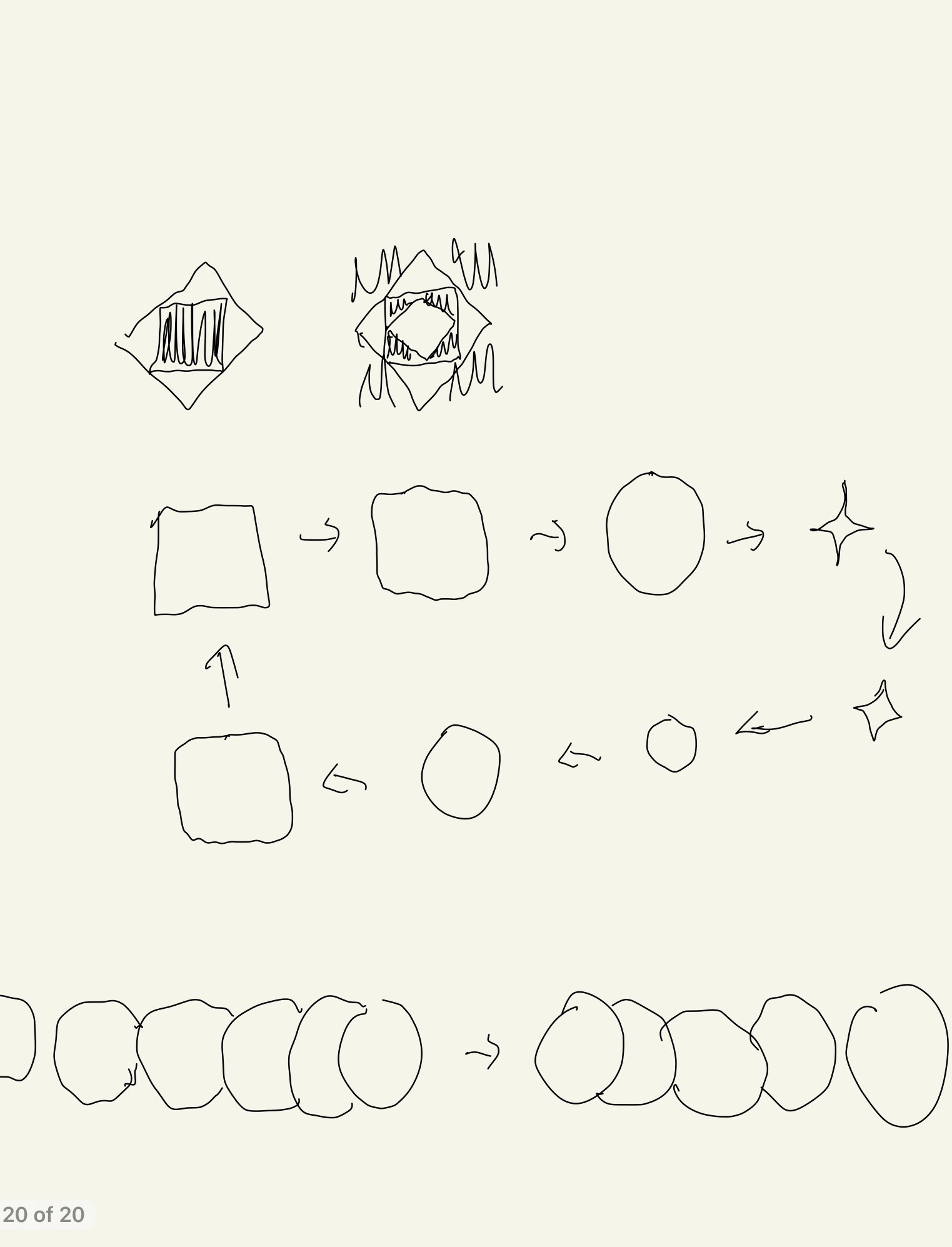
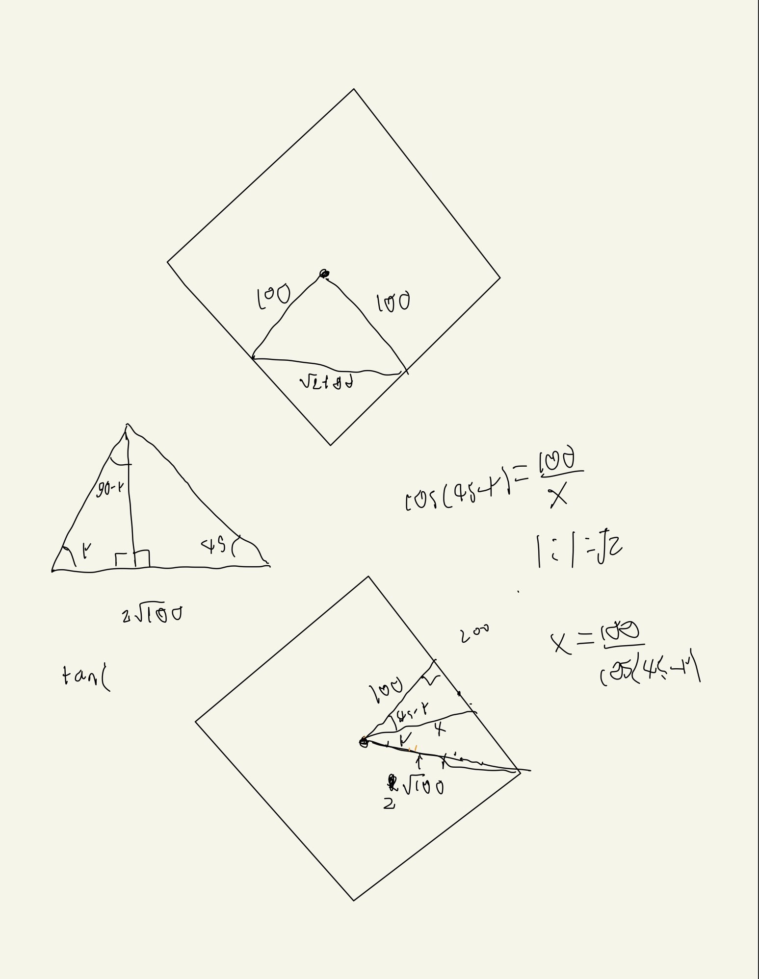
I feel like I did a good job of achieving my overall goal, to create a series of nested, rotating squares that intermittently blend into the background. I do feel however, I did a poor job on the details of my piece. I wanted to keep the piece monochromatic, but I think a brighter grey might have worked better and not made the piece feel sad. I think I should have also increased the size of the animation relative to the frame. Overall I feel like I achieved making a piece that is confusing to look at, a hope that I had after looking at the sample pieces by David Whyte, but I did not make it interesting enough to look at.

https://openprocessing.org/sketch/1471758

duq – LoopResearch

This piece really caught my attention due to its simplicity. I think some of the other pieces do look better, but I feel like this piece is something I could have realistically made if I had thought of the idea. It puts art like this so much more within reach.


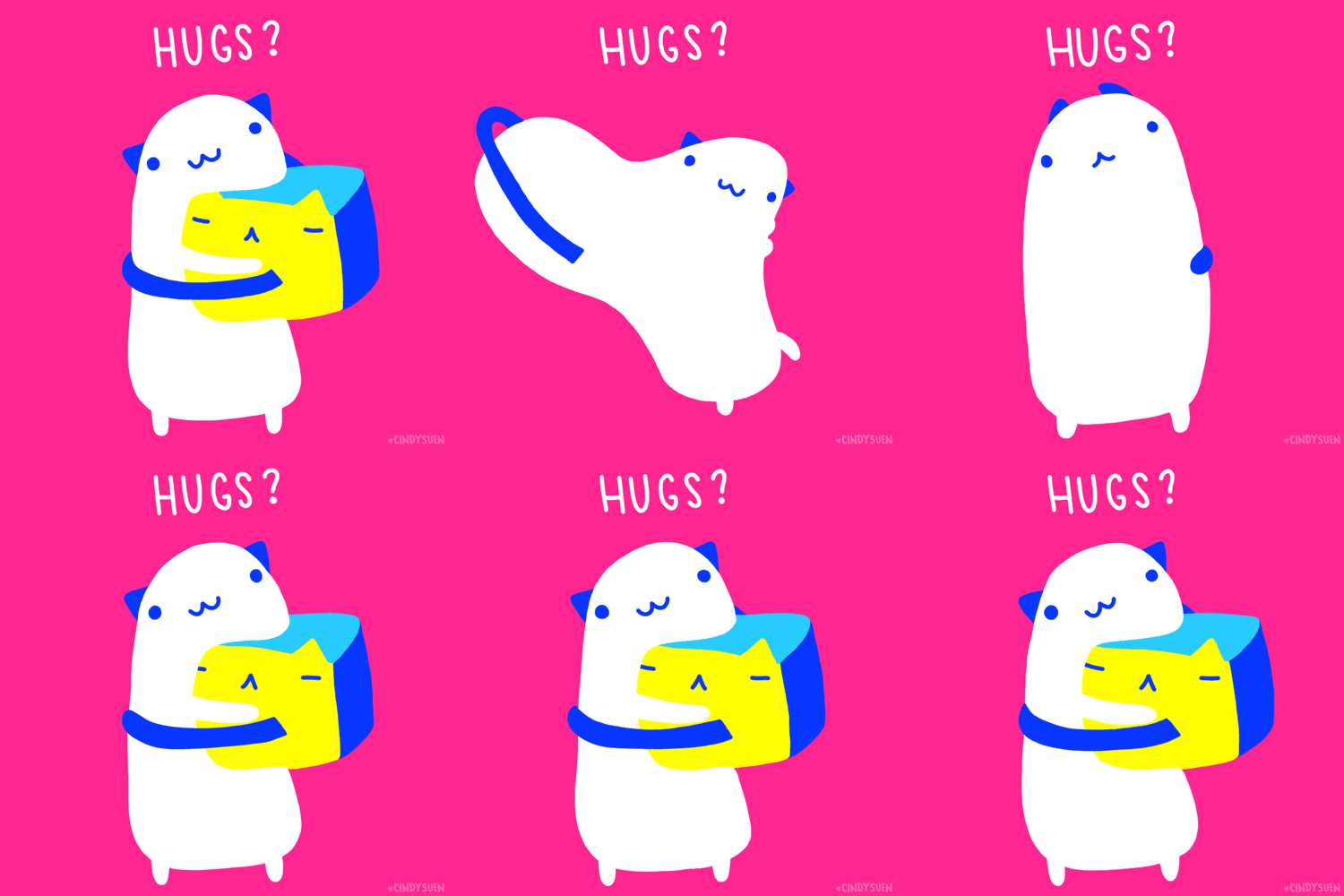
I really enjoyed this piece, as well as many similar pieces made by Suen due to her not attempting to make her gifs entirely smooth and instead leaning into the shifting shapes that originated in stop motion and other old forms of animation. I like this piece in particular due to the way different features turn into one another. The arms turn into ears, and the unhappy cube turns into a happy blob.


https://vimeo.com/266674042

I found this piece to be more frustrating that satisfying as it doesn’t follow my expectations. I thought that the ring would switch which track it was taking each time, to maintain symmetry as these pieces tend to do. Instead, it only goes to the right one in every four times, so when it does go right it is very satisfying  but otherwise is super frustrating.

CrispySalmon-timeresearch

Comparing the historical timekeeping devices with our modern ones, the modern standard clock is actually the most abstract. Historical “clocks” emphasize more on the idea of passing, while the modern clocks make it seem that time is a loop.

spingbing-Loop

Final:


Colored (video):

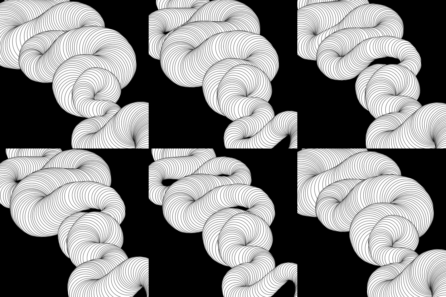
This piece exists in a shaded color version as well as this black and white version. I had originally set out to make a colored gif because my idea was to create an image of pulsing intestines. The colored version looks more like actual intestines because it looks more three dimensional with the shadows, but I think the lines on the monochrome one are sufficient in giving the allusion of 3D. The project is also interactive in that the user can draw their own version. I think the noise makes this successful in looking “alive”, but it does not give off a clear image of intestines, as I had originally intended.