Student Area

stickz – FinalProject

Jittery Line Drawing App 

I changed the direction of the final project to be a drawing app that interacts with the orientation of the user’s phone that can draw in 3D. I’ve been able to get multi-color lines working, where I implemented them as springs, and got some basic physics working. Wasn’t able to implement the phone orientation into the springs last night as planned, but I’ll get that up and running 🙁

Inspiration: https://experiments.withgoogle.com/ink-space 

Stuff I’m thinking about : 

  • Implementing Multi-touch for drawing – using LingDong’s template 
  • Different color themes for drawing lines 
  • Phone orientation that messes with the physics of the lines (then 3D orientation) 
  • More sophisticated 3D line forms

Screenrecordings of the Glitch Drawing App So Far

Stuff to work on:
- Different color themes for drawing lines 
- Phone orientation that messes with the physics of the lines (then 3D orientation) 
- More sophisticated 3D line forms


aahdee – FinalWIP

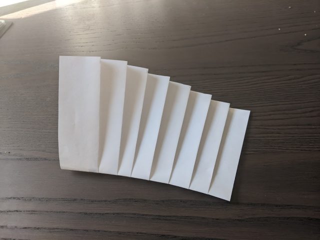
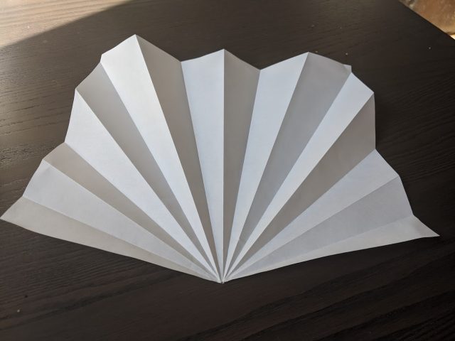
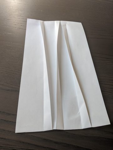
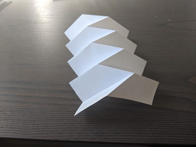
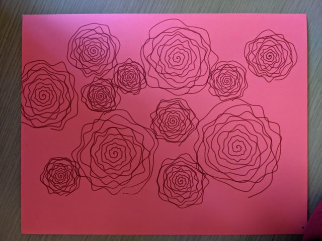
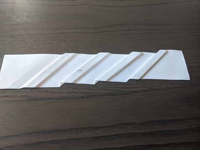
I spent the last few weeks devouring Complete Pleats by Paul Jackson. My intention for my final project is computation pleating by using a laser cutter to score paper that is drawn on by an Axidraw plotter. Before knowing how to do that, I need to know how to pleat paper effectively.

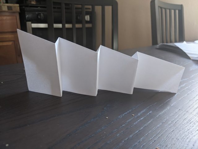
I’ve read through approximately 85% of the textbook and created multiple pleating examples that was shown in the book. Even though I have a background in paper arts and bookbinding, the book was rather challenging. Below is a few images of what I’ve created.

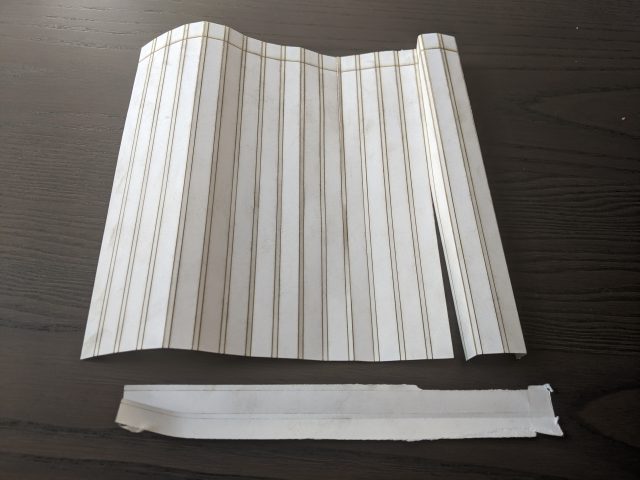
These were all created by hand and there are multiple failures behind it. After that was done, I decided to head to the laser cutter to attempt to pleat some paper. Simply put, it was a mess.

The paper can easily be formed into mountain folds but snaps in half when I tried to fold into valley folds. This may be because I used thicker Bristol 100lb paper. The laser cutter leaves nasty brown marks on the paper and when I attempted to fold it the charred color spread to the rest of the paper. I may just need to work out my kinks with the laser cutter, but considering that I can only access the cutter for 1 hour per day I don’t have a lot of room for rapid prototyping. I also need to research the ingredients of the pens I would use if I cut plotted art on the laser cutter as some chemicals can produce toxic results when a laser is applied. Considering that I’m using a language and libraries that I’m not familiar with, there’s a lot of variables here that I may just cut the laser cutter out of the equation and fold the paper with my hands.


miniverse – FinalProject

monster maker

[videopack id=”2283″]https://courses.ideate.cmu.edu/60-428/f2021/wp-content/uploads/2021/11/test.mp4[/videopack]

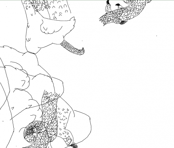
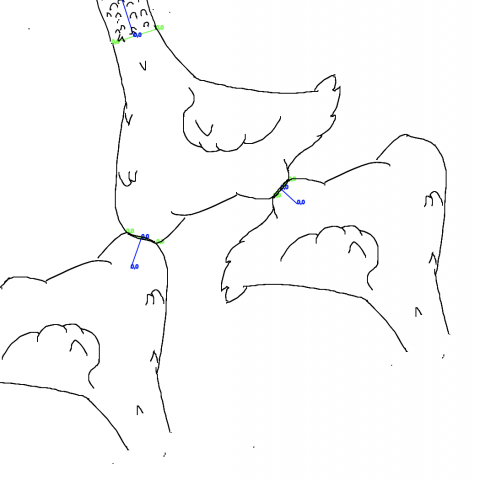
This is at the moment a little broken and the drawings a tad hasty, but essentially I want to make a recursive monster maker. It’ll take drawings of animal parts and automatically scale and fit them into predefined openings. Here are a broken runs of the algorithm.

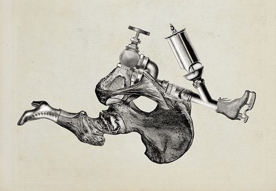
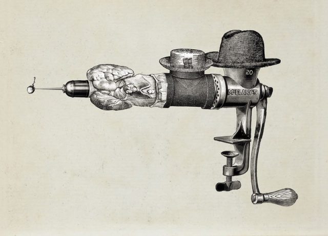
I drew some inspiration from a project Golan showed me: Mario Klingemann “Ernst” (examples below):

I’ve done some assemblage in the past with hand drawn pieces:


This is a truchet tiling with hand drawn pieces.


Some process shots:


(weird bug I need to fix)

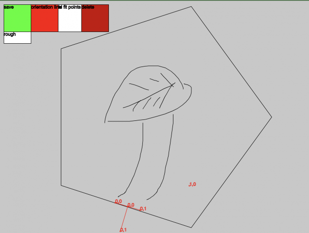
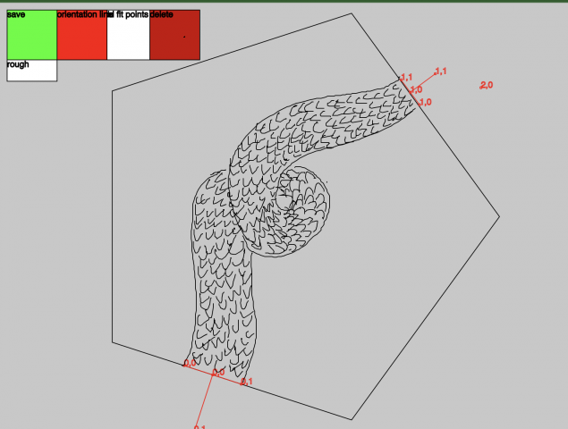
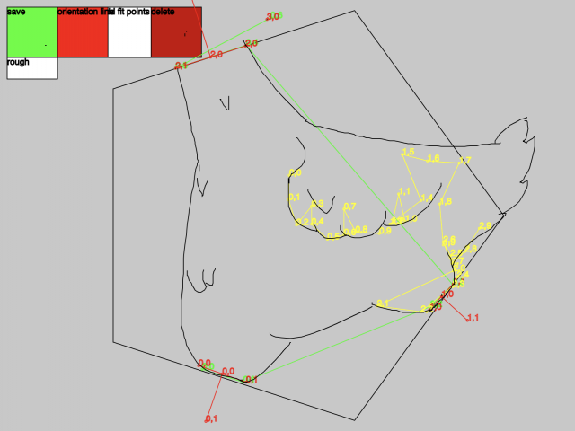
tool I build to draw, save, and generate, JSONs

https://save-json.glitch.me/


spingbing-FinalWIP

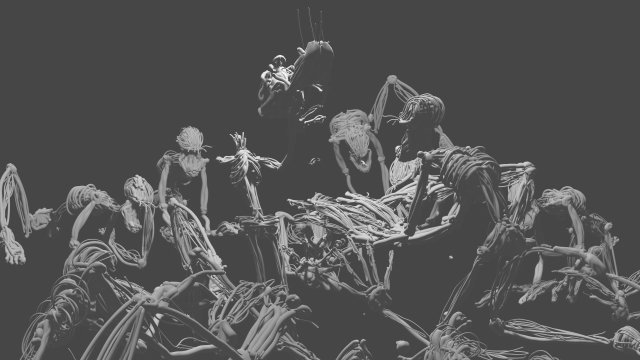
The concept of my project was decided after deciding the medium. Making a smooth 3D object in Tiltbrush (like one possibly made in a 3D rendering software) I think is theoretically possible but very hard to do, so the physical form of my object is a result of me working with Tiltbrush instead of against it.

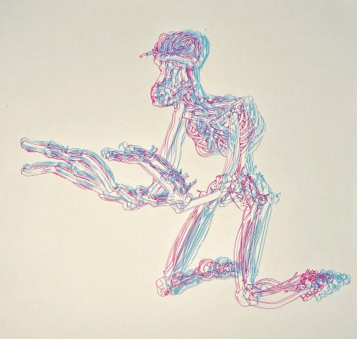
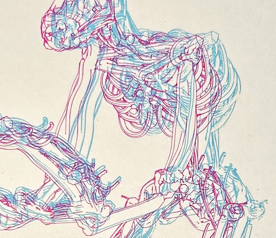
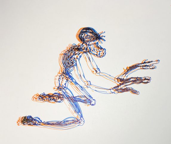
Initially, I messed around with blue/red 3D stereoscopy by plotting different angles of one object on top of each other. I thought it was funny that I went from 3D (TiltBrush) -> 3D (Blender) -> 2D (plotting the SVG) -> “3D” (stereoscopy). Even though this experimentation was not enough to be a final piece, it was useful to do because I realized I liked the layering of color. I may or may not go further into the use of contrasting colors in my final.


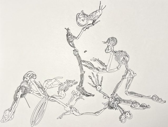
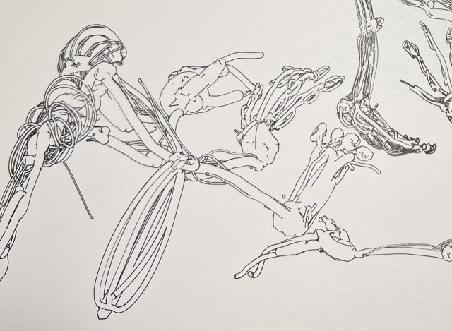
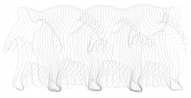
Finally, I have decided to create a sort of hellscape. It is also an experimentation with different mediums and a really funky workflow. Below is the SVG of a draft version. From here, I want to fill the background with more scenes by adding more 3D objects in Blender as well as drawing on top of the plot by hand. I also would like the use the big Axidraw to be able to add more detail. This scene is currently being plotted.

Prior draft of the scene:

Newer draft:

However, this looks more like an up close view of a traditional hellscape. While I like the perspective, I am also intrigued by art that ignores perspective such as seen in The Hellscape Garden of Earthly Delights by Hieronymus Bosch:

The Garden of Earthly Delights - Wikipedia

3 dimensionality exists within each object and their surroundings, but it is overall flat-looking. I think using the giant Axidraw to create this type of scene would be interesting.


grape – FinalWiP

As I mentioned in my ProjectProposal post, I was motivated to complete this project out of a desire to have a physical archive of my voice snippets.

[videopack id=”1934″]https://courses.ideate.cmu.edu/60-428/f2021/wp-content/uploads/2021/11/RPReplay_Final1635957413.mov[/videopack]

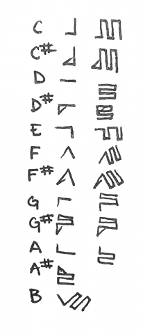
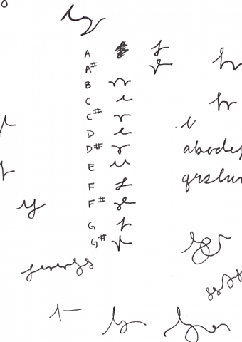
To make a real time hmhmhmgraph, I had to work with Max MSP’s pitch detection. I made a simple mic patch that sends pitch data to Processing via osc. I then map the pitch to one of 12 total notes that each have their own symbol.


There were some immediate setbacks with plotting in real time. One of which was that I had initially plotted the pitch from left to right, line by line. This however made the plot increasingly inaccurate wrt to my pitch, as the plotter would take a couple seconds to move down to the next line before plotting again. I then opted for a Boustrophedon plotting path, which goes from left to right to right to left in a snaking manner to minimize the time the plotter takes to move without plotting.

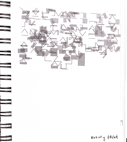
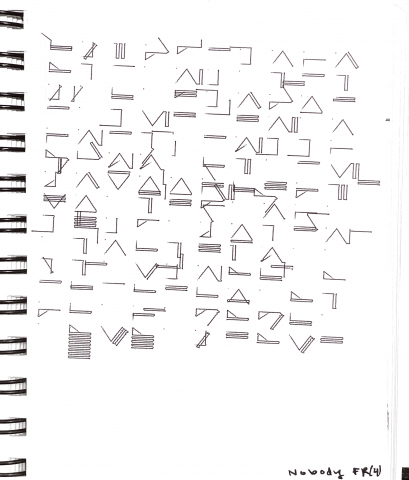
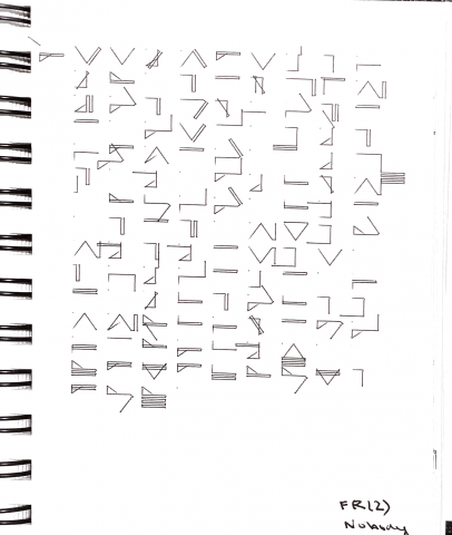
Another issue(/non issue) was that the frame rate affected the quality of the plot. Since processing attempts 60 fps, this clobbers my note variable in unpredictable ways. I mentioned that this was a nonissue because it looks cool. Anyway in order to minimize the number of overwrites I just lowered the frame rate to 4. I tried a frame rate of 2, but felt that the plotter became too slow at this speed.

These are all plots to me singing mitski’s nobody.

60 fps

4 fps

2fps

Here’s a video with me singing with it plotting.

https://vimeo.com/646970438

Some things I’d change:

If you notice from the video it can’t pick up grace notes or any quick notes but I’m also not entirely sure how to fix that lol. I’d also want to keep a record of both duration and pitch change and sync it to allison parrish’s pronouncing py  so I can generate lyrics for my voice thingies (song writing is a beat I have yet to vanquish).

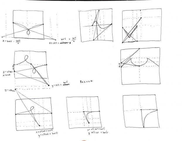
I’m also currently in the middle of implementing a new asemic notation using bezier curves that emulate cursive handwriting, just because I think the current system might be too intricate which time intensive on the plotter. Notes are below:


sweetcorn-finalproject

Party-Planning Floor Mat

I’m interested in creating objects which plan parties. (‘Party’ is used as a catch-all term for some community-expressive event).
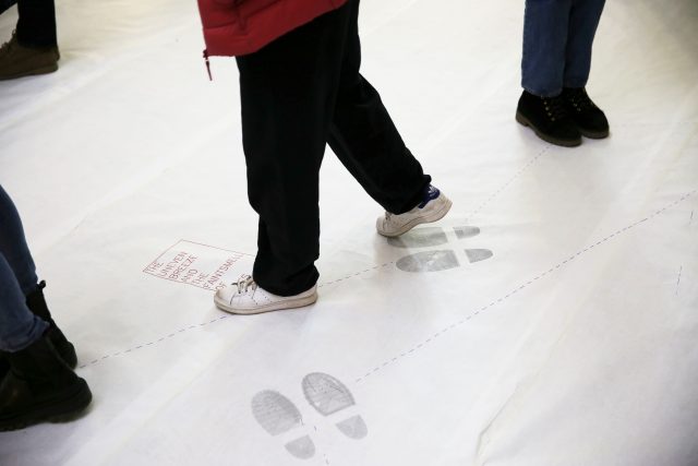
The ideal party-planning object to me is (1) unique (i.e., no two instances of it are identical), (2) low-effort to set up, (3) widely usable, and (4) interactive (both in terms of interacting with the object and each party-goer interacting with the other party-goers).
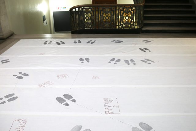
As best I could, I created party-planning floor mats under these constraints. In terms of (1) uniqueness, each floor mat is entirely generated. The size is arbitrary, able to scale from the area of one pair of shoes to the surface area of the globe, given appropriate material. Each area is filled with shoes according to a poisson-disc distribution. Each shoe is parametric, with variables relating to height, width, and concavity (magnitude and location). Party objects are placed on appropriate vertices of the shoes’ voronoi diagram. Each party object is a random choice from a natural-language-processing-generated list of 18,336 things that are wanted or desired in some way. Shoes face the nearest party object and party objects face the general direction of all shoes facing them. A closed path from shoe to shoe is determined from a decent enough traveling-salesman solution. Below is a gif of the debug-mode, which shows the cuts and the voronoi diagram, next to the full generated floor mat.
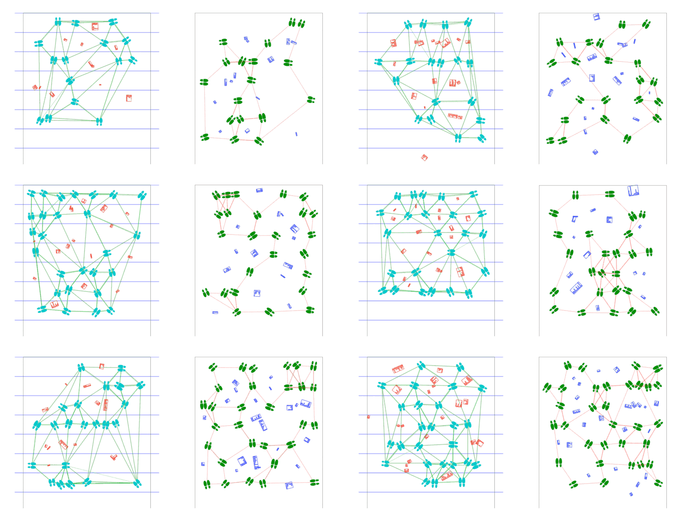
These elements are divided into 25-inch-wide strips of arbitrary length, which can be plotted on a large enough plotter, such as the studio’s MH871. Each color must be plotted as a separate layer, which, in combination with the difficulty aligning the paper over such a long length, does not exactly meet (2) the criterion of low-effort. I likely spent upwards of 3 hours simply plotting this 7-sheet-wide, 17-foot-long floor mat. Machines capable of plotting on this scale are also not commonplace, meaning these party-planning files, at least, are not (3) widely usable. The sheets themselves, though, may meet these two criteria. A better method of securing the sheets to the floor and to each other would greatly simplify things. I wonder about the product-ness of these mats and party-planning objects in general.
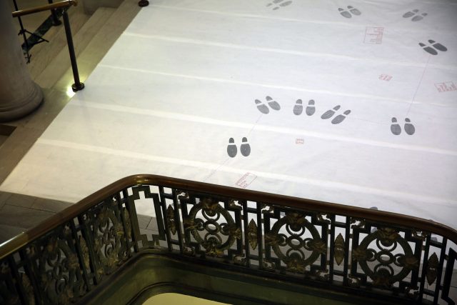
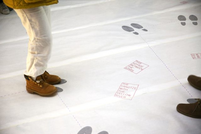
Part of me wants to either abstract or remove the words altogether. I’m just not sure how well they work in terms of augmenting the interactions between party-goers. I’m also not sure about their influence on the mood of the piece; they likely read as more foreboding or poetic than a “party object.” Of course, parties as I’ve defined them don’t need to be cheerful, but Iworry it makes the work read more as “art object” than “party-planning object.”
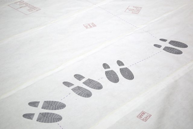
(4) I did see many people afraid to step on it. Given permission, however, people seemed to be having fun with the mat and one another. Some of the paths are quite long and a good number of people nearly fell trying to jump from shoe to shoe. People also ended up standing much closer to one another than they might normally. Maybe they needed an excuse?
– xoxo
sweetcorn
lsh-FinalProject

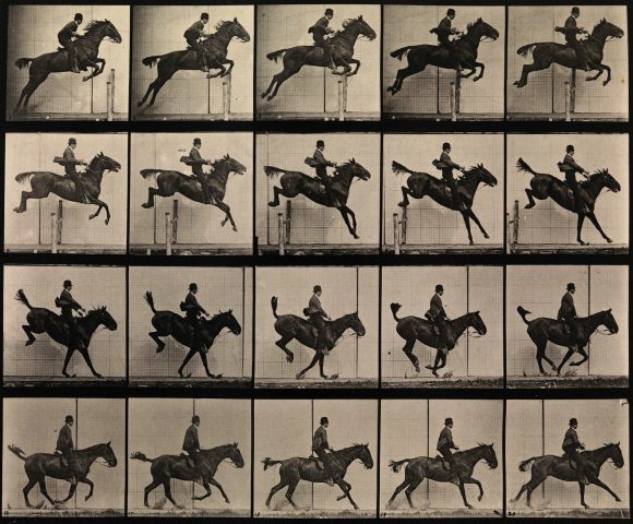
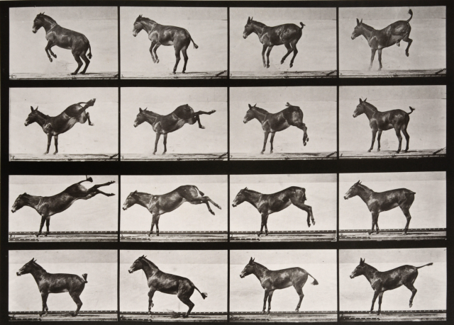
For my final project, I decided to make a tribute to the typology of drawing that focuses on the movement of living things. This typology explores motion, form, and time. One such example is Eadweard Muybridge’s Horse photographs.

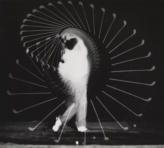
The photographs became import as a series rather than individually, and in turn offer insight into the locomotion of a horse. Another example of this typology is the work of Harold Edgerton, which become more formal due to the stark contrast in the photographs.
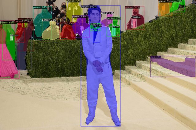
In dialogue with these works, I took advantage of the image segmentation library Detectron2, which allowed me to generate outlines of people from an image.

A segmented photo of Timothée Chalamet at the Met Gala
A sample segmentation.

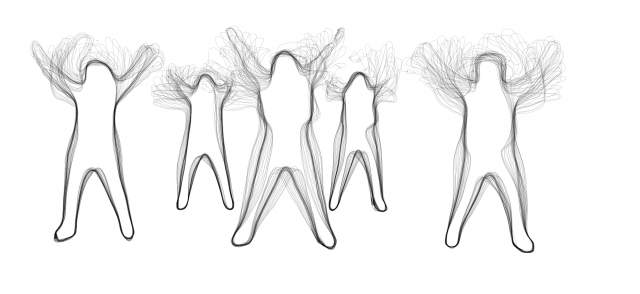
Using these outlines, I began sampling videos to create long exposure outlines.

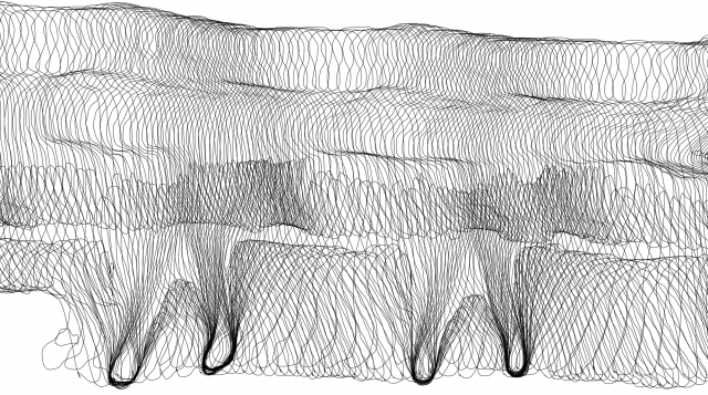
5 Figures with long exposure outlines
Outlines from a video of a group doing the YMCA dance.

I found walk cycles particularly compelling, partially due to the uniqueness of an individual’s gait.

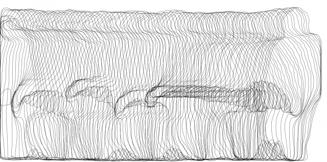
The outlines of a person walking.
Outlines generated from a video of a person walking.

With the focus of a walk cycle, I began recording my classmates’s walks.

A smear from a particularly nice walk.

Through the capture, the personality of a walk can be seen.

Another walk outline

Finally, to emphasize the temporality of the walk, I began experimenting with a dashed representation, fading out the edges of the moment.

lemonbear—MidSemester

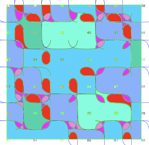
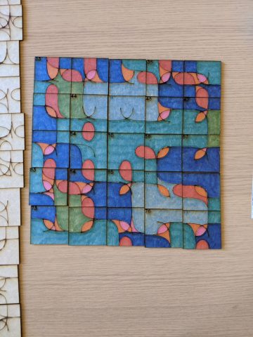
I decided to add color to revamp my tiling project from a couple weeks ago (where I coded a pattern to laser cut onto some fiberboard). Because I was dissatisfied by how strongly the grid dictated the piece, I thought of ways to make the piece more free flowing while still maintaining the original rules for the piece (edges want to match up). I devised a simple logic for the coloring, where the smaller shapes were colored warmly, and the larger swaths of color were cooler. I made sure none of the colors continued over edges, and disregarded the tile boundaries, opting to create a composition defined by only the drawn arcs.

Here’s the mockup for the coloring scheme:

I elected to only color a chunk of it as the original piece was somewhat overwhelming in scale. It came out like this:

The finished product.
Another fun doodle with the complementary colors.

lsh-Proposal

For my final project, I plan to create a tribute to Eadweard Muybridge. I am fascinated by his photo series of people in motion, and would like to capture similar information, but with the benefit of contemporary technology to layer it. My current plan of action is to have a projector pointed at people as they walk by, while copying their outlines as they move. Alternatively, I could take the outlines and try to layer them as plots, or geometry to laser cut. Part of the motivation behind this proposal is to move away from traditional concepts of what a drawing is towards something interactive.

Schedule/checkpoints:
11.08	Mon	-- Have segmentation working. 
11.10	Wed	-- Have image to segmentation working. 
11.15	Mon	-- Have projection working. 
11.17	Wed	-- Due: #11 (Major Milestone); CRITIQUE.
11.22	Mon	-- Refine graphic representation.
11.24	Wed	-- NO SESSION (Thanksgiving).
11.29	Mon	-- Document.
12.01	Wed	-- Due: #12 (Final Project); EXHIBITION.