Student Area

miniverse – MidSemester/public exhibit

I decided to revise my work on the truchet body tiling project. This essentially included me revising my work flow on getting hand drawn tiles into my truchet quickly to make “exceptions” to my rule set and create funny moments in the piece.

I added the creation of adam hands reaching to god. I also added some variation in the hands and the feet (middle fingers, peace signs, acrylics, etc). In line with my hairy framed blobs, I also added a hairy frame to this piece. To sign my work I included the sign language for HIMA in the bottom right. I also tweaked the truchet probabilities per Golan’s suggestion to have less piping and more disjoint pieces in the tiling.

Here’s the SVG for the final plot. (this is rendering small. click on it to see it larger).

(this are a lil crappy)

Full size pic of the 25×42 plot:

a few close ups:


miniverse – TilingPattern


Final PRODUCT


Process

I did a body horror truchet tiling.

Here’s how I made the tiles on procreate. I used the drawing guide and made a layer with a grid showing where lines should connect for each tile. Then I made a set of tiles and exported them as transparent PNGs. (there are 16 truchet tiles but only a few unique tiles which can then be rotated to produce the others in the set)

Import the PNG to illustrator and use Window > Image Trace with the preset line art. Expand the outline and save the SVG.

I used Golan’s truchet sketch on p5 as the code and swapped out the drawTile() with something that’ll display the appropriate SVG from the tile set.

miniverse – ProjectProposal

I have a few ideas and I need help narrowing it down

idea #1 Asemic writing

  • Training a GAN to produce children’s refrigerator writings + drawings
  • Then apply a post processing algorithm to imbue the output with estimated pressure data
  • Then get the axidraw working with pressure data (g code?)
  • Then get it loaded up with a crayon to draw the drawings with the same pressure variation of a child
  • End product?
  • A bunch of children’s drawings produced by a neural net and inscribed by a machine
  • From far away they look like nondescript children’s fridge drawings but closer up the writing is nonsensical and the drawing is not of an object. The drawing was conceived and executed by a machine. I think it can be kind of creepy.
  • what do I get out of it? Learning about GANs and getting the axidraw working with pressure

Idea #2 Generative multiples

  • An alphabet bestiary of animals.
  • Each letter = new animal
  • Each time a button is clicked a new generation of the alphabet bestiary
  • Some examples:
  • At the end I could try and plot it to make a physical book. Most likely this will exist as only online generative art. (dealing with stroke and fill is a pain, might need to use drawing bots libraries)
  • what do I get out of it? I want to start growing a following on twitter to sell NFTs. I think an alphabet bestiary would keep me to a consistent goal that includes daily tweet content (each animal). I also think this is a conceptually accessible project. I would learn about different algorithms to produce each animal. It’ll be a bit tough to keep the project visually cohesive while using different algorithms. Generative algorithms typically have a distinct visual feel. I think my main focus for this would be generative pattern algos. For the final I’ll probably have an incomplete bestiary of a couple letters.
  • (Lingdong already made something similar I might scrap this)

Idea #3 Embroidery

  • thinking about free standing lace like this
  • and using this style in creating dragonfly wings. Need to do experiments with the embroidery machine to see if this is possible
  • Also want to make wound patches (I’ll attach a sketch later) and veins / scars
  • or even a scarred / wounded stuffed animal
  • I think generative stuffed animal patterns with scars / wounds stitched on it would be an interesting concept and very on brand for my work
  • (idk if the machine will be fixed so I’ll need to look into that and meeting tatiana)

dinkolas-Proposal

I plan on making an elaborate generative multiples series. I was inspired by the Ralph Bakshi animated film Wizards, and looked into it. Some of the design was done by Ian Miller, who makes drawings like this:

Heaviest of Art on Twitter: "The H.P. Lovecraft inspired work of Ian Miller. #HeaviestofArt… "

I realize I can’t get things quite this elaborate in a generative way in just a couple weeks, but my plan is to attempt some of these elements (there are a few surprisingly algorithmic things in here, like circle packing, fields). The tentacles overlapping/twisting/winding is particularly appealing to me, along with the particular blend of 2D elements (I’d consider the mouths with teeth fairly flat), 2.5D elements (sections of tentacles that are organized in a way to be compelling in 2D, but have overlaps), and 3D elements (the ground platforms, overall depth of the image). I would also like to replicate some of the hatching style, although I can count at least 4 distinct hatching techniques in the image above.

I’ve already begun experimenting with some 2.5D tentacle braiding, although not much.

11/08 – Fully functioning boolean operations with polylines, lines. Tubes algorithm complete.

11/15 – 2d elements to cap tubes, tests w arrangements of tubes/caps

11/22 – 3d tube caps, layering. potentially more scattered 2d elements throughout layers (like the black sphere on the ground, or the human figure). potentially sky field design, although that is very much a stretch goal.

11/29 – multi color plots with 3d, 2d, and tubes.

Marimonda – Proposal

Brief proposal:

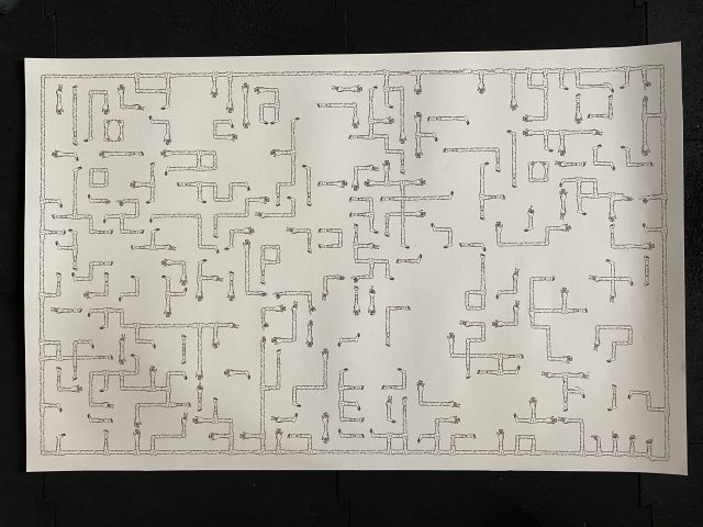
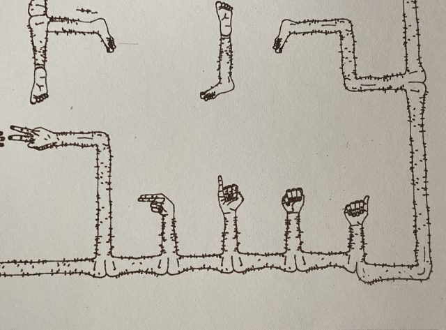
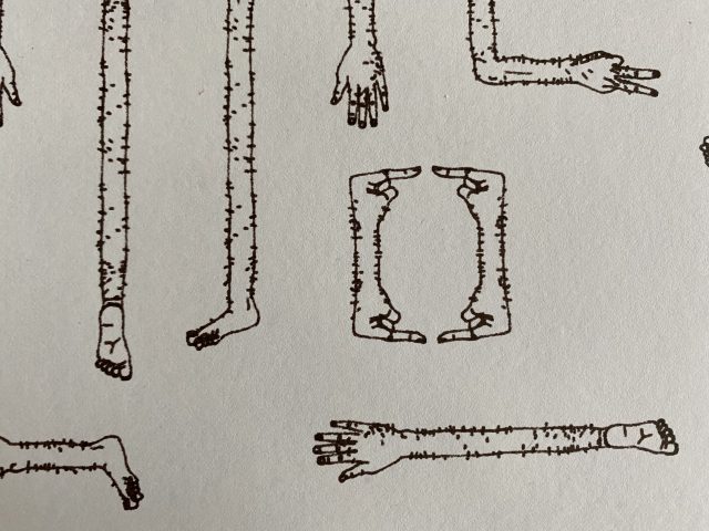
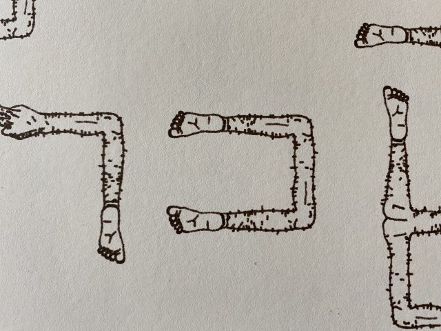
For my final project, I want to explore generativity in prints and Latin American counterculture. In particular, I want to look at comics and editorial printmaking and illustration and I want to merge traditional drawing techniques (such as etching and screenprinting) with the computational and generative design that can be made with a plotter. I am especially interested in the interaction between the human and the machine and I want to narrow down my focus this semester to this.

Additionally, I am looking towards the option of scaling and reproducing my project to make small zines or editions of generative comics.

TLDR: I want to make generative comics that explore ideas of Latin American counterculture and heritage, but more importantly challenge mediums and explore plotting, etching, and other forms of printmaking and bookmaking. In this process, I will explore different generative writing methods and different material conditions to make my comics. As such, I anticipate my project being comprised of smaller tests and pieces that are part of a set as an exploration.

———————————————————–

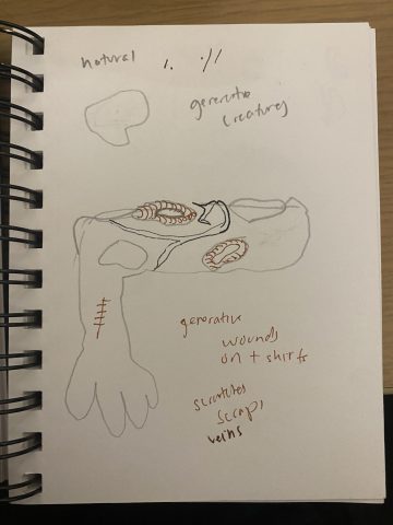
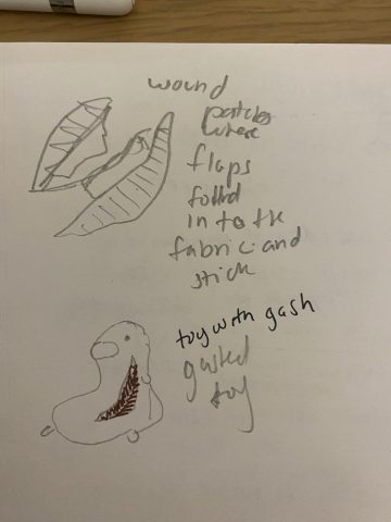
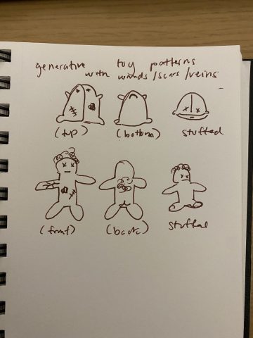
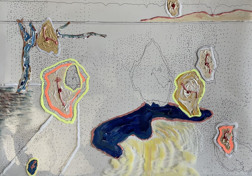
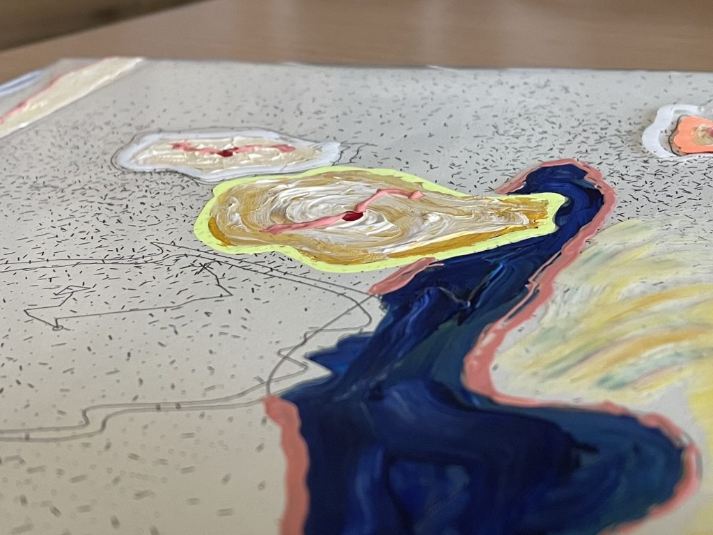
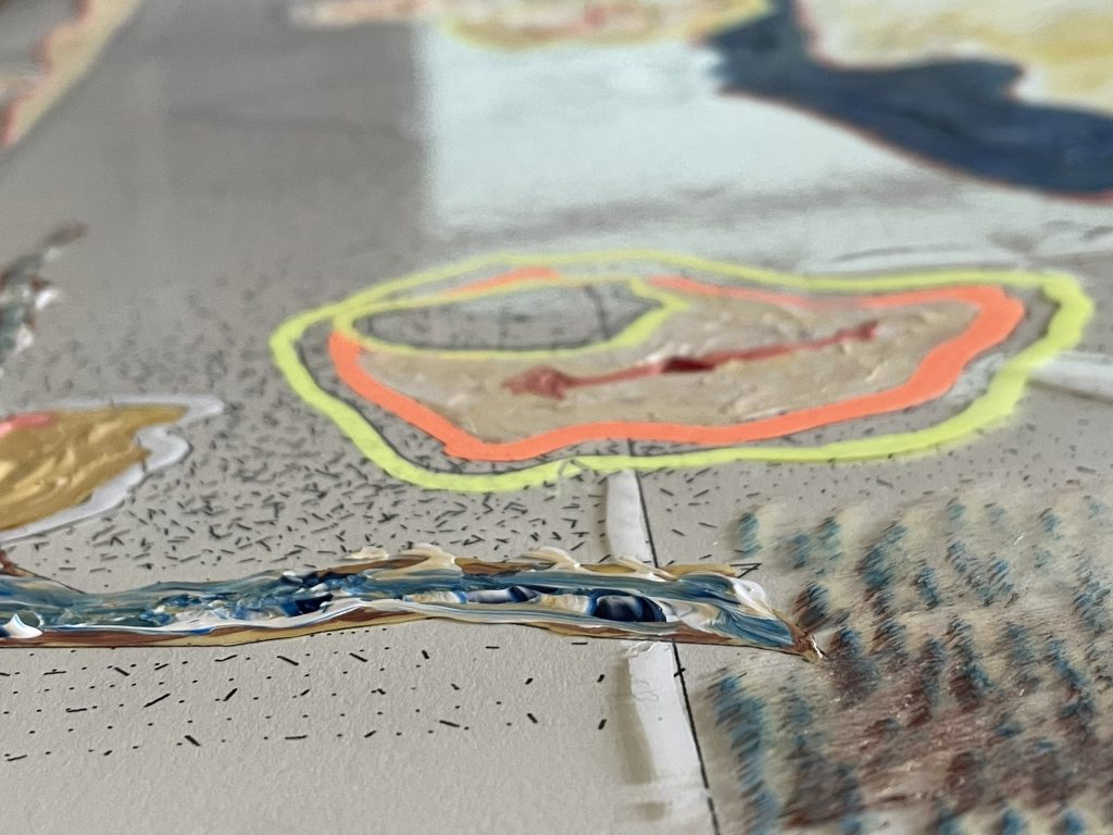
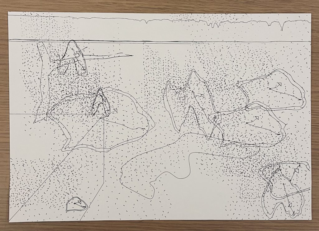
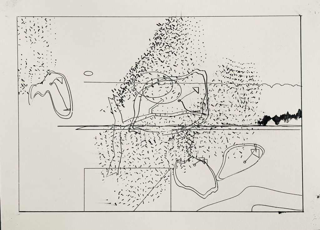
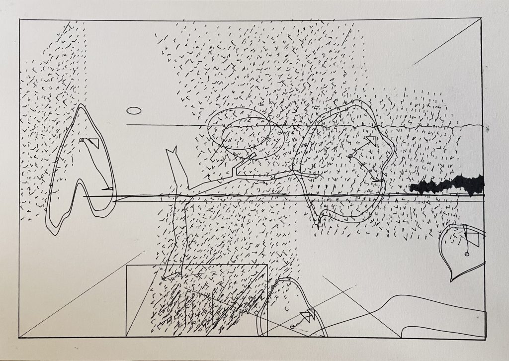
Brief Sketch: Opted not to add a sketch since I still don’t know what I want the visual representation of my project to look like, however below I address some of my inspirations for this.

———————————————————–

Schedule:

11.03	Wed	-- Proposal: Basic themes and idea 
                   Due: #10 (Research/Proposal/Tests); DISCUSSION.
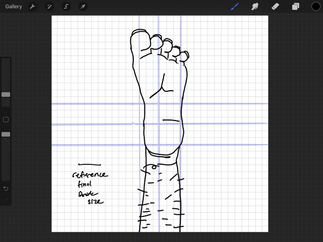
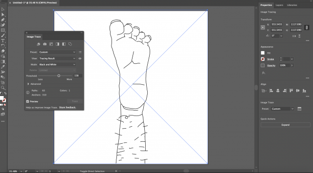
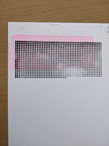
11.08	Mon	-- Completed etching test print and updated "blob" code. 
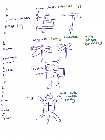
11.10	Wed	-- Completed brainstorming of themes for final project comic and writing.
11.15	Mon	-- Test prints.
11.17	Wed	-- Test prints.
                   Due: #11 (Major Milestone); CRITIQUE.
11.22	Mon	-- Test prints.
11.24	Wed	-- NO SESSION (Thanksgiving).
11.29	Mon	-- Start final prints + etchings.
12.01	Wed	-- Due: #12 (Final Project); EXHIBITION.

———————————————————–

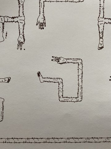
Previous work and inspiration:

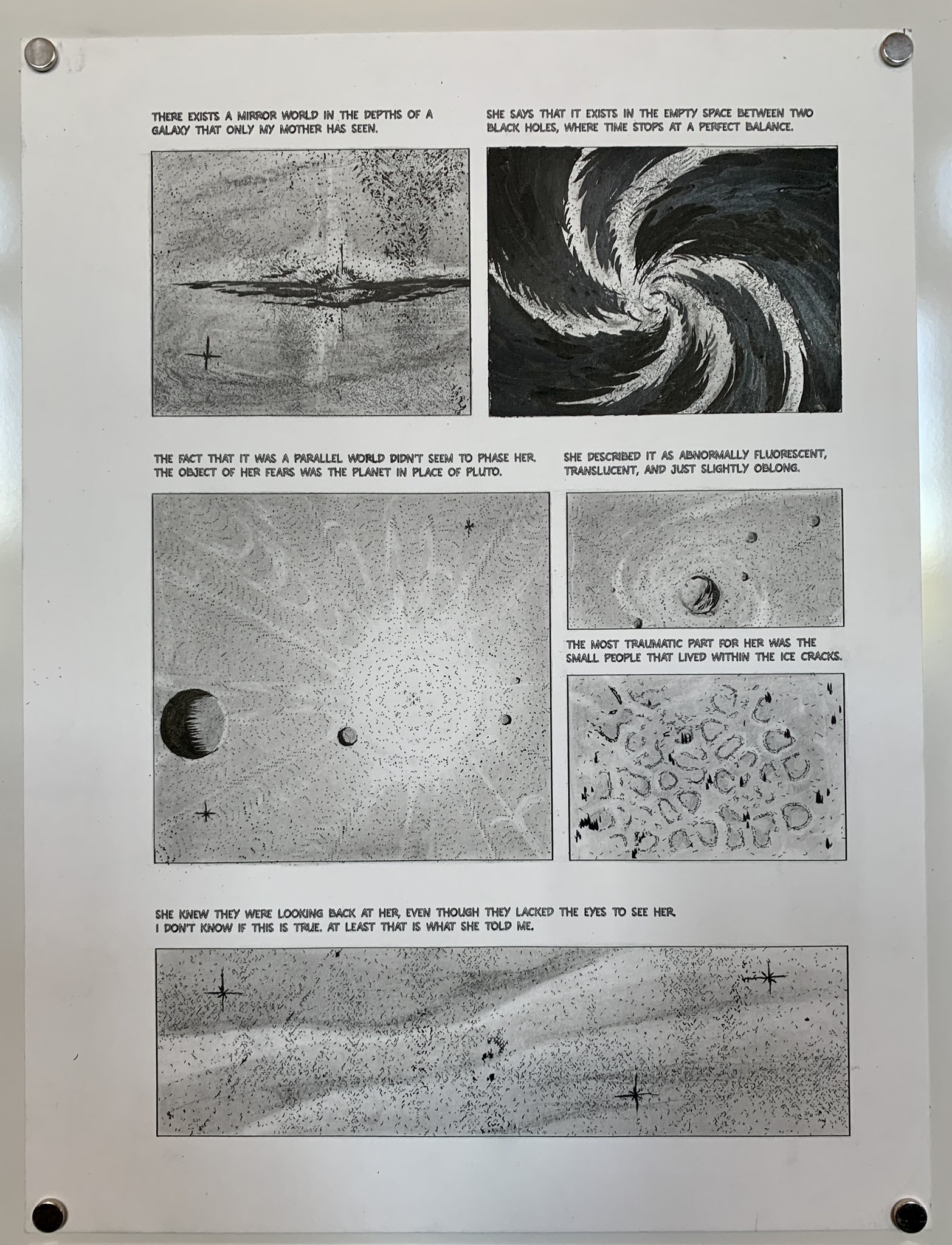
In past semesters I have worked a lot with comics and generative text centering on Latin American studies, history, and language. I would like to bridge this area of my practice with physical mediums and genuinely generative writing.

Some of my comics:

Image

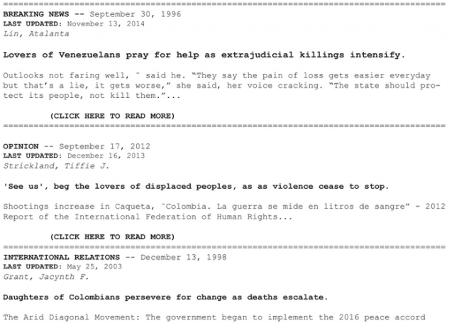
Some of my previous generative writing:


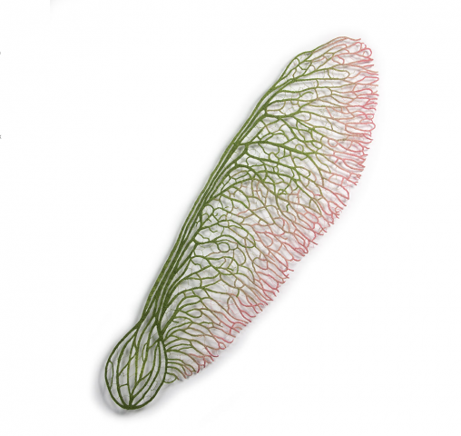
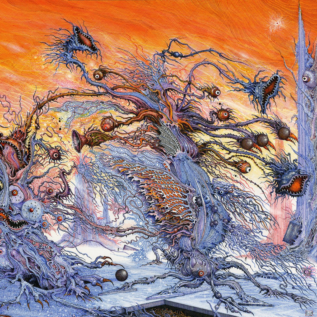
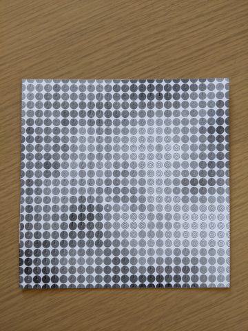
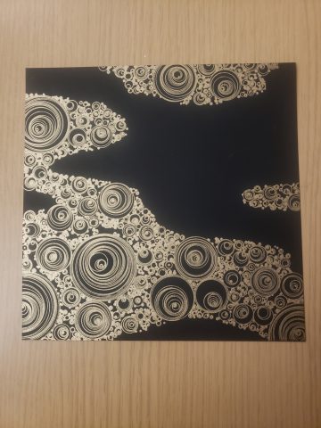
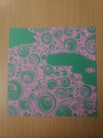
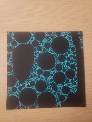
Some art that has been inspiring me:

A Trip Down Memory Lane: Microsoft Comic Chat | by Chris Gliddon |  Gliddon's Blog

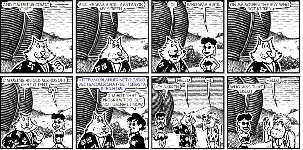
(Microsoft Comic chat)

Prints:Contemporary, FRANK STELLA (American, b. 1936). Engraving IX (from Swan
engraving), 1984. Relief-printed etching. 59-1/2 x 49-3/4 inch...

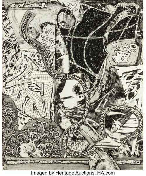
(etched engraving art: Frank Stella)

Life Through Graphics: Power Paola's Graphic Novels" by Iván Pérez Zayas |  Latin American Literature Today

(c: virus tropical by Powerpaola)

stickz – MidSemester

1 Version with Marker and Paint additions

Close-up Shots


Another Version without additions

I altered my previous blob assignment for my mid-semester project, where I was really interested in adding elements like paint and mark-making to improve upon my Dalí inspired clocks. Some major changes were that I altered the sizing of the drawing, resizing the elements and scaling up the work, along with adding more clocks with variable clock-times and bringing more elements into the composition. Of 40 variations of generated, updated blobs, I selected 2 that I thought looked the most interesting on screen, and plotted them. I then added a plastic covering that serves as protection and also a layer to preserve the drawing, while being able to add color and paint to the drawings. 
The inspiration behind the paint and markers that I added to the artwork had to do with Dalís exploration of texture, specifically ideas that play with softness and hardness in The Persistence of Memory. I approached the painting process with a focus on emphasizing the hardness, yet softness of acrylic paint, creating the 3D effects of the clock hands by squirting out paint from a tiny piping bag, while adding texture and paint to reveal the texture and dimensionality of the paint through protruding and layered surfaces. With the paint and neon markers, I made the decision to go crazy on the colors to create a more playful painting. I didn’t want to copy the color scheme, but I definitely could have benefitted from testing color combinations and making the best color scheme possible.
Looking back, the plotting and the painting did not come out as desired. The paint lost a lot of its dimensionality, where the hands of the clocks flattened out and a lot of the 3D texture that existed when the paint was wet flattened out in the drying process. I also should have been more intentional with color, and should have gone all the way with the paint or have more intentional areas; it was difficult trying to keep some elements of the hatching (not covering up the plotter marks) and choosing where to put paint. Along with the plotters, I realized sizing up is difficult, where material changes and the physical properties of the drawings can change. I think my smaller iterations were more successful, where material choices and composition of lines and line-width should be reconsidered. I realized that viewing the image from the computer screen and what comes out from the plotter certainly matters a lot, and needs to be tinkered with.
Some other versions (SVGS)

Original Blob's Assignment


lemonbear—FieldComposition

SVGs:

Photographs:

Reflection:

My offering for this prompt wasn’t especially adventurous, but from Golan’s suggestions in class the other day, I learned a bit more about Perlin Noise and the various parameters I could tune to get the piece to come across as a field when plotted. I also experimented a little bit with color and hacking my way into multicolor by taping multiple pens together; I think this method could be more impactful if I devised a less shoddy way to do it (more consistent pressure, more control over distance between pens) and had an actual svg that produced some kind of optical illusion when plotted with multiple pens at once.

lemonbear—FieldReading

I enjoyed Tyler Hobbs’ article on flow fields; the methodology felt approachable and at the same time produced a myriad of beautiful images. I liked how he experimented with color and line length to produce a wide variety of emotion in the final products.

Stickz – FieldReading

The collection of algorithms by Jason Webb were definitely surprising in the way generative forms can get really organic. This is especially true with the Physarum algorithmic model, where it generates organic web-like patterns recursively that look natural. It reminds me of close-up, magnified images of leaf veins.

frog-MidSemester

For this project, I made use of a modified circle packing algorithm that would use a thresholded noise field to generate a cool blobby form, fill it with circles, and apply a drawing step. At the drawing step, the circles can be drawn in different ways. Above I tune some parameters to produce the different circumscriptions and packing densities. I can also shut circumscription off at will.

It was exciting to seriously push myself with this project this time and I feel like I learned a lot about ways of filling a page and ways of considering and solving geometric design problems. Through testing I would devise different visual debug methods to give me an effective visual description of the code state.

Going forward, I want to use more color.