Student Area

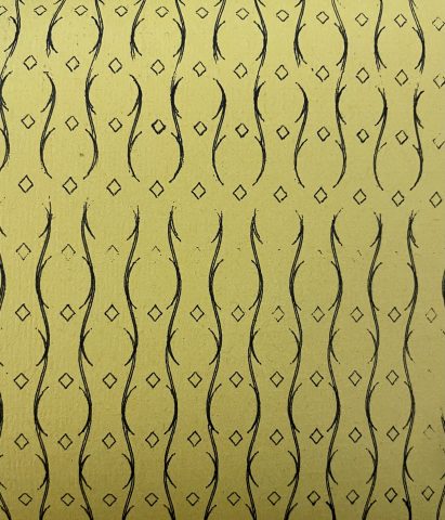
sweetcorn-TilingPattern

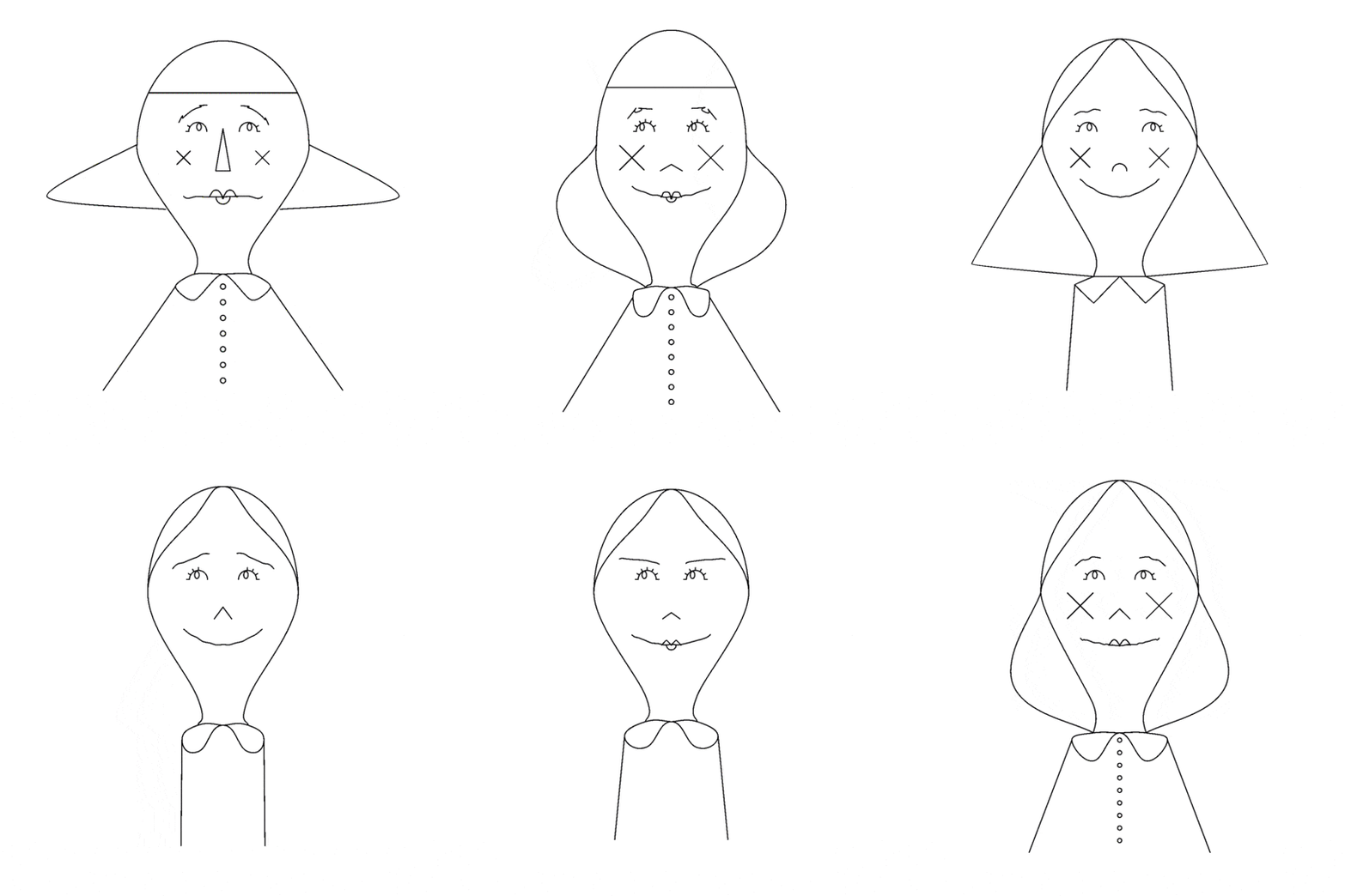
For my project, I picked up an old project of mine which generated childrens’-story-esque faces. I worked on this before becoming familiar with Shapely, so I had hadn’t implemented any sort of filling. I brought this old code from JavaScript to python and converted everything into Shapely geometries. Below is some documentation from the old project.

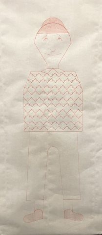
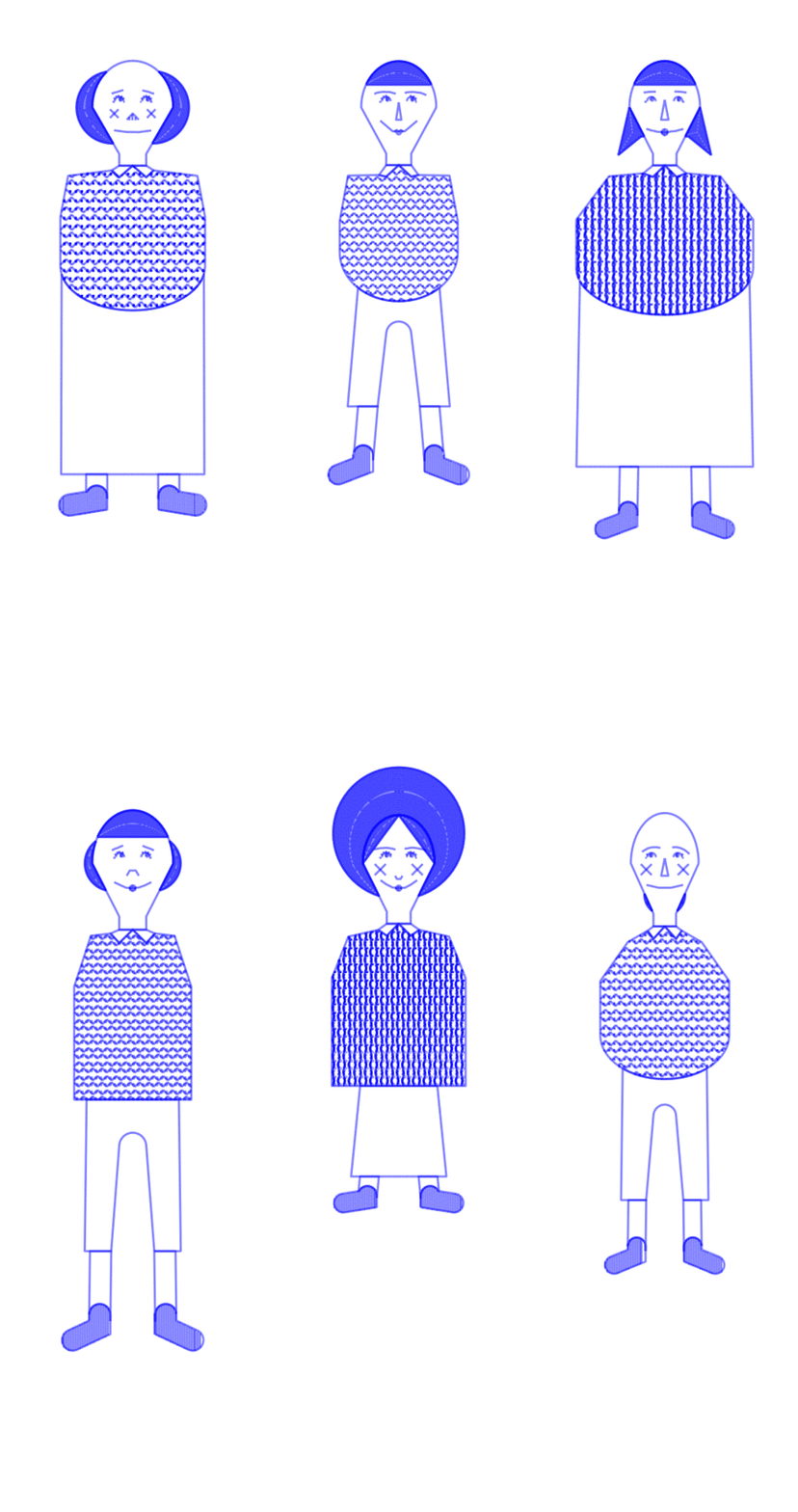
With my work last week figuring out how to plot on the USCutter MH871-MK2, I figured it would be lovely to generate and plot human-sized figures.

The hair and shoes are filled with simple hatching, but the shirt has a pattern build out of Hershey fonts. Using this python hershey font library, I randomly choose symbol characters and place them between arrangements of {}, /\, or two opposite-facing integral symbols. I use shapely to crop all the fills to their respective polygons. Below is a gif containing a few generated .svg’s

A video of the plot in progress:

And some plotted results:


marimonda – TilingPattern

I always thought some of the rules in Cellular automatons often resembled Iberian tilings and thought it would be cool to do something like that. Also plotted animation is awesome and I wanted to give it a try.

I made an interface that allows me to modify the rules for the CA as well as the starting seed of the algorithm (including a random seed).

For those wondering how the pattern works, in essence, it utilizes a persistence effect and retains some of the cells from the previous iteration marked with a different pattern. This results in four total layers where each of the four patterns can be overlayed on top of each other.

(off cell) (on cell)

(off*,1) (off*,2)

(off*, n)-> off, last on n frames ago.

Conway’s game of life + basic interface:

I added some of the pictures/themes I was considering in making this below. Obviously, not all of the pictures fit my idea in the final cut. But I experimented with a lot of these ideas. I originally started out by making hyperbolic tilings, which proved to be kind of annoying to implement given the timeframe though. I really like CA’s and tilings though, so I went with that.

Continue reading “marimonda – TilingPattern”

bookooBread – BlobFamily


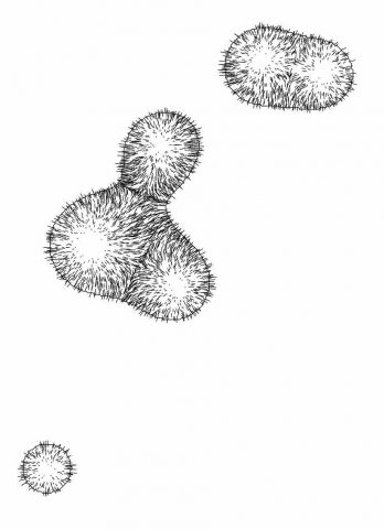
My interpretation of the blob family prompt manifested itself into an exploration of the differential growth algorithm. After dong some research on the algorithm itself and code tracing a few different implementations, I landed on Alberto Giachino’s Differential line growth with Processing. I have mostly been working in processing, and it didn’t require any outside dependencies, so it made the most sense to use this one as the base. Jason Webb’s 2D differential growth experiments also really helped in understanding how the algorithm works and how it can be modified. After playing around with the algorithm in the hatching exercise from last week, I wanted to see how I could constrain the growth to one specific shape, more specifically, in a blob-like shape. Golan had showed me how to use an off-screen graphics buffer, so I thought it might work if I tried to use that as a layer mask of sorts. The off-screen graphics buffer would contain white filled blobs (made by modifying the radius of a circle with perlin noise) against a black background. Therefore, whenever a node was at the location of a white fill, the differential growth cohesion and separation forces would act. When a node on the circle was at location of a black fill, there were no forces acting on it to make it grow. The nodes that were growing then formed into the shape of the blobs, and to my surprise, sort of collapsed in on each other where the edges were. It made what looked like the outline of the blob. The two pictures below are the blobs rendered digitally.

I had a lot of fun with this one! I love texture and I love organic/bodily looking things.

Here is the code:

Continue reading “bookooBread – BlobFamily”

dinkolas-BlobFamily

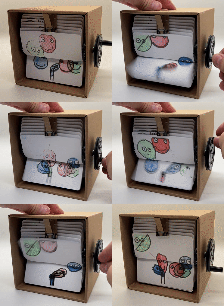
I assembled a “flipbookit” which is a little contraption to play a 24 frame looping animation drawn on the backs and fronts of 24 cards. Originally, the animation loop was a series of smiley faces being slurped into a tube, but the way I shuffled around the cards it ended up being a bunch of smiley faces being spat out of a tube instead.

Each smiley is made up of four chains of springs and a bunch of repelling points: the spring chains make up the outline, two eyes, and a smile, and the whole face is filled with repelling points to give it some volume. Two of the points are selected to be the left and right pupils, respectively. The whole face is sucked into the tube with a force field that is applied to every point. There are also collisions with the tube walls.

Each of six faces is on its own 24 frame loop, and the loops are offset from each other by 4 frames. In order to exaggerate the acceleration of the faces as they are sucked into the tube, there are actually more sub-frame simulation steps towards the end of each individual 24 frame loop than in the beginning. It starts out with just a couple simulation steps on the first frame, and ends with several hundred on the last frame. The faces are also filled with a simple parallel-line hashing with three distinct colors.
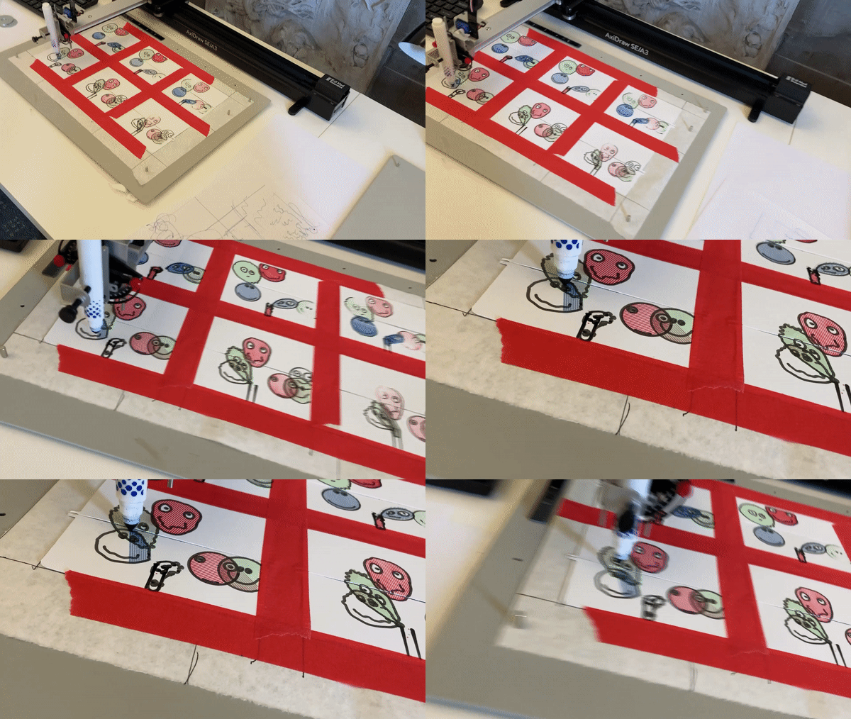
Originally I planned the walls of the straw to be a thick outline, the outlines of the smileys to be thin pens, and the fill color to be cheap color markers. This all worked out except for the thin pens, which didn’t like to draw on the plastic-y surface of the flipbookit cards, so I ended up doing thick marker lines for all the lines. I suspect that this was actually a good thing, and helped by increasing readability of the animation, and by fudging some alignment errors both between the lines/colors within a frame as well as alignment between frames.

Each frame is drawn on two cards, the top half on one card and the bottom half on another card. Each card is printed on the front and back. Thus half of the cards have the top of an odd frame on one side and the bottom of an even frame of the other side; and the other half of the cards have the top of an even frame on one side and the bottom of an odd frame on the other side. Luckily I could fit twelve cards on a 11″ x 17″ AxiDraw, and there are two of those, so I could print all the odd frames at once, then flip all the cards over and shuffle them around and print all the even frames, with two AxiDraws in parallel. So two AxiDraws, front and back, black outlines and three colors, made for 2*2*4 = 16 distinct svgs (actually 2*2*5=20 cuz originally the straw outlines were separate from the smiley outlines). I figured flipping and taping down the cards was more of a pain than swapping markers, so I only flipped twice (once for each AxiDraw), and swapped markers 16 times.

Reading

“A blob is an illusion of controlled chaos” (Entering the Blobosphere, Laura Hyunjhee Kim). Is the illusion the control or the chaos? I imagine you could get different blobs by approaching it in both ways.
stickz – PatternReading

I really enjoyed both texts, and felt that breaking down the process of how each type of pattern generation opened some “cheat codes” to this assignment. In general, I really enjoy working with randomness, and the aesthetics of organic shapes and forms, and the idea of predictable “unpredictableness”. 10PRINT talked about quotes that have to do with the idea of gestalt within stellar pattern work, where the whole pattern is much more impressive than the sum of its parts. I think this idea that great patterns depend on not the complexity or how great each individual pattern “part” is, but rather how all of it becomes combined as one. Another big idea from the text was that the most “delightful” work lies between “boredom and confusion”. This is something that I will keep in mind to guide my process, and I think it applies to the greater sector of generative and visual art. It’s definitely not going to be that simple to just make a piece “less boring”, but tinkering and making adjustments to find the happy medium is going to be crucial for this project.

grape – PatternReading

Something I found particularly interesting about the pattern reading was how they both highlighted something different about how the viewer is meant to experience patterns. In 10 PRINT, it’s that the viewer examines patterns by trying to anticipate what comes next; the excitement isn’t derived from something too predictable or too obscure but rather a balance in the middle (maybe if you didn’t provide a first time viewer a grid, the threshold would be if they couldn’t figure out the algorithm in the first ten seconds).  In Graphic Games, the first half of the reading focused on how our minds begin to read black/white as the primary shape in a pattern in relation to its coverage in a grid block or its “dark-light interchange.” I feel like truchet tiles could also make its way into optical illusions given both of these two ideas. I have no big introspective thoughts from reading this, but it has definitely given me a lot to think about in making a “good”(not boring) pattern.

lsh-BlobFamily

Continuing my practice of trying new tools for this course, I decided to try out the thing umbrella for this project. The umbrella is a project by Karsten Schmidt in which he creates a giant package ecosystem full of every algorithm one could ever want. Thi.ng was originally written in Clojure, and the transform definitely feels like Clojure. For instance, I spent a long time fighting with the system until I realized certain functions fail unless passed empty lists as a final parameter. That being said, the library is wildly powerful! I was able to achieve amazing results with very little code. I would totally use the thingiverse again, though maybe when under a much longer deadline. I found myself thinking of Good Shape while I worked—how it’s particularly difficult to describe what makes a shape “better.”

import { quad, asSvg, withAttribs, path } from '@thi.ng/geom';
import { star } from '@thi.ng/geom/ctors/polygon';
import { vertices } from '@thi.ng/geom/ops/vertices';
import { scatter } from '@thi.ng/geom/ops/scatter';
import { fuzzyPoly, compFill } from '@thi.ng/geom-fuzz';
import { svg } from '@thi.ng/hiccup-svg';
import { serialize } from '@thi.ng/hiccup';
import { shuffle } from '@thi.ng/arrays';

const width = 648;
const height = 864;

const buffer = 20;
const rad = 45;

const s = scatter(
    quad(
        [buffer + rad, buffer + rad],
        [width - buffer - rad, height - buffer - rad],
        [width - buffer - rad, height - buffer - rad],
        [0, height - buffer - rad],
    ),
    17,
);

const blobShapes = s.flatMap(([x, y], i) =>
    Array.from({ length: i % 2 ? 6 : 1 }, (_) =>
        star(
            rad + buffer * Math.random(),
            ~~(Math.random() * 5) + 3,
            [1.0, 1.5],
            {
                fill: 'none',
                stroke: 'black',
                'stroke-width': '1px',
                transform: `translate(${x},${y}) scale(${i / s.length})`,
            },
        ),
    ),
);
const blobs = blobShapes
    .map((s) =>
        fuzzyPoly(vertices(s), s.attribs, { jitter: 5, curveScale: 0.5 }),
    )
    .map((b) => withAttribs(b.children.at(0), b.attribs));

const scene = asSvg(...blobs);
const output = serialize(svg({ width, height }, scene));
document.querySelector('#app').innerHTML = `${output}`;