![[OLD FALL 2018] 15-104 • Introduction to Computing for Creative Practice](https://courses.ideate.cmu.edu/15-104/f2018/wp-content/uploads/2020/08/stop-banner.png)
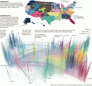
The project on information visualization that caught my eye was a project created by the New York Times in 2011 called “Phone Call Cartography” in which researches from MIT, AT&T, and IBM compiled research about phone calls and where they are from/to. This data is then compiled into a map in different arcs each representing thousands of phone calls. I have always enjoyed looking at maps, so seeing such interesting data being the foundation of one is fascinating. For the algorithm, it seems like they assigned the data to different regions and had regions with more data be taller and bolder. I think that it is really cool that even without the normal geographic map of the United States, it is still possible to tell what cities are where as well as a general population of different areas. I would be interested in seeing a similar map for today, I wonder if there would be a similar number of phone calls, fewer, or greater.