![[OLD FALL 2018] 15-104 • Introduction to Computing for Creative Practice](https://courses.ideate.cmu.edu/15-104/f2018/wp-content/uploads/2020/08/stop-banner.png)
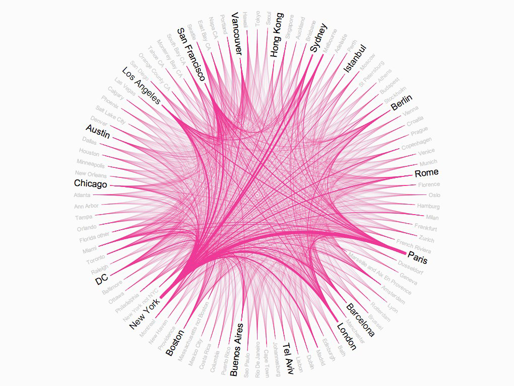
Airbnb’s Top 50 Markets / Rachel Binx / March 2011
Rachel Binx is a designer that visualizes information for a wide set of clients. This piece was created for a presentation that Airbnb’s CEO was giving on the cities which are most connected between via the app. The line weight that connects each of these locations is in proportion to the volume of trips booked from one to the other.
I feel drawn to this piece because of its relatively simple structure, but complex inner working of arc “strings”. Upon initial viewing, I get the idea that Airbnb simply reaches a large quantity of cities, as a very little proportion of viewers are going to count every city around the hub.
However, the design encourages viewers to engage in a more curious way, where they can discover these relationships without them being handed out. This “work” that the viewer does leaves the user with a sense of reward and a hint of ownership over the connections that they’ve inferred from this visualization.
This layers of interaction to this project brings Binx’s creative sensibilities into light. It is clear that Binx has an understanding of how people engage with visualized data, and what really “matters”. Every person in the room isn’t going to care that there are some x-thousand connections between one city and the other, but they may find more value in these inferetial comparisons.