![[OLD FALL 2018] 15-104 • Introduction to Computing for Creative Practice](https://courses.ideate.cmu.edu/15-104/f2018/wp-content/uploads/2020/08/stop-banner.png)
Nicholas Felton is one of my new favorite designers. He is a trailblazer in the field of digital data visualisation, and I am especially interested in his story because he came from traditional graphic design and moved on to creating algorithms that collect data after he realized how much he enjoyed representing it through graphics. I have always been interested in editorial design specifically because a lot of times, it involved an interesting combination of powerful aesthetics and thought-out information representation, and it’s hyper focused on making the reader understand what it’s trying to communicate. Felton does this with his in a lot of his work, and especially in the project Daytum.
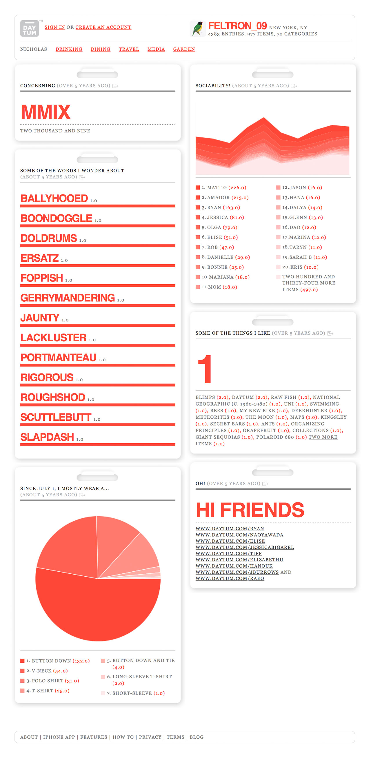
Daytum is a platform an app that collects personal statistics from the user and elegantly communicates them in different ways. The spreadsheets and visuals it produces are created in the spirit of Felton’s famous Annual Reports. Based on the interface and the type of information this app tracks, I’m thinking that it is created with code that takes certain data sets (and has to have different versions or be flexible to different types of data) and then puts them through a program that organizes the data points in relationship to each other and plots/prints them in different formats. What I find interesting, as a communications designer who is currently studying typography, is that the program probably has to account for formatting errors and irregularities that come with differing data: longer words that change the word spacing, numbers that contain decimals or are greater/less than zero, and orphaned words and other paragraph issues. I think what makes this program so elegant is Felton’s eye for clean design, so that these personal data points are plotted neatly and elegantly no matter what they are.
This project was released in 2008. I know there are a lot of similar and far more developed apps out there now, but this is on the first times an iPhone app took on this form, and I think thats important.