Jonathan Liang – Looking Outwards – 03

flowers of computation?


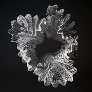
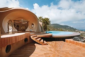
This is a work by Benjamin Dillenburger called Rocailles. Professor Dillenburger is a professor of architecture at the University of Toronto. What I find amazing about this work (and other Dillenburger works as well) is how it uses parametricism to generate beautiful sculptures. What I also admire about many of Dillenburger’s works is that they look that they are incredibly random, but have a computational formula behind how the forms are constructed. As an architecture student, I am pretty familiar with parametricism because it is now part of our core curriculum in school. Architecture now is turning to parametricism and computational design for housing units and designing buildings that can be integrated and be built by robotics. I have never been a big fan of computational design in architecture, but I love computational design when it comes to sculptures, installations, pavilions, and smaller scale works in general.

http://benjamin-dillenburger.com/projects/


Sarah Yae Looking Outwards 3

The Bubble Palace designed by architect Antti Lovag and commissioned by industrialist Pierre Bernard,  is located on the French Rivera. This was completed in 1989. If one were to step inside this home, he would find tubular halls and round windows. I admire this project in that it broke free from the concept that structures have to be made out of hard lines and rectangles. By incorporating round shapes and circles, this house no longer feels like an average home, but a house one would see in a cartoon. A globular structure allows this home to feel a bit more enticing, as well as evocative.

A back view of the the Bubble Palace– it has a magical feel!

For more information about the Bubble Palace, please check: https://www.architecturaldigest.com/gallery/most-beautiful-buildings-inspired-by-bubbles


Jonathan Liang – Looking Outwards-02

digital DADA

DATA-DADA is a series of algorithms created by Holger Lippmann that reads different color map arrays and represents them in circles and lines. DATA-DADA has created three series of maps. I found these maps interesting because in my architecture studio right now we are studying mapping and these maps can serve as inspiration for me and my projects. One thing that could be more better about these series of projects is if they could specify what the data is about or what they are representing.  But I do love the ambiguity that these circles and lines create. I do not specifically know what inspired Mr. Lippmann, but his DADA series reminds me a lot of Takeshi Murakami’s superflat style. Both artists have a very similar aesthetic, even though Lippmann utilizes data rather than made-up characters.

http://www.lumicon.de/wp/?p=3397


Kade Stewart-LookingOutwards-02

Marcin Ignac, Every Day of My Life (2012)

Marcin Ignac completes a lot of projects that focus on data visualization. Whether that’s data from an Internet of Things, from the stock market, or even from his dad’s workouts, Ignac finds a creative way to model the data. In “Every Day of My Life,” Ignac used an app called Tapper to track his foremost running app at all times of the day, every day, for two and a half years. He then visualized the data using Plask, separating each program into a specific color and each day into a band. The project should be consumed from top to bottom.

What I admire most about Ignac’s work, and specifically what I admire about this project, is that the work is something I would consider art at the end, but does not come from that. The usage of different programs is not meant to be artistic, and yet, Ignac takes it and makes art. In addition, the art holds onto the meaning – if I were to look at dark spots, I could probably guess where the holiday season slowed his work. This algorithm was probably pretty simple, assigning colors and arranging them chronologically. This simple yet meaningful project embodies Ignac’s style of grounding his work in the very real world of data.

Marcin Ignac

Sarah Yae LookingOutwards2 Section B

“Boil Up: Realtime Feeding Frenzy” (2013) is created by Robert Hodgin. His work can be explored on:

http://roberthodgin.com/portfolio/work/boil-up/

Hodgin’s animation installation of the sea and fish pattern amazed me. Although the audience receives a single experience,  there were so many procedural layers involved to create it. Hodgin had to break down his project into multiple steps, which added onto each other. For example, his first step would be the formation of bait by observing group behavior, then he would introduce the smaller predators.

The algorithm that generated the work was apparently “GPU-based” and his work was to be displayed via 4 projectors in a cylindrical room.

Hodgins’s artistic sensibilities manifested in his algorithm when he had to code the design of the fish as well as the sea, to make them look realistic.

Tuna model in “Boil Up: Realtime Feeding Frenzy