Caroline Song – Looking Outwards 12

Because I know I want my final project to relate to generative sound, I wanted to hone in on pieces and artists who worked with such medias in this last Looking Outwards post.

The first project I decided to look at is by April Aliermo. She focuses on installations and performances that are immersive experiences and are representative (in sonic form) of her values. Working with Kristina Guison and Kat Estacio, together they created an interactive installation called Dahan, Dahan Slowly, Carefully.

This piece involves disks of ice that melt and those drops go to hit the metal sculptures in different ways in order to induce percussive sounds which change as time goes on and the ice continues to melt. With each water droplet, there are generative visuals that respond and change accordingly. This is a intended to be meditative sculpture installation for the Long Stone, Gladwell Hotel in 2019

I admire the interactive element in the installation and the way it uses typical objects in everyday life, metal and ice, and suddenly amplifies the way we can use such materials by having them interact with each other and furthermore, I especially appreciate how the interaction will change at different stages of time based on how fast/slow the ice is melting and the acknowledgement of this change with the generated visuals that respond to the water drops.

In my opinion, I wish they had explored even further with different materials that the water drops hit, more so that just metal, in order to go more into depth as to how different materials affect the sound of water and therefore, how different materials can affect the accompanied generative visuals. Furthermore, I also wish they had explored the different factors that can make water melt faster or slower. I think that would have been very interesting in terms of a next step of this project. They have explored how free and how much expression can go into this piece and now to reverse the meaning and try to restrain water, an element that is not so easily controlled, would be interesting.

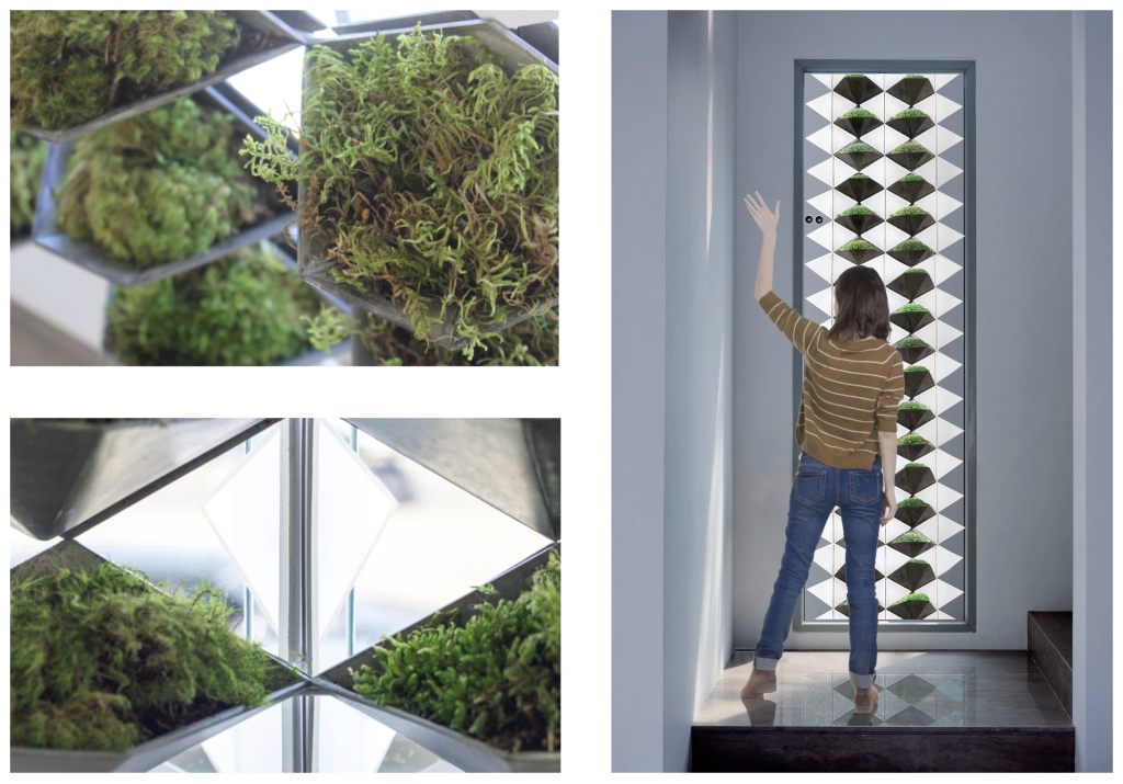
The second piece I chose to look at is by Helen Alexandra. She created a Prototype for a Multi-Species Architectural Element which is an interactive window installation with the purpose of attempting to create a connection between humans and the natural world.

Using sensors and motors, she created a piece that responds to the needs of specifically living moss and humans. In a window unit, there are automated apertures that change based on whether or not a human is detected about 10 feet from the window, in which the aperture will shift to accommodate the amount of sunlight that the human wants. When there is no human detected, the aperture shifts in accordance to what the living moss needs.

Prototype for a Multi-Species Architectural Element by Helen Alexander

I admire this project because of the end purpose that Alexandra wanted, which was to foster some sort of connection between humanity and nature which I think is important because humans take the natural world for granted most of the time.

I think to further this project, I would want to see Alexandra expanding this idea to not only the window, but perhaps different parts of the home/life in general in order to further deepen humanity’s appreciation for nature by seeing how nature fits in our daily life in many different places and different aspects.

Comparing these two installations together, I see the similarities in that the artists are trying to take advantage of natural elements of the world, such as water and earth. I think both of them are making a statement of the importance of these elements and are also trying to teach viewers and users how to interact with such elements and how many different ways there are to do so.

Ankitha Vasudev – Looking Outwards – 12

The two projects that I have chosen to discuss relate to climate change discuss this topic in different ways.

The first project is called Entropy, which was created by ecological artist Lloyd Godman in 2010. I find this project inspiring because it was made as a response to the fire that affected Australia in 2009. The projection was written in C++ and begins by selecting one of 30 composite images and randomly generates a pathway to a single image. The project is a randomized sequence based on images in the data bank. I think this project could have been improved by making it interactive and allowing viewers to click on certain images for more information.

Entropy displayed at the TarraWarra Muesum of Art in Australia, 2010.

The next project is a game called Climate Quest that was developed in 2015 at the University of Washington. The purpose of this game is to promote environmental awareness. The story behind the game is that climate disasters are occurring across the country, but the heroes must save lives and protect ecosystems. I admire this project because it conveys an important message in a non-conventional way. The idea of storytelling through a video game seems interesting and creative.

Link to an interview with one of the creators of Climate Quest

A GIF of Climate Quest

Emma NM-LO-12

Playful Geometries project is a user generated visual and sound project. Users can pick up a tablet and push, toggle, or slide buttons to produce different images and sounds on the screen. Visuals stem from geometric shapes and use bright colors. artifish is a project that encapsulates a digital aquarium. The working prototype serves to represent fish moving in a pond. Future versions aim to allow users to add to the digital aquarium with a variety of unique digital creatures and vegetation. In Playful Geometries, I really like the experience of giving the user the ability to create their own art using shapes. I have always been drawn to geometry when having to start with a blank canvas. In artifish, I really like the potential of adding unique digital creatures and vegetation. The visuals they have for the other creatures and vegetation look like they stem from geometry/math.

In artifish, I think their fish look more like tadpoles/sperm than fish, so I think they could improve upon their visuals. As for Playful Geometries, I think it would’ve been cool to have user input to create their own shapes (new geometry) and see it inputed into the visual.

Playful Geometries (2014)

By Davide Della Casa and Patrick Gaunt

Playful Geometries in action

artifish (2014) by Richard Rodkin

artifish prototype

Cool digital creatures and vegetation they want to implement in future versions.

Siwei Xie – Looking Outwards – 12

Project 1: The Map is divided into rectangular tiles that represent publicly traded companies. The area of a rectangle corresponds to the market capitalization of the company, and the color tells you how the stock price has changed since the previous market close. Unlike a traditional treemap, the Map of the Market introduced a new algorithm designed to create tiles that were close to square.

Martin Wattenberg, Map of the Market (1998)

Source of Map.

Project 2: Based on Google News data and state-of-the-art translation technology, the site identifies and displays which subjects are disproportionately covered in the news in each country. Users can explore the relative coverage of any particular subject across the globe. They also can see a view that emphasizes exactly the news that is not being published widely in their own country.

Martin Wattenberg, Live Visualizations at Google

Source of Live Visualization.

Comparisons: I admire the projects because both of them represent data in a visual and artistic form. However, the data they took is different, which results in different analysis and forms of expressions. They might overlook the progression of data over time and reasons behind layouts of the data.