![[OLD FALL 2020] 15-104 • Introduction to Computing for Creative Practice](../../../../wp-content/uploads/2021/09/stop-banner.png)
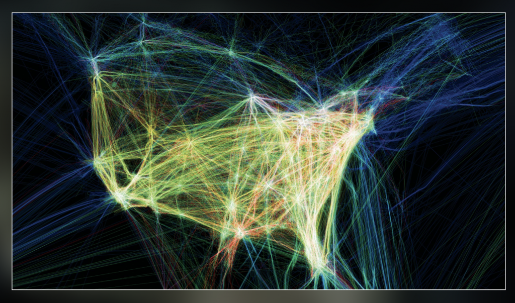
For this week’s Looking Outwards on the topic of informational visualization, I decided to look at the works by Aaron Koblin, and in particular, I was drawn to his Flight Patterns visualization (http://www.aaronkoblin.com/project/flight-patterns/). In this project, he took many data values and mapped out the paths of air traffic across North America. The visualization is abstracted to show strings of moving, glowing lines showing the progression and density of flight routes. When there is high air traffic and many routes intersect, the lines seem to glow at the intersection point. When the supposed “planes” travel away from each other, the movement fades out. To make this computational visualization, Koblin worked with his colleagues and plotted the data using the Processing programming environment. For the algorithms themselves, I think there is a component of controlling the amount of brightness of the lines. When they come in close proximity, they glow brighter, and this effect would have been created using conditionals and loop statements. I think the artist was able to take the shape of North America and make that appear obvious in the final product through creating color boundaries that show the distinction between “land” and “sea” spaces. I find this work really interesting, and it reminded me of a similar map that I was shown in my global history class, which mapped out the traffic patterns of slave ships to America over time.