var angle=0;
var boxWidth = 80;
var boxX = 30;
function setup() {
    createCanvas(600, 450);
    text("p5.js vers 0.9.0 test.", 10, 15);
}

function draw() {
	background(205, 255, 0);
	if (mouseY>height/2){
		background(139, 171, 14);
	}
    //changing color of background
	noStroke();
	 fill(105, 93, 34);
    if (boxX>width){
    	boxX=-boxWidth;
    }
    boxX=boxX+5;
    rect(boxX, height/2, boxWidth, 40);
    //moving rect
    fill(229, 163, 220);
	circle(mouseX, mouseY, 100);
	//pink circle
    fill(255, 213, 0);
    circle(600-mouseX, mouseY*4/5, mouseX*2/3);
    //yellow circle
    fill(149, 120, 229);
    push();
    translate(100, 100);
    rotate(radians(angle));
    rectMode(CENTER);
    rect(0, 0, dist(mouseX, mouseY, width/2, height/2), dist(mouseX, mouseY, width/2, height/2));
    pop();
    angle += 3;
    //rotating square
    fill(243, 142, 220);
    rect(width/2, mouseY, mouseX*3/8, 90);
    //pink rect
}
Author: judy xu
LookingOutwards-03

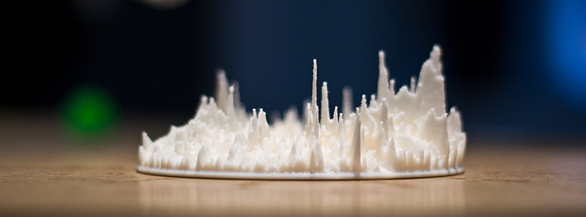
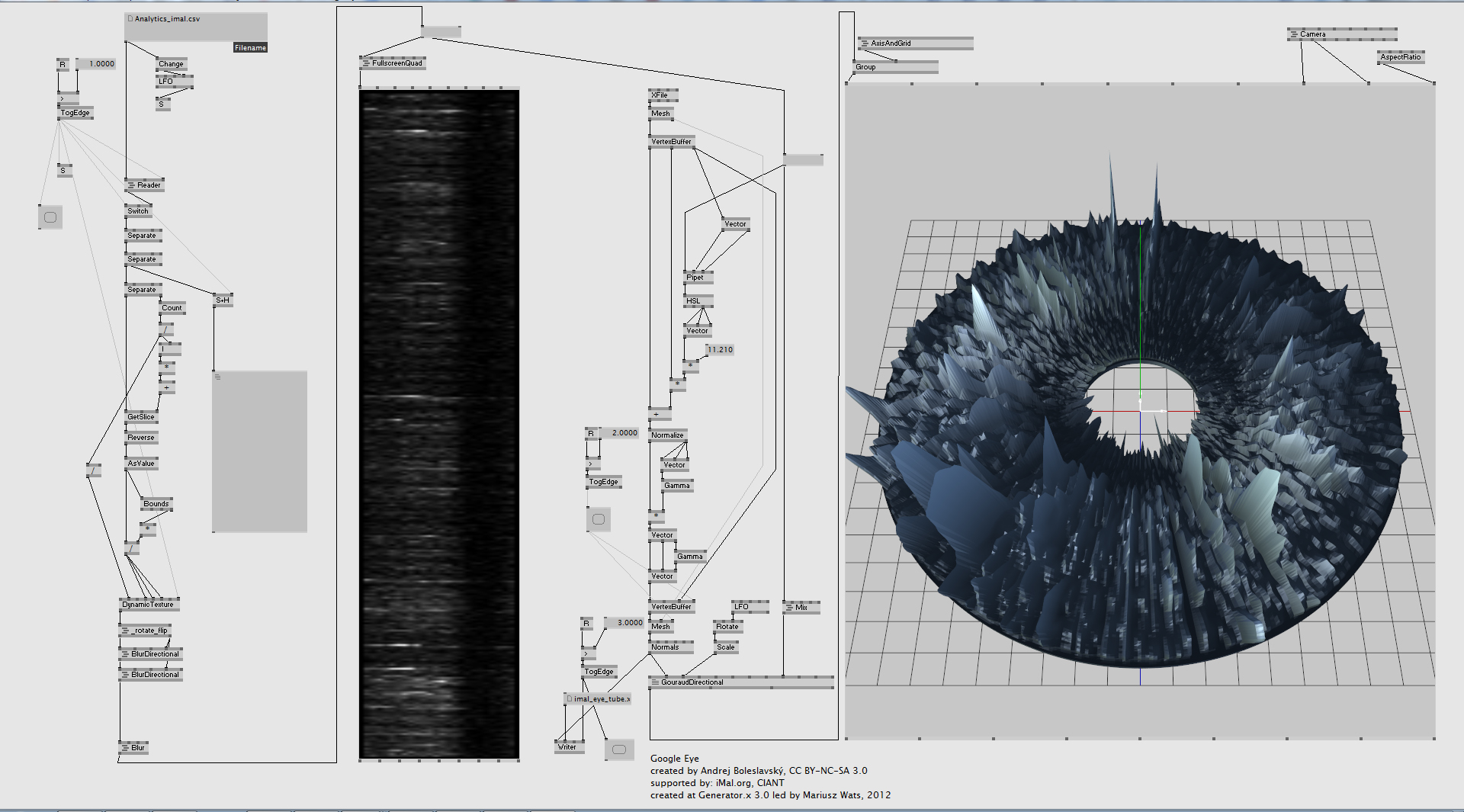
The artwork I find particularly inspirational is “Google Eye” created by Andrej Boleslavsky that visualizes Google Analystics data. I am fascinated by how different angles of viewing this artwork may lead to disparate implications. Observing it horizontally, we only see a mountain-like region that goes high and low, while from the top of it we see a human eye that indicates “how we are observed by a complex computational system”, inspiring me to consider how to combine several messages in one single artwork. In contrast to numbers and reports, Google Eye directly visualizes them for the audience and directly represents a one-year-cycle, leading us to reflect on the extend to which we are monitored by the system and how much “privacy” we are left with.
The artist constructed a model that generated by a custom made patch and transformed the dataset into valid model to print them out through 3D printing. While attempting to raise awareness of the invasion from information systems, the artists also realizes that this form enables the audience to gain better insight and makes the hidden patterns obvious.

Project-02-Variable Face
//Jiayu Xu
//Section A
var bodyWidth=450;
var bodyHeight=400;
var handWidth=90;
var handHeight=100;
var feetWidth=110;
var feetHeight=90;
var eyeDiameter=60;
var teethWidth=60;
var teethHeight=30;
var eyeBrowrightX=213;
var eyeBrowrightY=120;
var eyeBrowleftX=427;
var eyeBrowleftY=175;
var mouthWidth=243;
var mouthHeight=160;
var righthandHeight=240;
var lefthandHeight=240;
function setup() {
    createCanvas(640,480);
    background(random(204,255),random(204,255),random(204,255));
    text("p5.js vers 0.9.0 test.", 10, 15);
}

function draw() {
	stroke(0);
	strokeWeight(8);
	fill(153,76,0);
	ellipse(width/2-bodyWidth/2-20, righthandHeight, handWidth, handHeight);//righthand
	ellipse(width/2+bodyWidth/2+20, lefthandHeight, handWidth, handHeight);//lefthand
	ellipse(width*1/3, height-50, feetWidth, feetHeight);//rightfeet
    ellipse(width*2/3, height-50, feetWidth, feetHeight);//leftfeet
	fill(195,126,48);
	ellipse(width/2,height/2,bodyWidth,bodyHeight);  //body
	strokeWeight(30);
	line(eyeBrowrightX, eyeBrowrightY, width/3+60, height/4+50);//right eyebrow
	strokeWeight(8);
	line(eyeBrowleftX, eyeBrowleftY, width*2/3-60, height/4+55);//left eyebrow
	fill(0);
	circle(width/2-70, height/2-10, eyeDiameter);//righteye
	circle(width/2+70,height/2-10, eyeDiameter);//lefteye
	fill(153,76,0);
    arc(width/2,height*3/5, mouthWidth, mouthHeight, 0, PI);//mouth

    fill(255);
    noStroke();
    rect(width/2-teethWidth/2, height*3/5, teethWidth, teethHeight);//teeth
}

function mousePressed() {
	clear();
	bodyWidth=random(400,451);
	bodyHeight=random(300,400);
	eyeDiameter=random(40,70);
	eyeBrowrightX=random(200,220);
	eyeBrowrightY=random(120,200);
	eyeBrowleftY=random(150,180);
	mouthWidth=random(200,300);
	mouthHeight=random(0,160);
	righthandHeight=random(200,300);
	lefthandHeight=random(200,300);
	handWidth=random(80,100);
	handHeight=random(90,108)
	background(random(204,255),random(204,255),random(204,255));


}
The face in my work is “Shooky” from BT21, which is a cartoon character designed by Suga from BTS. I chose it because it can be easily represented by basic geometric figures and I would love to see how its facial expressions change after every click.

LookingOutwards-02
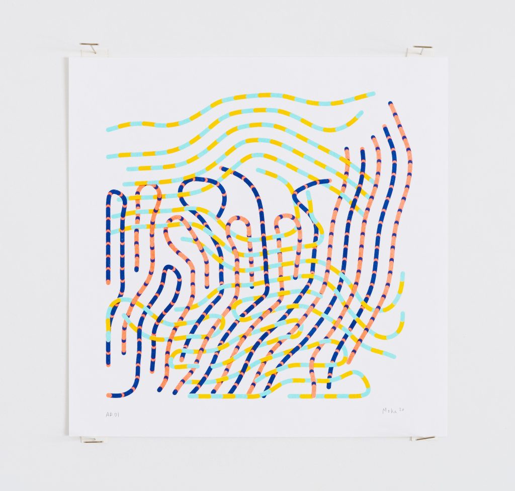
The work that I find inspirational is “Cables” created by Moka. It is the exact work that I like the ways of which the cables are intertwined in an order. Plus, the colors of the background and the cables are all appealing. The cables with light yellow and blue are spread horizontally and the others with pink and deep blue are spread vertically, but we don’t find the whole artwork to be complex, instead I think it is rather neat. I suppose the algorithm that generated the work is a program that can select the colors of the “lines” and the intervals of each color. The lines are probably on different covers so that they seem to be up or below one another. The artist hopes that his works can reveal a similar relationship between us and the machines. The crooked cables are arranged parallel to one another, and I think this is telling the audience how complicated information is transported and how the development of technology is forming our lives in a way that we don’t usually perceive. The different colors of each cable illustrates a different type of material that is transported through cables, whose colorfulness shows that our wonderful and convenient life is a bliss from technologies.

LO1-My Inspiration
The technological design that has inspired me is the new Burberry logo drawn by Peter Saville. The logo is created by him but Ricardo Tisci, the chief creative officer of Burberry, also had a discussion with Saville over what brand value should be included. He first tried to learn about the main objectives of the business by getting to know its brand culture and history. After talking to Ricardo, Saville realized that he needed to find a signature that can either be a logo on chiffon blouse and be inside the trench coat. He also considered how Burberry contains two Bs and three Rs. Saville attempted to gather the capital letters of Thomas Burberry and what the consumers like together. This has encouraged me to think of how to put different elements in one logo and bring such influence to the world. I think Saville has definitely used custom softwares due to the orderly arrangements of the monograms. Saville might not be inspired by others, but he surely had compared his previous experience on monogram design for Calvin Klein to this design for Burberry, which he found a difference between refocus/reorientate for Calvin Klein and represent the values of Burberry. By contrasting their specific needs for a new logo, Saville was able to design a monogram that represents Burberry for its 150-year-long history.
Wray, Adam, et al. How to Rebrand a Fashion Label.Vogue Business, 31 Jan. 2019 www.voguebusiness.com/companies/peter-saville-fashion-logo-design-burberry.
![[OLD FALL 2020] 15-104 • Introduction to Computing for Creative Practice](../../wp-content/uploads/2021/09/stop-banner.png)