LO 07 – Data Visualization

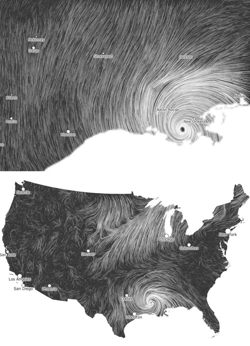
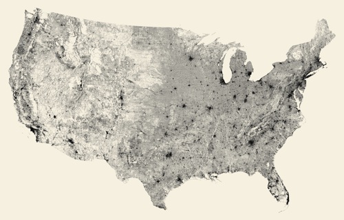
Wind Map (2012 – present)

Martin Wattenberg and Fernanda Viegas 

Wattenberg and Viegas’ Wind Map.

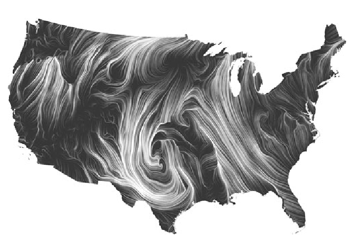
Martin Wattenberg and Fernanda Viegas’ Wind Map visualizes the tracery of wind flow over the United States in the most basic and familiar way—visual motion. On calm wind days, the artwork can be a “soothing meditation on the environment” (Wattenberg), whereas during hurricanes, the piece can become overwhelming and terrifying. Something that I found interesting was that bird watchers actually use the map to track migration patterns, and cyclists use it to prepare for trips. Even conspiracy theorists use the map to track mysterious air chemicals. Data for the wind map was collected from the National Digital Forecast Database, and Wattenberg took inspiration from Edmund Halley (1686), who developed the technique of using comet-like trails to visualize motion. Wattenberg used HTML and JavaScript. 

Images of the Wind Map during Hurricane Isaac (September 2012).

Looking Outwards 07 – Information Visualization

Image of Unnumbered Sparks

Unnumbered Sparks is a project by Aaron Koblin and Janet Echelman. This interactive monumental sculpture is a crowd-controlled visual artwork that is installed in air on a large canvas. The designs and colors of the sculpture are based on the visitors present in the area through their mobile devices. People are able to use their phones to paint different colors of light across the artwork. Every single movement of the mobile devices project vivid beams of light in the artwork. What I admire about this sculpture is that it is interactive with the audiences in the area. Thus, I find the large scale and complexity of the installation is really inspiring as a design major. The computational software that is used in this artwork explores different scale, shape, density, and interaction with visitors. The material used in this installation is also very interesting, because the structure of the sculpture is made with soft fibers that are attached to existing buildings in the area. The exploration of unique materials and interaction really shows how much the artists focused on the connection between installation and people. Computation technology is successfully used in this interactive sculpture and it also shows the creator’s sensibilities to incorporate art and people into the project.

Website:  http://www.aaronkoblin.com/project/unnumbered-sparks/

Video of Unnumbered Sparks

LO-07: Information Visualization

The project I chose this week was Aaron Koblin’s Amsterdam SMS. This project is an interactive visualization tool developed for the MIT Senseable City Lab which helps visualize SMS messages data. I admired this project because I was drawn to the boldness of the colors and like any artwork done using data, I just thought it was very interesting and cool. To generate this work, Koblin used Processing and OpenGL. The data he used was provided by KPN Mobile. Like his other works, Koblin uses bright colors or “light” (he doesn’t actually use light in this project but the bright colors do give off a similar effect!) to stimulate our sight and draw attention to the artwork.

Video of Amsterdam SMS Messages on New Years Eve (2007)

LookingOutwards-07

The project that inspired me is Kepler, developed by Roberto Fazio. Kepler is an interactive immersive experience based on NASA open data describing in real-time the properties and features of most exoplanets discovered up to the present time. I think the concept of having real-time updates instead of using the algorithm to summarize the data collected over years is very intriguing. Also, the way they visualize data in virtual reality creates a fresh sensation and curious experience, which is suitable media for the content Kepler displays-always going beyond the limits of the knowledge, proceeding into the unknown world.

video of “Kepler”

As for the algorithm, I know that Kepler is recorded in real-time from the Unity 3D application. I happened to know a little bit of unity. It is a very powerful software that combines coding, visualization, and even more functions, which allows artists, designers, and developers to create a real-time 3D immersive experience together.

Kepler’s representation of exoplanet

In the past, perhaps most people learn about exoplanet through documentary film or vague images captured by spacecraft, which do not necessarily convey the thrillingness of the discovery. I would say the creator’s sensibility is manifest through finding the most suitable media that perfectly embody the content, which, according to the creator, “ shapes the relationship between creative technologies and anthropic observation, placing humankind as witness of the multisensory artistic experiment.”

Links:
https://frm.fm/a/roberto_fazio/kepler
http://studiorf.io/

Looking Outwards: Data Visualization

Bible Cross References by Chris Harrison, 2007

Bible Cross References Data visualization, Chris Harrison and Christoph Röhmild, 2007. It resembles a rainbow, similar to Noah’s Ark mentioned in the Bible.

This data visualization was a collaboration between Chris Harrison and Christoph Römhild. The data visualization depicts all of the cross-references in the Bible. There were over 63,000 cross references in total, and the challenge was to visualize this large amount of information in an elegant way. The bar graph at the bottom of the visualization represents all the chapters in the Bible. The length of each bar depicts the length of each chapter. Each cross reference is depicted by an arc, and the color of each arc corresponds to the stance of the cross reference between the chapters.

I admire the visual aspect of the data visualization. The data visualization was made so it resembles a rainbow, which also has symbolic meaning in the famous story from the Bible, “Noah’s Ark.” The connection between the Bible and data visualization was very interesting and relevant to the information Harrison was displaying.

I’m now sure about the algorithms that generated the work, but I think Harrison used an algorithm that was able to find cross references in the Bible, and compute its distance across chapters. Then, he would change the colors of the arcs based on the distance.

LO 7 – Information Visualization

For this week’s LO, I decided to take a look at Periscopic‘s AgEvidence project (Dr. Lesley Atwood, Dr. Stephen Wood, Periscopic), which includes 16,000+ data points visualizing the impact of conservation agriculture in the US.

This project is quite inspirational not only because of the massive scale and data collected/visualized but also the impact of the way that the designers have presented data. The Periscopic data visualization firm collaborated with The Nature Conservancy on this project to help researchers from the Science for Nature and People Partnership team to synthesize and illustrate findings from over 40 years of agriculture research. AgEvidence displays the effects of conservation practices such as reduced tillage, early-season pest management, and cover crops on the environment and food production, as well as distinguishes research-rich and -sparse areas. I believe that the researchers first extracted and processed the data, then using percentage changes and nested levels to computationally visualize it.

I appreciate that the creators included key insights to highlight patterns in the data and make it more accessible to users. Moreover, they have allowed for easy data access and transparency through options to download filtered/holistic data sets so that users can discover even more nuances.

AgEvidence interactive tool: observations and map of study locations
detailed insights that make data more accessible

LO 7: Information Visualization

All Street Limited by Ben Fry

An Information Visualization project that I really admire is All Streets Limited by Ben Fry. In his work, Fry created an intricate map of all the streets in the 48 states of the United States. To achieve this incredible work, Fry translated data from the U.S Census Bureau into a map by first,  using Perl.Next to parse and filter data. Writing in javascript, Fry applied the Albers equal-area conic projection to transform latitude and longitude coordinates. Later, he converted his work into print. I really enjoy looking at his work as it is a great illustration of how the interconnectedness of little elements–small streets and roads–can make up a system–the map of the United States–showing the complexity that is not usually tangible or is overlooked. His work reveals the universal truth of how things operate and the power of systems–from an atom to the universe.

Link : https://3rdfloor.fathom.info/products/all-streets

Title: All Streets Limited

Creator: Ben Fry

Year: 2007

LookingOutwards-07

This project creates visualizations for the way that content is shared through Facebook. It creates branching organic visuals on a pastel background to show the different rates and tree-like structure that describes media dissemination using Facebook. The exponential share-based structure allows the graphic to start at the center and branch out to fill the space, so I think the algorithm may assign share trees randomly around the centerpoint to then extend in a somewhat linear fashion, but the curves of the branches may describe unique share patterns. The creator’s artistic sensibilities are manifested through the visual display of the linkages (the leave/flower graphics) and the algorithm that dictates the organization of the branches.

https://rachelbinx.com/Facebook-Stories-Virality

LO 7 – Information Visualization

“Multiplicity” by Moritz Stefaner

With an increase in use of technology, people’s city experiences have been collectively and continuously been documented on social media platforms, shaping a virtual city image. Designed and implemented by Moritz Stefaner in 2018, “Multiplicity” is a collective photographic city portrait that provides an immersive dive into the image space spanned by hundreds of thousands photos taken across Paris.

Collective photographic city portrait of Paris in 2017

Using machine learning techniques, “Multiplicity” is based on a sample of 6.2m geo-located social media photos posted in Paris in 2017, and it organizes images by similarity and content, allowing the audience to visually explore niches and microgenres.

Images organized by similarity and content

The projection spans three 1080p squares arranged in a slightly angled triptych structure, which allows for a more immersive experience, and visitors can navigate the manually annotated map using a touch device as well as a physical joystick. Overall, Stefaner intended to portray the city by using an arrangement of qualitative contents, encouraging viewers to explore and interpret on their own terms.

Immersive experience created by slightly angled triptych structure
Zooms portrayed in “Multiplicity” by Moritz Stefaner

LO 07: Information Visualization

This week, I decided to look into the visualization of data on the NASDAQ Stock exchange. The different examples all represent a single minute of trade that occurs, the images on the top using a unique color to represent the trader, and the images on the bottom using unique colors to represent each stock. When there is a big grouping of the same color on the top, it means that the same trader is buying and selling stocks. If this occurs on the bottom, it means that a single stock is going through different transactions. The reason why I chose this project is because I thought it was really interesting to see how a very complicated topic like trading can be simplified and visualized with colors. I am in awe of how the creator broke down the system and found out the most efficient way to represent the concept. Not only does the visualization hold value and meaning, simply put, the project is very visually pleasing and engaging. It holds the viewer’s attention on the screen due to the movement and engagement, which is also useful to begin understanding the extent and depth of this project.