![[OLD FALL 2020] 15-104 • Introduction to Computing for Creative Practice](wp-content/uploads/2021/09/stop-banner.png)
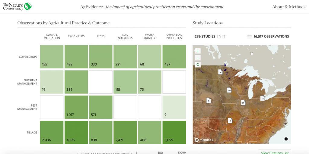
For this week’s LO, I decided to take a look at Periscopic‘s AgEvidence project (Dr. Lesley Atwood, Dr. Stephen Wood, Periscopic), which includes 16,000+ data points visualizing the impact of conservation agriculture in the US.
This project is quite inspirational not only because of the massive scale and data collected/visualized but also the impact of the way that the designers have presented data. The Periscopic data visualization firm collaborated with The Nature Conservancy on this project to help researchers from the Science for Nature and People Partnership team to synthesize and illustrate findings from over 40 years of agriculture research. AgEvidence displays the effects of conservation practices such as reduced tillage, early-season pest management, and cover crops on the environment and food production, as well as distinguishes research-rich and -sparse areas. I believe that the researchers first extracted and processed the data, then using percentage changes and nested levels to computationally visualize it.
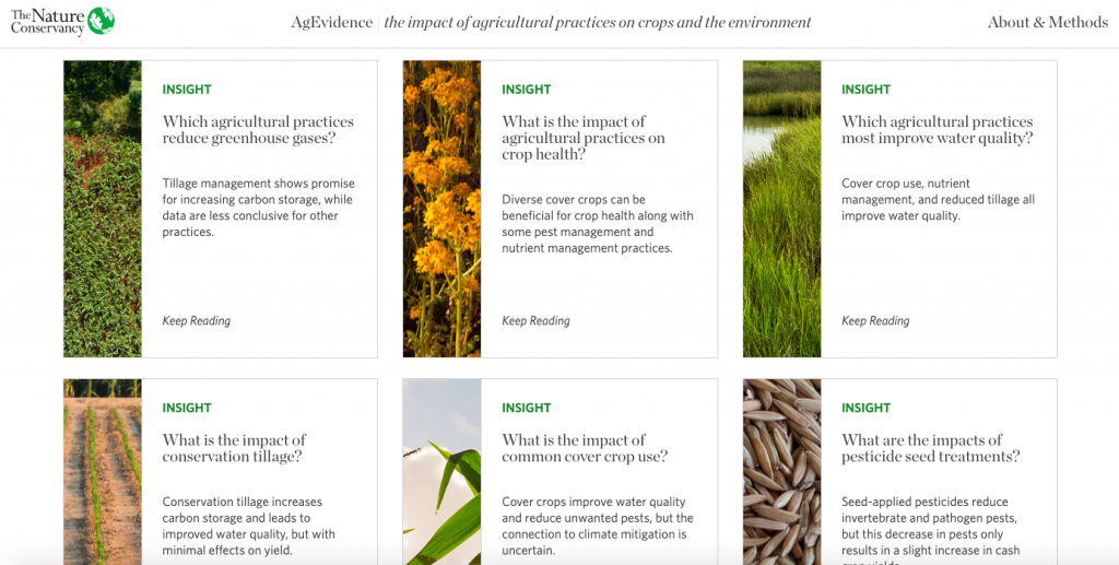
I appreciate that the creators included key insights to highlight patterns in the data and make it more accessible to users. Moreover, they have allowed for easy data access and transparency through options to download filtered/holistic data sets so that users can discover even more nuances.