![[OLD FALL 2020] 15-104 • Introduction to Computing for Creative Practice](wp-content/uploads/2021/09/stop-banner.png)
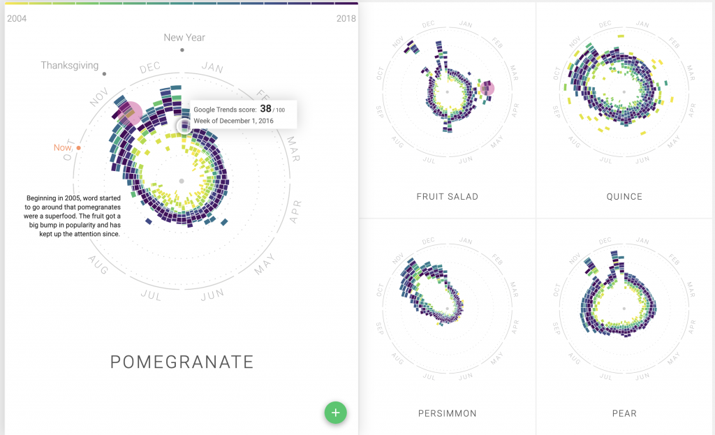
The Rhythm of Food, a project lead by Moritz Stefaner and the Google News Lab, investigates seasonal patterns in food searches. By looking at Google search data and plotting over 130,000 data points, this team was able to create a radial “year clock” chart which reveals the seasonal trends for various food/drinks. For the visualiation, each year is represented by a different color, and the segmented block’s distance from the center represents the relative search interest. the project was built using ES2015, webpack, react, Material UI, and d3 v4. I particularly enjoy the evolution of the visualization, and how the team organically found their way to the seasonal trends. It can be a daunting task when attempting to investigate a complex cultural phenomenon, but when done well, it becomes easy to appreciate the simplicity of presentation.