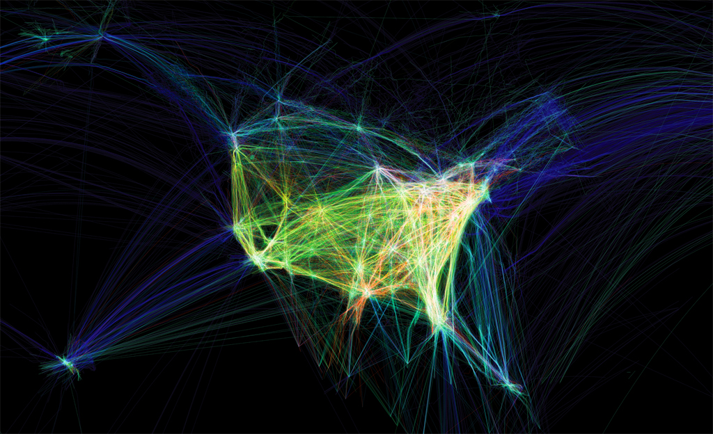
Looking Outwards 07 (Information Visualization) by Shruti Prasanth talks about Aaron Koblin’s Flight Patterns. I was first drawn to the project because of its aesthetic visuals. The contrast between the dark background and bright neon lines were eye-catching, and the shapes created by overlapping strings give an interesting pattern. I definitely agree with Shruti that the overlapping intersections of the strings really enhance the visuals of this project, especially because the lines glow brighter at the intersection point which shows the density of the air traffic. It was interesting to know that Shruti finds this map similar to the map she saw in global history class about traffic patterns of slave ships. I definitely see the similarity between the visuals of the traffic patterns of slave ships in American history and the Flight Patterns by Aaron Koblin, because they both use lines to represent the traffic patterns. The interesting part I personally think about the connection between the two maps is that one represents the traffic pattern on the ocean and the other represents the traffic pattern in the sky. We can compare and see how much technology has developed over time, and also see how different transportation is. The contrast between the colors of the background and the strings definitely makes the shape of the United States more clear in the project, but I personally think the dark spaces in the background represents the “air/sky” rather than the “sea”. The visuals of the project to me feels like the strings are placed in mid-air. I personally interpreted the strings to be visual representations of trails left behind planes, something like contrails.
Link to Aaron Koblin’s Flight Patterns here
Shruti Prasanth’s Looking Outwards-07, October 18, 2020: https://courses.ideate.cmu.edu/15-104/f2020/2020/10/18/lookingoutwards-07-6/
![[OLD FALL 2020] 15-104 • Introduction to Computing for Creative Practice](wp-content/uploads/2021/09/stop-banner.png)