LookingOutwards-03

The project I’m choosing is called “Grotto” by Benjamin Aranda and Chris Lasch. I enjoy how this project looks because it has a fascinating premise. The project is based on the work of Wilson Bentley who worked for 45 years to prove that no two snowflakes are alike. He documented 5,381 individual crystals to notice patterns that are key inspirations behind the logic of “Grotto.” Though each snowflake is different, they follow certain rules, especially the rule of six, that not only constitute the number of sides a snowflake has but also describes the molecular relationship. This concept is used in the project, where only one simple rule is followed to maintain consistency between geometries, but it is demonstrated that possibilities generated from varying how such a rule repeats prove endless. I think that the algorithm is produced in a similar logic; one simple rule, for example, limiting the number of sides that each component can have, is kept, and then different functions loop in order to seemingly endlessly generate the shape to produce different conglomerations. In the final form, I can see much artistic sensibility, as it seems that inspirations from nature were taken to create these forms. For example, in some generated patterns, the result resembles a clump of snowflakes, as a form of direct inspiration from Bentley’s work, and in others, the product looks more like a flower.

“Grotto” proposal

Looking Outward #3

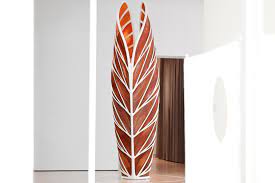
For this week’s Looking Outwards, I looked at Neri Oxman’s Mediated Matter group. This project was active 2010 to 2021. One thing I liked about their project was that their designs were inspired by nature. I think there is a pattern in generative art, where people often aim to make things that don’t look like they were made by people. The ability of a computer to pick absolutely random values is something humans have difficulty with, but emulates the natural growth of things (to some degrees at least). This is one of several projects I have noticed that emulates the structure of veins in a leaf. 

My favorite project from this group is Aguahoja III. This piece inspired me because of how beautiful it is. It looks like a plant from an alien planet. This sculpture doesn’t just look nice though, It also uses interesting materials and holds an interesting message. They took the idea of leaves to the next level and actually 3D printed this with cellulose, chitin, and pectin. The result is a tough leather like material that fits beautifully into the computer’s design.

Seeing things like this makes me excited to bring ideas to life. It sucks when ideas can only be digital, but when they can be brought into real life through sculptures and visuals, it makes me excited for all the cool stuff we will have in the future.  

https://www.media.mit.edu/projects/aguahoja-iii/overview/

Looking Outward – 03

Work Title: Momentum, 2008, Hollywood Hills

Artist: Matt McConnell

https://www.mattmcconnell.com/momentum https://www.youtube.com/watch?v=puuTwNM3-sI&t=49s

Designed by McConnell Studio are these interactive kinetic sculptures with sound elements embedded in them. The concept is to reflect the millipede’s motion of walking. When millipedes move, their legs move in a wave-like motion from back to forth. As the first pair of legs begin to go down, the second pair of legs are already coming up. I think this idea of biomimicry — taking what we observe in nature and making it become part of the art piece —is a valuable design process. Because the structure and form of the artwork are not decided randomly, it already has a clear algorithm methodology such as repetition, arraying, rotating, etc. Fundamental functions that can potentially generate these patterns include loops, mapping, and bezier curves. There is also sound incorporated into this artwork, which is probably caused by the movement of each curve. So each curve segment is given a pitch, and when the curve is in motion in a particular direction, the sound plays with a combination of different sound waves.

Looking Outward – 03

This video shows the process of building Digital Grotesque!

Digital Grotesque is a creation of architecture where the artist, Benjamin Dillenburger, uses algorithms to generate the geometry, and then uses sand printing to create the builds. The 3D printed sandstone parts (which are made up of sandstone and resin) can then be connected together to make up the completed piece, and it is huge. It is essentially printing architecture!! The artist uses a computer to generate very intricate, complex parts, and it is absolutely amazing to me that the computer was able to execute this amount of detail at such a large scale without needing any intervention. I also really admire the use of texture that is able to come through. Dillenburger shares that the precision is down to millimeters and that this kind of detail could never be drawn by hand as there are 260 million facets and 30 billion voxels. I often have thought about how modern buildings have lost their detailed quality, and this technology makes me wonder how the future of architecture and style could change with generative processes and technology.

Title: Digital Grotesque (2013)
Artist: Benjamin Dillenburger
Link: http://benjamin-dillenburger.com/grotto/

The Foldable Fractal

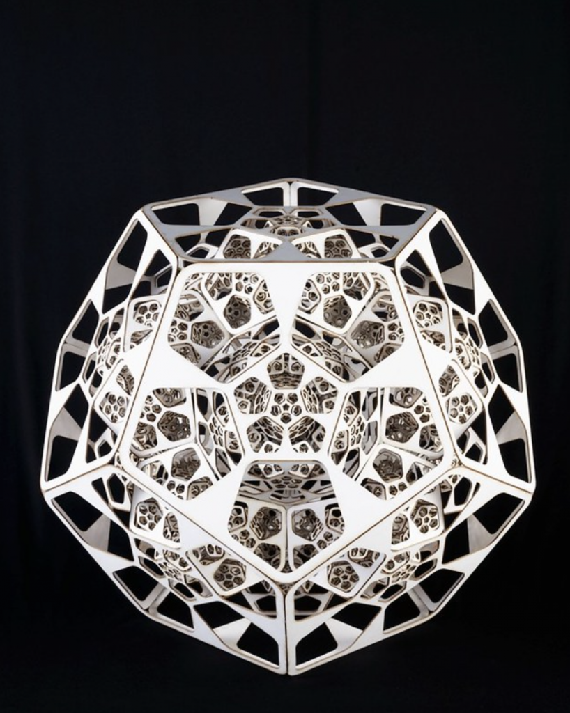
The project I found that I admire is “Foldable Fractal 2.0” by David Dessens who is a generative artist. This project was from 2008.

I admire the visual look of it a lot. It is mesmerizing and beautiful to just look at. It is also gives off clock vibes to me, and makes me think of time passing or gears turning, even though the sculpture does not move. The design of it is simple as well, it seems to just be a pattern of hexagons that repeat within each other to create the structure. I admire how peaceful it seems too. It is a design that invites the viewer to stare and dissect.

The algorithms that were used to generate this art was through using a recursive algorithm that is based on a lindermayer system. It uses a recursive algorithm of a pentagon shape after folding a pentagonal dodecahedron. I believe the artist used a program called Generator.x 2.0 to build the algorithm and sculpture.

“Foldable Fractal 2.0” by David Dessen (2008)

“Blooming” Fibonacci Zoetrope Sculptures by John Edmark

Alexia Forsyth

15104

09/13/22

“Blooming” Fibonacci Zoetrope Sculptures by John Edmark

John Edmark’s “Blooming” Fibonacci is a beautiful floral display of 3D fabrication.  His series is beautiful and inspiring. The amount of detail is truly spectacular to see in a 3D fabrication. Edmark has several pieces similar to the one below, each magical and awe-inspiring. According to the artist, the piece was inspired by the golden angle: everything is synchronized explicitly to the rate as the sculpture turns 137.5 degrees. Every petal is placed at a particular length from the center. It gives the appearance of petals moving: shifting outwards and shrinking at the corners. The 3D model spins at 550 RPMs and is videotaped at 24-frames-per-second. This creates a repeating optical effect. His artwork is special because it mimics phyllotaxis, the geometric arrangement of leaves on a plant stem.

Bloom

Blog 03: “Twisted Belly Vase”

By Ilia Urgen
Section B

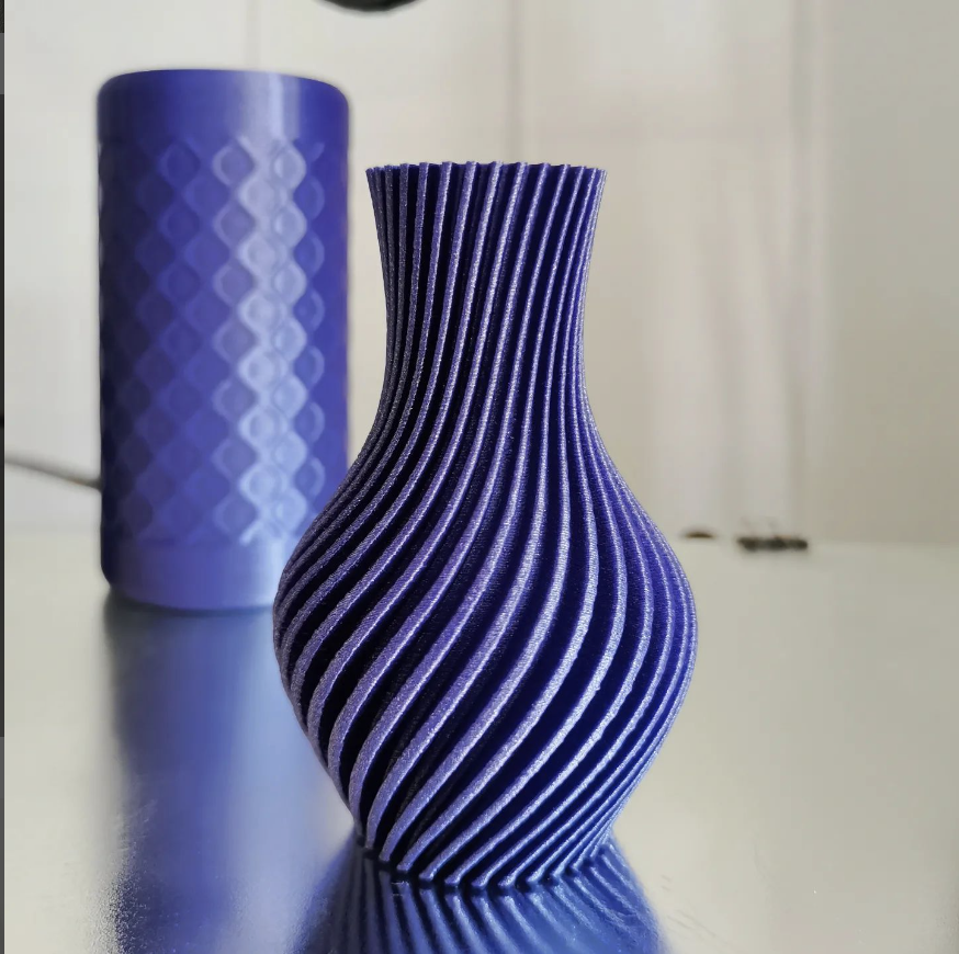
Twisted Belly Vase is a 3D printed object created on April 25th, 2022 by Instagram artist namu3d. The original size of the figure was 80mm by 60mm, but the model was printed 60% larger. Altogether, the print took around one-and-a-half, which is the average print time for a model of this size.

There are many features that make the Twisted Belly vase stick out, and my favorite design feature is the flow of the rather-vertical lines around the vase’s upper and lower diameters. The thinning neck around the center of the vase gives off the hourglass aesthetic, with the “belly” of the vase greatly expanding in proportion and then once again, returning to its original diameter size.

The software used to 3D print this vase was MakerBot, a highly ubiquitous design program. It allows the creator to explore various vector scales, rotations, and linear parallel lines, which are just three of many possible functions and variables when it comes to computational fabrication.

The creators of Twisted Belly Vase, namu3d, has made other aesthetically-pleasing vases, bowls, and cylindrical elements. His design style involves simple, yet complex-looking geometric shapes and unusual rotations. I have a deep appreciation of namu3d’s design style because I too, find beauty in the simplest geometric shapes found in the world around us.

“Twisted Belly Vase”
@namu3d on Instagram

Looking Outwards 03

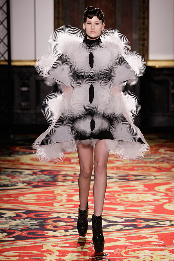
This project is a fashion line called Voltage by Iris Van Herpen, an architect-turned-designer. The line has pieces like a “skirt-and-cape combo lined with thousands of tiny white anemone-like nodules.” It essentially is a 3D printed (on an Object Connex) and laser sintered fashion line and a frontrunner of digital fabrication. What I find most interesting about the garments she made are that they have a mix of both soft/flexible and hard/structured elements. This varying of the softness and elasticity allows the clothes to have differing forms and ranges of motion. I assume that the process of production and the algorithms used are related to CAD, or computer-aided design, to make templates that can be used to make 3D models.

Iris Van Herpen’s Voltage , 2013

Video of Voltage line : YouTube video of Van Herpen’s full line

Look 5 out of 11

Blog 03 – Computational Fabrication – srauch

I’m inspired by the whole body of Micheal Hansmeyer’s work, but a piece of his that perhaps most outwardly displays the algorithmic nature of his architectural practice is Subdivided Columns. As Hansmeyer describes it, he did not design columns, but rather designed a process that produces a column. His algorithm “subdivides” the surface of a cylinder into smaller and smaller surfaces, applying different division ratios to produce unique forms. The final column is generated by breaking up the digital column into 2700 horizontal “slices”, which are laser cut out of greyboard and assembled.

In Subdivided Columns, Hansmeyer plays with the idea of the undrawable vs the unimaginable. Even though we can imagine these forms, or at least the idea of them, most computer software and traditional drawing techniques are incapable of generating them. With a computer’s help, for the first time in human history, we can actually realize them. It makes you think about how our work is the product of our minds and our tools. Hansmeyer’s work embodies the notion that with new computational tools, we can produce something deeply human – the kind of computational thinking we’ve been pondering for centuries – but at the same time, completely new.

Here’s a video showing the process used to create Subdivided Columns

lo: computational fabrication

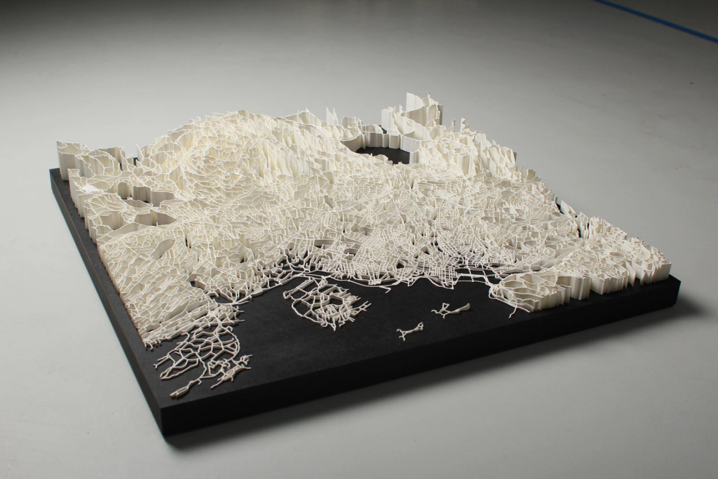
copyright bengler 2013 | 3D visualization of walking paths in Norway

While looking through the provided resources, one project that really caught my eye was Intersections by Even Westvang and Simen Svale Skogsrud. They looked at data of Norway pertaining to how people travel and live throughout the region and turned it into 3D elevation maps. I take great interest in data visualization and I think cross referencing data to make a 3D model is very very interesting, especially when the visual is representative of the data like it is here being the shape of the region surveyed. Since they were just working with raw data I’m sure the computational side wasn’t too hard. They probably just had to clean and aggregate the data to fit their desired outcome! I think the artistry is in the medium choice: 3D printing what could be a graph with 2 axes is a very compelling way to show arial data like the city information they were looking at. The tangibility of it works to emphasize the comparisons they sought out to make.

More information here.