//Paul
//kengpul
//Section A
var x;
var y;
var circ = [];
// determines the line and size of the circle creating the circle w line inside
var drawingLine;
var lineDeg = 0;
var circleDeg = 0;
var colorStep = 0;
var colorStep2 = 0;

function setup() {
    createCanvas(480, 480);
    background(random(50,70),100,random(150,256));
}


function draw() {
    //creating perilin colors
    //cghanges size of the elements based on mouse y
    drawingLine = map(mouseY,0,height,20,height/5)
    //background(240,170,20);
    push();
    translate(width/2,height/2);
    rotate(radians(circleDeg));
    bigCirc();
    pop();
    circleDeg += map(5,0,width/2,0,drawingLine)*1.5;


    colorStep = colorStep += 0.01;
    colorStep2 = colorStep2 += 0.005;

}


//two functions under creates a line that spins
//according to the center of the circle created in bigCirc(), this is done to replicate
//the effect of an Astroid but with an interactive twist

function insideLine(){
    push();
    stroke(100,255,100);
    strokeWeight(1);
    //moves origin to center and top so the lines can rotate as it should
    translate(width/2-drawingLine,drawingLine/2+drawingLine*2);
    rotate(radians(lineDeg));
    line(0,0,0,drawingLine/2);
    strokeWeight(7);
    var pointCol = 255 * noise(colorStep2);
    stroke(pointCol,10,10);
    point(0,drawingLine*2);
    pop();
    //changes how "circular" the dots are printed
    lineDeg += map(mouseX,0,width,0,5);
}

function bigCirc(){
    noFill();
    strokeWeight(1.5);

    //rgb value created with noise so each color doesnt vary too much circle to circle
    var r = 255 * noise(colorStep+5);
    var g = 255 * noise(colorStep+15);
    var b = 255 * noise(colorStep+20);
    stroke(r,g,b);
    circle(width/2-drawingLine,drawingLine/2+drawingLine*2,100);
    insideLine();
    //rotates the insideLine inside the circ
}
//when clicked , canvas resets with diff background so the program doesnt over crowd
function mousePressed(){
   background(random(50,70),100,random(150,256));
}
Category: SectionA
Blog 07
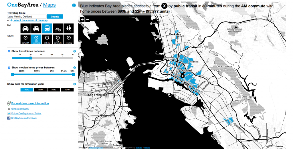
For this week’s blog about information visualization, I found the work by the Stamen Studio very compelling, especially the “OneBayArea Map” that mapps transit ranges around the entire bay area in one program. Besides the eye-catching and interactive homepage, their works include very strategic methods of making useful maps that get straight to the point without sacrificing information. The “OneBayArea Map” not only lets commuters understand commute time and distance, it directly relates this information with housing prices, helpful for homebuyers to find ideal homes to commute from. Moreover, it also encourages commuting methods like bussing, biking, and walking by showing how little time they actually take in some cases, comparable to single person vehicles. It also suggests concepts relating to socioeconomic status and access to public transportation systems. To do so, I think this project includes layering many different types of maps and consolidating the data of these, which is then transferred into codes to revisualize these data into an interactive map. The map’s aesthetics not only generates a nice looking program, but it also creates simplicity and clarity that is very important to an info-packed map.
https://stamen.com/work/onebayarea/
<img source=”https://courses.ideate.cmu.edu/15-104/f2022/wp-content/uploads/2022/10/oakland-30-2.png”>
LookingOutwards-07-UCSF Health Atlas
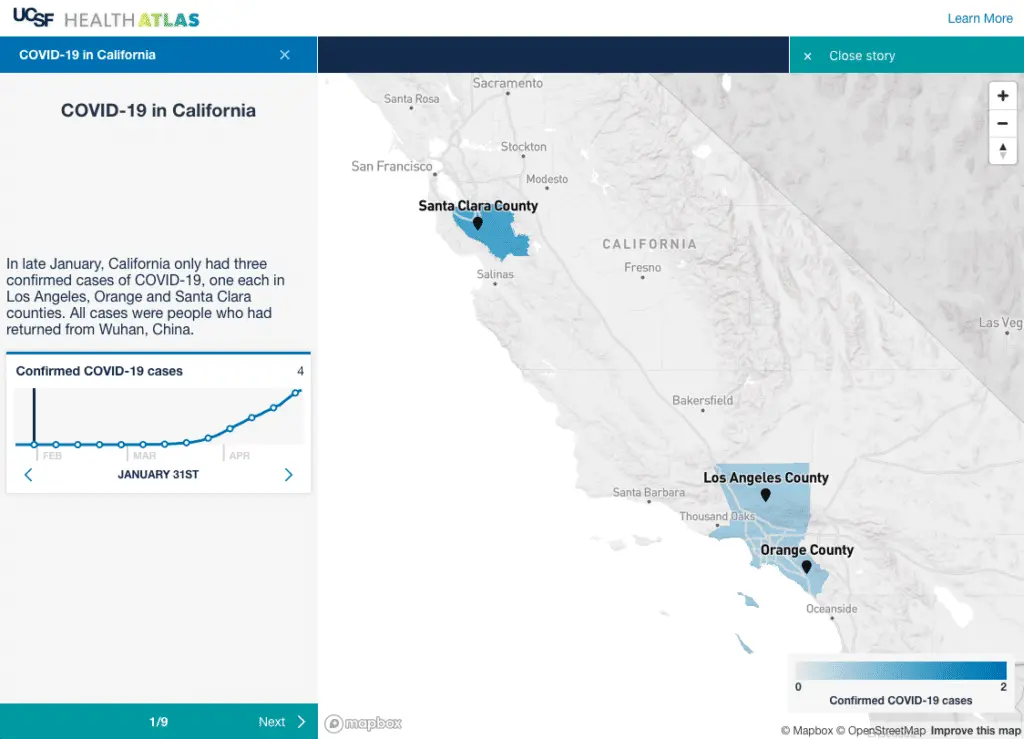
The UCSF Health Atlas is an online software that visualizes Covid 19 pandemic cases in all the counties in California. I admire its purpose, which is to explore the influence of “socioeconomic and environmental factors” during the pandemics, which means the project is based on census tract at a county level, and it allows us to see the detrimental influence of pandemics with our eyes.
For the Algorithm, I believe that it imports census Datas and data of covid cases into the website. Then the web divides the cases into different data sets on a county level and uses different coloration to represent the severity of the pandemic. The blue the county is on the map, the more covid cases it has, and yellow represents the amount of people who died from the pandemic in that county.
The artistic sensibilities manifest in the final form of a map of blue California that shows the number of the covid cases based on its lightness, because the darker colors mean more cases. I hope it becomes a map of the whole planet in the future, so people all over the world can know when to be cautious about pandemics.
Link: UCSF Health Atlas Author: Collaboration of UCSF School of Medicine Dean’s Office of Population Health and Health Equity led by Debby Oh and Stamen Design Year of Creation: 2020(To my best Knowledge)
Looking Outwards: 07
The Atlas of Moons by National Geography is a mesmerizing set of all the moons currently present in our solar system (which I personally had no idea about). National Geographic is no stranger to beautiful images of the world around us. This visualization is a much-needed reminder of how lucky we are to be able to witness and live amongst something like this in our lifetime. According to National Geographic, our solar system hosts over 200 moons that we currently know of, including our own. The purpose of National Geographic is to broadcast nature and space as we currently know it, making it accessible to the average person. This visualization is scrollable, starting with background information to the various moons that exist in the solar system. Viewers can scroll through, compare, and get lost in space from their own homes.
Project 07
this is my project.
var nPoints = 400;

function setup() {
    createCanvas(400, 400);
}


function draw() {
    background(0);

    // draw the curve
    push();
    translate(width/2, height/2);
    drawEpitrochoidCurve();
    pop();

    push();
    translate(width/2, height/2-20)
    drawCardioidCurve();
    pop();
}

//--------------------------------------------------
function drawEpitrochoidCurve() {
    // Epicycloid:
    // http://mathworld.wolfram.com/Epicycloid.html
    noFill();
    strokeWeight(1);

    //change color
    if (mouseX< width/2) {
        stroke(0, 50, 233);
    } else {
        stroke(81, 211, 255);
    }

    var x = constrain(mouseX, 0, width);
    var y = constrain(mouseY, 0, height);
    var a = map(x, 0, width, 50, 150);
    var b = map(y, 0, height, 1, 6);
    var h = constrain(mouseY, 50, 90);

    //draw Epicycloid
    beginShape();
    for (var i = 0; i < nPoints; i++) {
        var t = map(i, 0, nPoints, 0, TWO_PI);

        x = (a + b) * cos(t) - h * cos(t * (a + b) / b);
        y = (a + b) * sin(t) - h * sin(t * (a + b) / b);
        vertex(x, y);
    }
    endShape(CLOSE);

}


//--------------------------------------------------
function drawCardioidCurve() {
    //Cardioid
    // https://mathworld.wolfram.com/Cardioid.html
    push();
    translate(x, y);
    rotate(radians(-90))
    var x = constrain(mouseX, 0, width);
    var y = constrain(mouseY, 0, height);
    var a = map(x, 0, width, 20, 80);
    var b = a/2;

    //change color
    if (mouseY > height/2) {
        fill(233, 50, 50, 200);
    } else {
        fill(169, 22, 22, 200);
    }

    //draw cardioid
    strokeWeight(1)
    stroke(244, 82, 255);
    beginShape();
    for (var i = 0; i < nPoints; i++) {
        var t = map(i, 0, nPoints, 0, TWO_PI);

        x = a*cos(t)*(1-cos(t));
        y = a*sin(t)*(1-cos(t));
        vertex(x, y);
    }
    endShape(CLOSE);
    pop();

}
Looking Outwards-07
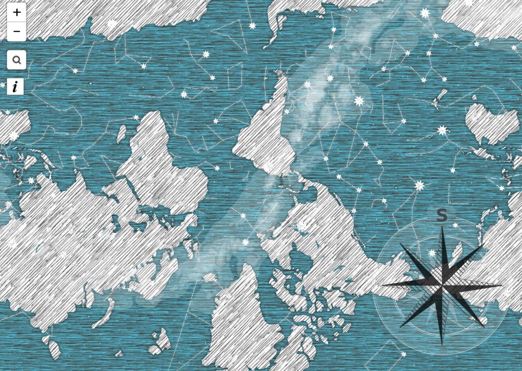
I really admired Patricio González Vivo and Jen Lowe’s map “Guayupia”, which is created for their son, and it’s a great example for discovering about data visualization. They think beyond typical standard and restrictions in creating a map: they want to use this map to tell their son where he comes from and the unlikely fact of his existence. So this is a map exploring about culture and history rather than simple numerical information. They explore South America and Argentina history from different aspects, and there are many different components in this map. The thing I found is interesting is that they also make their map become a symbol of culture: they combine stars with human, creatures and god, and they even incorporates the mass migrations of the Tupi-Guarani people.
Lowe uses basic lines and shading to construct this map. They use lines to show star, land and coastline based on history research, shading is used to show migrations. I like the color of this map and how they use uniformed ways to represent different things.
link: http://themapisnot.com/issue-iv-patricio-gonzalez-vivo-jen-lowe
Project 7 – Curves
It slowly draws a butterfly if u move your mouse from left to right!
/*
 * Andrew J Wang
 * ajw2@andrew.cmu.edu
 * Section A
 *
 * This Program is ButterFly and Flower Curves
 */


function setup() {
    createCanvas(480,480);
}

function draw() {
    background(220);
//create constrain for the rest of the codes' mouse X and Y
    var conY = constrain(mouseY,0,height);
    var conX = constrain(mouseX,0,width);
//create two array sets for Flower's X and Y
    var pointX2 = [];
    var pointY2 = [];
//remapping A and B with mouse X and Y
//A => inner circle, B => outer circle
    var a = map(conY,0,width,50,150);
    var b = map(conX,0,width,5,15);
    var h = 20;
//using for loop to get points
    for (var k=0; k<=2000; k+=1)
    {
        //2 PI but 2000 points
        var t=k/1000*Math.PI;
        //epitrochoid formulas for X and Y
        var xP2= width/2+((a+b)*Math.cos(t)-h*cos(((a+b)/b)*t));
        var yP2= height/2+((a+b)*Math.sin(t)-h*sin(((a+b)/b)*t));
        //push values to lists
        pointX2.push(xP2);
        pointY2.push(yP2);
    }
//connect vertexes and close them
    push();
    noFill();
    //stroke
    stroke(0);
    strokeWeight(5);
    beginShape();
    for (var k=0; k<=2000; k+=1)
    {
        vertex(pointX2[k],pointY2[k]);
    }
    endShape(CLOSE);
    pop();
//connect vertexes and close them
    push();
    //no stroke only fill
    fill(255,200,200);
    strokeWeight(0);
    beginShape();
    for (var k=0; k<=2000; k+=1)
    {
        vertex(pointX2[k],pointY2[k]);
    }
    endShape(CLOSE);
    pop();
//same logics but this time it is the butterfly curves
    var pointX = [];
    var pointY = [];
    for (var k=0; k<=2400; k+=1)
    {
        //Mouse Y dictate how big the butterfly will be
        var xP= width/2-map(conY,0,width,0,100)*Math.sin(k/100*Math.PI)*((Math.exp(Math.cos(k/100*Math.PI))) - (2*Math.cos(4*(k/100*Math.PI))) - (Math.pow(Math.sin((k/100*Math.PI)/12), 5)));
        var yP= height/2-map(conY,0,width,0,100)*Math.cos(k/100*Math.PI)*((Math.exp(Math.cos(k/100*Math.PI))) - (2*Math.cos(4*(k/100*Math.PI))) - (Math.pow(Math.sin((k/100*Math.PI)/12), 5)));
        pointX.push(xP);
        pointY.push(yP);
    }

//this time I use smaller circles to represent the curves
    fill (90,map(conY,0,width,0,255),100);
    stroke (90,map(conY,0,width,0,255),100);
    //mouse X dictates how many circles
    for (var k=0; k<=conX*4; k+=1)

    {
        circle (pointX[k],pointY[k],3);
    }
    }
Looking Outwards – 07
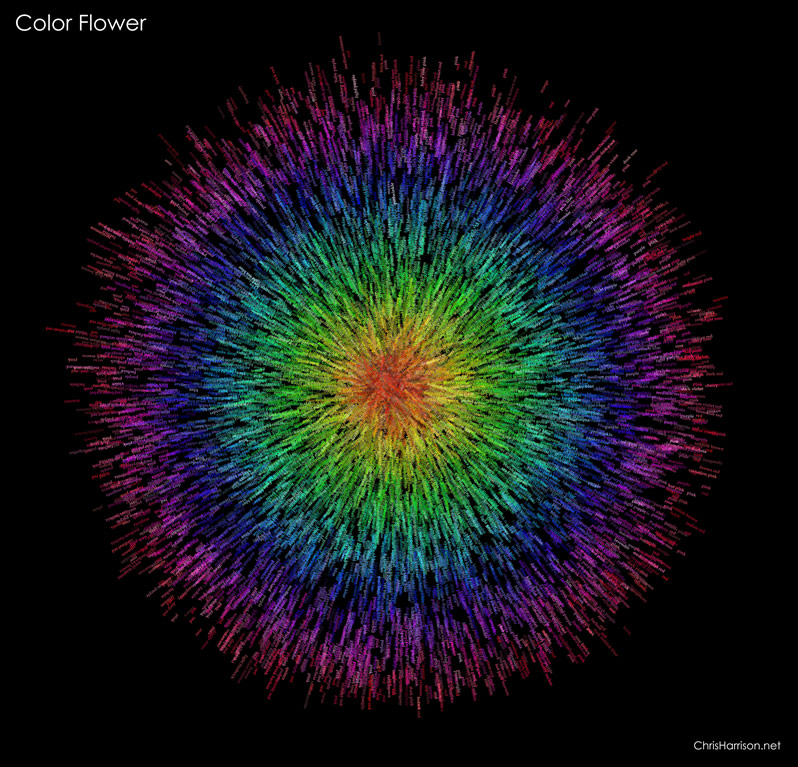
I really admire how Chris Harrison did his color flower, and the way he made his algorithm to create these sets of patterns is amazing and visually satisfying to look at. Although he didn’t specify how he made his algorithm, I can still guess a few of the steps that he took to make this work of art. First he made a set of point data within a boundary of a circle, and assigned values of those points based on the distance of them towards the center of the circle. Then, he used the points and the center of the circle to create vectors from the points and go away from the center of the circle. Eventually, based on hue value stored on each circle, they grab the name of the named color and list them on the vector using the color with the corresponding hue value, making this image a colored and worded art piece. Also, I love that he’s able to use the same algorithm to generate images not just circular but other shapes, such as spirals and others.
Link: https://www.chrisharrison.net/index.php/Visualizations/ColorFlower
Moritz Stefaner’s Impfdashbord
Looking Outwards 07: Information Visualization
Alexia Forsyth
Moritz Stefaner is an independent designer and consultant that specializes in data visualization. She is dedicated to helping organizations develop research and data into something beautiful. I really admire the practicality of Stefaner’s work. This type of visualization seems like a useful skill to have in any career path. Her Impfdashbord describes Germany’s Covid-19 vaccine information. She prioritizes a mobile-first design approach, avoiding the common chart formats. As part of her design she even added a “vaccination clock” to help viewers visualize the pace of vaccination. Her dashboard is really creative and seems to genuinely make an impact in how Germany, and world viewers see the success of covid vaccines. She uses social media preview images and utilizes favicon and puppeteer to generate a cohesive set of images that accurately represent the data
link: https://truth-and-beauty.net/projects/impfdashboard
cabspotting SF
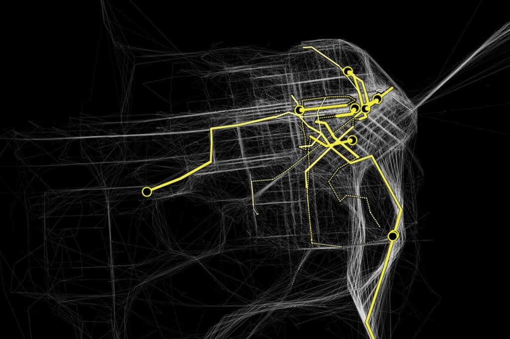
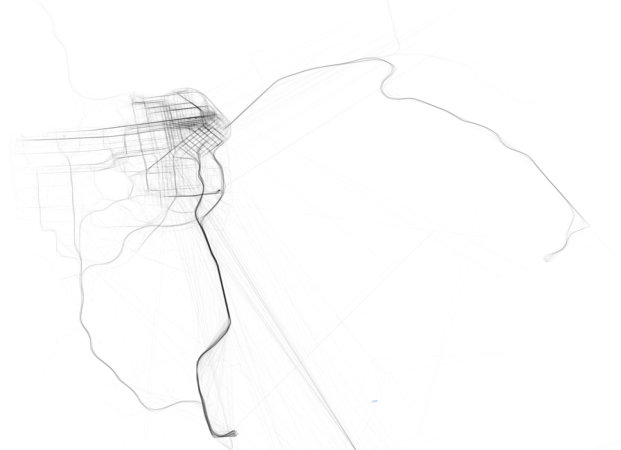
Cabspotting SF was created by Stamen Design for NYMoMA, originally as part of a research project called Invisible Dynamics (sponsored by the SF Exploratorium). This project was one of the first uses of realtime GPS data in data visualization. The movement of taxis is represented frame by frame as an array of semi-translucent yellow dots, which we can see intersect and densify in higher traffic areas. The concept is relatively simple, but the visualization is quite encapsulating (especially given that this project was done in 2008). The route of a single taxi can be singled out or compiled with the movement of all the other taxis at a given time and overlaid on a map that seems to glow. Stamen Design does many projects with a local focus, specializing in data visualization and cartography. They value aesthetics as well as thorough research, which is quite apparent in Cabspotting SF.
![[OLD SEMESTER] 15-104 • Introduction to Computing for Creative Practice](../../../../wp-content/uploads/2023/09/stop-banner.png)
