Jake Barton – Local Projects

Jake Barton is the founder of Local Projects, a media and physical design firm which specializes in creating interactive experiences. He is interested in the process of learning and memory: namely, escaping from the typical classroom method of lecture and memorization. Instead, he argues that we learn with our hands. The tools we use don’t just aid us, they inform our learning and actions. How can we engage in storytelling? Can we travel through time? Who tells the story? For example, in the 9-11 museum (designed in part by Local Projects), visitors hear oral histories from a vast array of different people. Visitors can participate by recording their own stories and memories, which are added to the museum archive, then shared and synthesized, thus making the memories more powerful.

Jake Barton presents at Eyeo 2015

In presenting the projects, Jake Barton reviews the core intents of the experience, then demonstrates these in practice by showing clips of people interacting with and reacting to the installation. This solidifies the otherwise lofty goals as educational aims that are truly attainable through great interdisciplinary design and storytelling.

As a student of architecture, learning design, and history, the engaging work of Local Projects fascinates me. Individuals can be active participants both in history and in their own learning process, rather than being silent receptacles of segmented facts.

Local Projects’ work at Cooper Hewitt encourages visitors to become designers. I was lucky enough to visit and design my own “wallpapers” and play with the various interactive interfaces.

Looking-Outwards-08

In this blog, I looked at Adam Harvey’s work and presentation. Harvey is a Interactive Telecommunications graduate of NYU with experiences in engineering and photojournalism at Penn State. In the presentation, he discusses his current projects, frame.io and megapixels.cc. Lots of his work deals with computations that are related to computer vision algorithms. For this specific presentation, it was a lot about the bias involved in surveillance and face recognition. I was really interested in the connection he makes within face recognition. In the lecture, Harvey also makes the unexpected connection between generic heat sensor camera softwares and ITA to aid his introduction. What I found very helpful was the examples he shows, especially short clips that demonstrate how their algorithms work through camera and imaging. Sections of the lecture like the one about the Brainwash Cafe were very helpful in demonstrating the risks in publicizing face recognition datasets and how they can be problematic. I really admired the way he not only showed us precedents of instances of problematic datasets, but he goes beyond to track where these datasets remerges and ends up in, to really demonstrate the risk involved.

(videos could not be embedded)

https://courses.ideate.cmu.edu/15-104/f2022/wp-content/uploads/2022/10/Eyeo-Festival-2019-on-Vimeo.html

VFRAME

Looking Outwards 08: Lucianne Walkowicz

As her biography page stated, Lucianne Walkowicz is an astronomer at the Adler Planetarium in Chicago, and the 2017-2018 Baruch S. Blumberg NASA/LOC Chair in Astrobiology. She got her PhD in Astronomy from the University of Washington. Lucianne is a TED Senior Fellow and a practicing artist who works for a variety of media , ranging from performance and sound.

The work I admire about Lucianne is her creation of JustSpace Alliance, a non-profit organization advocating for a more just and inclusive space exploration, because her work attempts to solve threshold problems, relating more ordinary people to space technology. One example of this is when she gives people in the New York Subway the opportunity to ask her questions about astronomy.

One strategy Lucianne used is to tell some jokes about herself to reduce stress from herself and the audience, which, I think, allows her to talk more fluently and casually. She also uses many images to visualize her presentation as she talks about each topic. One thing I learned is that I can add an icebreaker in the beginning to relax myself and the audience when presenting my own work.

Link: Not Not Rocket Science

Looking Outwards – 08

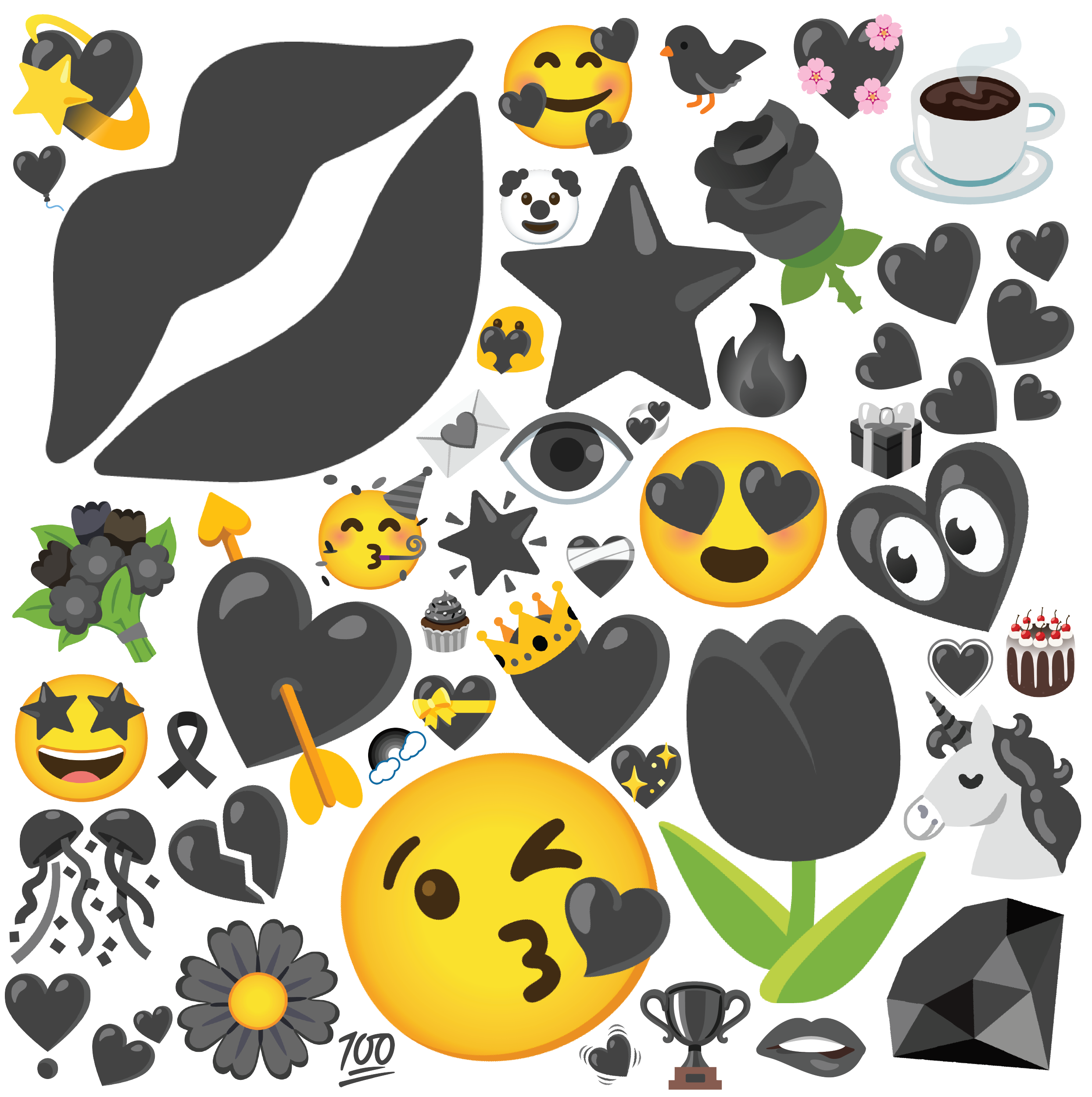
This week I watched the lecture of Jennifer Daniel, who is an American designer, editor, and illustrator, and she also leads the Emoji Subcommittee for the Unicode Consortium, while working for The New York Times and The New Yorker. What people might not know is that Jennifer initiated the gender-inclusive representation movement for the emoji creation group around the globe that shares the same sets of Unicodes for emojis. Among the new gender-inclusive emojis that she created, Mrs. Claus, Woman in Tuxedo, and Man in Veil are the most famous ones. I admire the movement because I think as we develop, we should make all aspects of our modern technology more inclusive for more and more people, to further facilitate our advances. To do this, she believes that we need more and more emojis that can better represent individuals, thus she and her team developed several emoji-related apps such as Emoji Kitchen. While introducing those emoji-related apps during her lecture, she started with the very core and basic definition and evolutions of emoji, then explained every issue of the emojis that we are using and why we should improve them, eventually demonstrating how her works can solve those problems. I enjoy watching her lecture because of how direct her approach to the topic is and how simple she made her works look to non-programmers.

Eyeo 2017 – Jennifer Daniel from Eyeo Festival on Vimeo.

Emoji Kitchen Examples:

Emoji Kitchen

Jennifer Daniel’s Website/Blogs: https://httpcolonforwardslashforwardslashwwwdotjenniferdanieldotcom.com/category/blog/

Looking Outwards-08

The artist I choose is Helena Sarin, a visual artist and software engineer. She is not only skilled with computing and software design, but also moonlighted in applied arts like fashion design. Her core art work with GANs (Generative Adversarial Networks), which provides her probability to create and try new model and new data, also giving unpredictability inspirations.

Her artwork has am interesting art philosophy, that seeing the world in a different way. The research GAN in her project firstly record the object without any emotional stuff, than the art GAN get rid of useless details in the recording and guide people to the essence by training data. And algorithm complexity, data ownership and idea all play important roles in her process of creating art.

The aesthetic value of GAN art is also need to be notice. Her work usually contains collaging different things together, fracturing images and recombining elements through algorithms to form new scene structure.

Link to her own website: https://aiartists.org/helena-sarin

Link to her speech: https://vimeo.com/354276365

looking outwards-08

Kawandeep Virdee

Kawandeep Virdee is the co-founder of New American Public Art, an organization that strives to create interactive art, “art that sees you,” in public spaces, so there’s never a paywall for the artwork. He places meaning-making and joy, especially that which is created in community or with other people, at the forefront of his practice. He does this not only by making his interactive art pieces customizable to the audience but also by being aware of the site or public setting which allows conversation to be made between audience members because, as he says in the video, you can always create more meaning with others than with oneself. I really admire his ability to do this through complete customizability, like in PDX I Love You where people create heart cutouts of anything (photos, maps, graphics, etc.) they like on Valentine’s day, because it allows an entire range and freedom within that range of meaning-making depending on whatever the audience member wants. His accountability of both accessibility and customizability perfectly accomplishes his goal as it creates genuine meaning-making in the face of certain obstacles, like the consumerism and societal expectations that usually engulf valentine’s day is countered by PDX I Love You’s way of creating meaning. The cool thing is that his work really ranges in the type of interaction as PDX was about sharing and love but he has spherical sculptures about the interaction of movement that’s simply fun for kids to play with and data-collecting visualizations of some kind of input that the audience can execute in real-time. He succeeds in the community effect he attempts to achieve by displaying his work in large public settings or a server that is being updated live so people can see their inputs simultaneously manifest with others. I thoroughly admire his placing of visual execution fully on the audience because it promotes artistic diversity, freedom, community, and spontaneity, which are some of the paramount reasons I am an artist myself. Thus, I see those aspects of presentation as very educational to my practice.

https://whichlight.com/

Looking Outwards 08

Hannah Wyatt

Nicole Aptekar is a digital artist based in Brooklyn, New York, who creates paper-sculptures, provoking deep questions about the world around us. Aptekar studied at NYU ITP, and has always strived to build a artistic-technical relationship with audiences, through mediums: musical synthesizers, painting, animation, digital art.

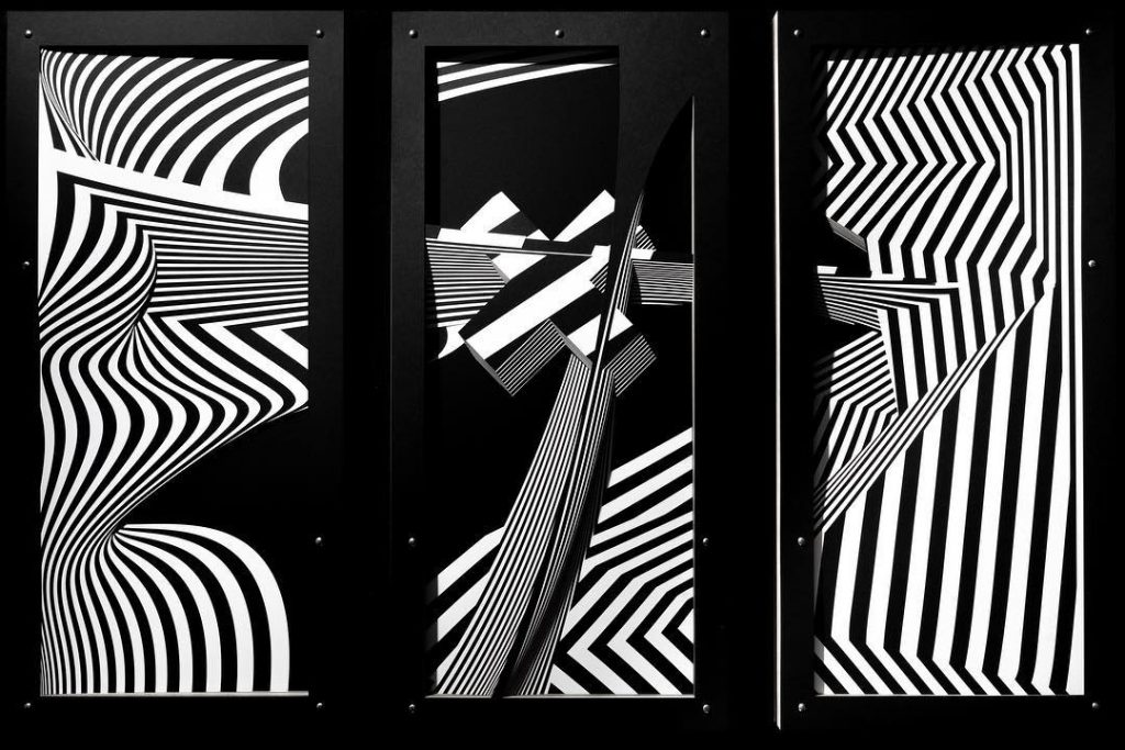
Aptekar’s work mainly depicts her dark anxiety/fear in a fictional landscape, complete with strong shadows, curves, and a black and white color palatte. After each piece is finished, she writes the moment the art represents- and an excerpt becomes the title. (Seen below)

I watch enraptured by the gaze of the mountains.

I also appreciate Aptekar’s acknowledgement of the creative process, and her expression of the hardships she faced along the way. From creating a fire- touch sensitive version of popular arcade game “Dance Dance Revolution” (see below), to a “LED lit, fire breathing, collaborative music sequencing, cube tornado!”, she has experimented with a lot to get where she is today.

Syzygryd: A Living, Breathing Kinescape | levitica neueVisit
Eyeo 2019 Video on Nicole Aptekar

The Creative Practice of an Individual: Amanda Cox

Alexia Forsyth
15-104
October 25, 2022

Amanda Cox presented for the Eyeo Festival in 2018 where she discussed processes, practices, and lessons she has learned through her career. She is the editor of a feature of The New York Times called The Upshot. It launched in 2014 and is aimed to provide news and commentary via graphics and charts. Amanda graduated from St.Olaf in 2001 with a bachelor’s degree in math and economics and graduated from the University of Washington in 2005 with a master’s degree in statistics. She won the National Design Award in 2009 and the Excellence in Statistical Reporting Award in 2012. I really admire Amanda’s work because it is useful and practical. Through her data visualization, she has been able to make a difference in media politics and information distribution. She worked on a project that measured the percentage of children who grew up rich and how their wealth changed as an adult. She looked into differences in race and incarceration rate. In the 2016 election, her team worked on a project called ‘Chance of Winning Presidency’ that repetitively forecasted the likelihood of Clinton and Trump’s success. Although the code behind each of her projects is complicated the outer visual is simple and user-friendly. She explained the impact and importance of her work more than the code behind it, avoiding using intimidating jargon.

Looking Outwards-07- Section A

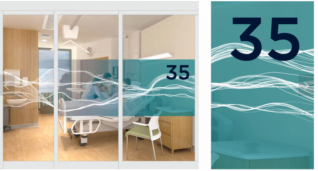
I was inspired by a piece by Stefanie Posavec that was made for the Papworth Hospital Inpateints Ward. Specifically, I thought the her “Flows” piece was super pretty. I liked the piece because of how she connected the hospital’s specialty on that floor (relating to blood and vessel) to a calming element found in nature. Not only did she include all these connections behind why she chose the design she did, I was inspired by how the piece was designed to calm patients who had just come out of surgery. I think this is really important because hospitals can be a scary place and it’s cool how she was able to create something really nice from data. I admire these aspects because art has the ability to make places seem less scary and help people though the tough time they are going through.

To generate this work, Posavec used data points from echocardiograms. The, she probably drew many curves connecting the point but had the height of the curves fluxuate a little bit (maybe using something similar to noise) so that it seemed like the lines were flowy.

Stefanie Posavec, Papworth Hospital Inpatients Ward, 2019

Here is the link and here is the image:

Stephanie Posavec’s piece is on each door of level 3 at the Royal Papworth Hospital. This is a sample of what it looks like.

looking outwards-07

Ben Fry – Mario Soup/All Streets

https://benfry.com/allstreets/

This work immediately intrigued me because of its nostalgic draw, but the arrangement and presentation itself make it become a truly standalone artwork. The method of extracting data that Ben Fry uses throughout his work really made me think about how data, in itself, doesn’t really mean anything unless assigned to a certain context or presentation. For example, All Streets is about the concentration and representation of roads in the USA on a map; however, the actual illustration of the data combined with the contextualization of what that data represents geographically, which is in constant engagement with how audiences interact with the map when making sense of it in their intersubjective interpretation of the map (what they call home, what they’ve assumed borders were, what they’ve assumed population/road densities were in certain places).

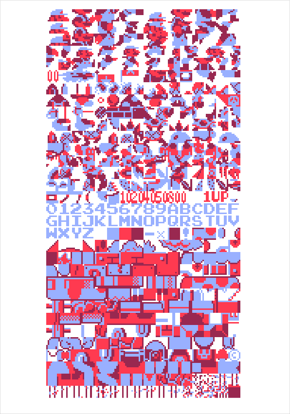
Thus, in Mario Soup, this method becomes even more meta. The data itself that was specifically made for art is revealed to the audience to be nothing more than pixels of color themselves by the reorganization of that data. Especially interesting is that this was how the data was arranged by the programmers of the game for the utility of the game itself, so utility organization has been flipped on its head as an aesthetic itself when was supposed to be the means of a different aesthetic–that for a game. This was done by decoding the raw data of a Nintendo game cartridge as a four-color image, according to Fry.

https://benfry.com/mariosoup/