![[OLD FALL 2019] 15-104 • Introduction to Computing for Creative Practice](../../../../wp-content/uploads/2020/08/stop-banner.png)
The Rhythm of Food is a visualization project led by creative director Moritz Stefaner in collaboration with Google News Lab. It takes 12 years of google search data and analyzes food seasonality. They developed a radial “year clock” chart to reveal season trends for specific food items like an apricot. The distance from the center shows the relative search interest and the different colors indicates a specific year. By having this, it allows an easier visualization of the year by year trends and rhythms.
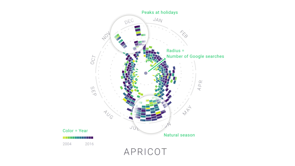
In order to make this project, Moritz used many different softwares like ES2015, webpack, react, Material UI, and d3 v4. What I admire is that Moritz took something usually boring and difficult to read in chart data, but now it is very aesthetically pleasing and easy to understand.
If you want to learn more about this amazing project, click this link:
http://truth-and-beauty.net/projects/the-rhythm-of-food