![[OLD FALL 2019] 15-104 • Introduction to Computing for Creative Practice](../../../../wp-content/uploads/2020/08/stop-banner.png)
Giorgia and Stefanie who share similar professional backgrounds – information designers – met at Eyeo festival in 2014. After spending time with each other, they decided to collaborate for the next Eyeo festival. Then, their collaborative project, Dear Data, was created. Giorgia is from Italy, but lives in New York City working at a company she co-founded, Accurat. Stefanie is from Denver, but moved to London. For their project, they wanted to use data as a way of communicating with each other and learn more about each other from different continents.
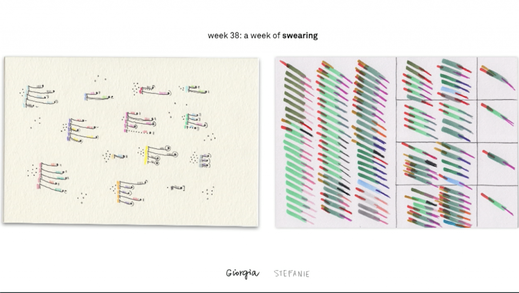
Each week, they had different topics such as how many times one has checked the time, how many times they have thanked someone, and keeping track of how many times they swore as seen above, but it was up to each of them to decide how and what kind of data to collect and the way of they would visualize the data. To add a personal touch on their data visualization – which is something they both value and care about as information designers – they decided to share their data through sending each other postcards. On the front side of a postcard, they would have their visualizations and explanations on the back side. By the time they gave the presentation at Eyeo 2015, they were on Week 40 of sending each other postcards.
This project was particularly interesting to me because, as people who could never meet each other, they found an unconventional way to get to know each other more, which was through sharing personal data. As information designers, they both value the personal and interactive ways of presenting data to people. This project taught me the power of making data visualizations more personal and interactive so that more people get engaged, which will be critical if you are delivering information to spread public awareness on an issue.