Gretchen Kupferschmid-Looking Outwards-07

an example of a data visualization generated by Halo representing various data

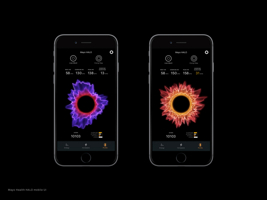
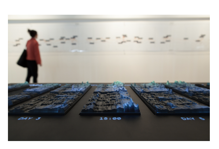
Created by Ora Systems, the project “Halo” is a visualization platform that can combine up to ten different data sets into a fluid multi-dimensional band of light. Ora currently works to develop “halo”s that represent patient’s health status, working with health companies such as Mayo Clinic to enhance the way we look at the health data of patients by creating responsive wearable-driven health identities through an app. Through familiarizing yourself with the visualization, the user should be able to easily understand and compare vast data sets. I appreciate the way this project combines both a creative and artistic approach to the output of the visualization with a technical advancement in its combination of so many different data inputs/sets. I also appreciate that this project can be used to solve problems through its design and not just be a visual.

reated by Ora Systems, the project “Halo” is a visualization platform that can combine up to ten different data sets into a fluid multi-dimensional band of light. Ora currently works to develop “halo”s that represent patient’s health status, working with health companies such as Mayo Clinic to enhance the way we look at the health data of patients by creating responsive wearable-driven health identities through an app. Through familiarizing yourself with the visualization, the user should be able to easily understand and compare vast data sets. I appreciate the way this project combines both a creative and artistic approach to the output of the visualization with a technical advancement in its combination of so many different data inputs/sets. I also appreciate that this project can be used to solve problems through its design and not just be a visual.

Lauren Park – Looking Outwards – 07

Artist Aaron Koblin visualized using bright colors and overlapping shapes to mark the many different pathways across North America by air travel. This project was originally developed by Scott Hessels and Gabriel Dunne for a project called “Celestial Mechanics” and uses data from the US Federal Aviation Administration (FAA) to help track these planes. This piece conceptualizes these pathways for over a 24 hour period.

I enjoy the visuals of this time-lapse animation piece because these colorful routes remind me of fireworks and show where each route starts and ends. It also paints a bigger picture for me to see how much the US relies on planes and how many airports we have. With the data collected from the FAA, the information was translated into these visuals through an open source programming called Processing.

The artist was highly successful in effectively displaying and color coding flights depending on each different type of flight. In contrast with the dark background, these bright colors also depict the relationship between humans and the technology we rely on. The way these pathways all come together to form a broad shape of the US is really powerful in communicating to viewers that we are systematically a part of this process of air travel.

“Flight Pattern” time-lapse animation (2005) by Aaron Koblin

Joseph Zhang – Looking Outwards – 07

Installation in San Jose Airport

As I scoured the internet for computational data visualization projects, I happed to find this installation, a physical project that I’ve walked by countless times on my way to various cities across the United States. This project is called eCloud, a data-driven project located in San Jose Airport that changes according to live weather patterns across the world. eCloud is a sculpture inspired by the formation and properties of an actual cloud, hence the clor and positioning in space. The design takes into account the sky weather, temperature, wind speed, wind direction, relative humidity, and visibility. With this information the polycarbonate tiles transition from full transparency to opaqueness, creating an elegant array of floating components. Some of the cities include Prague, Berlin, Los Angeles, and Rio De Janeiro

Complimentary digital interface

To accompany the installation, there’s a digital interface that shows all of the data currently used. This project really fascinated me because it takes a form in nature and abstracts it into something so artistic, yet still computational. This project is a good example of a design system—that is alone, each tile means nothing. However, when together, you get a beautiful cluster of data titles.

Jai Sawkar – Looking Outwards – 07

Phantom Terrains by Stefanie Posavec, Frank Swain and Daniel Jones

This week, I read about the work of Stefanie Posavec in Information Visualization. In her case, she used the silent wireless signals that surround us, converted into a sound that can be heard through specially modified hearing aids. She created a system of visualizing the wireless signals as they were heard on walks around London. 

Stefanie describes this as an “experimental platform which aims to answer this question by translating the characteristics of wireless networks into sound”. I find the graphic not only very interesting but find the premise in which it was derived interesting as well. She essentially brings a sonic ambiance into a visual resolution, creating a conversation about what else can we not visualize but can represent it through information visualization.

Link

Jina Lee – Looking Outwards 07

This is the physical installation created by Studio NAND.

This week, I looked at emoto’s project for the London 2012 Olympics. I thought this design was interesting because it was able to capture and visualize the global response to the 2012 Olympic Games. Studio NAND created emoto. Emoto is a dual part project that is an online visualization and physical installation that showed the responses to the Olympics. This project seems extremely interesting because you are able to see responses from all around the world, allowing you to see new perspectives.

On the left image, it shows the Twitter activity. On the right image, it shows the Topic view, which shows the most discussed topics on the first day of the Games.

For their data, they used millions of tweets that talked about events, players, and teams during the Olympics. The live online component occurred at the same time as the games and translates “real-time global sentiment into custom visualizations.” This platform allowed people to utilize online discussions through tweets which helped calculate the sentiment.

The interactive installation allowed people to scroll through the data that represented the emotional response of the Games.
The phys­ical data visualization in combination with a 10 meters long printed timeline.

The physical model had a button to start the experience. Once you press it, it starts the time which helps go through all the tweets that were made during the Olympics. I thought it was interesting because you can see everyones opinion in such a tight space. In addition, they would show the tweet above the physical model. It would project what tweet was made. Visitors could navigate a generative physical sculpture representing all responses over time with over layered information from posted tweet.

https://nand.io/projects/emoto

Sydney Salamy: Looking Outwards-07

Herald Harbinger is a piece created by Jer Thorp in 2018. The piece is a number of columns made up of bars of screens. These screens visualize both the human activity that occurs outside the plaza (ie: movements of people and of vehicles) and the real-time activity of the Bow Glacier located in the Canadian Rockies, and the glacier activity is made audible outside the plaza as well. These visualized data feeds are supposed to contrast with and show the relationship between each other (human activity vs. natural activity).


  • I admire how much effort is put into the project to get it to work. Not only did they have to go all the way to an iceberg to get the sounds, but instead of just getting a recording and leaving, they decided to set up their equipment so that the sound is collected in real time. I also like the idea of humans vs. nature. The way Thorp used moving lights to portray this relationship was interesting, and resulted in a pretty piece. I like their decision to play the sounds of the glacier outside the building. Since it’s an urban area, there isn’t much of a chance for interaction with nature, especially nature of this type, making the choice much more impactful and interesting.


  • I don’t know much about the algorithms that generated the work, but I assume it’s relatively complicated. The algorithms would need to be able to convert the information they are receiving from the two very separate areas into lights to be portrayed on the screens. I’m not sure if specific sounds got specific positions and/or colors on the screens, or whether it was all random, but this would have to have been written in the algorithms as well. This conversion would also have to be done in real time. 


  • Thorp’s work revolves around data, and he is one of the world’s most well-known data artists. Herald Harbinger uses data collected from the equipment near the glacier and the urban area outside the plaza the piece is in to create the piece itself. The data is what is shown interacting on the screens.
Video demonstrating the art piece Herald Harbinger. It shows the piece in action, lights changing in correspondence to the changes in the sound that are being played during the video. It also shows outside the building where the sounds of the glacier is being played and where the sounds of human life are being taken from.
Equipment used to gather the sound data from the Bow Glacier in the Canadian Rockies. Pictured is a number of crates with wires and other equipment inside, along with a stand holding up pannels.

Sarah Kang-Looking Outwards-07

“Madonna’s ‘Like a Virgin’“, by Martin Wattenberg

In this project, “The Shape of Song”, artist Martin Wattenberg demonstrates his explorations of trying to “see” musical form. I was intrigued by this project because adding a dimension of visual sense allows one to experience and interpret music in a brand new way. To achieve this experiment, Wattenberg created a visualization program that highlights the repeated verses in music using translucent arcs, called an “arc diagram”. This software, written entirely in Java. analyzes “MIDI” files of the musical piece which are commonly found on the web. Using this information, an arc connects a pair of identical sections of a musical piece. The arcs seem to be proportionally sized in terms of the spacing of the repeated sections. This allows the piece to be viewed in terms of its structure, rather than sound. The visualizations created by Wattenberg allow the viewer to analyze the entire musical piece as one visual composition in a matter of seconds, as opposed to the minutes it would take to listen to the entire song.

“Moonlight Sonata, by Beethoven” by Martin Wattenberg

http://bewitched.com/song.html

Crystal Xue-LookingOutwards-07

Wind Map

“The wind map is a living portrait of the wind currents over the U.S. “

Martin Wattenberg co-leads the People + AI Research initiative at Google. And he produced a lot of data visualization work.

The real-time wind map showed the tracery of wind flowing over the US delicately. The direction, intensity of the wind can be captured just at a glimpse of the map that can even be zoomed in.

Images from Hurricane Isaac (September 2012)

It is such a successful project to me is that it achieved the purpose of visualizing complex data artistically for people not in the academic field. Mentioned by Martin, “bird watchers have tracked migration patterns, bicyclists have planned their trips and conspiracy theorists use it to track mysterious chemicals in the air. ” Mostly using the simplest and strongest visual language, data visualization workers can produce complex but legible work.

lee chu – looking outwards 07

gun death visualization by Periscope for 2013

Kim Ree, co-founder of a data visualization firm Periscopic, is probably best known for her work in visualizing gun deaths in 2010 and 2013. The diagram above illustrates the overwhelming amount of deaths from U.S. owned guns. The orange strokes depict the actual lifespans of gun victims, and the gray projects an estimated lifespan according to the U.S. distribution of deaths and likely causes of death. By also counting the amount of hours that these victims were robbed of, the data is much more impactful than if it were simply a death count. Play with the visualizer here.

Not speaking in relation to this particular piece, but I think the most interesting aspect about data visualization is that it can be depicted in a way to sway or even change one’s impressions of anything.

Jasmine Lee – Looking Outwards – 07

Created by Nathan Yau in 2017, Occupation Matchmaker is an interactive data visualization that looks at who people in certain occupations end up marrying. The project builds off an earlier project released by Adam Pearce and Dorothy Gambrell for Bloomberg.

Software developers often end up marrying within the same industry, notably to other software developers.
Original visualization by Pearce and Gambrell.

Yau’s artistic sensibility is clearly visible in the way he chose to visualized the grouping of different types of occupations and how they overlap. The visualization of this project, compared to its initial development by Pearce and Gambrell, showcase a more holistic image across the board. The viewer is made clearly aware of the connections that exist between different occupations within the same industry whereas the earlier chart shows more linear connections. In creating this visualization, Yau made sure to take into account how some occupations are much more common than others, and used a relative scale to change the sizes of the circles. Yau created this visualization using R (to analyze) and d3.js.

Musicians overwhelmingly marry other musicians, but also marry others from wildly different occupations.