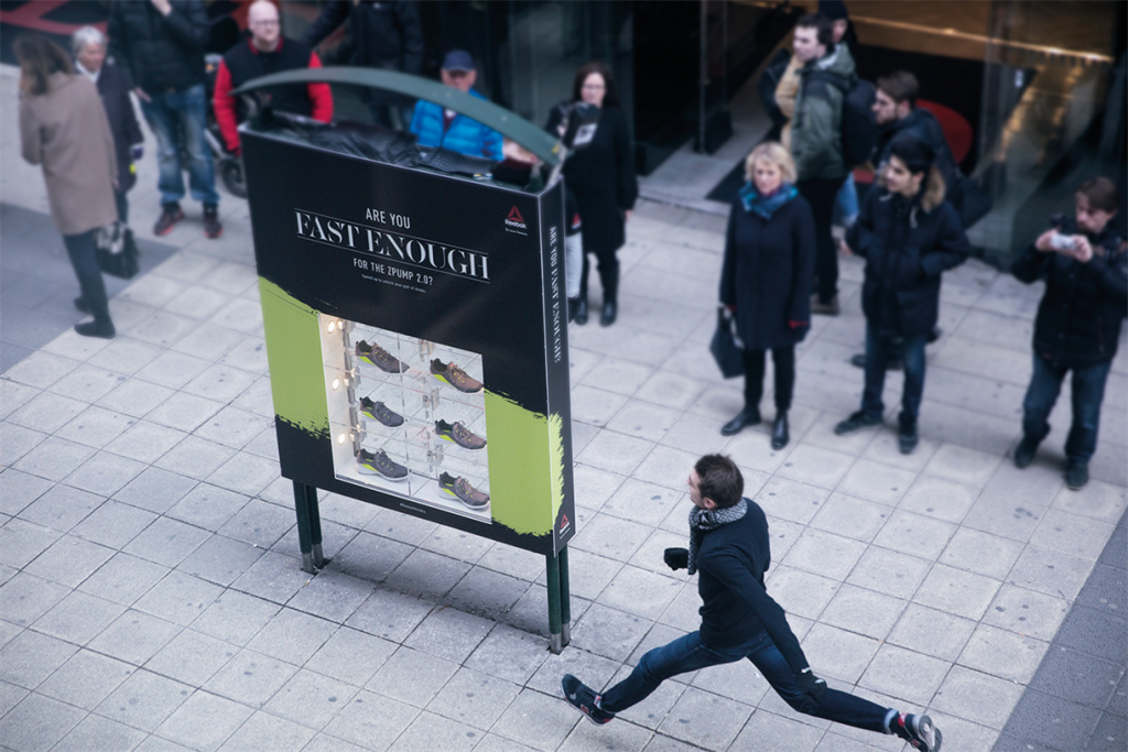
As my final project proposal focuses on interactive environments, I selected the Animal Agency’s Rebook ZPump campaign that motivates people to run as fast as they can to win a free pair of shoes. What I admire about this project is that it turns a traditional form of a billboard into an interactive element through technology. By a sensor measuring speed, people run across the advertisement to see how fast they run. If it meets a specific rate, the billboard will unlock a shoe to be taken. The next work is an advertisement for the Ford Explorer. The user scans a QR code and places the phone on the magazine. Through this, it creates the illusion that there is a moving car on the phone. In comparison to the Rebook campaign, they involve the sensing of human interaction that I desire to implement in my final project proposal.
The projects I chose were Basecamp, 2014, by Leander Herzog and BZ_zoom_test_3, 2019, by Jonathan McCabe. The first is a number of pyramids that seem to have different layers of color dripping down from their peaks, and will retreat back into them and come back out corresponding with the changing background color. The second is a video of a picture with a lot of different shapes, patterns, and colors that is zoomed in on for minutes straight. It seems like the picture is infinite.
Similarities
Both use very bright and vibrant colors, with the pallets continuously changing as time goes on.
Differences
Basecamp uses shapes with sharp edges, while Zoom consists primarily of curves and malformed circles.
The first has very clear dividing lines between the different colors, whereas the second has gradients
The first is interactive while the pother is just a video for purely watching.
I admire their color use. The projects are just so pretty. I derive a lot of my enjoyment from them purely on their aesthetic appeals. I also like how they are essentially never ending. I know that the Zoom video technically ends, but it’s almost under the guise that it wont. This continuous change allows for the audience to be given something new, so they never really get bored. They will have to keep watching since there is always some new part of the piece to see.
For Basecamp, an overlooked opportunity could be to experiment more with color. For the most part, it seems the colors are the same, just switched around a little. Maybe they could correspond more with the background. If the background was one color, the shades on the pyramids could be its complementary, or they could shades of a color that contrast well with it. Anything to spice things up a bit. For the Zoom video, I think the picture is very pretty, be the video is only zooming in on a single point that the audience doesn’t get to choose, causing the surrounding image area to be ignored. Maybe the video could be turned into those ones where the audience can use their mouse to change what they’re looking at.
For my final project, I want to create generative placement of text letters based on data received from the projected temperature rise from different areas around the world. The data from the specific place which the classic book is from its fed into a program which determines its placement for each page of the book. Each page represents moving forward one year.
I was having trouble finding other artists who have worked with APIs to generate the placement of text, but I did find two artists whose work is of interest to me and relevant to my final project. The first is Georg Nees, who was an early pioneer of generative art. His piece, Gravel, provides a sort of visualization of the progressive instability I am envisioning for this work.
Gravel, by Georg Nees
Bleed, a design consulting firm also has some projects that involve generative text and processes based within nature that are interesting to me and relevant to my work. For example, as quoted in the Its Nice That article, “Bleed took the Albert Einstein quote “look deeper into nature, and you will understand everything better,” as a concept but also a tool so that every time a character from the sentence is typed, a sphere is formed using a certain amount of triangles.”
I am interested in how the movement and placement of typography could be conceptually linked to broader ideas of nature.
Dot Piano is a visual musical instrument that displays dots of different colors and sizes when keys on a computer keyboard are pressed. Each note is assigned a color and moves a certain direction according to how it was programmed. I really like all the tones sound well together and it visually looks beautiful too. For my final project, I wish to do something similar, but with sounds recur often in our daily lives (from the tech world) and the visual display will be associated through color and shape with the brand that owns the sound.
The Apple startup sound is one of the most iconic sounds for any Mac User as it is the first thing that greets the user along with the logo when you start up your computer. The history of the sound is a bit complex (it was also a pun that referenced the lawsuit between Apple Company and Apple Corps at the time) as it had several versions, but Jim Reekes, the Sound Designer for apple, created it after he decided that the Mac 2 sound program had a horrible sound (it used the tri-tone, the worst-sounding music interval according to Christianity and Jim Reekes), so he tweaked it to create Sosumi. I want to use Sosumi for my game, but I am not sure if I am allowed to since it is trademarked, but reading about the history that has shaped this iconic sound intrigued me to create a project that subtly embodies the age of technology.
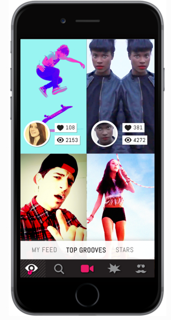
Scott Snibbe is a designer in interactive art, augmented reality, gesture – based interfaces, and digital video. His work has been acquired by multiple known companies like Facebook and New York MoMA. Snibbe started his career as an early developer for After Effects which was also acquired by Adobe. Two of his projects that I believe relate to my final project are two of his app designs; these are: Eyegroove and Bjork: Biophilia.
Example of what Eyegroove looks like to the user.
Eyegroove is an app that allows fans to create music videos and share them as a social network (very similar to tik tok). You could choose songs and create videos to the songs and then share them. Bjork, on the other hand, is considered the first “app album”. This app explores the relationships between music and natural configurations. Both of these apps let people interact via music as well as change the music or what the app is doing. I like that both of these projects change how people can respond to music, but I think they would be interesting if the user could also make their own music.
For this looking outwards blog post, I decided to explore other sound art and a mobile game. I decided to look into François Quévillon’s Algorithmic Drive and the mobile game Tap Tap Revolution.
I found François Quévillon’s sound project intriguing because it invited audience members to experience sound from a slightly skewed perspective. It explores upon the intersection of sound with the concept of the unpredictable nature of the world. The description “unpredictable nature” inspired me to explore the idea of how unpredictable fires can be and how unpredictable of an impact it could have on society.
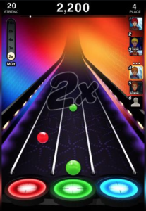
Tap Tap Revolution uses the user’s tap response on the screen to produce certain sounds– in the game, songs. This concept inspired me because I wanted to conjoin user’s response to produce a sound.
These two projects are similar in the way that they depend on data to produce various sounds that explore the intersection of the data and a concept– unpredictable nature of the world and music respectively.
From these two projects and my childhood game– Pokemon– I decided to create an interactive game to demonstrate the unpredictable nature of the California fires and sounds accompanied with it.
Nick Taylor is the Head of 3D at MancsMachine London. He was a creative coder who now is fully committed to motion design. However, he still integrates generative design, algorithms, and proceduralism in his work. He codes with Vex, Python, Hava, GLSL, and C++.
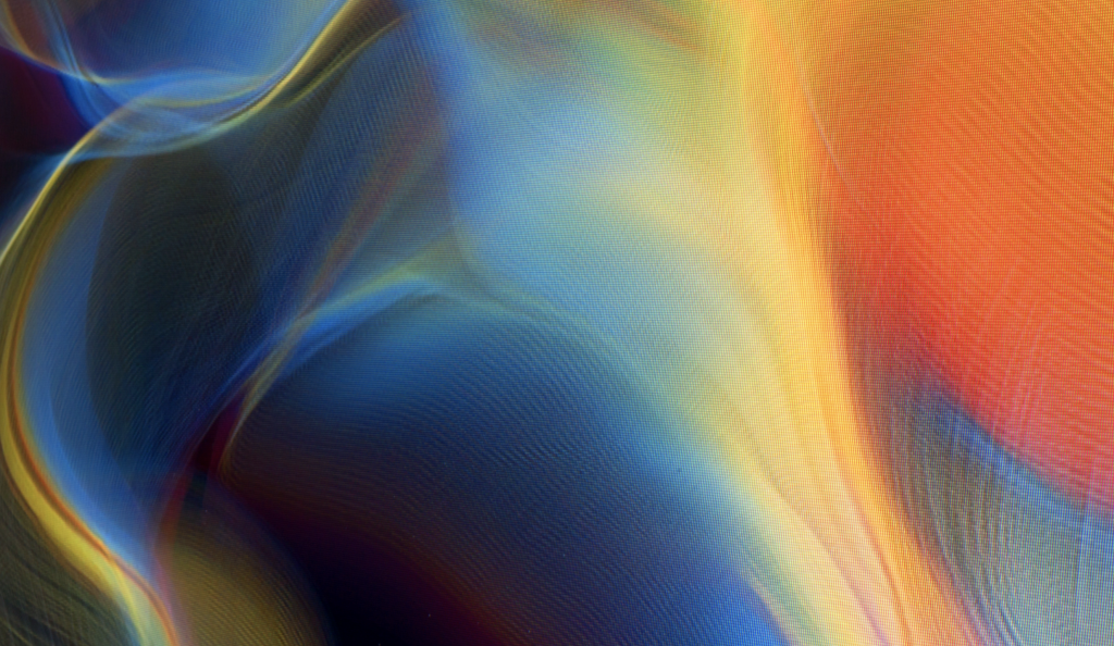
Vapour is an extremely dynamic and colorful video. It is a code-based exploration of turbulent particle systems and vivid color transitions. This project was created for Intel and produced by Future Deluxe. Nick Taylor used generative artwork and mixed it with in-camera techniques and optical tricks. The result is a beautiful motion graphic that looks organic yet digital.
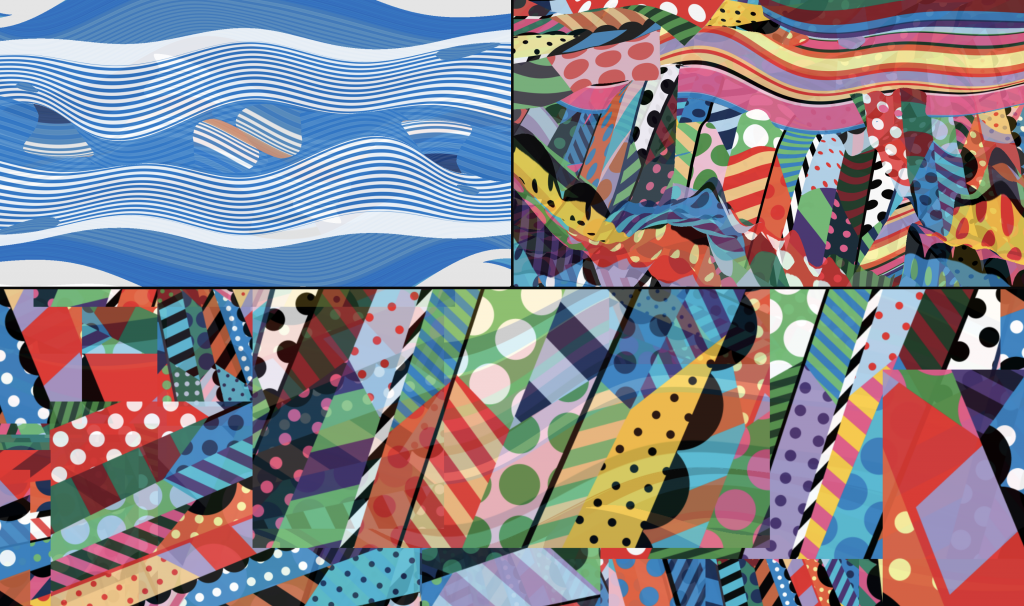
Joshua Davis is a digital artist, web designer, toy designer, and also motion graphic artist. He works at his own studio, Joshua Davis Studios Inc. (freelance?). This project is actually for Life Wtr and Super Bowl 51, featuring music from DJ Khaled and Bruno Mars. He uses processing, HYPE framework, GLSL, Minim/FFT+SVG to generate this colorful graphic video. The video is filled with colorful animations that hold the essence of the brand LIFEWTR.
screenshots from video
INSPIRATION: While both of these motion graphic artists have very different styles, they both seem to play with motion design for advertising. As an aspiring graphic designer who is also interested in video/motion, I find their projects intruiging and much more interesting than a 2D poster. Therefore, for my project, I want to create an interactive poster/logo.
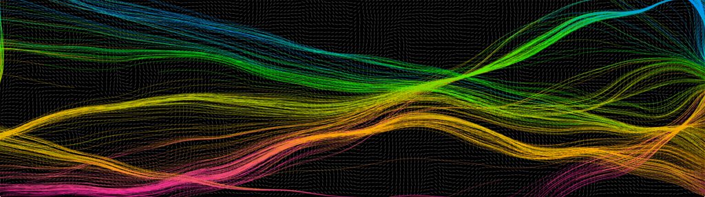
NAND.Io – Raw Sensor DataLevels of excitement from biometric dataVisualization alongside driving experience
The two practices I drew inspiration from for the final project included innovative and dynamic information visualizations from Nand.io studio and Stefanie Posavec. The work of Nand.io studio seeks to capture the experience of driving through data, motion, and light. The forces at work within the movement of the Infiniti Q10 are translated abstractly into the diagrammatic explorations in dynamic data. Speed, heart rate, motion, and fluid dynamic shapes are consolidated into cohesive data sets then used to show the data.
Phantom Terrains
Stefanie Posavec’s project, Phantom Terrains, explores the physicality and the auditory presence of wireless networks through experimentally augmenting wireless networks within soundscapes. Network identifiers, data rates, and encryption modes are moved into sonic parameters, then associated with auditory representations.
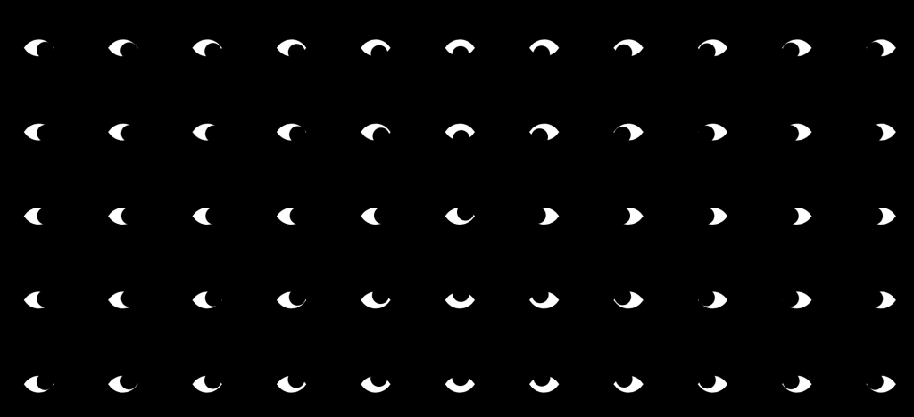
I’m inspired by these 2 projects because of their simplicity and how much they catch your attention. In the first project, all the eye pupils follow where the mouse is. When you hold the click, it changes to a grid of black dots that act like a wave when your mouse comes near them. It’s a very interesting switch between different kinds of “moods” which I really like.
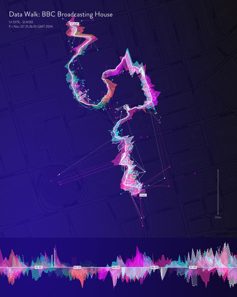
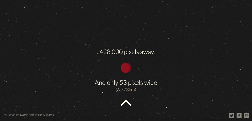
Im not sure if this second project uses P5 but the website: http://www.distancetomars.com/. I really like the storytelling aspect of it and how it uses the website window itself to illustrate how far Mars is from Earth.
The artists both display abstract visuals for sounds and songs. For Julien Bayle’s “ALPHA”, I really appreciate the ragged line drawings that take on black and white visuals. Julien Bayle also seemed to have used algorithmic sequencing to construct not only the visual, but also the sounds. This artist seemed to successfully create very different, complex 2D and 3D shapes that match the beats of the sounds, but could have used these complex shapes to form a more interesting narrative that happens throughout the piece.
For Cody Courmier’s piece (“Abstract Visual Sound”), I appreciate the simple shapes and colors used for the song “Tangerines”. All these shapes and movements seem more animated and less randomized, compared to Julien Bayle’s work. There seems to be a clear beginning and finish to the piece, as if it was to visually act as an introduction to something, such as an ad, rather than to just provide visuals for the song. Overall, I think for this piece the theme could have been more specified to revolve around the mood of the song, but seemed to flow better in rhythm.
![[OLD FALL 2019] 15-104 • Introduction to Computing for Creative Practice](https://courses.ideate.cmu.edu/15-104/f2019/wp-content/uploads/2020/08/stop-banner.png)