![[OLD FALL 2020] 15-104 • Introduction to Computing for Creative Practice](../../../../wp-content/uploads/2021/09/stop-banner.png)
http://feltron.com/BikeCycle.html
I found Nicholas Felton’s data representation very intriguing. The BikeCycle project gathers cyclists’ data over a year and represents them on screens in MoMa to show patterns of people’s commute and journey. The data is represented through various diagrams and breakdown of information in order to visualize it for easier digestion. The visualization of the bike patterns are lively and constantly changing. I feel that this is a very interesting way to portray Manhattan, a city that never sleeps. The constant buzz of the city is well represented by the ever changing patterns and movement in the visualization of cyclists and bikes.
Month: October 2020
Project-07-Curves
sketch
var x ;
var y ;
function setup() {
createCanvas(480, 480);
strokeWeight(0.7);
frameRate(5);
}
function draw() {
background(10, 20, 60);
translate(89,89);
for (var j = 1; j <=2 ; j++ ){ //setting up 2x2 grid for circles
for (var k = 1; k <=2 ; k++){
push();
translate (j*100,k*100); //moving the grid to the center
drawpattern();
pop();
}
}
}
function drawpattern() {
var a = map(mouseX, 0, height, 10, 80); //establishing variables that lead the cruves to vary
var b = map(mouseX, 0, width, 10, 20);
var h = map(mouseX, 0, width, 0, 100);
noFill();
stroke(mouseY, mouseX, 200);
beginShape(); //drawing geometry
for (var n=0; n <=800; n++) {
var Deg = map(n, 0, 100, 0, TWO_PI);
x = (a-b)*cos(Deg) + h*cos(((a-b)/b)*Deg);
y = (a-b)*sin(Deg) - h*sin(((a-b)/b)*Deg);
vertex(x, y);
}
endShape();
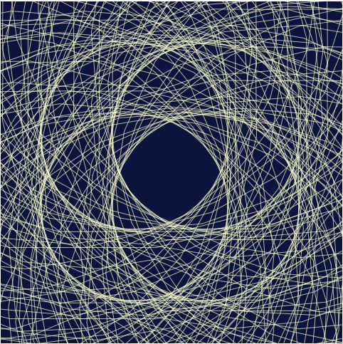
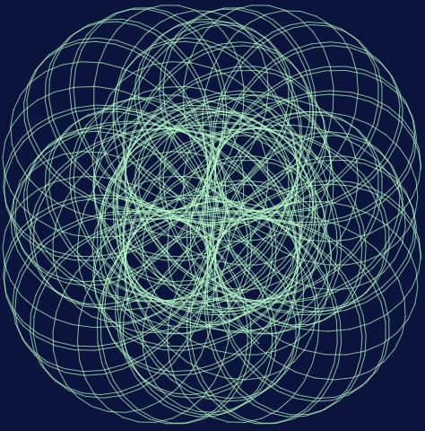
}I wanted to give this piece as much variation in structural form as I could.

Looking Outward 08 – The Creative Practice of an Individual

Mike Tucker is a creative lead at Magic Leap, a company that makes an AR headset designed to be comfortable and maneuverable to use. Since the 1990s up to 2018 when he gave a talk at the Eyeo Festival, he transitioned across different mediums to produce work, starting 2D based mediums such as Hypercard and Adobe Flash, moving onto dynamic mediums such as interactive spatial exhibits and finally into VR development.
Mike discussed some main principles he learned from helping create Tonandi at Magic Leap – an interactive project featuring the music of the band Sigur Ros. He mentioned how head tracking, 6 Degrees of Freedom, Spatial Sound, Touch/Hand controls, Eye tracking, and Environmental Design were key, showing how each principle influenced the final version. Tonandi combined audio and visual elements to create an AR space with translucent, abstract, nature-inspired shapes that moved along to the music and changed the user’s perception of sound and their surroundings.
Having a slight interest in VR, I went into his talk mostly expecting him to talk about his work and the company in a very surface level overview without much of the guiding process. However, I came out of it amazed at how sound could be integrated into a spatial experience and immerse a user further than just visuals could, as well as how he demonstrated that spatial computing was ripe with versatility to overtake the future, including applications for impaired users and the possibility to develop experiences entirely through AR and VR.
Looking Outwards 08
Looking Outwards 08: The Creative Practice of an Individual
Catherine D’Ignazio’s Feminist Data, Feminist Futures lecture was interesting to me. Catherine is a professor at MIT, artist, and software developer who focuses on feminism and data literacy. She is from North Carolina and studied International Relations at Tufts University and received master degree in Studio Art, Design and Theory from Maine College of Art and a Master degree in Media Arts and Sciences from MIT. She has a variety of Art and Science background. In the beginning of her talk at Eyeo 2019, she talks about how “we often our work is looking 20 or 30 years into the future, what relationship between the human and technology will look like.” Her works embrace this idea. Her work “Data Feminism” was particularly interesting. Is is very interesting how she takes a feminist approach to data science. She focuses on how to put the data in the service of justice. I think this idea is admirable and fascinating that she is intersecting a humanities principle, feminism, with data science. I like how her work takes an approach in which to be more inclusive. Her other work, DataBasic.io is interesting too. One of the tools included in DataBasic.io is the WTFcsv, which is a web application that returns a summary of the fields, data type, range, and basic descriptive statistics of a CSV file. This tool helps to fill the significant gaps for people who do not know how to code and to help them understand data more easily. I like how she approaches the data science with humanitatrian view to make it more accessible to more people. I would like to create a work like hers, incorporating different aspects and perspectives to the data science.
LO-8: The Creative Practice of an Individual
The person I chose was Janelle Shane, an artificial intelligence researcher. She is based in Boulder, Colorado, and studied electrical engineering at Michigan State University for her undergraduate degree.
She is essentially a researcher who focuses her work on showing the shortcomings of machine learning and AI through humor.
I admire Shane because her projects are very lighthearted and creative. AI is something that can be very daunting to many because of how “human-like” it’s becoming so I love how she focuses on its struggles in a humorous way to show how it still has a long way to go to actually think like a human.
The work that piqued my interest was Neural Candy Hearts. I thought this project was very creative and funny since she uses AI to recreate the famous Valentine’s Day candy hearts.
Shane’s presentation style is just like the projects she works on. She talks very casually about her works and presents them highlighting the humorous aspects to engage her audience. Based on the way she presents her projects, I think that it is very important to basically let the projects themselves do the “talking.” In other words, I think it’s important to show what your project does rather than try to explain it bit by bit.
LookingOutwards-08
Ariel Waldmen works on NASA’s Innovative Advanced Concepts program and explores the relationship between scientific exploration and creative expression. Although she has a concentration on space exploration specifically, she also works in other science fields to promote collaboration in science. I admire how her work not only shows a lifelong fascination of space exploration, but also a longer journey into how she can share that fascination with others. I think my favorite project of hers is spaceprobe.es, which displays the satellites, rovers, and probes currently in space to share the active projects of space exploration. To present effectively, she uses real world examples to lead viewers through more familiar stories to the lesser told ones.
Looking Outwards 08- The Creative Practice of an Individual
Nadieh Bremer’s website:
https://www.visualcinnamon.com/The person I will be writing about today is named Nadieh Bremer. She is a graduated astronomer, turned data scientist, and now data visualization designer. She creates unique interactive data visualizations for press releases, data driven reports, and data art. After reading her “about” tab on her website, I learned that she is very passionate about what she does. She left the world of academia to pursue data science and once she learned that she really enjoyed visualizing analysis, she started creating personal projects. She describes her work as the following, “My projects include both web-based interactive visualizations, frequently using a storytelling technique to show insights into complex data and static visualizations that typically allow a bit more freedom in their design.” After looking through her work, I noticed that although her work is based on real information and a collection of facts, the visual aesthetic of her visualizations is art itself. It is something that can be seen hanging off a wall as an art piece itself. Her use of color is captivating in all her data visualizations and she uses many different forms to express information. One thing about her work that I want to reflect in mine is how playful it is. There was a project that had graphics of cats and dogs that I really enjoyed. It really opened up the range of how playful data visualization can be and that really inspired me to take risks with my work and include my personality in it.
LO-08 Creative Practice of An Individual
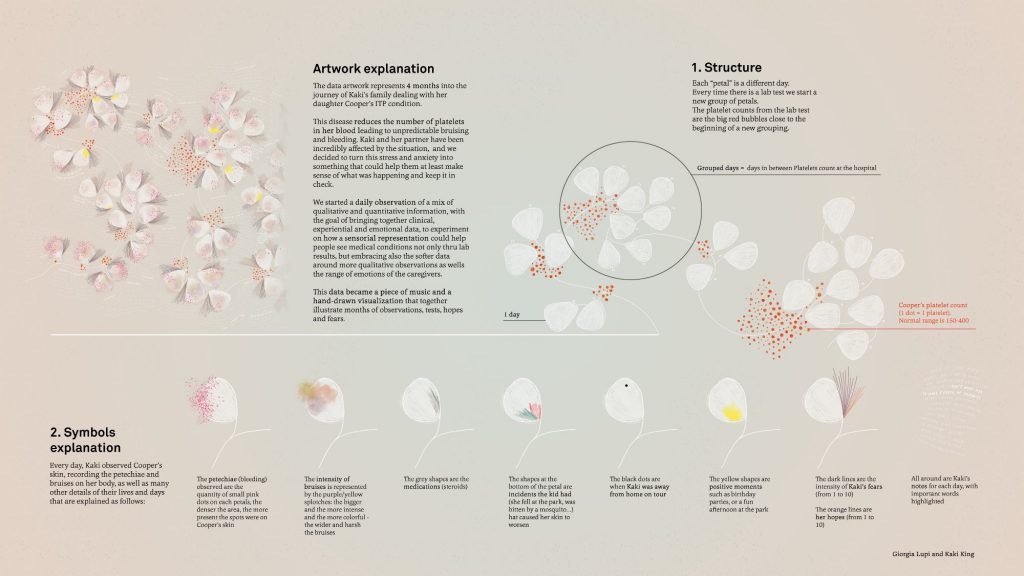
Giorgia Lupi is an information designer, partner at Pentagram, co-founder of Accurat, and co-author of two books. She got her master’s degree in Architecture and is based out of Milan and New York. Her work is featured at the MoMA, Cooper Hewitt, and Smithsonian. She describes herself as a data humanizer, she humanizes data through the story behind the data. Her body of work usesdata to visualize aspects of life that we ‘don’t usually associate with numbers.’ Her work ranges from hand-drawn data visualizations to data driven fashion collections to large-scale computer graphics for big names like SNL and IBM.
I admire how Lupi uses data to better understand human nature because she helps her audience empathize with others. For example, in the project of hers I admire most, Bruises she uses her friend’s daughter’s clinical data to illustrate both the factual and emotional aspect of the experience. Lupi’s presentation strategy is a conversational tone and a ton of visual aids. This is effective because it doesn’t feel dry, she tells a story and uses humor to engage her audience. I can definitely learn from the way she frames the story of her art to help her audience relate more.
LO8: The Creative Practice of An Individual
A speaker at the Eyeo Festival that I found very inspiring is Nadieh Bremer. Bremer graduated with a degree in Astronomy from the University of Leiden in 2011. During her time there, she was introduced to the programming language IDL often used in Astronomy to analyze data. From her introduction to IDL, she realized that she wanted to be a data scientist; however, she wanted to analyze more tangible data rather than being in a niche field like astronomy, so she joined Deloitte. During her time there, she learned 6 different languages including R where she started doing simple data visualizations. In 2013, she joined a data science conference Strata where she was introduced to coding in d3 and found her love in data visualization design.
I admire her work greatly as they are able to present complexities and interconnections into beautiful and tangle visuals. One of my favorite work from Bremer is a data visualization she collaborated with UNESCO to show the interconnectedness between different cultures across the world. The map displays intangible cultural heritage–ranging from skills to practice to knowledge totaling about 500 cultural elements. Cultural elements are hard to quantify, yet Bremer was able to come up with an impressive map with statistics and interactive visual elements. The thoughtfulness that went into her work blew my mind. Her work also portrays a harmonious combination of mathematics and the arts, which makes it very intriguing and inspiring.
Looking Outwards 08
The person who’s video I watched was Neil Mendoza. Neil is from London, UK, and is based in California. His artwork is him “combining sculpture, electronics and software to bring inanimate objects and spaces to life.”. Neil presents in a fun and funny way. He tries to compare himself to comedic things and tries to show off serious work with a fun presentation. Neil uses digital and mechanical technologies to bring inanimate objects and spaces to life. Using this medium, he explores the absurd, the humorous, the futile and the surreal. I admire that he likes to create “useless” machines, like teaching a fish to use hand tools or using hamsters as an art tool, as shown in his video. I really admired the hamster art that he presented about. I like this piece because it was a hamster running on a wheel that ended up moving an arm to draw itself on the wheel. I also admired his fish piece where a fish was able to make a hammer move and smash down, I admire this because it is such a unique concept I never would have thought of.