LO 07 – Information Visualization

PENNY

By Stamen Design


Today, I will be talking about an AI Project called Penny done by Stamen Design. This simple tool is designed to help understand what wealth and poverty look like to a artificial intelligence built on machine learning using neural networks. Penny is built using income data from the U.S. Census Bureau, overlaid on DigitalGlobe satellite imagery. This information was then given to a neural network. Trained to predict the average household incomes in any area in the city using data from the census and the satellite. The AI looks for patterns in the imagery that correlate with the census data, and over time, users are able to ask the model what it thinks income levels are for a place just from a satellite image. This project is really interesting to me because this visualization and AI can be used to improve the quality of life, and physically see the imbalances within a neighborhood for better wealth distribution.

View project here

LO-07: Visualizing Information

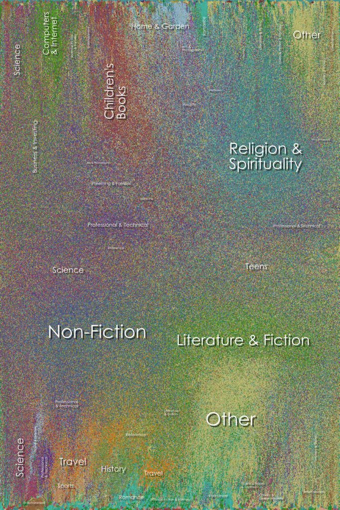
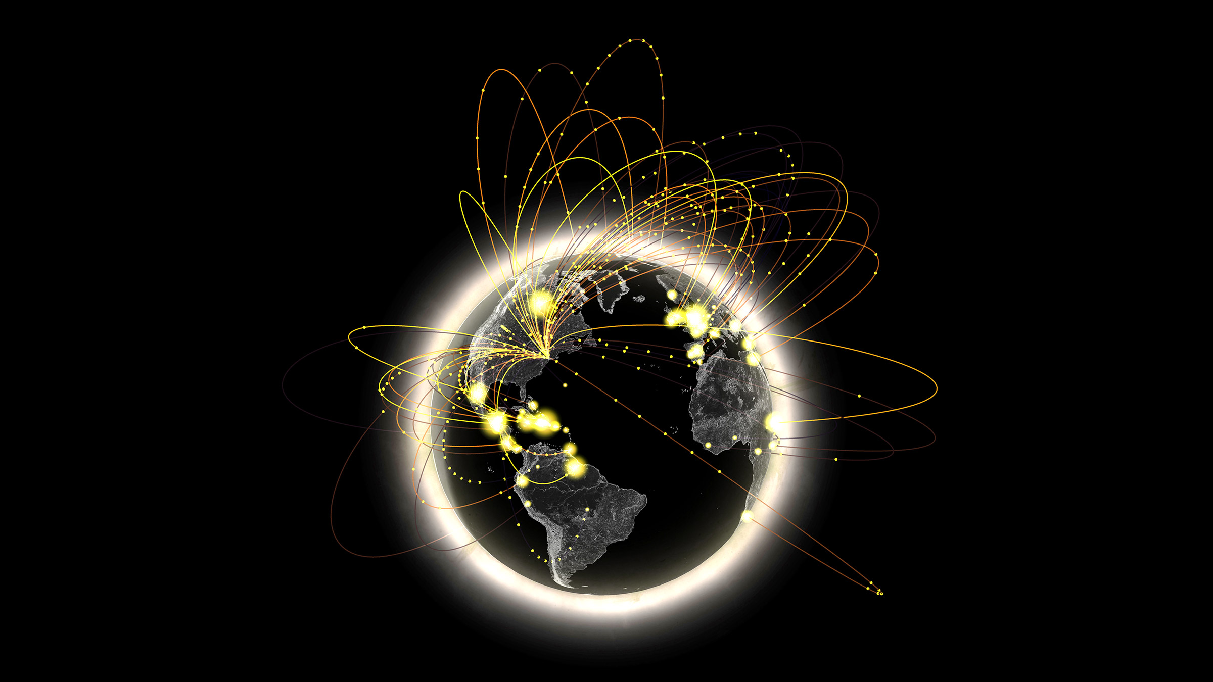
A Visualisation Project by Stamen Design: Metagenomics with The Banfield Lab

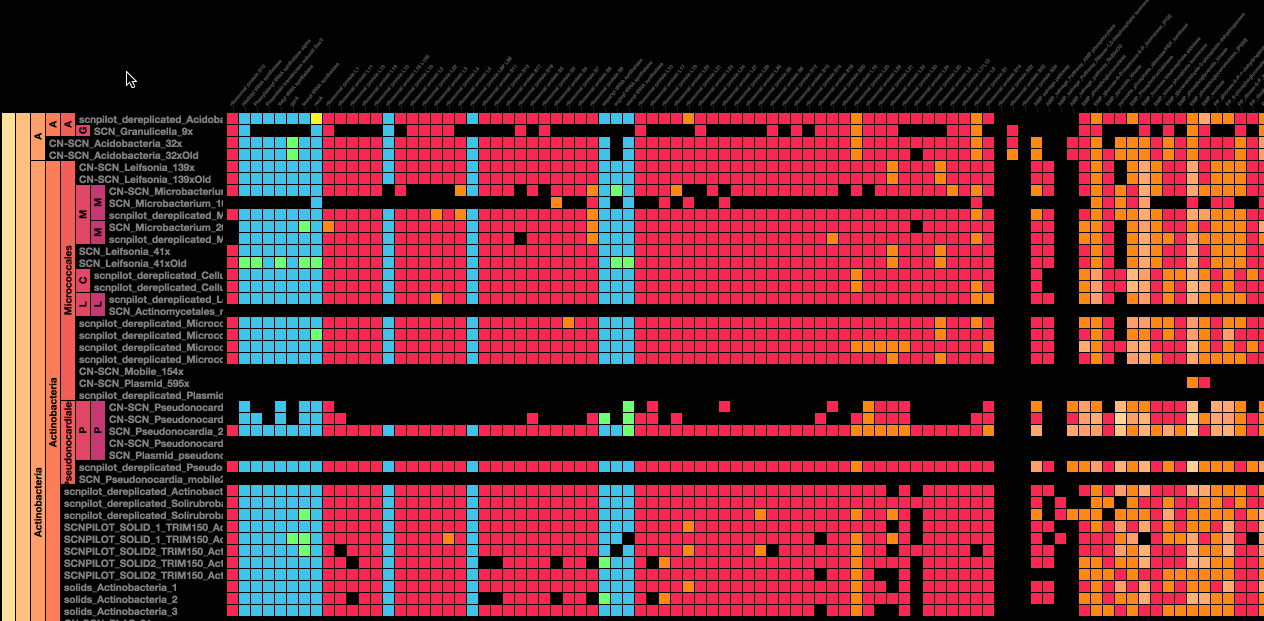
Usually, information Visualisation examples I have seen either visualise quantified data to tell a story in compelling forms, most data visualizations on the internet are complicated, without covering the complexity of scale or information, the Metagenomics project by Stamen Design, on the other hand, takes into consideration a vast libraries of life and categorisation of species into a large map that uses a simple, excel like cell structure but encodes a vast amount of information in the way it is ordered and color-coded. This project is called “New images of complex microbiome environments”.

Erik Rodenbeck details the process of collaboration and creating this project.

https://stamen.com/wp-content/uploads/2020/06/banfield_metag.gif


Stamen Design is a data and information design studio. They partner with educational institutions and world organisations to use data and design to weave useful narratives that bring our attention to important information about our world.

As per the document published by Stamen Design, “Understanding the genomic content of an ecosystem yields incredible insight into who the dominant organisms are, the minor constituents, and all levels in between… including viruses”. Given that our lives are currently affected by a virus that seems like an abstract entity, but is a living organism with a cell-structure, this application of information visualisation to see something of a big, intangible scale is an important application of visual design in making the abstract concrete. Not only does the project encode tonnes of information, but it acts as a living document, that scientists can use as a library to understand this information.

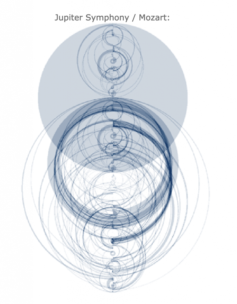
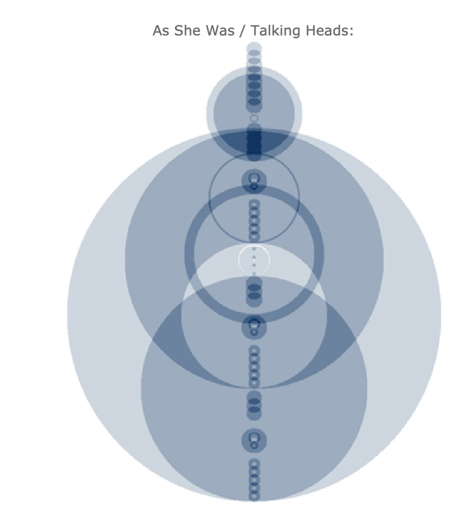
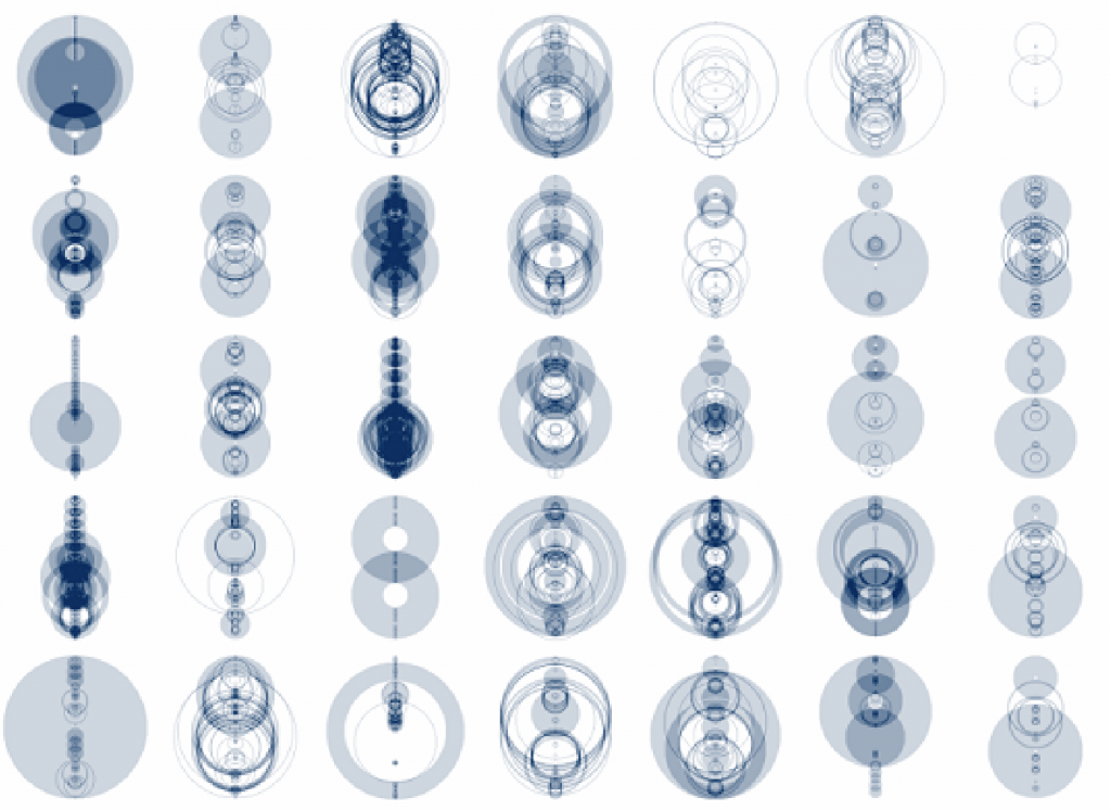
Having been a fan of Stamen Design’s work for years, what I like about their work, is that they master the ability to encode complex information in simple geometric shapes.

From the perspective of a p5.js learner, this teaches me that I can use the simple functions of p5.js to create compelling visual information.

For example, in the image, above, I could imagine that using a mouseX, mouseY to highlight some parts of the map, and creating set of bars the heights of which can change based on the mouse position, p5.js can be used to create visualisations and paired with the backend engine of a dataset to tell stories through data.

Looking Outwards 07 – Information Visualization

https://guns.periscopic.com/

On their website, Periscopic brands themselves as a “socially conscious data visualization firm”. They are a team of designers who bring light to societal issues through striking visualizations, such this one, the annual number of gun homicides in the US. 

This visualization represents the lives of those lost to a bullet through an arc of time. A victim’s arc starts as a bright orange line and fades to ash gray at the point they were killed, and the arc extends to the point of their expected natural life expectancy. Each arc can be clicked on providing more information about the homicide and expected lifespan. Periscopic mentions that the gun data was in ASCII format originally, making it difficult to extract the data for artists who had little coding experience. They have converted the data into CSV format and shared it freely.

This visualization struck me by how simple yet powerful its message is. Knowing the context of gun killings that this graphic conveys, the way the arcs turn from a passionate orange to lifeless gray is chilling, especially when seeing the vast number of lines form into a faded mass of death. And even if the 2018 death count of 11,356 doesn’t seem like much, the 472,332 lost years of human life makes it clear that gun homicides are a problem we must address.

Looking Outwards-07

Nathan Yau is using data from the running app RunKeeper to create visualizations of the most taken courses or paths runners take in different cities. Nathan is a statistician from FlowingData who focuses on information design, as seen in the informational maps he has created below. He finds that visualization is a key way to make data more accessible and attractive. 

He created these data visualizations for 18 major US cities, including Chicago, LA, and New York City. He simply concluded that most runners love to run near nature, which are near water and parks.

To create these visualizations he may have used photoshop to collage all the paths of every runner or maybe if he used p5js he created arrays that marked each location as a point and when each location is marked the density increases, which increases the deepness of the purple as well.

Philadelphia running paths
New York City running paths

LookingOutwards-07

Martin Wattenberg is a co-leader of the People + AI Research initiative at Google. My career has encompassed machine learning, visualization, journalism, and art. Asking a question to himself, “what does music look like?” made him create this art piece. According to him, The Shape of Song is an attempt to answer his paradoxical question. I admire how he related music with this “visualization method called an arc diagram that highlighted repeated sections of music–or of any sequence–with translucent arcs.” It is very interesting to see how arc diagrams shape different thicknesses, sizes, saturation, etc to express diverse kinds of music. Just like every music has its own sequence, all of these art pieces create their own unique components.

LO 07 Data Visualization

TableTop Whale is an online blogger currently working in at the New York Times graphics department. Her work is specialized towards information design with a focus o science communication. Her PHD work was done in Biology and Data science. On her blog the tableTop whale, she posts a variety of data visualization graphics. I think what intrigues me the most is her explorations on the geology of various planets of the solar system. Mapping terrain and topography has been an interest of explorers for centuries even before the age of exploration. In the past cartographers used various analog techniques to map out the world as we know today. Now, with the avdvent of GIS data, we have the capability creating maps almost on demand with digital tools such as ARC GIS and a variety of other Geospatial data visualizer. What’s interesting about TableTop Whale’s work is that she uses USGS’s data sets for the planets, but renders them in a style that evokes maps of the age of sail. This is interesting because, the style evokes a sense of unknown and allows for out imagination to run wild about the possibilities of new uncharted territory. That’s also what’s so special about having large datasets to manipulate and visualize, it can allow for new information to emerge from things we already know about. Allowing us to dive even deeper into what we already know possibly defining the unknown.

https://tabletopwhale.com/index.html

Looking Outwards 07: Information Visualization

This week, I decided to look at Chris Harrison’s Amazon Book Map He looked at 735,323 books and captured similarity data between them based on what Amazon recommended. He then color coded them depending on genre and created a visualization of his findings. I really admire the effort he put into it and the way it all came together in a mosaic like pattern. The algorithms he used created the layout and clustering but he noted that his algorithm didn’t work well for unstructured graphs. Harrison has created a lot of these visualizations and is trying to look at a new way to display data, and I think he was very successful with this. Especially color coding, it allows the user to see how different genres mesh together in a more user-friendly way.

Chris Harrison, Amazon Book Map

LO – Aaron Koblin

Eamonn Burke

I once again return to the work of Aaron Koblin, because I find his work to be the most interesting subjects and the best representations of the listed designers. Here he visualizes AT&T call traffic in NYC, which is a fascinating way to represent geography and globalization. As with the last Koblin project I used, I love this piece because it’s at the intersection of human behavior and design. It depicts the social phenomenon of urbanization and globalization, as physical distance becomes negligible and we become one mind.

 I think Koblin used his creative sensibilities to convey this idea of a collective brain, by evoking the concept of travelling neurons to suggest connectivity. He also clearly conveys the “hotspots” and distinguishes the different types of calls by using brightness and color. 

I would guess that the software Koblin used here tracks call information including distance and location, and then uses this data to plot functions of curves that are projected onto a 3D world model, with the height of the curve depending on the distance of the call.

LO-07

When I saw this assignment I immediately thought of the subreddit DataIsBeautiful. As I was scrolling through it, I found one that was very cool and interesting. It was a Visualizations of Color Themes in Pixar Films by redditor /keshava7 created about 4 months ago. I love Pixar films, and I’ve watched almost every one. Some of the older ones give me a great sense of nostalgia. Their visualization of data using Pixar films is very pretty, and I like how they are all shaped like disks. It reminds me of the old Blu Ray disks (although I also remember the older format of VHS). They created this visualization in Python by extracting 5000 frames per movie, and they compressed each frame into a pixel. They start each movie at 270 degrees and go clockwise, so the first frame of each movie starts at 270 degrees. There is another redditor /julekca who gives a more detailed description on how to do it, it makes me want to try it myself. It is very beautiful to see all the different colors of some of the films I watched as a child.

Here’s a link to the post:

LO-7: Unnumbered Sparks, Janet Echelman, 2014

I was attracted to this work at the first sight. It is a monumental, beautiful sculpture work flowing in the sky, consisted of an intricate, color-changing net. The audience can interact with the piece by connecting to the project’s wifi and give instructions to the website promoted, such as changing colors, moving parts around, etc. I like how it gives the audience the chance to be the creators of this art work and fully participate in it by taking out the artist’s role as the maker. I also like the sense of vulnerability and mobility in this work. The piece is like a floating, colorful, and constantly changing nebula that has fragile, mysterious, mobile beauty.

The team collaborated with Janet Echelman, a sculpture artist who works with public space. What they used to build this sculpture is a kind of fiber that is fifteen times stronger than steel. And the sculpture was put up into the middle of an active city’s sky. The project team built the modal in Chrome with webGL. They then modified parameters to get the complex behaviors they were looking for. The mobile and interactive aspect of the piece was made possible by a language developed by the team. It sits in between Javascript and C language. People’s input would then directly influence what they see. The team commented on this, saying “they can draw and paint with light,…people are the Co-creators. Seeing the delight and wonder on people’s faces is the best reward for the team.”