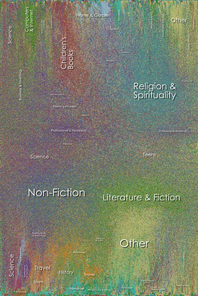
For this LO, I looked at Chris Harrisons data visulazation on amazon books. In the project he let his computer run an automated algorithm based on title, topic, and relevance to each other. This allows for similar books to “cluster” and create a more solid color. What I thought was interesting is how he mentions through each iteration, the books that are more and more similar will then begin to attract to one another, thus the more time provided equals a more coherent data graph. But due to the sheer sample size of the project, 700,000 books, Chris stated that it would have taken too much memory for the computer to run. Thus emphasizing the sheer physical space it takes to process data with a large sample group. What I thought was the most intriguing aspect of the project is the resulting color field as it creates such a unique gradient that almost seems like some form of abstract pixel art.
Category: SectionA
PROJECT-07 (curves)
// SEAN CHEN
// 15-104 A
var nPoints = 100;
var tx = []; // keeping track of the x y of each hypotrochoid
var ty = [];
var rot = 0; // rot init
var size = []; // each size
var col = []; // each color
function setup() {
createCanvas(480, 480);
background(255);
}
function distance() { // distance from center to mouse
var d = dist(width/2, height/2, mouseX, mouseY);
return d;
}
function hypotrochoid(a, col) {
push();
fill(col);
var x, y, a, b, t;
b = a / int(map(distance(), 0, width/2, 1, a));
stroke(0);
rotate(radians(rot));
beginShape();
for (var i = 0; i < nPoints; i++) {
t = map(i, 0, nPoints, 0, TWO_PI);
x = (a - b) * cos(t) - b * cos((a-b) / b * t);
y = (a - b) * sin(t) + b * sin((a-b) / b * t);
vertex(random(3)+x, random(3)+y);
}
endShape(CLOSE);
pop();
}
function draw() {
background(255);
rect(0, 0, 480, 480);
push();
translate(width/2, height/2); // initial hypotrochoid
hypotrochoid(120, color(245,211,114));
pop();
for (var i = 0; i < tx.length; i++) { // added hypotrochoid
push();
translate(tx[i], ty[i]);
hypotrochoid(size[i], col[i]);
pop();
}
rot += 1;
text("click to add!", 10, 20);
}
function mouseClicked() { // add new hypotrochoid
tx.push(mouseX); // input new at mouseXY
ty.push(mouseY);
size.push(random(50, 200));
col.push(color(random(255),211,114));
if (tx.length > 12) { // delete after 12
tx.shift();
ty.shift();
size.shift();
col.shift();
}
}
Looking Outwards 7
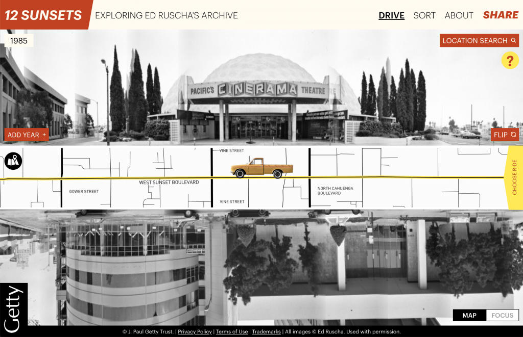
For this week, I chose to focus on Stamen’s project called “Getty Institute: Ed Ruscha’s Photo Archive”, a computational organization and documentation of Ed Ruscha’s photo archives of Los Angeles. These photographs were taken from a car-mounted camera, which when driven, would document the buildings and street views of Los Angeles’ Sunset Strip. This documentation continued every few years, creating a dynamic record of the changing views of the street.
The photos, however, were never digitized, which made it hard to visualize the change in the strip over time: hence the implication of the dynamic interface created. With the use of “AI-generated tags”, Stamen was able to sort through the photos and create an interface that allows the user to virtually “drive” through the street and visualize the change over time. The interface simultaneously shows multiple years of change stacked on top of each other as the user “drives” through the map that is sandwiched in the middle. One is also able to zoom or sort through specific photos with keywords. This project is therefore a combination of both the algorithms created that easily sorts and orders photos, and the ‘creative’ part of the interface that allows the user to drive the car.
Project 07-Curves
/*
Lauren Kenny
lkenny@andrew.cmu.edu
Section A
This program draws a grid of Epicycloids.
Functions for this shape where adapted from
https://mathworld.wolfram.com/Epicycloid.html.
*/
//sets up the canvas size and initial background
function setup() {
createCanvas(480, 480);
background(220, 100, 100);
}
//draws a grid of epicycloids
function draw() {
translate(20, 20);
background(0);
strokeWeight(2);
noFill();
//color changes with mouse position
//red and green change with y position
//blue changes with x position
var r=map(mouseY, 0, height, 80, 255);
var g=map(mouseY, 0, height, 80, 120);
var b=map(mouseX, 0, width, 80, 200);
for (var row=0; row<width-20; row+=50) {
push();
for (var col=0; col<height-20; col+=50) {
stroke(r, g, b);
drawEpicycloid();
translate(0, 50);
}
pop();
translate(50, 0)
}
}
//draws a singular epicycloid
function drawEpicycloid() {
var minPetal=6;
var maxPetal=10;
var minSize=4;
var maxSize=8;
//number of petals increases as y position of mouse increases
var numPetals = int(map(mouseY, 0, height, minPetal, maxPetal));
//size of shape increases as x position of mouse increases
var size = (map(mouseX, 0, width, minSize, maxSize))/(numPetals/2);
beginShape();
for (var i=0; i<100; i++) {
var t = map(i, 0, 100, 0, TWO_PI);
var x = (size * (numPetals*cos(t) - cos(numPetals*t)));
var y = (size * (numPetals*sin(t) - sin(numPetals*t)));
vertex(x, y);
}
endShape();
}
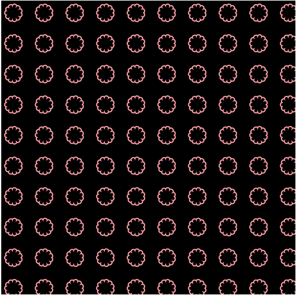
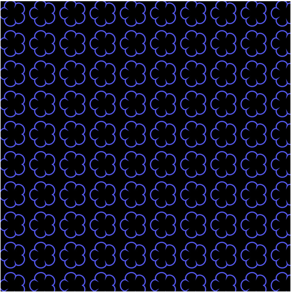
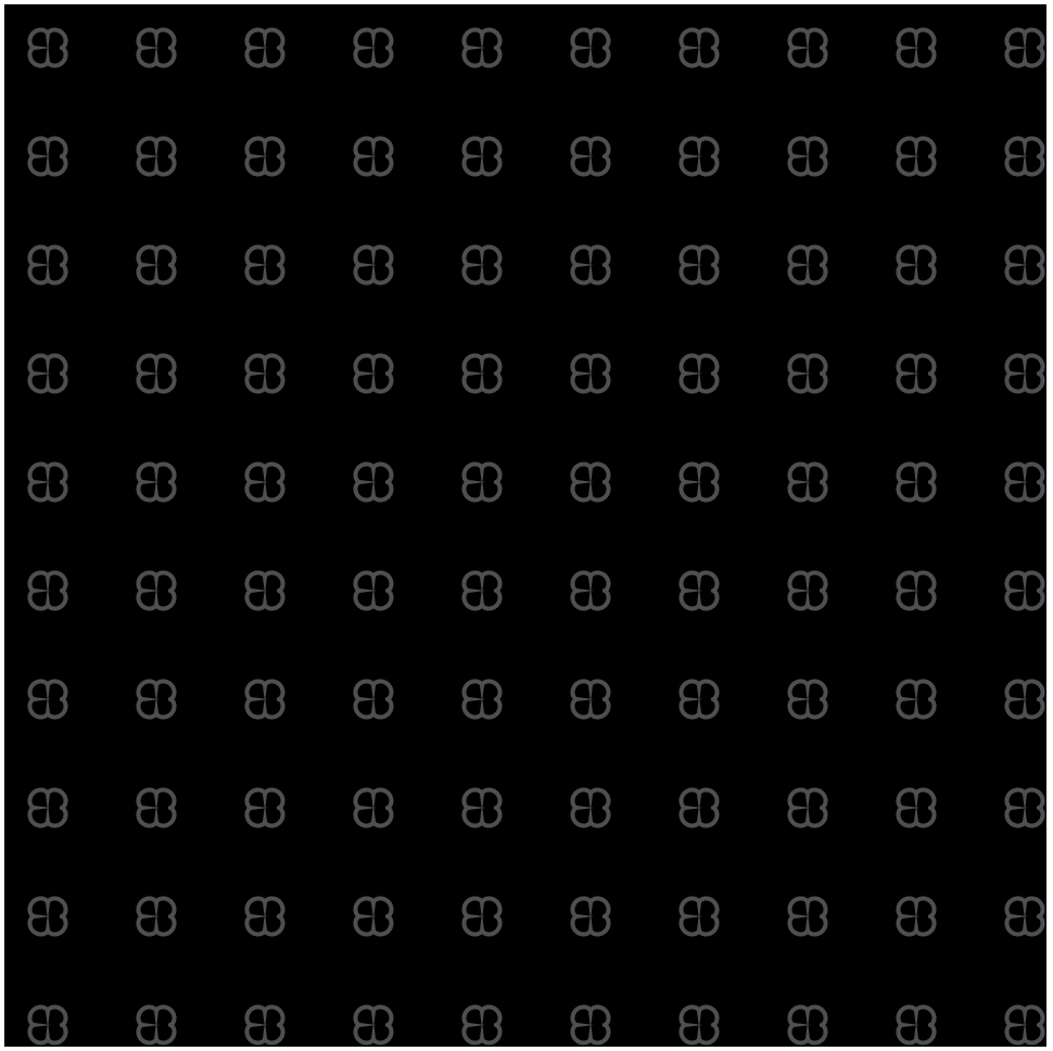
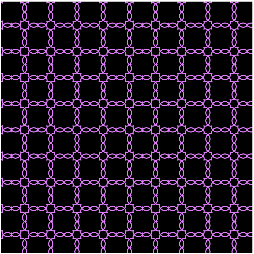
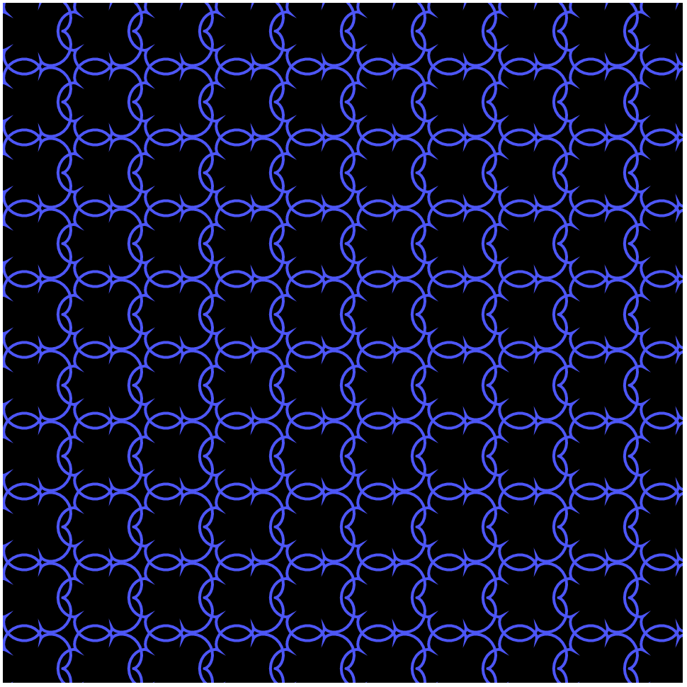
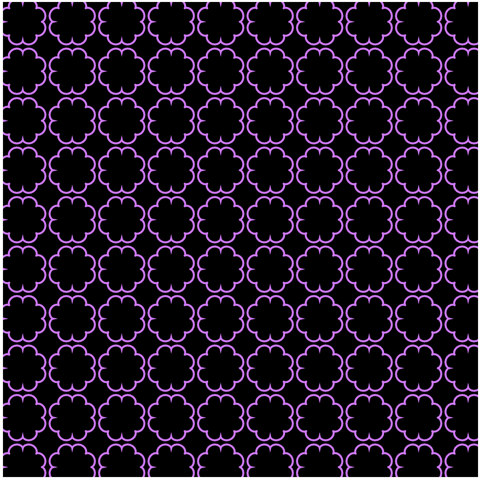
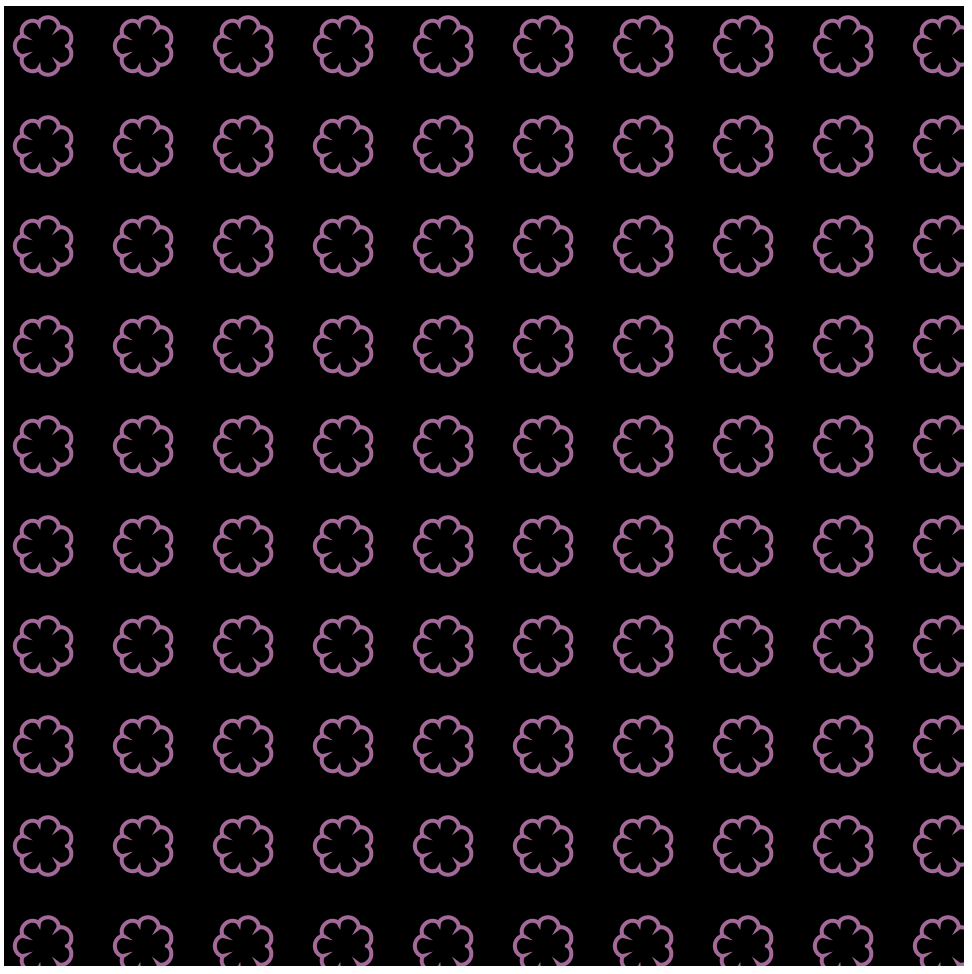
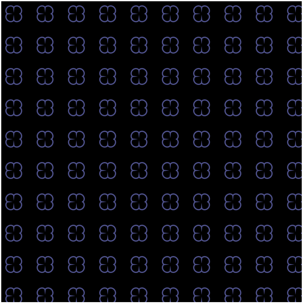
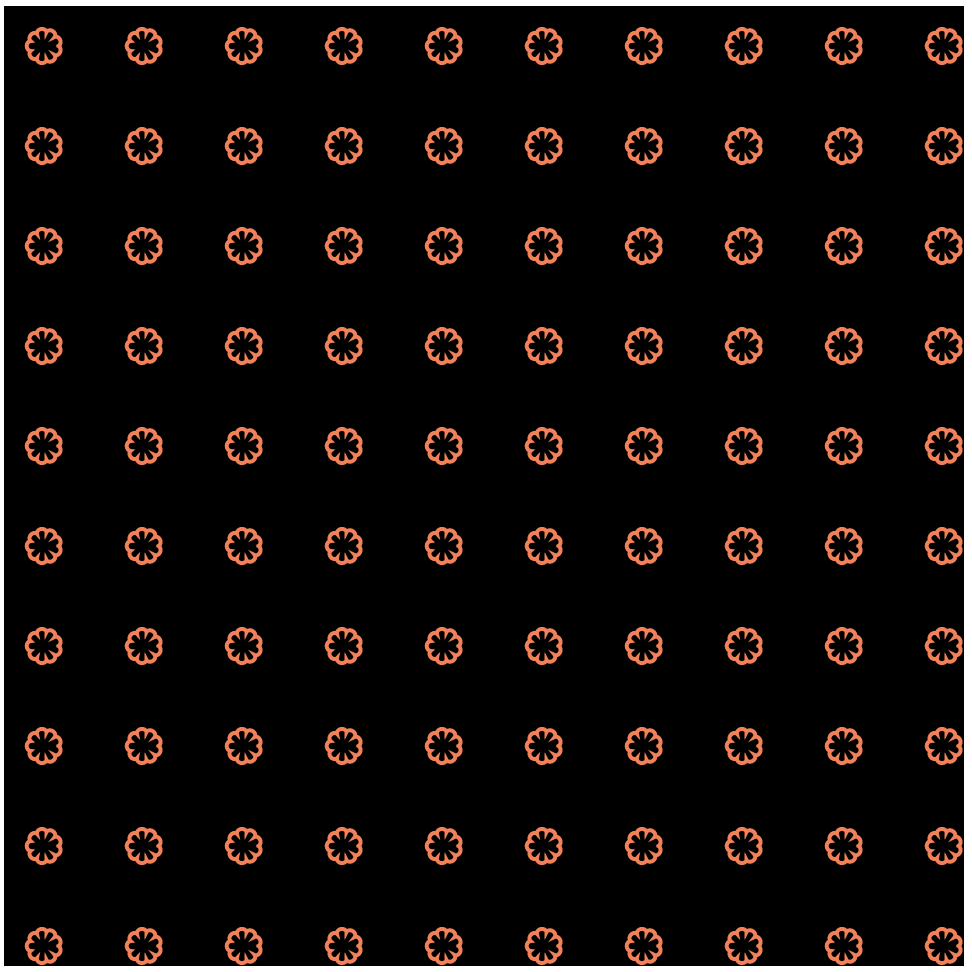
For this project I was really interested in the epicycloid because of the variation that could be added to the number of petals. In my program, I explored altering the number of petals in relation the mouse y position. I also added a variation in the size based on the mouse x position. It was fun to figure out through experimenting what each variable in the formula affected within the actual shape. Here are some screen shots with different mouse positions.
Looking Outwards-07
http://intuitionanalytics.com/other/knowledgeDatabase/
http://moebio.com/research/sevensets/
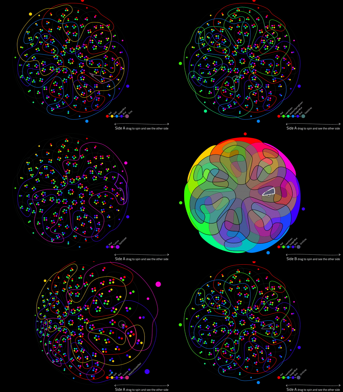
This project titled “Personal Knowledge Database” was created by Santiago Ortiz. In this computational project, Santiago catalogues his internet references collected over more than 10 years. These references include projects, wikipedia articles, images, videos, texts, and many others. All of these references are organized into an isomorphic 7 set Venn diagram that tries balance each section. The 7 categories in this Venn diagram are humanism, technology, language, science, interface, art, and networks. He has also included 19 filters based on the source of the reference (ie. Image, post, blog, book, etc.).
What I absolutely love about this project is the self-reflection of his own digital searches and references. I think looking at 10 years of this data can teach you a lot about yourself, and I’ve always admired large scale self-reflection. What is also amazing about this project, is that all of these references are embedded into the interface, so with one click you can access any of the information. This project shows a lot about this artist’s sensibilities, and I admire them very much. I would be curious to know how Santiago feels after cataloguing this much personal data and finding patterns.
One other comment I have about this work is that I find it a bit hard to keep track of the category overlaps with the main Venn diagram. With the colored archetype, you are given a list of which colors are overlapping with each section you hover over. I wonder if this would be a helpful section to be utilized in the main project.
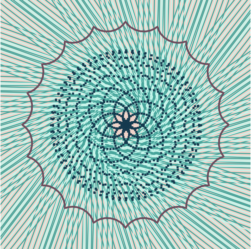
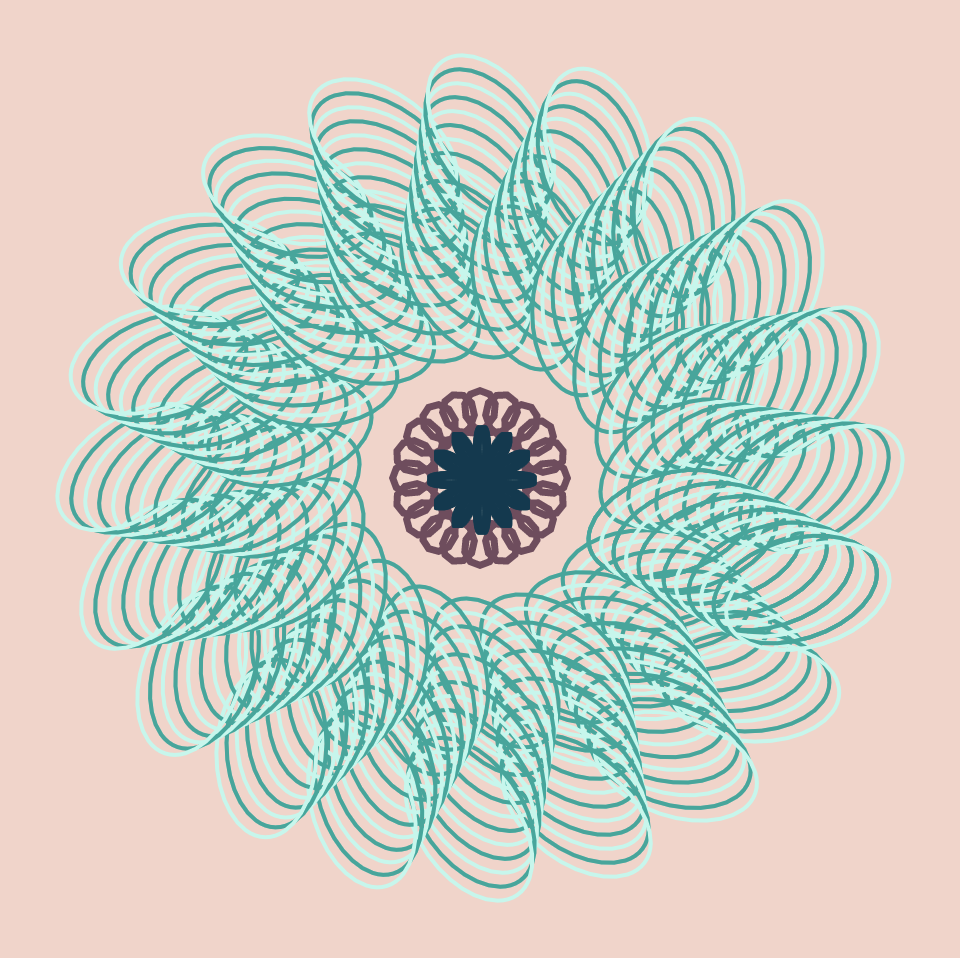
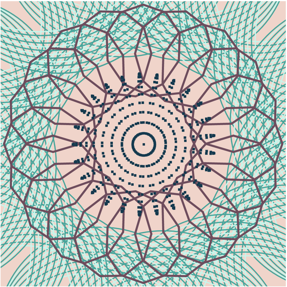
Project : 07
//Aadya Bhartia
//Section A
//abhartia@cmu.edu
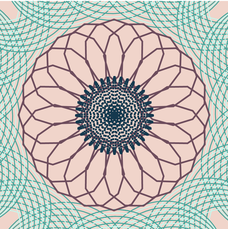
/*The code aims to use three main types of curves and modify them based on the X and Y position the mouse
Each set of curves are represented in different ways making the code more visually interesting */
var angle = 0;
var numP = 10000;
function setup() {
createCanvas(480, 480);
}
function draw() {
background(245, 211, 200);
var midX = width/2;
var midY = height/2;
var currentX = constrain(mouseX, 0, midX);
var currentY = constrain(mouseY, 0, midY);
noFill();
translate(midX, midY); //transa;lting origin to centre of canvas
var m = map(constrain(mouseX, 0, width), 0, width, 0,width/60);
push();
rotate(radians(angle));
angle +=mouseY/4; // making the set of curves rotate based on mouse position
drawHypotrochoid1(currentX,currentY);
pop();
drawHypotrochoid2();
drawRose(m);
}
//Rose rhodonea curve set mapped with rectangles
function drawRose(m){
fill(2, 58, 80); //dark blue
noStroke();
var roseW = 18;
for(var i = 0; i < numP/10;i++){ // reducing density of points
var roseMap = map(i, 0, numP/10, 0, TWO_PI);
//The design chnages based on MouseX
var n = int(map(mouseX, 0, width, 1, width/15));
var radius = -m*cos(n*roseMap);
var x = roseW*radius*cos(roseMap);
var y = roseW*radius*sin(roseMap);
rect(x-1,y-1,4,4); // makinf the shape out of smaller rectangles instead of curves
}
}
// Hypotrochoid curve set 1
function drawHypotrochoid1(currentX,currentY){
var a = 5;
for(var k = 0;k<=PI*2;k+= PI/10){
for(var i = 0; i<width/40;i++){
push();
strokeWeight(2);
//every alternate stroke uses a different shade of blue
if(i%2 == 0){
stroke(3, 168, 155);
}
else{
stroke(188, 248, 236 );
}
rotate(k);
ellipse(currentX + a*i, currentY + a*i, 2*mouseX/2, 2*mouseY/2);
pop();
}
}
}
// Hypotrochoid curve set 2
function drawHypotrochoid2(){
stroke(115, 75, 94); //maroon
noFill();
strokeWeight(3.5);
var hypoMapY = map(mouseY, 0 , height, 0, width/4); //curve shape evolves based on Mouse Y
//Mouse X controls the size of the curve
var a = map(constrain(mouseX,0,width), 0 , width , 0, width/2);
var b = a/20;
beginShape();
for(var i = 0; i<numP; i++){
var hypoMap = map(i,0,100,0,PI);
var x = (a - b) * cos(hypoMap)+ hypoMapY* cos(((a-b)/b)*hypoMap);
var y = (a-b) * sin(hypoMap) - hypoMapY * sin(((a - b)/b)*hypoMap);
vertex(x,y);
}
endShape();
}
Looking Outwards : 07
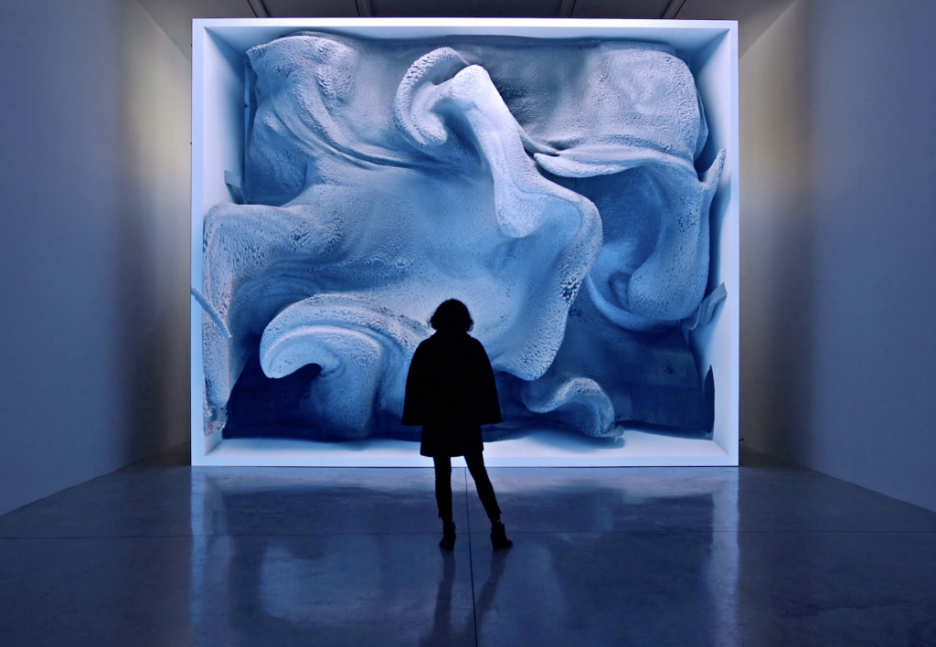
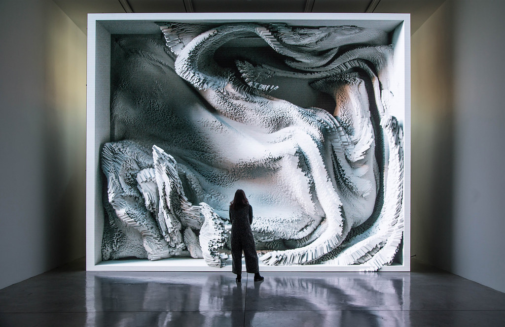
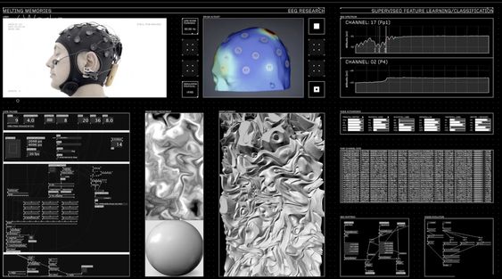
Conceived by Refik Anadol Studio “Melting Memories” offers new insights into the representational possibilities emerging from the intersection of advanced technology and contemporary art. A series of artworks are created by visualising different EEG(electroencephalogram) data collected. By representing the EEG data gives it a tactility that emphasises the materiality of memory. EEG data measures changes in brain wave activity and provides evidence of how the brain functions over time.
Anadol showcases his creative vision of “recollection” by translating the elusive process of memory retrieval into data collections. Melting Memories provides the viewer with revealing and contemplative works through the augmented data sculptures and light projections.
I find the way in which he broke down the various components of EEG data to produce these magnificent drawings which start to take on organic forms is fascinating. And how the title too relates back to the artists own experience with unexpected interconnections among seminal philosophical works, academic inquiries and artworks that take memory as their principal themes.
LO-07
Ben Fry is a leading member of Fathom, a team that creates programs and applications to visualize, analyze, and understand data of all sorts. They have a wide range of projects, such as COiN, which helps people read and understand contracts. The program breaks the document down into sections, provides definitions, and allows the reader to switch back and forth easily throughout the “living” document.
I like this project because everybody will have to sign multiple contracts and agreements in their lifetimes and most people will have questions as they are going through them. These would traditionally be directed to a lawyer, which can get expensive. This program provides a more even playing field for the average person, without needing to add the expense of a lawyer.
The algorithms that generated the work most likely focus on data analysis and key words that break the document into sections. While the creators do not have much artistic day in data, they were able to use creativity to determine how the agreements are presented in the program. Overall, this program has the potential to serve any adult who has access to a computer, making contracts less daunting overall.
COiN, a project by Fathom, founded in 2010
Project 07: Butterfly Curve
var n = 100; //Number of points
var r = 50; //Radius
var x = [] //List of X values
var y = [] //List of Y values
var t = [] //Parameter
function setup()
{
createCanvas(480, 480);
frameRate(60)
//Initialize Butterfly curve by assigning X, Y and T values
for (let i = 0; i < n; i++) {
t[i] = random(0, 180);
//Equations taken from https://mathworld.wolfram.com/ButterflyCurve.html
x[i] = r * sin(t[i]) * (exp(cos(t[i])) - 3 * cos(4 * t[i]) - pow(sin(t[i] / 10), 5));
y[i] = r * cos(t[i]) * (exp(cos(t[i])) - 3 * cos(4 * t[i]) - pow(sin(t[i] / 10), 5));
}
}
function draw()
{
background(0);
//Make (0,0) center of canvas
translate(width / 2, height / 2);
let my = map(mouseY,0,height,18*PI,6*PI); //Map mouse Y to number of rotation iterations of butterflies
push();
noFill();
stroke(100)
strokeWeight(0.25)
//Begin curve for butterfly
beginShape();
for (let i = 0; i < my; i += 0.01)
{
//Equations taken from https://mathworld.wolfram.com/ButterflyCurve.html
let bx = r * sin(i) * (exp(cos(i)) - 3 * cos(4 * i) - pow(sin(i / 10), 5));
let by = r * cos(i) * (exp(cos(i)) - 3 * cos(4 * i) - pow(sin(i / 10), 5));
//Vertex has X and Y points corresponding to parametric equations
vertex(bx,by)
}
endShape();
pop();
//Draw flying circles
push();
fill(255);
noStroke();
//Loop for number of circles
for (let i = 0; i < n; i++)
{
let mx = map(mouseX,0,width,-0.005,0.005); //Map mouse X to speed at which parameter changes (from negative to positive speeds)
t[i] += mx; //Add mapped mouse X to parameter
//Reset parameter if it exceeds 180 degrees
if (t[i] > 180)
{
t[i] = 0;
}
//Equations taken from https://mathworld.wolfram.com/ButterflyCurve.html
x[i] = r * sin(t[i]) * (exp(cos(t[i])) - 3 * cos(4 * t[i]) - pow(sin(t[i] / 10), 5));
y[i] = r * cos(t[i]) * (exp(cos(t[i])) - 3 * cos(4 * t[i]) - pow(sin(t[i] / 10), 5));
//Draw circle
circle(x[i], y[i], 3);
}
pop();
}
The Butterfly curve seemed really similar to the Lorentz attractor curves I was looking for last week’s Looking Outwards. I initially wanted to make a circle follow the trail of the curve and have the mouseX determine the speed, however I realized that it was actually easier to have multiple circles follow the path.
MouseX controls speed and direction of circles, MouseY controls amount of curve iterations of the butterfly curve.
Looking Outwards 7:
Nathalie Miebach combines her love of art, science, and data analysis to create interesting sculptures that reflect the primal forces of nature. She transforms data taken from massive storms and turns them into 3-dimensional sculptures. Meteorological data is taken and then transformed into sound, which is then arranged into a “musical score” built entirely of weather data. This score is then combined with the sounds of human experiences and interpretations of the weather, creating a juxtaposition of objective and subjective data. This musical composition is then turned into a sculpture that reflects both the empirical data, and nuanced human emotions of a storm.
I really appreciate the subjective, sensational effect the sculptures have. Some of them look like actual buildings being torn apart by the wind, and some look like the distortions and disturbances in the air as a storm rips through.