TableTop Whale is an online blogger currently working in at the New York Times graphics department. Her work is specialized towards information design with a focus o science communication. Her PHD work was done in Biology and Data science. On her blog the tableTop whale, she posts a variety of data visualization graphics. I think what intrigues me the most is her explorations on the geology of various planets of the solar system. Mapping terrain and topography has been an interest of explorers for centuries even before the age of exploration. In the past cartographers used various analog techniques to map out the world as we know today. Now, with the avdvent of GIS data, we have the capability creating maps almost on demand with digital tools such as ARC GIS and a variety of other Geospatial data visualizer. What’s interesting about TableTop Whale’s work is that she uses USGS’s data sets for the planets, but renders them in a style that evokes maps of the age of sail. This is interesting because, the style evokes a sense of unknown and allows for out imagination to run wild about the possibilities of new uncharted territory. That’s also what’s so special about having large datasets to manipulate and visualize, it can allow for new information to emerge from things we already know about. Allowing us to dive even deeper into what we already know possibly defining the unknown.
Category: SectionA
Project 7 Curves Composition
There are two hypotrochoids that are being drawn simultaneously in this program, as Mouse Y changes you can alter the pedals of the hypotrochoids., the lines redraw themselves every 3 loops around the circle so as you move Mouse Y around you begin to get an overlay of various patterns.
//tjchen
// section a
// 07 project composisiton with curves
var t = 0
var numPoints = 100;// global set up of num of points on circle
var lineX = [];
var lineY = [];
var lineX2 = [];
var lineY2= [];
function setup() {
    createCanvas(480, 480);
    background(0);
    strokeWeight(1);
    stroke(255);
    noFill();
}


function draw() {
    background(0);
    translate(width/2,height/2)
    stroke(255,0,0);
    draw_hypotrochoid_1(t);
    stroke(0,255,0);
    draw_hypotrochoid_2(t);
    t+=1;
}


function draw_hypotrochoid_1(t){
    var a = 150; // radius of large circle
    var b = 8; // radius of spinning circle
    var h = mouseY/10; // location of fixed point
    var xH= (a-b) * cos (radians(t)) + h * cos(((a-b)/b)*(radians(t)));
    var yH = (a-b) * sin (radians(t)) - h * sin(((a-b)/b)*(radians(t)));
    circle(xH,yH,10);;
    lineX.push(xH);
    lineY.push(yH);
    if (radians(t)>4*PI){ // 4 trips around the circle before redrawing circle
        lineX.shift();
        lineY.shift();
    }
    strokeWeight(1);
    for (i=0; i < lineX.length-1; i++){
        line(lineX[i], lineY[i], lineX[i+1], lineY[i+1]);
    }


}

function draw_hypotrochoid_2(t){
    var a2 = 200; // radius of large circle
    var b2 = 8; // radius of spinning circle
    var h2 = mouseX/10; // location of fixed point
    var xH2= (a2-b2) * cos (radians(t)) + h2 * cos(((a2-b2)/b2)*(radians(t)));
    var yH2 = (a2-b2) * sin (radians(t)) - h2 * sin(((a2-b2)/b2)*(radians(t)));
    circle(xH2,yH2,10);;
    lineX2.push(xH2);
    lineY2.push(yH2);
    if (radians(t)>4*PI){ // 4 trips around the circle before redrawing circle
        lineX2.shift();
        lineY2.shift();
    }
    strokeWeight(1);
    for (i=0; i < lineX2.length-1; i++){
        line(lineX2[i], lineY2[i], lineX2[i+1], lineY2[i+1]);
    }


}
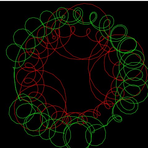
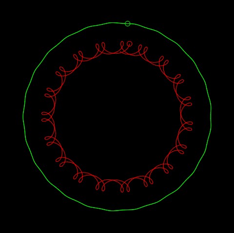
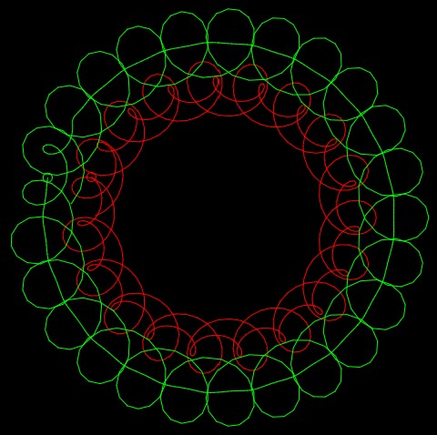
curves in another composition
Project-07-Butterfly Curve
// Sarah Luongo
// sluongo
// sluongo@andrew.cmu.edu
// Project

/* This code aims to create the curve, butterfly curve, as explained on Wolfram
MathWorld. In addition to drawing the curve I played around with the fill color
and stroke depending on the X position of the mouse. */

// Setups canvas size and speed
function setup() {
    createCanvas(480, 480);
    frameRate(10);
}

// Draws the butterfly curve
function draw() {
    var red = random(255); // Random shade of red
    var green = random(255); // Random shade of green
    var blue = random(255); // Random shade of blue

    background(0); // Black background
    translate(width/2, height/1.64); // Translate to the "center" of canvas
    rotate(PI); // Rotate 180 degrees

    if (mouseX < width/3) {
        fill(red, green, blue); // Random fill color
	stroke(0); // Black
	// Draws butterfly curve 4 times
        for (var i = 0; i < 4; i++) {
            drawButterflyCurve(i);
        }
    } else if (mouseX >= width/3 & mouseX < 2*(width/3)) {
	noFill();
	stroke(red, green, blue); // Random stroke color
	// Draws butterfly curve 4 times
        for(var i = 0; i < 4; i++) {
            drawButterflyCurve(i*2); // i*2 makes size of curve bigger
        }
    } else if (mouseIsPressed) {
	background(225, 200, 255); // Purple background
	noFill();
	stroke(0); // Black
	drawButterflyCurve(1); // To see original curve
    } else {
	noStroke();
	fill(red, green, blue); // Random fill color
	// Draws butterfly curve 4 times
        for(var i = 0; i < 4; i++) {
            drawButterflyCurve(i/3); // i/3 makes size of curve smaller
        }
    }
}

// Butterfly Curve
// https://mathworld.wolfram.com/ButterflyCurve.html
function drawButterflyCurve(j) {
    var da = .01; // How round the "wings" are
    var a = map(mouseX, 0, width, 0, width/9); // Constrain x size of butterfly curve
    var b = map(mouseY, 0, height, 0, width/8); // Constrain y size of butterfly curve
    // Creates the butterfly curve
    beginShape();
    for (var t = 0; t <= 24*PI; t += da) {
	// The parametric equations found on the website commented above
	var r =  exp(cos(t))-2*cos(4*t)-pow(sin(t/12), 5);
	var x = a * sin(t) * r * j;
	var y = b * cos(t) * r * j;
	vertex(x, y);
    }
    endShape();
}
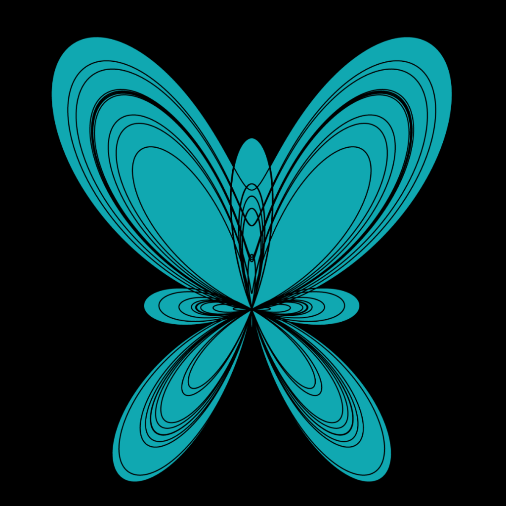
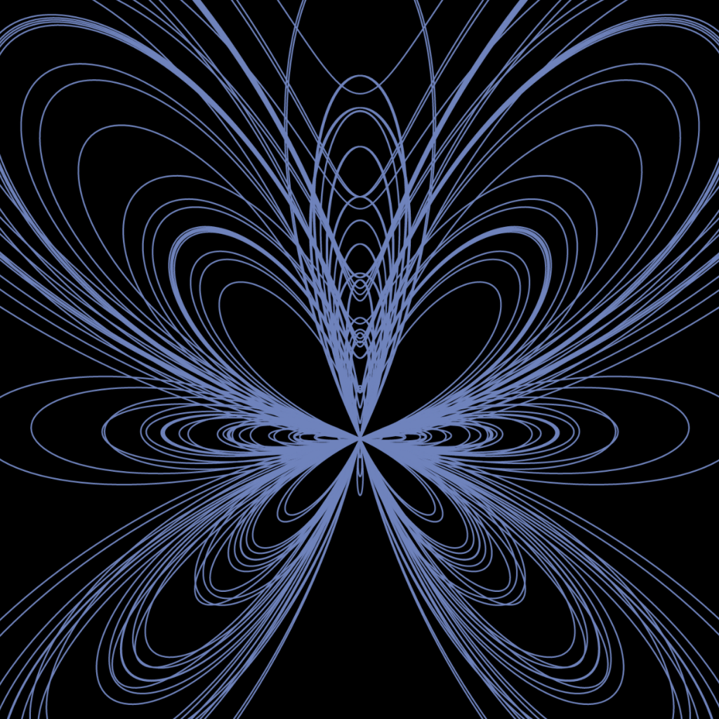
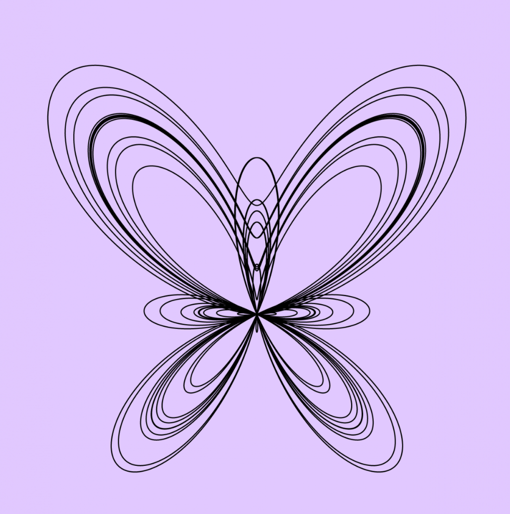
When I saw this curve on Wolfram MathWorld, I was super excited because I had attempted to draw a butterfly in my last project. I think this curve is way cooler because there’s a lot more curves and more going on. So, it wasn’t just a boring (although I don’t find it so boring) Butterfly Curve, I added some if statements to duplicate the curves, change colors of the fill and stroke, but if this is too much for you you can also click the mouse in the bottom right to get the normal curve. Also, moving the mouse up and down and side to side within each if statement changes the size of the curves. If you move it left to right within a third of the width it kind of looks like the butterfly is flapping it’s wings.

LO – Aaron Koblin
Eamonn Burke
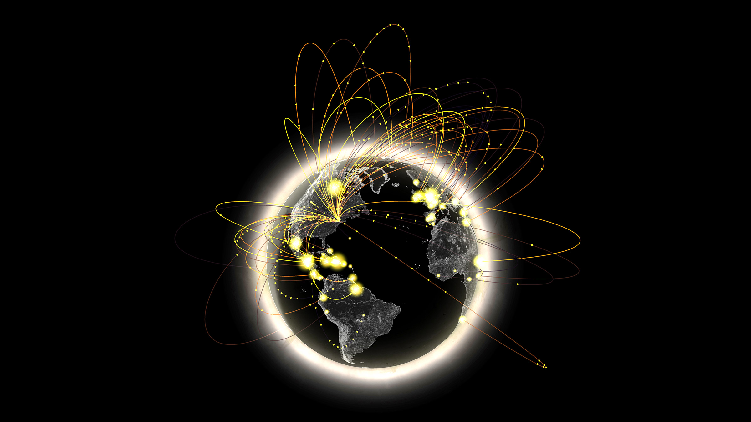
I once again return to the work of Aaron Koblin, because I find his work to be the most interesting subjects and the best representations of the listed designers. Here he visualizes AT&T call traffic in NYC, which is a fascinating way to represent geography and globalization. As with the last Koblin project I used, I love this piece because it’s at the intersection of human behavior and design. It depicts the social phenomenon of urbanization and globalization, as physical distance becomes negligible and we become one mind.
I think Koblin used his creative sensibilities to convey this idea of a collective brain, by evoking the concept of travelling neurons to suggest connectivity. He also clearly conveys the “hotspots” and distinguishes the different types of calls by using brightness and color.
I would guess that the software Koblin used here tracks call information including distance and location, and then uses this data to plot functions of curves that are projected onto a 3D world model, with the height of the curve depending on the distance of the call.
LO-07
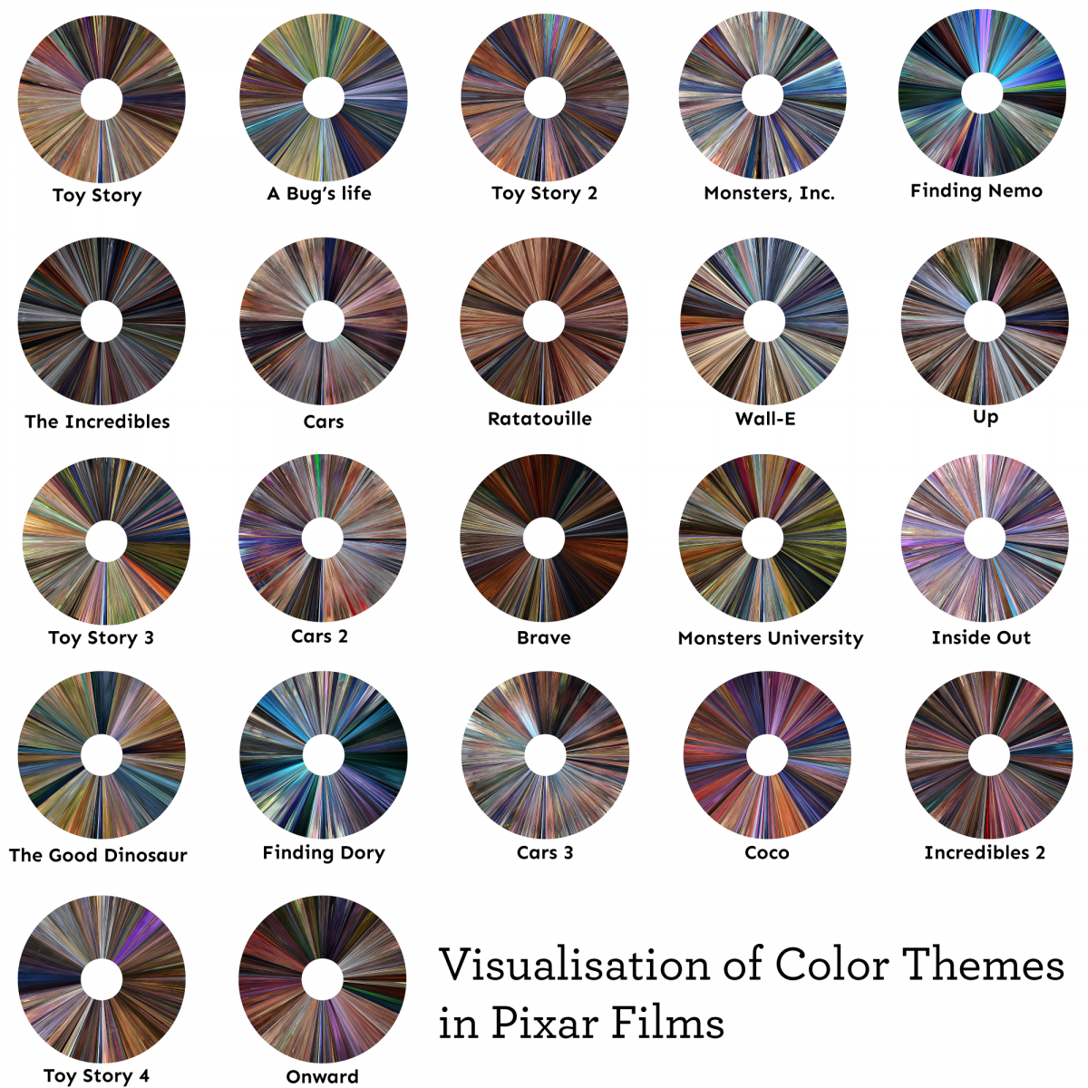
When I saw this assignment I immediately thought of the subreddit DataIsBeautiful. As I was scrolling through it, I found one that was very cool and interesting. It was a Visualizations of Color Themes in Pixar Films by redditor /keshava7 created about 4 months ago. I love Pixar films, and I’ve watched almost every one. Some of the older ones give me a great sense of nostalgia. Their visualization of data using Pixar films is very pretty, and I like how they are all shaped like disks. It reminds me of the old Blu Ray disks (although I also remember the older format of VHS). They created this visualization in Python by extracting 5000 frames per movie, and they compressed each frame into a pixel. They start each movie at 270 degrees and go clockwise, so the first frame of each movie starts at 270 degrees. There is another redditor /julekca who gives a more detailed description on how to do it, it makes me want to try it myself. It is very beautiful to see all the different colors of some of the films I watched as a child.
Here’s a link to the post:
LO-07: Information Visualization
The project I chose this week was Aaron Koblin’s Amsterdam SMS. This project is an interactive visualization tool developed for the MIT Senseable City Lab which helps visualize SMS messages data. I admired this project because I was drawn to the boldness of the colors and like any artwork done using data, I just thought it was very interesting and cool. To generate this work, Koblin used Processing and OpenGL. The data he used was provided by KPN Mobile. Like his other works, Koblin uses bright colors or “light” (he doesn’t actually use light in this project but the bright colors do give off a similar effect!) to stimulate our sight and draw attention to the artwork.

Project-07: Curves
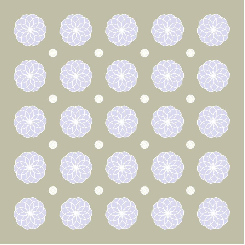
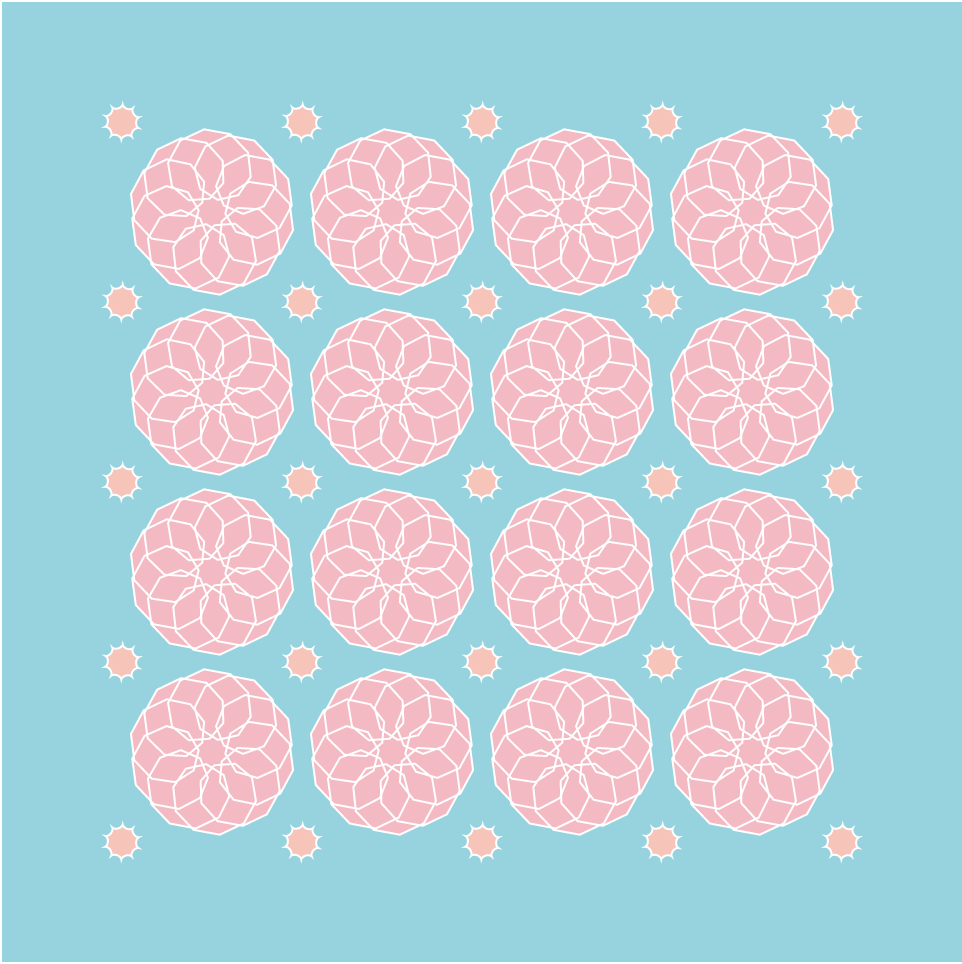
For this week’s project, I decided to use 2 different curves that reminded me of flowers, a 10 cusp Epicycloid and a 10 cusp Hypotrochoid. I decided to make them rotate and change in size based on the mouse movements but in opposite directions to give off a pulsating effect. I also utilized mousePressed so that the curves can alternate. The mouse positions also control the colors of the curves and the background so that the final output is unique in all positions. The colors of the flowers and background are quite muted to give off a slight vintage wallpaper vibe with a modern twist.
(below are screenshots of the code at different mouse positions)
sketch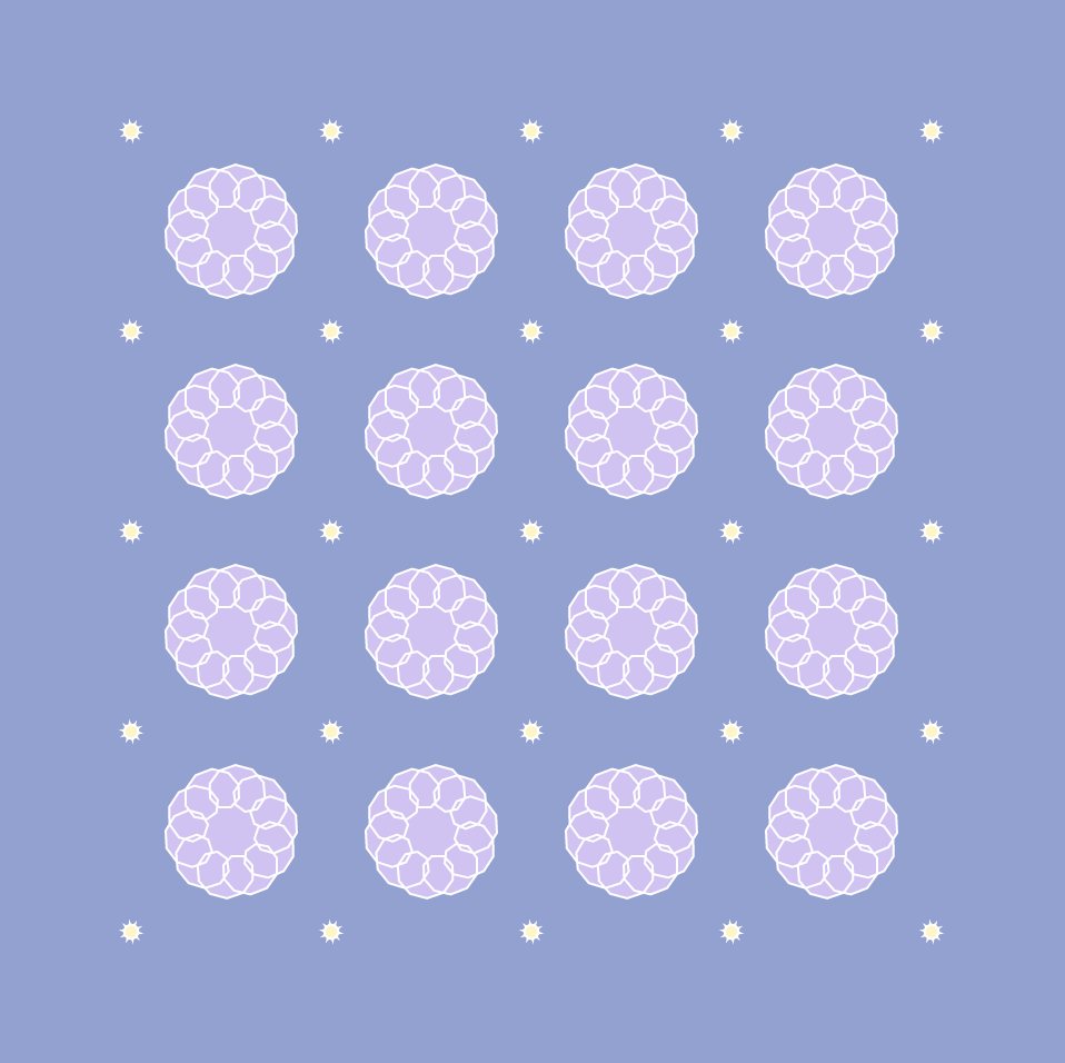
function setup() {
    createCanvas(480, 480);
}

var nPoints = 100;

// background color codes
var r = 205;
var g = 152;
var b = 152;

// to switch curves based on mouse click
var whichCurve = 0;

// curve color codes
var curver = 202;
var curveg = 255;
var curveb = 255;

function draw() {

	// to add/subtract color codes based on mouse position
	var colordiffX = map(mouseX, 0, 480, 0, 53);
	var colordiffY = map(mouseY, 0, 480, 0, 53);

	background(r - colordiffX, g + colordiffY, b + colordiffX);

	stroke(255); // white outline

	// 5 x 5 curves (outer)
	for(var x = 60; x < width; x += 90){
		for(var y = 60; y < height; y += 90){
			push();
			translate(x, y);
			fill(curver + colordiffX, curveg - colordiffY, curveb - colordiffX);
			if(whichCurve == 0) {
				drawHypotrochoid();
			}
			else {
				drawEpicycloid();
			}
			pop();
		}
	}
	// 4 x 4 curves (inner)
	for(var x = 105; x < width - 90; x += 90) {
		for(var y = 105; y < height - 90; y += 90) {
			push();
			translate(x, y);
			fill(curver + colordiffY, curveg - colordiffX, curveb - colordiffY);
			if(whichCurve == 1) {
				drawHypotrochoid();
			}
			else {
				drawEpicycloid();
			}
			pop();
		}
	}
}

// draw rotating 10 cusp epicycloid
function drawEpicycloid() {
	var x;
	var y;
	var a = mouseX / 30;
	var b = a / 10;
    var h = constrain(mouseY / 8, a / 10, 8*b);
    var ph = mouseX / 50;

    beginShape();
    for (var i = 0; i < nPoints; i++) {
        var t = map(i, 0, nPoints, 0, TWO_PI);
        x = (a + b) * cos(t) - h * cos(ph + t * (a + b) / b);
        y = (a + b) * sin(t) - h * sin(ph + t * (a + b) / b);
        vertex(x, y);
    }
    endShape(CLOSE);
}

// draw rotating 10 cusp hypotrochoid
function drawHypotrochoid() {
	var x;
	var y;
	var a = (width - mouseX)/20; // opposite movement from epicycloid
	var b = a / 10;
    var h = constrain((height - mouseY)/8, a/10, 10*b);
    var ph = (width - mouseX) / 50;

    beginShape();
    for (var i = 0; i < nPoints; i++) {
        var t = map(i, 0, nPoints, 0, TWO_PI);
        x = (a - b) * cos(t) + h * cos(ph + t * (a - b) / b);
        y = (a - b) * sin(t) - h * sin(ph + t * (a - b) / b);
        vertex(x, y);
    }
    endShape(CLOSE);
}

// mouse pressed alternates order of curves
function mousePressed() {
	if(whichCurve == 0){
		whichCurve = 1;
	}
	else {
		whichCurve = 0;
	}
}
LookingOutwards-06
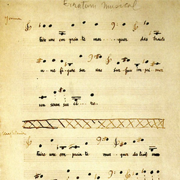
As one of the most renowned abstract artist, Marcel Duchamp produced “two works of music and a conceptual piece—a note suggesting a musical happening” between 1912 – 1915. Similar to his other creative work, his compositions represent a radical departure from anything done up till his time.
In the process of the composing, Duchamp made three sets of 25 cards, one for each voice with a single note per card, where extensive passages of pitches and rhythms are fully specified, but the rhythmic coordination of parts within the ensemble is subject to an element of chance. It is considered as one of the earliest work that is mechanically driven and largely determined by random procedures.
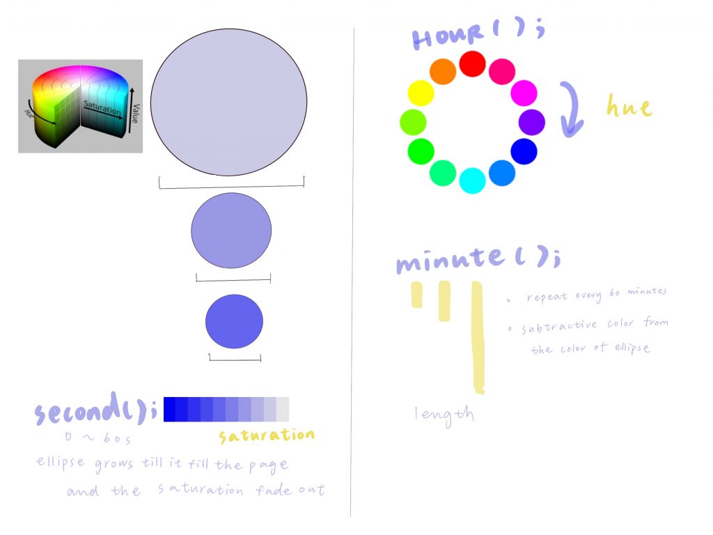
Project-06-Abstract-Clock
//Isabel Xu
//15-104 Section A
//Project 6
var circ_size;
var s;
var h;
var m;

function setup() {
  createCanvas(480, 480);

  //choose HSB colorMode for further arguments on hue and saturation
  colorMode(HSB);
  frameRate(10);
}

function draw() {
  background(255);

  let h = hour();
  let s = second();
  //define the hue of the cicle with the current hour
  //define the saturation of the circle with the current second
  fill(360-h*15,104-s*1.73,255);
  noStroke();

  //define the size of the cicle by the current second
  let circ_size = (second ())*8;
  //ellipseJitter effect
  ellipse(width/2+random(-3,3), width/2+random(-3,3), circ_size, circ_size);

	// When the circle gets bigger than the screen
	// Make it small again
 	if (circ_size > 480) {
   	 circ_size = 0;
  	}
  	let m = minute()
  	push();
    //let the following element to locate at the center
  	translate(width/2+random(-3,3),0);
    //fill the rect with color that subtracted from the color of the circle
  	fill(h*15,s*1.73,255);
  	//define the length of the rect with the current minute
  	rect(-10,0,10,(m*8));
  	pop();
}
Looking Outwards-06
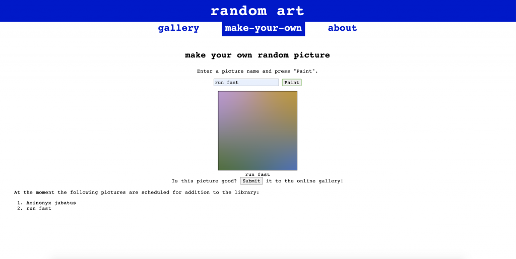
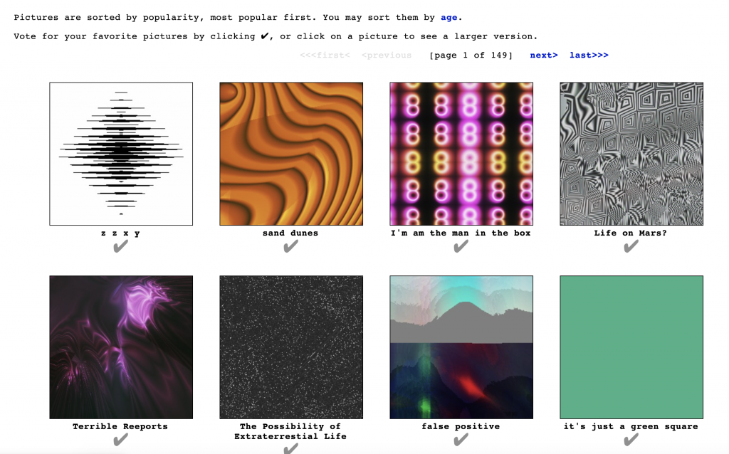
I have been quite interested in random generators and found this random art generator.
This program was created by Andrej Bauer in ocaml. The website contains a web version using ocamljs. To run the program, you are able to input a title for your piece. Based on the documentation, works are normally composed of two words. The words trigger a formula that randomly generates pseudo-random numbers which then create the picture. It is pseudo-random because the same word will always trigger the same number output and create the same artwork. Within the two word name, the first name determines the colors and layout of focal point. The second word determines the arrangement of the pixels in the image. When I first tested this out, I only typed in one word so I wonder how the program works if only given one input.
I admire this project because of the connections created between words, art, and randomness. It is wonderful seeing all of the art generators out there pushing the limits of the meaning of art and creativity. I find the parameters chosen for the two inputs to be interesting, and I wonder what it might look like if different parameters of the piece were explored.
This project is also quite exciting because of the large number of possibilities it can create. I don’t know how many combinations of two words there are, but I’m sure there are a lot. This website allows you to make your own image and then submit it to a library for people to vote on their favorites. It would be interesting to what words are used to make the best pictures using this algorithm.
![[OLD FALL 2020] 15-104 • Introduction to Computing for Creative Practice](../../../../wp-content/uploads/2021/09/stop-banner.png)
