LO 1 – My Inspiration

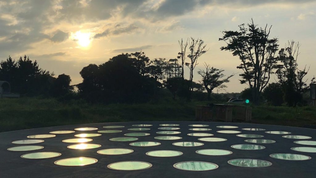
Image of Jeju Pool from Jen Lewin’s Website

Jeju Pool, which is an interactive circular installation created by Jen Lewin, is a technological piece of art that caught my attention when I saw it in Jeju Island. Jen Lewin was the one who designed the artwork, and there were many other people (the team of Jen Lewin and Jeju LAF) who were involved in installing the artwork in Jeju Island. The Jeju Pool has series circular platforms that communicate wirelessly with other platforms. The surface of each circular pad can sense people’s movement and speed as they work on top of each pad. Using the data collected, the software determines the ripples of light that will appear in other circular pads. This installation is somewhat a visual instrument, where different patterns vary as people engage with the artwork. The Jeju Pool was inspired by the lights and reflections we see in nature. What I really love about Jeju Pool is that it is installed in a landscape with woods and plants surrounding the artwork. This project allows people to have an interaction and special experience both with the installation and Jeju Island itself.

Check Jen Lewin’s website here.

LO 1

“This Person Does Not Exist” is a computational project that was created by Phillip Wang using StyleGAN, a machine learning framework made available by the technology company Nvidia. Phillip is a former Uber software engineer who created the program to show the impressive capabilities of GANs (generative adversarial networks.) It was originally shared to a small Facebook group but went on to get over 4 million hits. His inspiration for the project likely came from the rise of intelligent video manipulation and “deepfakes” on the internet.

Upon loading the webpage, the screen is filled with a high definition headshot of a random person. Reloading the page brings up another person, and so on. While the images look believable, they are all completely fabricated by an artificial intelligence; thus the title “This Person Does not Exist.”

What makes this project so interesting to me is the questions it brings up. If a computer program can so easily trick us into thinking a face is real, what else could we be made to believe? In a world where we already question almost every piece of information fed to us from entertainment media and the news, it seems as though tools for digital deception are only becoming more advanced. By highlighting the exponentially expanding capabilities of artificial intelligence, this work leaves the user feeling both deep discomfort and utter awe.

An artificially generated face from the website.

LO 1: My Inspiration

One project that I found inspirational–and actually led me to take this class– is a project done by Elena Deng and Dani Delgado for the 15-104 class they took in the fall of 2018. For this project, they attempted to visualize certain sounds through visual elements. As the user interacts with the artwork by clicking on different parts of the computer screen, certain sounds and shapes appear. Through coding in p5.js, they were able to make an invisible thing–sound–visible. As I interacted with the artwork for the first time, I found myself deeply immersed in it. When I clicked on my computer screen, I felt very peaceful– the colors, shapes, and sounds work perfectly to evoke a sense of tranquility. I am unsure of what prior works inspired the creators of this project; however, after a bit of researching, I found that many artists, such as  Norimichi Hirakawa, have used computational art to represent abstract or invisible subjects similar to the creators of this project. This project also shows an emerging future as more people can use the power of computation to express and access certain aspects of life, nature, or oneself like never before. It also shows that coding is evolving to become a new medium for artists and designers to use.

Authors: Elena Deng & Dani Delgado
Project Name: Final Project
Link to project:
https://courses.ideate.cmu.edu/15-104/f2018/2018/12/07/dani-delgado-and-elena-deng-final-project/

LO 1-My Inspiration

Title: Generative Portraits
Artist: Diana Lange

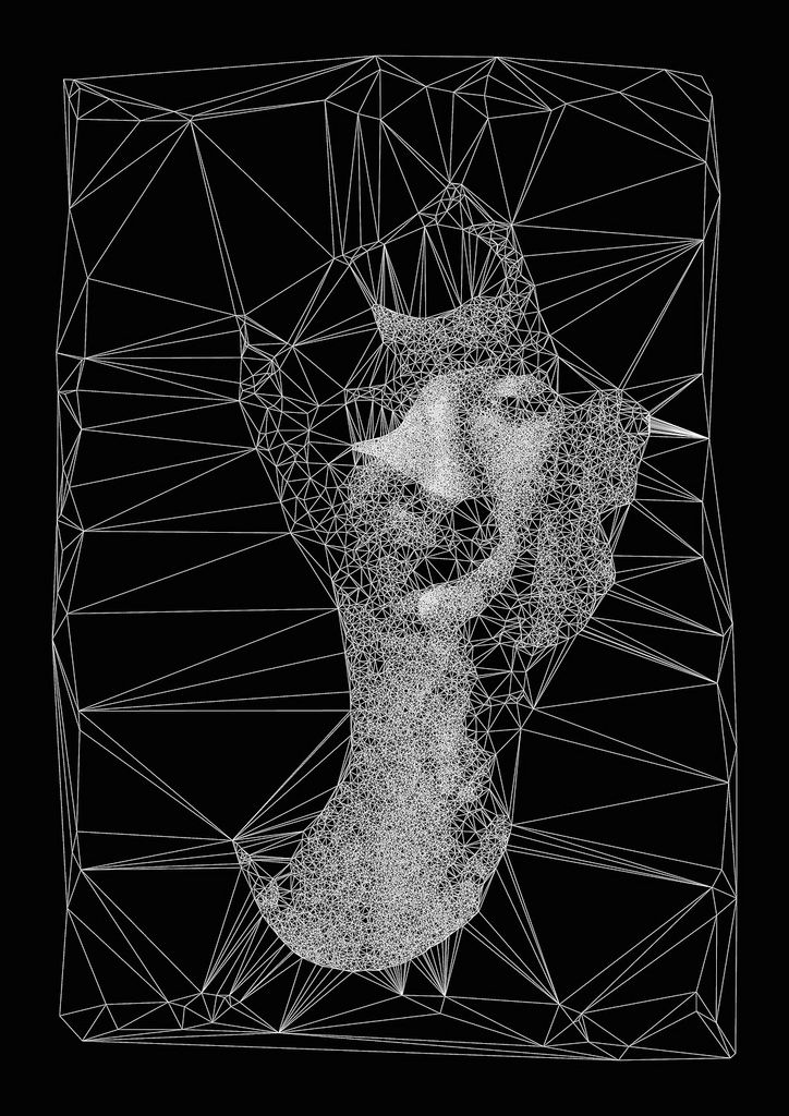
“Generative Portraits,” a collection of work by graphic artist Diana Lange, depicts human-like entities, with each image made up of hundreds of white lines connected by nodes on a black background. While none of these pieces fully replicate a human face or form, they are often reminiscent of parts of facial features–an earlobe, the bridge of a nose, eyelids, etc. Lange uses Processing and 3D modeling software to construct each of these portraits, creating areas of higher visibility, detail, and clarity by increasing the concentration of interconnections in specific places. Although it’s unclear where Lange drew inspiration from for this collection, she as an artist often looks to the patterns found in nature, using them to inform her code.

An example of Lange’s work

LO 1 – My inspiration

I went to the teamLab Borderless exhibition last year in Shanghai and was amazed by the project. The project wants to create a world that is connected by artworks and there are no boundaries for people to explore. It is a super immersive experience and all these artworks are fluid around in the place. I think the biggest inspiration for Teamlab’s project is nature. You can see from their works that there are so many natural elements.

I attended their lecture in school and learned that there are usually 10 – 15 people working together for one project. In a team, they usually have three main teams. The project management team who deliver the message from the client and push the project forward. The design teamwork on the concept and visual design. The last team is the engineering team that builds the project from concept to reality. For the Borderless project, it took them about 3 months to finish. The engineers use software like Unity, OpenGL, Processing those kinds of languages or software.

LO 1 – My Inspiration

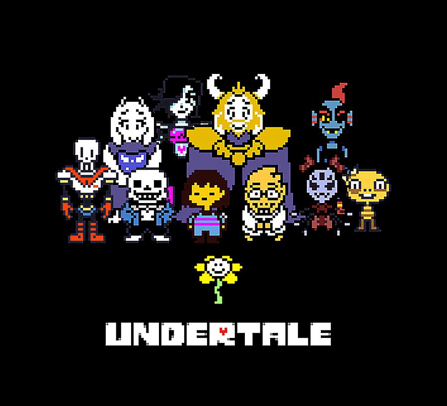
Undertale main characters

A project I really admire is the indie game called “Undertale”. It is a story orientated role-playing game about a child who falls into the underground, and has to navigate through a world of monsters (some of whom helps him) to get back to the surface. This game is one of the reasons I want to learn programming.

I admire it very much because programming is used really well as a storytelling tool. It is a multiple-ending game, in which every decision the player makes affects the outcome. In fact, there are so many different possible endings that people disagree over how many endings it has. This type of storytelling is very powerful because the story is literally in the player’s hands. And I want to explore novel ways of storytelling that programming offers.  

Another reason I admire “Undertale” is because it is done by very few people. The main team consists of just two people: Toby Fox, the developer and composer, and Temmie Chang, the artist assistant. Toby Fox used the game engine GameMaker Studio for development. This shows that a good and meaningful game does not have to take a big team, a big budget, or a super complex programming language.   

LO 1 – My inspiration

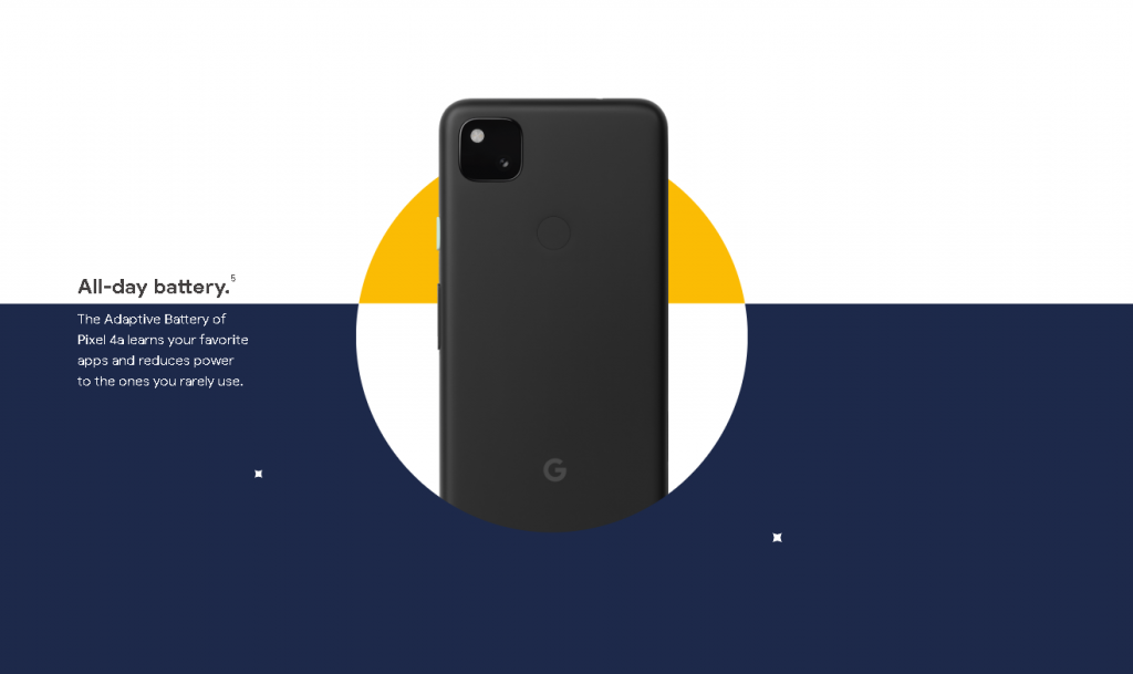
Slider from interactive product page with scaling graphics

I saw this interactive experience this summer, as the Pixel 4a has just released. I was intrigued by the product page experience. I admire how it blends communicating information through high contrast shapes and scaleable objects. There’s no information on the page related to the creation of the site, but I’m sure the team of designers and developers behind it only had a matter of months to design the page, as Google has a frequent product release schedule. The whole experience blends from one section to the next, with lots of attention paid to details of opacity and object transitions. I’m not sure how it was made or if it was a custom-coded experience or off-the-shelf software. I think there’s a large precedent in the tech industry for needing smooth, seamless but memorable experiences on product launch pages, but they also need to communicate key information. I’m sure they were guided by Google’s brand identity and the previous work of their competitors, such as Apple’s product pages.


Product Page
No author or title found, Google Pixel 4a by Google.

LO: My Inspiration

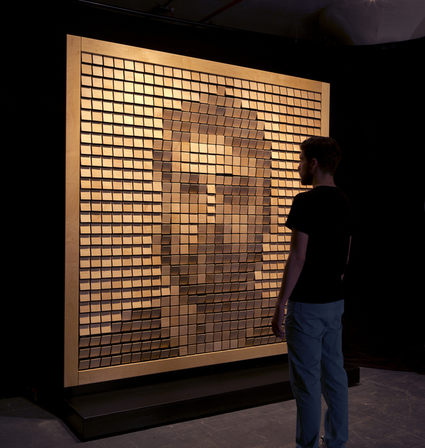
In this project, Daniel Rozin and his team members decided to create ‘mirrors’ that requires the idea of participation of interaction where the viewer becomes a part of the project/artwork. Audiences can understand the interface that exists between them and the piece. People see themselves reflected from uncommon materials like wooden tiles, trash, fans, etc. When he first created the wooden mirror, it took him a year to actually build it. He had to cut out all the tiles and get the motors to learn how to control them(all of the electronics, mechanics, and the fabrication was needed).

I found this project very interesting because they built and programmed to reflect the viewer’s form(which is the idea of a mirror but a different way of the showing). Daniel Rozin had to prepare to create a complex piece that required controlling cameras and moving close to a thousand motors. I believe that Daniel Rozin has come up with this project because he perceived the world and themselves differently. When people thought about the wheels and the radio as great inventions of mankind, he thought about a simple mirror. Daniel Rozin talks about this project that shows the light when a person stands in front of it. He thinks that “it takes more than the audience’s image but maybe it’s capturing something about our soul and displaying back to us.”

Daniel Rozin| Wooden Mirror(2014)

LO 1 – My Inspiration

Looking Outwards Text – 01
Iris Yip / 15-104 D

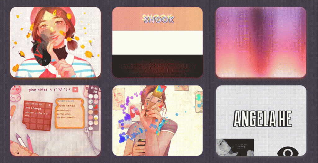
A project focusing on computational art that really inspires me is Angela He’s ‘A Coding Project a day for 20 days’. It is a series of small coding projects (web-based) done over the course of a few weeks ranging from simple mechanisms like sliders to loading screens to interactive mini-games.

The premise of the project was to help her develop skills that she could use for her future, larger-scale projects like developing webpages and/or games. I thought breaking down the daunting task of learning to code into smaller, more feasible tasks was a great way to get into coding and overcome its admittedly daunting nature for beginners. I was really fascinated by her easy-to-follow documentation of her journey, and was inspired to take this class and learn coding for myself because of how she broke it down into simpler steps and incorporated illustration and visual elements, which really intrigued and excited me. I found that the coding brought an additional layer of interaction to her visual works and opened up a lot of possibilities that don’t necessarily exist in traditional types of 2D art like illustration. The balance between code and art really appealed to me as a designer, and I really admire the casual nature of the project and how she let herself learn by doing and taking inspiration from others without copying.

She explored a lot of different softwares for coding, as well as different online resources including GitHub and even going into Chrome Developer to see for herself the kind of code a webpage might use.

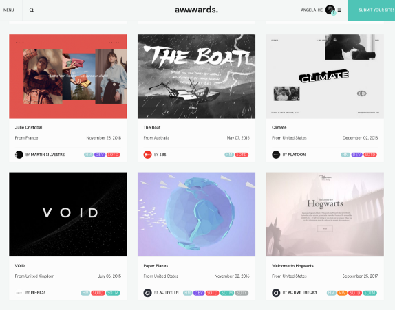
On the project page, she goes into a lot of detail about what inspires her, including projects hosted on websites like CodePen, and Awwwards. For visuals, she also looked at websites like Behance and dribbble. She is relatively well known for her illustrations and her visual novels (completed for Ludum Dare, a game jam competition.)

REFERENCE:
Project Link
Author: Angela He, also known as ‘zephybite’

LO 1 – My inspiration

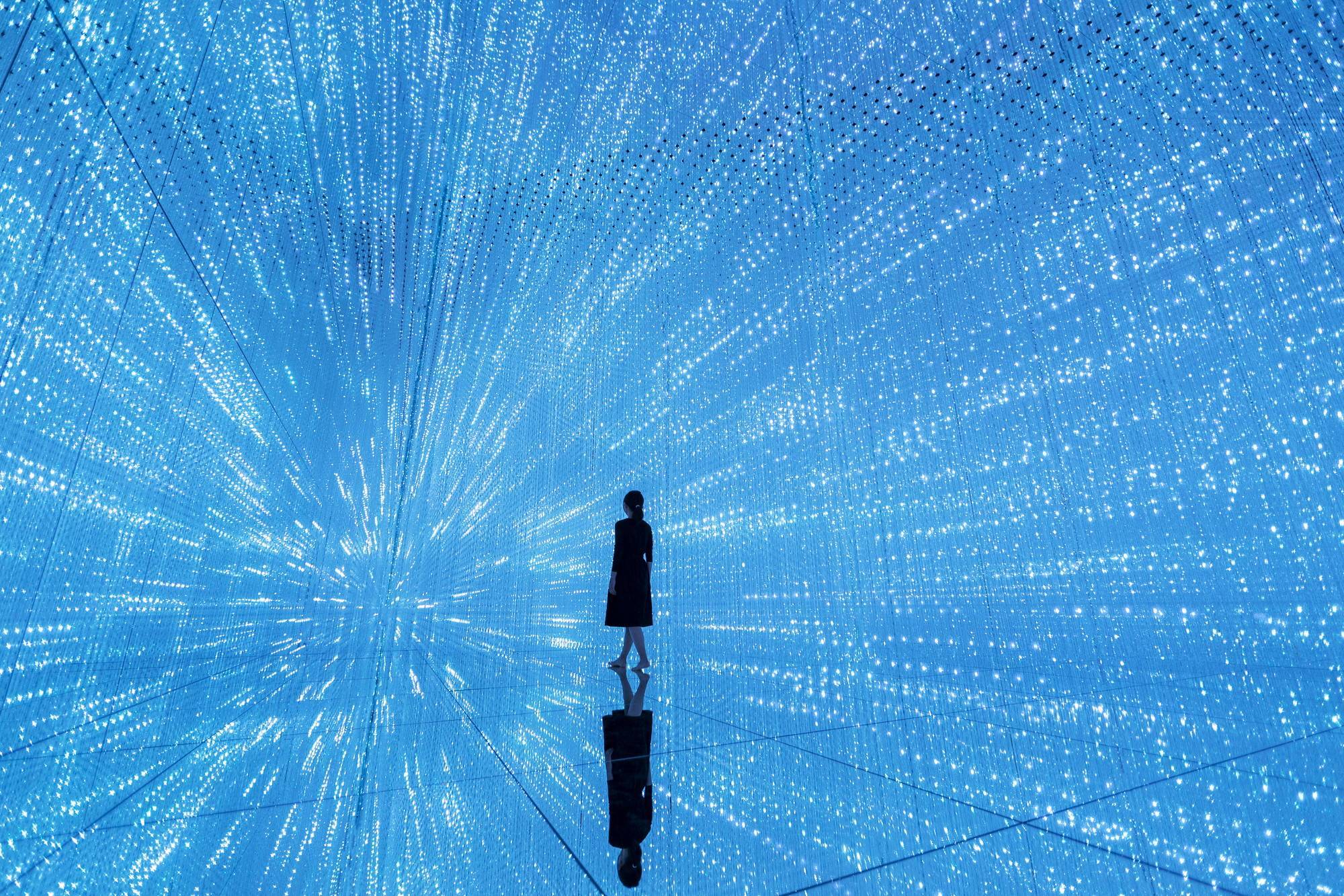
One interactive art piece I admire comes from teamLab Planets TOKYO. It’s a piece called “The Infinite Crystal Universe” and it uses hanging strips of LEDs in a presumably reflective space that simulates an infinite environment. It utilizes pointillism to create visuals for the user. Due to this being a piece put into the museum by its owners, one can assume that a large number of people worked on it. As for the time it took, the project must have lasted for months if not years. The piece utilizes its own app to “throw” elements into the LED galaxy, so custom software was created that took information from the phone such as the direction the user is facing. Although I am not sure if the creators were inspired by any specific past works, the piece is entirely space-themed and the promotional video is occasionally reminiscent of 2001: A Space Odyssey’s stargate scene, with lights flying by the viewer at incredible speeds. The piece is also similar to a large-scale version of the mirrors that use LEDs to create the illusion of an infinite hole. I think that this piece can lead to more art that allows viewers to interact with it in multiple ways, from physical steps to digital apps. I do not believe that the piece itself is so revolutionary that a slew of new space-themed 3D artworks will be created, but I do believe that this piece is incredibly interesting in its own right. I would love to see more interactive art pieces that make use of perspective and 3D space to create seemingly endless environments. Personally, I have always been interested in space and I would love to create something like this myself, had I the time or the budget to do so.

Picture taken inside The Infinite Crystal Universe.