![[OLD FALL 2019] 15-104 • Introduction to Computing for Creative Practice](wp-content/uploads/2020/08/stop-banner.png)
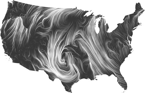
“The wind map is a living portrait of the wind currents over the U.S. “
Martin Wattenberg co-leads the People + AI Research initiative at Google. And he produced a lot of data visualization work.
The real-time wind map showed the tracery of wind flowing over the US delicately. The direction, intensity of the wind can be captured just at a glimpse of the map that can even be zoomed in.
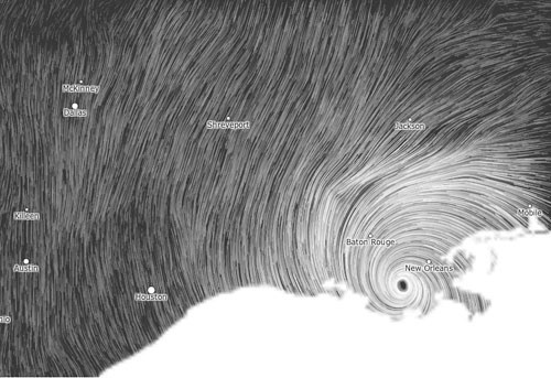
It is such a successful project to me is that it achieved the purpose of visualizing complex data artistically for people not in the academic field. Mentioned by Martin, “bird watchers have tracked migration patterns, bicyclists have planned their trips and conspiracy theorists use it to track mysterious chemicals in the air. ” Mostly using the simplest and strongest visual language, data visualization workers can produce complex but legible work.