![[OLD FALL 2019] 15-104 • Introduction to Computing for Creative Practice](wp-content/uploads/2020/08/stop-banner.png)
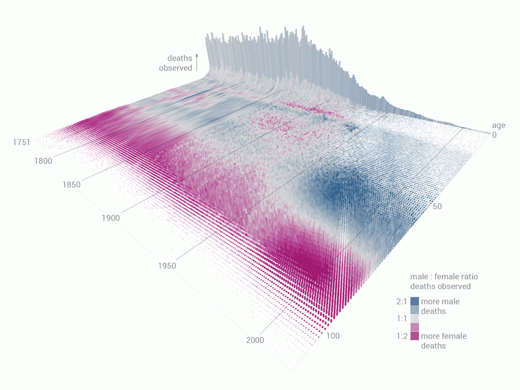
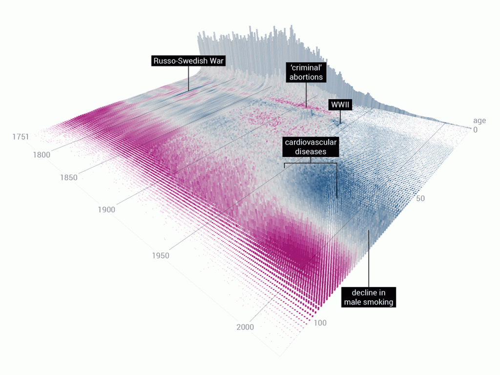
A data explorer, Wesley Bernegger, created the above data visualization for the Swedish Human Mortality Database. First, he had to decode the database that consisted of 264 years worth of data. He focused on basic trends in mortality such as deaths increasing with older age, highest observed mortality during war times. Then, slowly, he moved onto more specific patterns such as infant mortality spikes, higher mortality events, and he studied more of the Swedish history in order to get a better understanding of these trends. Finally, he included additional variables: male to female mortality ratio by age across all years and cumulative deaths observed during a year for each age group.
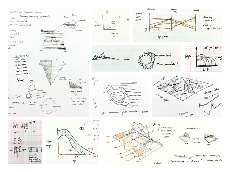
Then, further in the process of data visualization, he included the z axis, making the graph more 3D, in the hopes of better understanding the plots within the context of total mortality. Finally, they added gradient of colors to distinguish mortality rate of female and male.
This particular project was interesting to me because I have never seen one like it. It is very interesting because each data point might seem obscure, but it is effective in giving the big picture of mortality rates in Sweden across the years with additional variables such as gender, different historical events and age groups.