![[OLD FALL 2019] 15-104 • Introduction to Computing for Creative Practice](wp-content/uploads/2020/08/stop-banner.png)
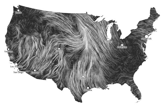
The project Wind Map, is a data visualization by Martin Wattenberg that became the first web art to be included in the MoMA’s permanent collection. The project shows winds flowing over the US from day to day with speed and direction of the lines representing wind behavior pulled from the National Digital Forecast database updating once per hour. While the representation is slightly abstracted to increase readability of the map, the overall patterns it captures are very informative and show the overall wind trends across the country in an informative and beautiful way. The project is created entirely in Javascript and HTML and shows the possibilities of computational techniques to visualize data. I found the project to be a fairly simple yet very well executed example of information visualization and thought the use of animation made understanding the previously less interesting raw wind data very intuitive and engaging.