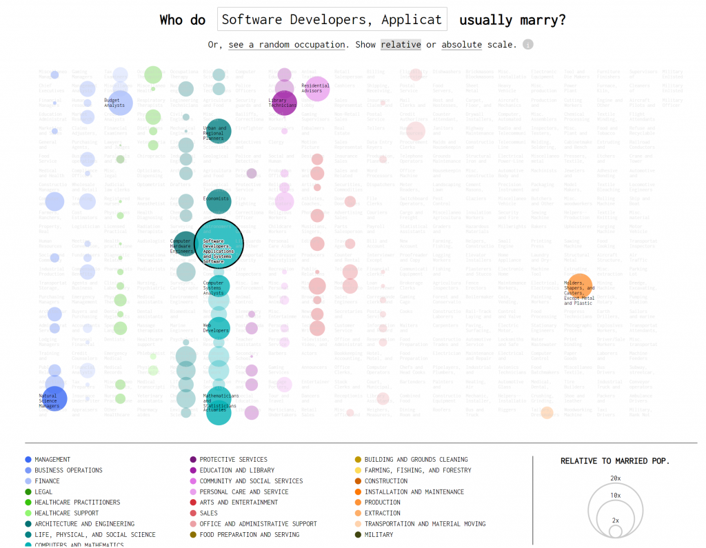
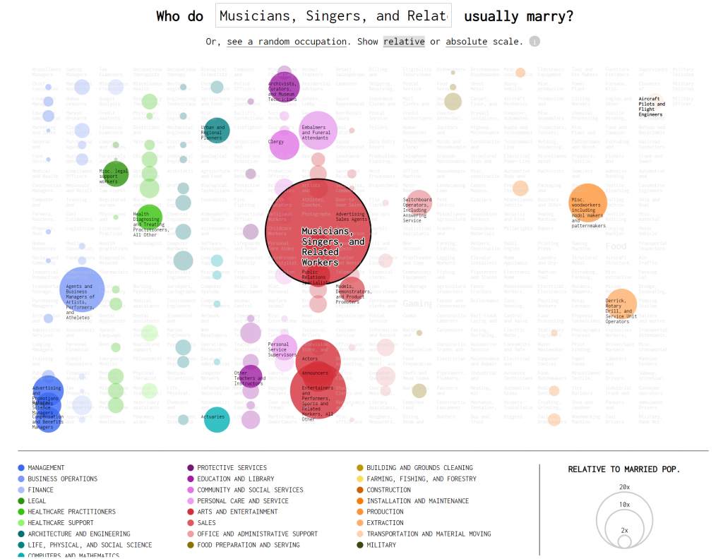
Created by Nathan Yau in 2017, Occupation Matchmaker is an interactive data visualization that looks at who people in certain occupations end up marrying. The project builds off an earlier project released by Adam Pearce and Dorothy Gambrell for Bloomberg.


Yau’s artistic sensibility is clearly visible in the way he chose to visualized the grouping of different types of occupations and how they overlap. The visualization of this project, compared to its initial development by Pearce and Gambrell, showcase a more holistic image across the board. The viewer is made clearly aware of the connections that exist between different occupations within the same industry whereas the earlier chart shows more linear connections. In creating this visualization, Yau made sure to take into account how some occupations are much more common than others, and used a relative scale to change the sizes of the circles. Yau created this visualization using R (to analyze) and d3.js.

![[OLD FALL 2019] 15-104 • Introduction to Computing for Creative Practice](wp-content/uploads/2020/08/stop-banner.png)