![[OLD FALL 2020] 15-104 • Introduction to Computing for Creative Practice](../../../../wp-content/uploads/2021/09/stop-banner.png)
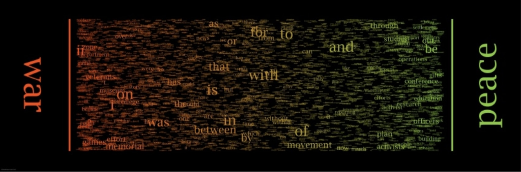
The project that caught my eye this week is Chris Harrison’s WordSpectrum. Its purpose is to visualize bigram data to represent word associations. For example, it takes the words “war” and “peace,” and then places words that appear most frequently as bigrams with these from left to right depending on which word they appear next to more. Due to this, you get “war” and “ii” on the same side of the graphic, then you have “peace” and “officers” on the other side. In the center of the graphic you have words that are used generally equally between the two, and because these words are related to each other, most of the time these words will be conjunctions. For example, the word “and” is near the center for most graphics because people have a tendency to write phrases such as “war and peace,” or “good and evil,” leading to high word associations between the two. I find this project particularly interesting because it shows to at least some degree what people associate with certain words, giving a glimpse into the minds.
Month: October 2020
Project-07 Curves
//Robert Rice
//rdrice
//Section C

var x=[];       //bucket of x-coordinates for the vertices
var y=[];       //bucket of y-coordinates for the vertices
var a = 26.5;   //The scale of the curve
var n = 200;    //The curve's "resolution". How many vertexes are used to form the curves.
var q = 3;      //the number of petals

var rStart = 0;
var angle = 0;  //variable that contains the slow, global rotation
var dr = .1;    //speed of slow rotation

function setup() {
    createCanvas(480, 480);
    background(220);
    angleMode(DEGREES);  //me dum dum no like radians
}

function draw() {
    background(0);
    translate(width/2, height/2);   //sets center of the drawng to the center of the canvas
    stroke(255);
    strokeWeight(1);
    noFill();

    q = map(mouseY, 0, height, 3, 30, true);
    a = map(mouseX, 0, width, -26.5, 26.5, true);
    rStart = map(mouseY, 0, height, 0, 360);

    for (i= 0; i < n; i++) {    //calculates the base curve x and y-values
        let t = -10 + (20/n)*i  //calculates 't' values that are used to evaluate x and y components
        x[i] = 3*a*((t**2) - 3);
        y[i] = a*t*((t**2) - 3);
    }

    for (let i = 0; i < q; i+=1) {
        petal(0, 0, rStart+angle+i*(360/q));
    }

    angle = angle + dr  //drives the rotation of the drawing
}

function petal(v, w, r) {
    push();
    translate(v, w);
    rotate(r);

    beginShape()
    for (i=0; i < n; i++) {
        vertex(x[i], y[i]);
    }
    endShape();
    pop(); //forms a petal at v(x-coord) and w(y-coord) with rotation r based on the curve defined in line 25
}Project 07: Curves
For this assignment I began with the equation for the Quadratrix of Hippias, and scaled the equation based on the Y-Coordinate of the mouse. I also identified the limits of the formula and changed their visibility based on the X-Coordinate of the mouse.
sketchDownload
var t = 0;
var points = 200;
var eX = [];
var eY = [];
var a = 0;
var b = 0;
var r = 200;

function setup() {
    createCanvas(480, 480);
    background(0);

    stroke(255);
    strokeWeight(1);
    noFill();

    a = 15;
    b = mouseY;
}

function draw() {
  background(0);

  if (mouseY < 150 || mouseY > 330) {
    a = map(mouseY,0,height,-40,40);
  } else {a = 15}

  for (let i = 0; i < height; i += 1) {
    eY[i] = i;

    eX[i] = eY[i]*((1)/(tan((PI*eY[i])/(2*a))));

    line(eX[i]+240,eY[i]+240,eX[i+1]+240,eY[i+1]+240);
    line(eX[i]+240,-eY[i]+240,eX[i+1]+240,-eY[i+1]+240);

    if (abs((eX[i])-(eX[i+1])) > 400) {
      push();
      strokeWeight(2);
      stroke(map(mouseX,0,width,0,255),0,0);
      line(eX[i]+240,eY[i]+240,eX[i+1]+240,eY[i+1]+240);
      line(eX[i]+240,-eY[i]+240,eX[i+1]+240,-eY[i+1]+240)
      pop();
    }
  }
}
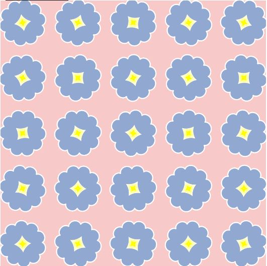
Project 7: Curves
For this project, I was really inspired by some of the curves and the fact that the hypocycloid resembled the outline of a flower! I wanted to create something that was a cross between something resembling Tyler the Creator’s ‘golf wang’ line and a bed of moving flowers in the wind.
I therefore came up with my final product, which has flowers with centers that move and rotate depending on the user’s mouse position:
sketchDownload
// Susie Kim
// susiek@andrew.cmu.edu
// Section A, 15-104
// Assignment 7

// set global variables
var angle = 0;

function setup() {
    createCanvas(480, 480);
    frameRate(15);
}

function draw() {
	background(247, 202, 201); // sets background to pink tone

    // create grid of flowers, starting at 40, 40. results in a 5x5 grid of flowers.
	for(var x = 40; x <= 480; x+= 100) {
		for(var y = 40; y <= 480; y+= 100) {
			push();
			translate(x, y);

			// have flowers rotate depending on mouse X pos
			rotate(radians(angle));
	        angle += mouseX;

	        // call upon flower functions to draw flower outer and center
	        drawHypocycloid();
	        drawAstroid();

	        pop();
		}
	}
}

// draw blue flower exterior
function drawHypocycloid() {
	// set local variables
	var a = int(map(mouseX, 0, width, 15, 40));
	var b = int(map(mouseY, 0, height, 8, 13));

	// set colors and strokes
	fill(145, 168, 209);
	strokeWeight(2);
	stroke(255);

	beginShape();

	// draw hypocycloids, with size increasing for mouse X and number of petals increasing with mouseY
	for (var i = 0; i < 250; i++) {
		var subAngle = map(i, 0, 110, 0, TWO_PI);
		var x = a*((b - 1)*cos(subAngle) + cos(subAngle) + cos((b - 1)*subAngle)) / b;
		var y = a*((b - 1)*sin(subAngle) + sin(subAngle) + sin((b - 1)*subAngle)) / b;
		vertex(x,y);
	}
	endShape();
}

// draw yellow center of the flowers
function drawAstroid() {
    // set colors and strokes
	fill(255, 255, 0);
	strokeWeight(.1);
	stroke(255);

	beginShape();

	// draw for each astroid, with size increasing with mouse X position
	for (var i = 0; i < 300; i++) {
		var subAngle = map(mouseX, 0, width, 7, 15); // changes size with X pos
		var x2 = subAngle*pow(cos(i), 5);
		var y2 = subAngle*pow(sin(i), 5);
		vertex(x2, y2);
	}
	endShape();
}
Looking Outwards 07: Information Visualization
Of the examples I looked at, I really enjoyed the 7 sets Venn Diagram, made by Santiago Ortiz’s Moebio Labs. I really like that they use colors instead of numbers or letters, since it makes the intersections between the different sets much simpler to understand. The work was created by looking at a static set of the 7 way Venn Diagram, and using the shapes as a base to create an interactive version. Similar to much of the other work on the Moebio website, they use a lot of color, specifically intersections of color, in order to help with visualization and gradients between zones. I think that it is also great that they didn’t stop at the first success, and went on to add a second side of the diagram which consists of only the gradients of different colors.
LookingOutwards-07
The work is called “Word Spectrum: Visualizing Google’s Bi-Gram Data” by Chris Harrison. It is a visualization of word associations found from Google, where words closer to the ends are more associated with that one word, while words in the center are more evenly associated between both opposing words, and where the font size of the word would be based on the frequency of use of the word. Immediately I was drawn to the work for the following reasons. First, it was visually obvious that there had been many factors that contributed to the color, size, and placement of each word. It reminded me of tug-of-war in the sense that the strength a word had (which would be the frequency of use), the closer or further it came to one side. Second, I admired how the words that were pitted against each other covered many topics, such as war/peace, socioeconomic status, ethnicities, religious beliefs, and things such as love/like. These words often come across our daily dialect and it was interesting to see exactly how often we associate certain words with it. The algorithm that helped generate the work was Google’s enormous bigram dataset, where distributions of words can be analyzed. The creator’s artistic sensibilities and thoughts are manifested in this work as many of Chris Harrison’s previous works focus on research done online. His previous works include unique visualizations of Wikipedia categories, Amazon book links, and internet searches. This work was intriguing and made me wonder what a visualization of my most common used words would look like.
https://www.chrisharrison.net/index.php/Visualizations/WordSpectrum
Looking Outwards 07
he project I will be discussing for this looking outwards is The Ross Spiral Curriculum from 2015. It was created by Santiago Ortiz and it is an interactive display of a K-12 curriculum. At the center of the spiral is cultural history, and different subjects expand outwards in complexity from that center point. I admire this project because it was created to serve teachers and administrators, so its design is easily readable. It also outlines the material by grade and by time, which allows for digesting the information in whichever manner is most useful. Because you can zoom in and out to view the design as a whole or individual parts and you can click on parts of the design to reach new pieces of information, I know that there is some interactive code involved. The curve of the spiral also makes me think that there is code similar to the code we used for our project this week involved.
Here is a link to the project:
https://spiral.ross.org/spiral/#/
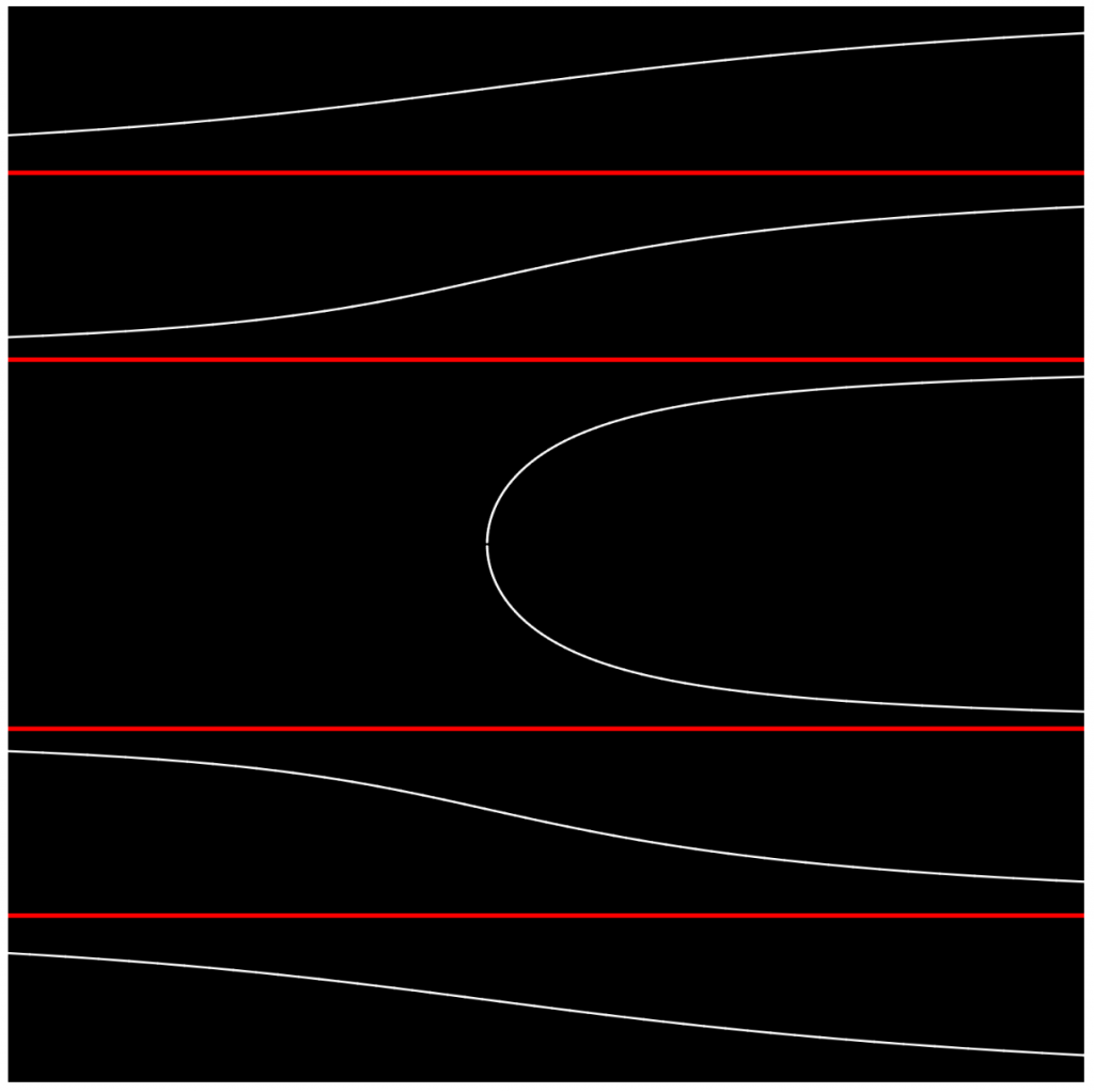
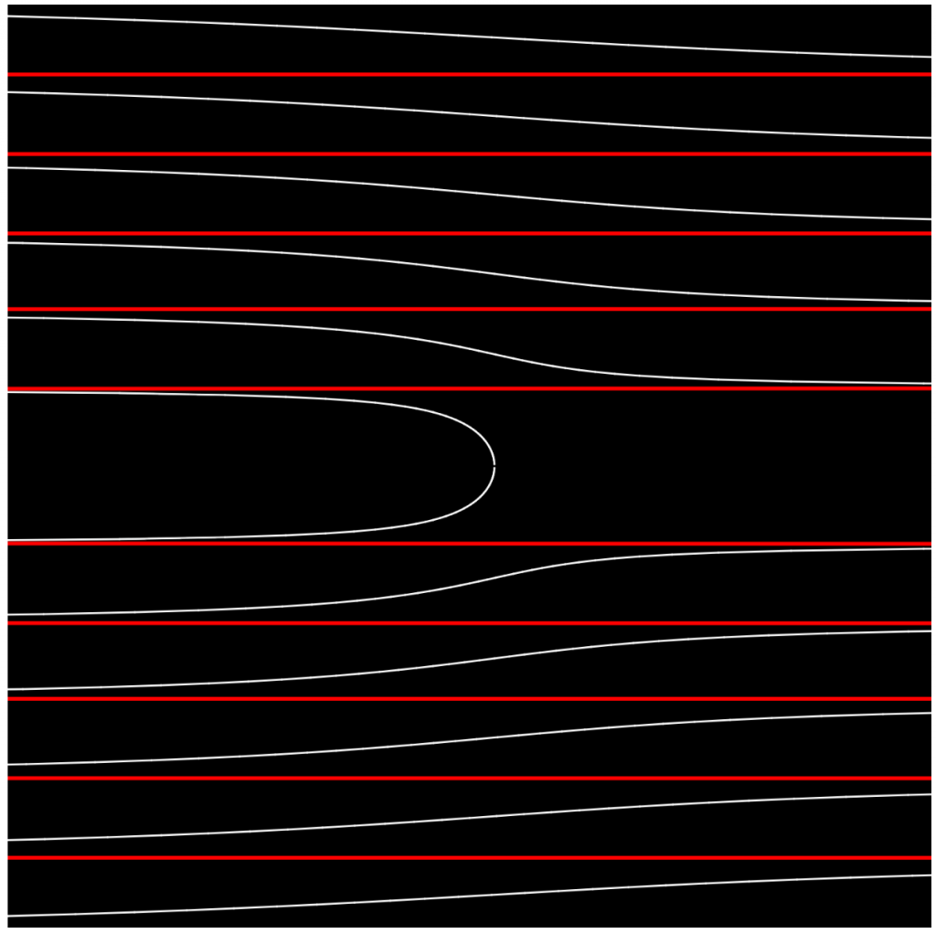
Project 07 Curves
curveDownload
function setup() {
    createCanvas(480, 480);
    background(220);
    text("p5.js vers 0.9.0 test.", 10, 15);
}

function drawAgnesiCurve() {
	var x; //x position of the curve
	var y; //y position of the curve
	var a = mouseX; //honestly not sure what a does
	stroke(max(mouseX, 255), max(mouseY, 255), 0);
	strokeWeight(4);
	beginShape();
	for (var i = 0; i < 65; i++) {
		var t = map(i, 0, 65, 0, TWO_PI);
		x = (2*a)*sin(t);
		y = a*(1-cos(2*t));
		vertex(x, y);
	}
	endShape();
}


function draw() {
	background(0, 0, min(mouseX, mouseY))
	for (var nLine = 0; nLine < 48; nLine++) {
		translate(width/2, 0);
		drawAgnesiCurve();
		translate(0, 10);
	}
}
Project 07 – (Curves) Futuristic Macaroni
Although a disappointingly small amount of code to show for it, this assignment was a huge challenge. Interpreting the math formulas in order to take intentional creative liberties required a lot of guess work and experimentation. I made many iterations of interactions involving different curves until I came across the epicycloid plane curve and figured I would try to work with it. This whole project for me was just about experimenting which in the end I found really rewarding, I was able to make an almost 3D feeling interactive shape with pretty streamlined code.
sketchDownload
// Assignment 07 - PROJECT
// Name: Jubbies Steinweh-Adler
// Email: jsteinwe@andrew.cmu.edu
// Class: Section D


var ns = 60; //rotation
var nm = 0.4; //sensitivity of wrarotation
var size = 3;

function setup(){
  createCanvas(600,400);
}


function draw(){
  background(0);
  translate(width/2,height/2);
  stroke(250, 230, 0);
  strokeWeight(5);
  fill(0);

  var t = 3;
  var a = map(mouseX, 0, width, 1, 7);
  var b = map(mouseY, 0, height, 1, 100);
  var offsetX = width/2 - mouseX;
  var offsetY = height/2 - mouseY;


  //DRAW SHAPES
    for(let i = 0;i < 60; i++) {
      circle(x1(t+i, a, b) + offsetX, y1(t+i, a, b) + offsetY, 7);
      square(x1(t-i, a, b), y1(t-i, a, b), map(mouseY, 0, height, 0, 30), 3);

  }


}
function x1(t, a, b) {
  return (a + b) * cos(t/ns) - b * cos((a + b) /b * (t/nm));
}
  function y1(t, a, b) {
  return (a + b) * sin(t/ns) - b * sin((a + b)/b * (t/nm));
}
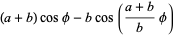
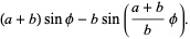
Notice how the columns in the spiral meld into a new column when the shape rotates beyond the rotation capacity! It’s fun to play with : ^)
LO 07 – Data Visualization and WikiRacing
Data Visualization
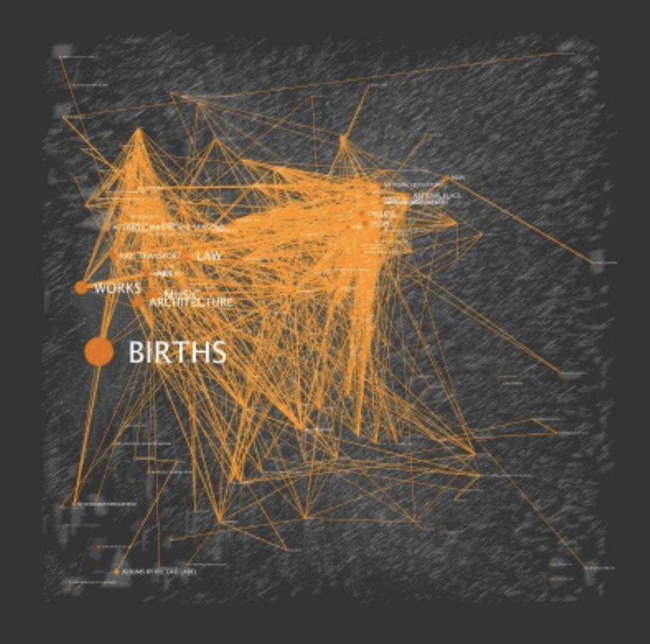
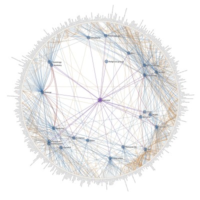
According to Wikipedia, “Wikiracing is a game using the online encyclopedia Wikipedia which focuses on traversing links from one page to another”. I used to play Wikiracing in high school due to school-provided computer restrictions which severely limited entertainment websites, (3-Clicks-To-Jesus was a popular variation of this game requiring the player to start at a random word and try to reach ‘Jesus’ in – you guessed it – three clicks). When I saw Chris Harrison’s Wikipedia data visualization project, ‘Cluster Ball’, I was immediately reminded of Wikiracing and the intricately woven nature of the Wiki universe. This graphic elegantly depicts the interrelations of wikipedia articles that have a common denominator. As stated in the project description, links between category pages are illustrated by edges, which are color coded to represent their depth from the parent node. Not only would this graphic serve as a handy aid in an intense round of WIkiracing, but it uses simple means to demonstrate how humans communicate and organize language. I admire this work because I think it is surprisingly moving to see how organically the structures of interrelation seem to develop and how every word contributes to and depends upon a greater system of words. The, overwhelming, intricate, and organic architecture and relationships of a single word to a system of words reminds me of ants working together in clearly systematic ways that I don’t quite understand, but can’t help but appreciate the intricacy of.
https://www.chrisharrison.net/index.php/Visualizations/ClusterBall