LO-07

The projects I looked at were from Stamen Studios, they are a studio that creates many types of interactive informational visualizations, especially maps. They help companies/ organizations/individuals to customize their information and present them in the most insightful and legible way possible. One of their projects that I looked at was an interactive map that explores the impact of global warming on North American birds. The map allows you to control what scenario and what season you want to view and uses colors on the map and the species to inform us how much the species is in danger because of global warming. I thought the map delivers information very well and is also really easy to navigate. 

http://stamenprod.wpengine.com/work/audubon-survival-by-degrees/

Link to the map:

https://www.audubon.org/climate/survivalbydegrees/

Project 7: Curves

sketchDownload
var a = 0; //radius of exterior circle
var b = 0; //radius of interior circle
var h = 0; //distance from center of interior circle

var r;
var g;
var b;

var theta = 0; //angle


function setup() {
    createCanvas(500, 500);
    background(220);

}

function draw() {
    r = map(mouseX, 0, width, 45, 191);
    g = map(mouseX, 0, width, 16, 175);
    b = map(mouseY, 0, height, 105, 225);
    background(r, g, b);
    for (var x = 0; x <= width; x += 70) {
        for (var y = 0; y <= height; y += height/5) {
            push();
            translate(x, y);
            drawHypotrochoid();
            pop(); 
        }
    }
}


function drawHypotrochoid() {
    noFill();
    r = map(-mouseX, 0, width, 107, 24);
    g = map(-mouseX, 0, width, 67, 162);
    b = map(-mouseY, 0, height, 67, 162);
    stroke(r, g, b);
    
    a = map(mouseX, 0, width, 1, width/10);
    b = 20;
    h = map(mouseY, 0, height, 1, height/5);
    
    beginShape();
    for (var i = 0; i < 1000; i++) {
        var x = ((a-b) * cos(theta)) + (h * cos((a-b)/b * theta));
        var y = ((a-b) * sin(theta)) - (h * sin((a-b)/b * theta));
        var theta = map(i, 0, 100, 0, TWO_PI);
        vertex(x, y);
    }
    endShape();

}

I chose the hypotrochoid curve because when I was experimenting with it, so many different patterns came out of it and I wanted the result to have as many variations as possible. So as you move your mouse up, down, or diagonal, the curve patterns would change every few movements.

Project-07-Curves

For this project, I was interested in the different depictions that were shown in the example for how to generate a circle curve. I thought it would be fun to try and draw a circle, but with a specific math curve. I chose the petal curve, and created a code that allowed you to manipulate the shape and frequency of the curve based on the position of the mouse. At first, it looks like a relatively pattern, with the petal curve rotating in the center, and its shape becoming skewed the greater the mouseX position it. However, if the mouse is pressed, then the pattern becomes more intricate, with the curves increasing in frequency to create a void, or circle, in the center. I had difficulty being able to take the curve a step further to make it more dynamic to look at. At first I chose a much more complicated curve, but I could not get the parentheses right while typing it in and it never looked correct!

peachsketch
var nPoints = 100
var angle = 0
var m;
var n;

function setup() {
  
  createCanvas(400, 400);
  m = width/2
  n = height/2
}

function draw() {
  background(0);
  frameRate(20)
  drawPetalCurve(m,n);
  if (mouseIsPressed){ // if mouseIsPressed, draws higher frequency of rotating petal curves
    for (j= 0; j<10;j++){
    drawPetalCurve(m,n);
  }
}
 
}

function drawPetalCurve (m,n){
  var x; 
  var y;
  var a = 100
  var b = 100
  var p = (constrain(mouseX, 50, 300))/50 //change dimensions of curve based on mouse location
push();
stroke(255)
noFill();
  translate(width/2, height/2) // curve drawn at center
beginShape();
  for (var i = 0; i < nPoints; i++) {
    rotate(angle)
        var t = map(i, 0, nPoints, 0, TWO_PI);
        x = p*a*cos(t)*(sin(t)*sin(t))	
        y = a*(cos(t)*cos(t))*sin(t) 
          vertex(m/2+x, n/2+y)
    angle+=0.1
       }
    endShape(CLOSE); 

pop();
   
}

Looking Outward – 07

The project I chose to look at for this week’s looking outwards was Aaron Koblin’s light project called “Flight Patterns”. The project facilitates a way to look at the air traffic over North America and visualize it into color and forms. I admire this project because the basis of looking at air traffic patterns seems mundane and maybe irrelevant, but Koblin was able to completely shift that to find underlying geometry, form, and depth of design. I suppose the algorithms generated for this piece was using air traffic control data and finding and system to systemize the information and plot into beautiful patterns and connections. I think the artist’s creative sensibilities lie in the determination for what colors respond to the algorithms to produce images that separate and combine information.

Link: http://www.aaronkoblin.com/work/flightpatterns/index.html

Project 07: Composition with Curves

Curvehc
var nPoints = 600;

function setup(){
    createCanvas(480, 480);

}

function draw(){
    background(0);
    //calling functions
    hypotrochoid();
    epicycloid();
}

function hypotrochoid(){
    //drawing hypotrochoid
    //https://mathworld.wolfram.com/Hypotrochoid.html
    push();
    noFill();
    stroke(57, 139, 173)
    translate(width / 2, height / 2);
    var x = constrain(mouseX, 0, width);
    var y = constrain(mouseY, 0, height);
    var a = map(x, 0, width, 70, 150);
    var b = map(y, 0, height, 0.5, 4);
    var h = constrain(a/2, 100, 200);
    beginShape();
    for (var i = 0; i < nPoints; i++) {
        var t = map(i, 0, nPoints, 0, TWO_PI);
        x = (a - b) * cos(t) + h * cos(((a - b) / b) * t);
        y = (a - b) * sin(t) - h * sin(((a - b) / b) * t );
        vertex(x, y);
    }
    endShape();
    pop();
}

function epicycloid(){
    //drawing epicycloid
    //https://mathworld.wolfram.com/Epicycloid.html
    push();
    translate(width / 2, height / 2)
    var x = constrain(mouseX, 0, width);
    var y; 
    var a = map(x, 0, width, 10, 20);
    var b = a / 30;
    var h = constrain(mouseY / 9, 0, 0.7 * height);
    var ph = mouseX / 25;
    fill(202, 223, 232, 70);
    stroke(90 + 98 * sin(millis() / 500), 174, 200); //making the color change smoothly
    beginShape();
    for (var i = 0; i < nPoints; i++) {
        var t = map(i, 0, nPoints, 0, TWO_PI);
        x = (a + b) * cos(t) - h * cos(ph + t * (a + b) / b);
        y = (a + b) * sin(t) - h * sin(ph + t * (a + b) / b);
        vertex(x, y);
    }
    endShape(CLOSE);
    pop();
}

At first, I wasn’t really sure how I was supposed to do the project since it looked complex. I also didn’t know what type of shapes I should create either. However, using the mathematical formula turned out to be not as overwhelming as I thought it would be since they created the shapes for me. I tried doing this project by exploring different types of curves and ended up choosing hypotrochoid and epicycloid. I began by drawing the hypotrochoid first by plugging in different numbers. Once I got that in place, I thought it looked empty in the middle so I then added an epicycloid curve. Although it was challenging to figure out which variable controls what, it was satisfying to see the end result. 

Screenshots of two different states

LookingOutwards-07

Flight Patterns by Aaron Koblin.

For this week’s Looking Outwards on the topic of informational visualization, I decided to look at the works by Aaron Koblin, and in particular, I was drawn to his Flight Patterns visualization (http://www.aaronkoblin.com/project/flight-patterns/). In this project, he took many data values and mapped out the paths of air traffic across North America. The visualization is abstracted to show strings of moving, glowing lines showing the progression and density of flight routes. When there is high air traffic and many routes intersect, the lines seem to glow at the intersection point. When the supposed “planes” travel away from each other, the movement fades out. To make this computational visualization, Koblin worked with his colleagues and plotted the data using the Processing programming environment. For the algorithms themselves, I think there is a component of controlling the amount of brightness of the lines. When they come in close proximity, they glow brighter, and this effect would have been created using conditionals and loop statements. I think the artist was able to take the shape of North America and make that appear obvious in the final product through creating color boundaries that show the distinction between “land” and “sea” spaces. I find this work really interesting, and it reminded me of a similar map that I was shown in my global history class, which mapped out the traffic patterns of slave ships to America over time.

Project 07- Curves

sketchDownload

//Shruti Prasanth
//Section C
//Project 07 Curves


var numPoints = 400;
function setup() {
    createCanvas(480, 480);
}


function draw() {
    background(105,179,183); //BLUE background
    
    for (var x = 80; x <= 460; x += 80) {   //number of elements in the grid
        for (var y = 80; y <= 460; y += 80) {
            push();
            translate(x, y);
            HypocycloidPedal();
            pop();
        }
    }

}

function HypocycloidPedal() {
    //radius
    var a = map(mouseX, 0, 480, 0, 120); 
    var b = map(mouseX, 0, 480, 0, 120);

    strokeWeight(mouseY/50, mouseX/50); //change in stroke thickness
    stroke(255); //WHITE 
    noFill();

  
    beginShape();
    for (var i=0; i<numPoints; i++) {
        var angle = map(i, 0, 100, 0, TWO_PI);
        var n = 8; //number of petals

        x = a * (((n-1) * cos(angle)) + (cos((n-1) * angle)) );
        y = a * (((n-1) * sin(angle)) - (sin((n-1) * angle)) );

        vertex(x, y);       
    }
    endShape();     
}


For my project I was inspired by ornate printed patterns and mosaics. I wanted to make something that formed interesting shapes when the curves intersected and dynamically changed. Here are some of the screenshots of the different patterns that are created when you move your mouse around the canvas:

Project 07 – Curves

sketch
//TERESA LOURIE
//SECTION D
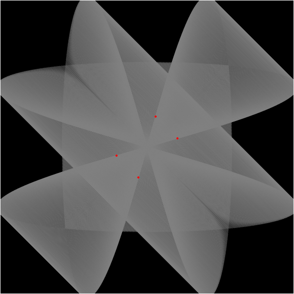
//PROJECT: INTERACTIVE CURVES
var x = 2;
var y = 2;

function setup() {
    createCanvas(480, 480);
    background(255);
    

}


function draw() {
    background(255);
	
	//figureeight();
	push();
	//for (i=0; i<500; i++){
		
		devilscurve();
	//}
	devilscurve2(); //draw both curves at once on white background
}

function figureeight(){
	push();
	translate(width/2, height/2);

	background(255);
	beginShape();
	stroke(0); 
	strokeWeight(1);
	noFill();

	//loop for curves 
	for(var i =0; i < 750; i++){
		
		stroke(map(mouseY, 0, 480, 0, 255), 0 ,0);
		var t = map(i, 0, 750, 0, 2*PI);
		var a = mouseX;
		var b = 1;


		x = a*sin(t);
		y = a*sin(t)*cos(t);


		vertex(x, y);
	}
	endShape();
	pop();
}

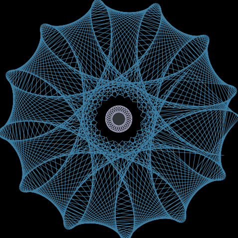
function devilscurve () { //devils curve function
	push();
	translate(width/2, height/2); //put it in the center
	
	beginShape();     //beginshape, using vertices along the equation
	strokeWeight(3);
	noFill();

	//loop for curves 
	for(var i =0; i < 3000; i++){
		
		stroke(0, 255, map(mouseY, 0, 480, 0, 255));
		var t = map(i, 0, width, -50, 100);
		var a = map(mouseX, 0, width, -50, 10);
		var b = map(mouseY, 0, height, -50, 50);


		x = cos(t)*sqrt((pow(a, 2)*(t)-pow(b, 2)*pow(cos(t),2)/(pow(sin(t),2)-pow(cos(t),2))));

		y = sin(t)*sqrt((pow(a, 2)*(t)-pow(b, 2)*pow(cos(t),2)/(pow(sin(t),2)-pow(cos(t),2))));


		vertex(x, y);
	}
	endShape();
	pop();
}
function devilscurve2 () { //devils curve function
	push();
	translate(width/2, height/2); //put it in the center
	
	beginShape();     //beginshape, using vertices along the equation
	strokeWeight(3);
	noFill();

	//loop for curves 
	for(var i =0; i < 3000; i++){
		
		stroke(255, map(mouseY, 0, 480, 0, 255), 0);
		var t = i
		var a = map(mouseX, 0, width, -50, 100);
		var b = map(mouseY, 0, height, -50, 50);


		x = cos(t)*sqrt((pow(a, 2)*(t)-pow(b, 2)*pow(cos(t),2)/(pow(sin(t),2)-pow(cos(t),2))));

		y = sin(t)*sqrt((pow(a, 2)*(t)-pow(b, 2)*pow(cos(t),2)/(pow(sin(t),2)-pow(cos(t),2))));


		vertex(x, y);
	}
	endShape();
	pop();
}

Looking Outwards 07: Information Visualization

We feel fine” project was created by Jonathan Harris in 2009 for a book co-authored with Seth Kamvar. The graphs show in-depth exploration of human emotions. They’re developed from a database of more than twelve million individual sentences collected over three years from personal blogs on the Internet and show the world’s emotional landscape of ups and downs. I personally admire how he was able to create a statistical graph of the world’s emotional struggles, such as mood swings. I thought that choosing this particular theme was interesting to begin with. I believe that gathering information on emotional state and putting it into graphs are more challenging than getting statistical and measurable information, such as rainfall rate, and turning that into graphs. His artistic ability shined through his graph by using different color schemes and styles to convey all the different emotions. His graphs clearly conveyed the complexity of emotions as well.

One of the “We feel fine” graphs

Project 07 – Curves

The inspiration behind this project was Viviani’s Curve, which is normally contained in 3D space, but can be represented from its front view on the 2D plane as a parabolic curve. I also animated a few circles moving along the curve to give it a bit more life. You can make some pretty interesting shapes, one of which is pictured below.

AAAAAAAAAAAAAAAAAAAAAAAA

function setup() {
    createCanvas(600, 600);
    background(220);
    text("p5.js vers 0.9.0 test.", 10, 15);

    // want to animate circles along curves
    circlePos = 0; // this follows the angle and is a global
}

function draw() {
    background(0);
    var angleIncr = 0.01; // hopefully leads to high definition curve
    var angle = 0;
    var dx, dy;
    var hw = width / 2; // "half width"
    var hh = height / 2;


    beginShape();
    fill(128, 128, 128, 128); // using RGBA
    stroke(128, 128, 128, 128);
    strokeWeight(1);
    // more understandable than using a for loop
    while (angle < 2*PI) {
        // aiming to use Viviani's Curve
        dx = sin(angle);
        dy = 2 * sin(0.5 * angle);

        // want to scale values based on mousePos
        dx *= mouseX - hw;
        dy *= mouseY - hh;

        vertex(dx + hw, dy + hh); // beginShape() doesn't work with translate()
        vertex(-dx + hw, -dy + hh);
        vertex(dy + hw, dx + hh);
        vertex(-dy + hw, -dx + hh);

        // increment angle
        angle += angleIncr;
    }
    endShape();

    angle = 0;
    // second while outside of beginShape()
    while (angle < 2*PI) {
        // aiming to use Viviani's Curve
        dx = sin(angle);
        dy = 2 * sin(0.5 * angle);

        // want to scale values based on mousePos
        dx *= mouseX - hw;
        dy *= mouseY - hh;

        // draw circle
        if (circlePos == angle) {
            fill(mouseX % 255, mouseY % 255, (mouseX + mouseY) % 255);
            circle(dx + hw, dy + hh, 15);
            circle(-dx + hw, -dy + hh, 15);
            circle(dy + hw, dx + hh, 15);
            circle(-dy + hw, -dx + hh, 15);
        }

        angle += angleIncr;
    }

    circlePos = circlePos + angleIncr;
    if (circlePos > 2*PI) circlePos = 0; // can't modulo properly with PI
}

An image captured when the mouse was at the left side of the screen.