I came across the work of Robert Henke and found his installation, music, and software development work interesting especially with more knowledge of computer generated sounds from this weeks’ lectures. One track I wanted to highlight is “Gobi: The Long Edit” released this spring, a remastered edit of a previous track. What I find very impressive with this track is how organic it feels and the complexity of the layering of frequencies. It’s clear that Henke used a variety of modulators to adjust the frequency and amplitude of the waveforms. The result is an experience that is comparable to the sounds of creatures, vibrations, and ambience of a rainforest. To create something that feels organic and “real” with synthetic, digital means must be a difficult process. It makes me wonder how authentic soundtracks are in movies and TV. To what extent are they manipulated to resemble real-life? Even though I find this track comparable to nature, there is no doubt Henke incorporates his personal artistic vision into this sound art. This is especially apparent in his other tracks like the ones in his album “Archaeopteryx.” These pieces feel more distinctly “electronic” with clear examples of techniques like reverb, delay, and different-shaped waves.
Month: November 2020
LO – 10
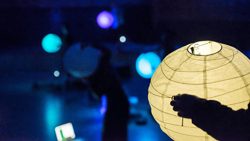
“Aura” by the Stanford Laptop Orchestra, who also go by SLOrk, is a wonderful work or art that is very harmonic and calming. Using ChucK, a programing language specifically for music creation, and SLOrk music lanterns about nine artists move the lanterns – “auras” – from side to side to communicate with ChucK via WiFi to create the music, lights, and colors. This piece starts with one voice, and gradually the rest join in to create harmony. The initial voice “calls” the other voices to join in and their auras all have the same light, thus creating “harmony”. However, as they all join the auras become unique in color though still in harmony. As the piece ends, the artist move apart leaving their auras behind. What makes this work so special is that it embodies the “why” qualities of humans. The idea was that as human relationships grow, their auras blend and harmonize, and remain as memories. It’s the positive light radiating off others that forms as we grow close with one another and share memories. Something that we see with our “third eye” as we interact and reminisce. A lot of SLOrk’s work explores and embodies humans through music and technology. This piece was such a wonderful embodiment and a light in some stressful times we are all going through right now. Even during these crazy times we all have relationships with people that are helping us through these times.
If you want to see more of their work check out their website:
To see this specific piece:
http://slork.stanford.edu/works/aura/
And here’s the video:
LO-10 Computer Music
Computer Orchestra was created in 2013 by Fragment.in, an artist collective comprised of Laura Perrenoud, David Colombini and Marc Dubois. They used Processing, SimpleOpenNI, and OpenKinect to create this project. Computer Orchestra is an interactive installation that uses multiple computers to allow the user to conduct their own orchestra. Their hand movements are recognized by a Kinect motion controller that transmits data to Processing through the SimpleOpenNI library. Processing then sends a signal to the main computer which gives instructions to the rest of the screens.
I admire how this piece is made to be accessible. Computer Orchestra crowdsources sounds to use and users can upload their own sounds as well. I also admire that there is a visual component to the project, along with the sound the program creates aesthetically pleasing sound waves on the screen that enhance the experience. It’s amazing to see how just one person can create the feel of an entire orchestra.
Fragment.in states that they use their work as a way to question the impact of the digital on everyday life. These artistic sensibilities are seen in Computer Orchestra through the way it highlights how one person can replace an entire orchestra with the use of digital.
Portrait – Painting
var strokeX = 7		//horizontal size of dots
var strokeY = 7		//vertical size of dots
var size = 7		//space between dots
var portrait;		//my image
var painted = [];		//the painted
var erased = [];		//the erased area
var erasing;		//boolen for whether or not erasing has been activated
var brushSize = 20		//defines what is "near mouse"

function preload(){
	portrait = loadImage("https://i.imgur.com/iJq4Jtv.jpg")		//loading imgur image into variable
}

function paint(){			//draw function for paint object
    fill(portrait.get(this.x,this.y))		//calling the color at the certain image coordinate
		ellipse(this.x,this.y,strokeX,strokeY)		//drawing an ellipse at that coordinate
}

function erase(){
	fill(255,241,175)
		ellipse(this.x,this.y,strokeX,strokeY)
}

function makePaint(px,py){		//constructor for paint object
p = {x:px,y:py,
	drawfunction:paint
}
return p;
}

function makeErase(ex,ey){		//constructor for erase objecg
e = {x:ex,y:ey,
	drawfunction:erase
}
return e;
}


function setup() {

createCanvas(300, 400);
   background(255,241,175);		//beige
   noStroke();
   ellipseMode(CORNER);		//ellipses defined by "corner"

}


function draw() {

	background(255,241,175)		//beige

	for(i=0;i<painted.length;i++){		//display function for paint object
		painted[i].drawfunction()		//calling the draw function for the array of objects
}


if(mouseIsPressed){
	 for(x=0;x<=width;x+=size){		//for loop to set up dots
		for(y=0;y<=height;y+=size){
			if (nearMouse(x,y) == true){
				if(erasing == false){
					var p = makePaint(x,y)
			        	painted.push(p)
			        brush(mouseX,mouseY)
			    }
			        if(erasing == true){
			        	var e = makeErase(x,y)
			        		painted.push(e)
			        	eraser(mouseX,mouseY)
			    }
			}
		}
	}
}


	fill(128,88,43);	//brown
		rect(0,0,width,20);		//drawing the border
		rect(0,0,20,height);
		rect(0,380,width,20);
		rect(280,0,20,height)

	fill(255);
		textSize(7);
		text('Press P and Drag to Paint',20,13);		//instructions
		text('Press E and Drag to Erase', 195,13);
		text('Press A to paint abstractly',20,391);
		text('Press R to paint realistically',190,391);
		text('b for smaller brush',120,8);
		text("B for bigger brush", 120,15);
}

function nearMouse(x,y){
	if (dist(x,y,mouseX,mouseY)<brushSize){		//if the mouse is within "brush size" of given x and y coordinates
		return true;
	}
	return false;
}

function brush(x,y){		//drawing the paintbrush

	push();
		rectMode(CENTER);
			fill(222,184,142);		//light brown
				rect(x,y+20,15,70);		//the handle
		ellipseMode(CENTER);

	if(mouseIsPressed){
		fill(portrait.get(x,y))		//fill with color of image coordinate that it is above
		}else{
			fill(0)		//fill black is not pressing
}
		ellipse(x,y-5,20,12)		//the brush
		triangle(x,y-25,x-10,y-5,x+10,y-5)
	pop();
}

function eraser(x,y){

	push();
		rectMode(CENTER);
			fill(245,116,240)		//pink
				rect(x,y,30,40)		//eraser shape
	pop();
}

function keyPressed (){

	if(key=="a"){
		strokeX = random(5,100)		//pick random shape of the dots, and random seperation
		strokeY = random(5,100)
		size = random(0,5)
	}

	if(key=="r"){		//shrink the dots and space between
		strokeX = 2
		strokeY = 2
		size = 2
	}

	if(key == "B"){
		brushSize +=5		//increase the brush size (more dots included in nearmouse function)
	}

	if(key == "b"){			//decrease brush size (less dots included)
		brushSize -=5
	}

	if(key == "p"){
		erasing = false		//not erasing (painting)
	}

	if(key =="e"){
		erasing = true		//erasing (not painting)
	}
}
LO – Digital Grotesque
As a fellow studier of architecture, I also admired this piece’s structural qualities. However, it seems my peer and I are taking two different scopes when admiring the project. He remarked on the delicate ornate detailing, while I find myself inspired differently. To me this project ponders a larger idea, that at one point in our future not only products, but entire environments will be digitally fabricated. I agree with my peer that the intricate detail is astounding and impressive, but I would disagree that it is the “main idea” of the work. I think that it’s actually the opposite: I see this project as attempting to ponder a massive, and extremely scary question: can an environment be digitally manufactured with a level of detail that actually makes it impossible to distinguish from a “natural environment”. Like a simulation, the detail is there not to draw attention, but to dismiss attention that might expose the environment as “fake”. For example, someone standing in an empty room knows it’s man made, because no natural environment really looks like it. In the middle of a forest, however, we don’t even consider that the environment is fake, because of the sheer amount of detail.
Project 9: Portrait
var picture;
var size = 20
var x = 0;
var y = 0;

//load image
function preload() {
    picture = loadImage("https://i.imgur.com/bOywqob.jpg");

}

function setup() {
    createCanvas(600, 500);
    background(255,0,255);

    //load pixels from image
    picture.loadPixels();
}

function draw() {
  //pixel colors of the image at x and y position
    var col = picture.get(x, y);
        fill(col);
        noStroke();
        rect(x, y, size);
        var xpos = mouseX - x;
        var ypos = mouseY - y;
        x += xpos / 5;
        y += ypos / 5;
    }
function mousePressed() {
  size += 10

}Project- 09- Portrait
//Shruti Prasanth
//Project 9- Portrait
//Section C

function preload() {
    var portrait="https://i.imgur.com/CDcRoOA.jpeg"; // image by Aliena85
    photo=loadImage(portrait);    //image variable
}

function setup() {
  createCanvas(300,400);
  background(0);
  photo.resize(300,400);    //resizing the image to fit the canvas
  photo.loadPixels();
  frameRate(10000000000000000000000*100000000000000000);
}

function draw() {
  var x=random(width);
  var y=random(height);
  var pixelx=constrain(floor(x),0,width);
  var pixely=constrain(floor(y),0,height);
  var pixelcolor=photo.get(pixelx,pixely);    //calling each pixel color
  noStroke();
  fill(pixelcolor);    //colors of the squares that appear

  square(x,y,random(0,5));    // squares that form the image


}


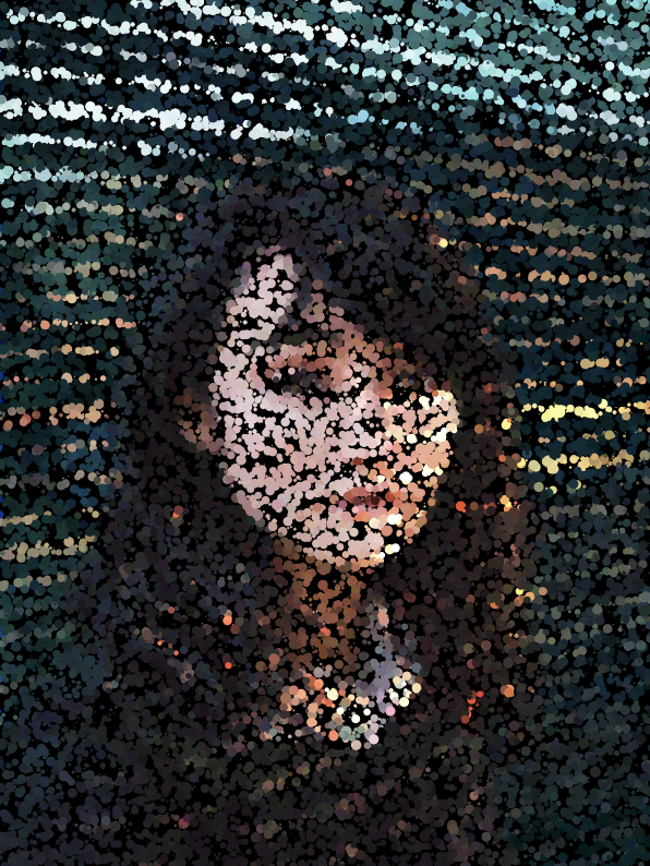
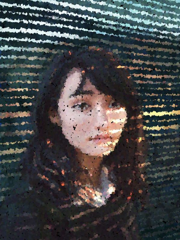
My inspiration for this portait was this painting of a girl submitted by Aliena85 on imagur.com. I thought the strokes that created the background and the sunlight filtering through the blinds would be interesting if they appeared in a stippling colored pixel form. It feels magical as the image starts to form because the specs look like colored dust, and gives the portrait of the girl a glowy quality.
LookingOutwards-09

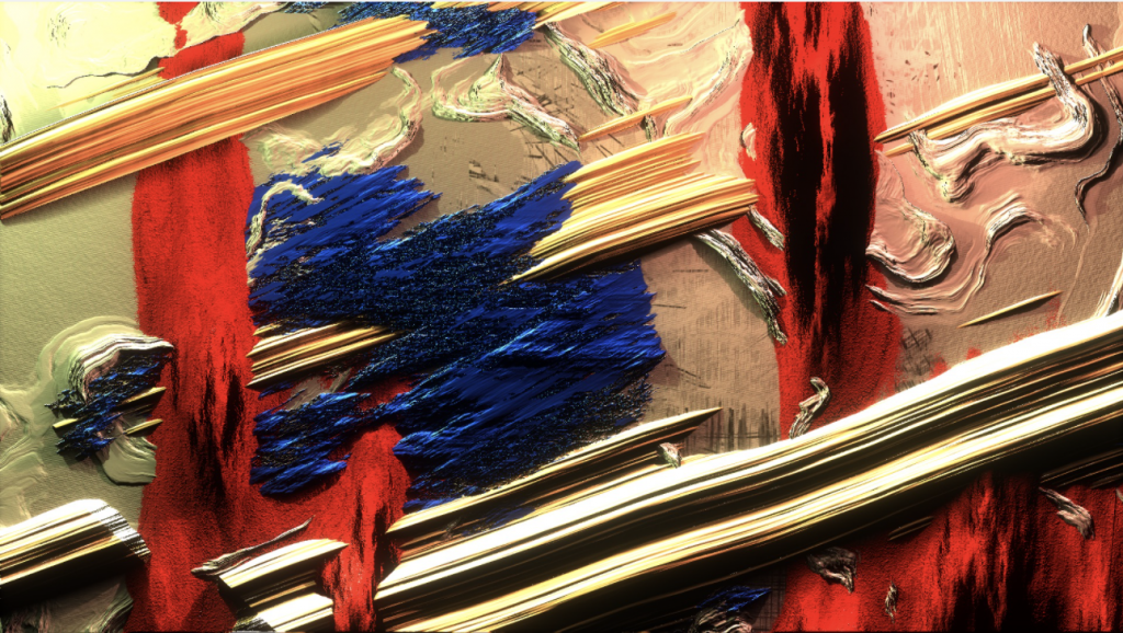
One of my classmates whose post I came across was Rachel Kim’s (rkim) Looking Outwards 04, where she analyzed Kynd and Yu Miyashita collaborative artwork called Expressions. I liked how my classmate gave thoughtful insight about how the artist used thick and bold paint as inspirations for creating 2D and 3D graphics. I agree that the artwork is interesting, especially because there is a play with light and shadows to create a digitized representation of paint strokes.
From my own observation of the work, I can add on to the conversation that the variation in texture and intersecting strokes create a visually harmonious and balanced composition which is pleasing to the eye. The use of light and shadows is what makes the artwork appear like oil paint, which is very unique.
Project-09
I found the stock photo on imgur and experimented with the two different shapes. At first, I didn’t have noFill() for the shapes, so the circle half looked funny because there were white circles all over the place. The diamond side looked better because everything was square. I ended up putting in the noFill(), so both halves look much more similar once enough of the shapes have drawn.
Image after the program has run for a few seconds
Image after the program runs for awhile
LO-09
This week, I looked at Shaun’s post about Ariel Waldman. It is crazy that she got a job with NASA right out of art school by cold calling them! I think that this background makes her perfect for the project that Shaun talks about in his blog: she seems to be all about making space exploration (and all of her other projects) more accessible to the average person. I wonder if this is because she did not have as much of a science background coming out of school, and therefore she is able to articulate concepts in ways that average people understand.
When I looked through her website, I saw that she also wrote a book titled “What’s It Like in Space?: Stories from Astronauts Who’ve Been There.” This is another project that, like Spaceprob.es that Shaun talked about in his post, gives everyone a look into what going to space is like. Right now, few people can actually go to space; significantly more people can read her book or visit her website.
Shaun’s original LO-08 post
Ariel Waldman’s website
Ariel Waldman’s book: What’s It Like in Space?: Stories from Astronauts Who’ve Been There (2016)
![[OLD FALL 2020] 15-104 • Introduction to Computing for Creative Practice](../../../../wp-content/uploads/2021/09/stop-banner.png)
