My inspiration would go here.
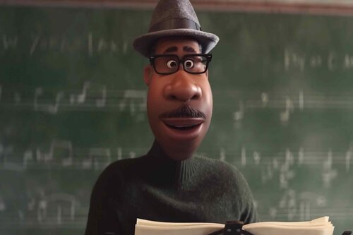
Pixar is where I wish I could work if I didn’t work at CMU.
[OLD FALL 2020] 15-104 • Introduction to Computing for Creative Practice
Professor Tom Cortina • Fall 2020 • Introduction to Computing for Creative Practice
My inspiration would go here.
Pixar is where I wish I could work if I didn’t work at CMU.


I’ve always been inspired by teamLab Borderless, an immersive, interactive museum of colorful digital art installations in Tokyo. The museum is structured so that there are quite literally no borders between different art installations – each piece seamlessly blends and communicates with each other, creating a breathing, vibrant space that people can interact with. It became the most visited single-artist museum in the world, welcoming over 2.3 million people in its opening year alone.
Borderless is an impressive feat of audiovisual experiences, comprising of over 500 computers and 470 projectors in the museum alone. The museum was created by the art collective teamLab, an interdisciplinary, collaborative group of artists, animators, designers, architects, engineers, and programmers. Although there’s very little public information on how teamLab created Borderless, I think it’s safe to say that the collective used a mix of custom scripts and commercial software to bring the immersive space to life. It’s amazing to witness what they could accomplish only two years ago in this museum, and I’m excited to see how teamLab will build upon their success to enhance immersive, interactive experiences in the future.
One of my favorite works of computational art is the
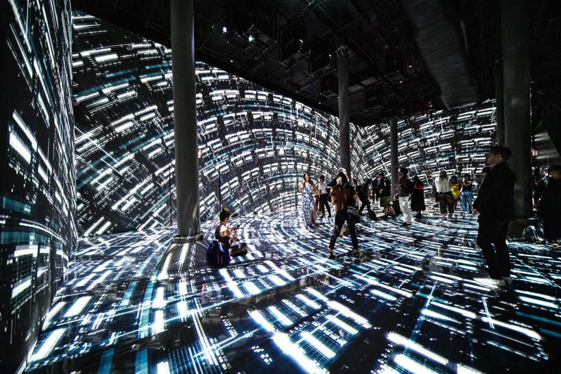
installation “Machine Hallucination” by Refik Anadol. The installation was made by 18 people: Anadol, Nicholas Boss,
Maurizio Braggiotti, Efsun Erkilic, Carrie He, Daniel Seungmin Lee, Toby Heinemann, Ali Emre Karacali, Efe Mert Kaya, Pelin Kivrak, Ho Man Leung, Kyle McLean, Alex Morosov, Christina Moushoul, Raman K. Mustafa, Julia Pryde Thompson, Kerim Karoglu, and HyeJi Yang. Anadol created this project by creating a machine learning algorithm that he fed over 100,000,000 photographs of New York City. The algorithm creates “visual associations as it learns (1:12-1:15)” allowing it to generate imagined images of New York’s past, present, and future. Anadol says that his work was inspired by the writings of Stéphane Mallarmé, Susan Sonntag, and Jonathan Zittrain. I like this project because it generates ideas about cities and how they might change over time, and it conveys these ideas with mesmerizing visuals. As a student of Architecture, these ideas could be helpful in understanding the longevity of a project or visualizing how it will look after being used for a few years.
Sources:
Artwork – https://refikanadolstudio.com/projects/machine-hallucination/
Video – https://www.youtube.com/watch?v=I-EIVlHvHRM
Endless or bottomless scrolling seems intuitive in social media design, however, it was only recently created by Aza Raskin. While thinking of infinite scrolling he was being considerate of user needs and wants about the desire to see more. Aza Raskin simplifies the decision making of exploring social media but deducing if a user is already at the bottom of a page they want to see more. By acknowledging what the user wants he takes the initiative of providing them the information they crave for. He makes a reference to drinking wine where the stopping point would be when the bottle or glass is empty.
That is the stopping cue when drinking wine and the stopping cues Aza Raskin removes were the buttons for more or next page.
As far as I know, he was the mind behind infinite scrolling. He removed the design of stopping cues and added the design of loading more content, creating a seamless transition. Aza Raskin was a designer targeting use experience which he sees from other forms of media like Google or Facebook. He has done research on how web browsers should be designed for mobile use, what interfaces can do with your data, and more. The act of searching comes to an end when a goal is met. Knowing that if a user wants more content resulting in him taking away the decision to decide if they want to continue.
As a fairly new design principle, bottomless scrolling changes how the user perceives information and social media. There is a larger information dump when content is constantly loaded up for the user which can be a pro or a con.
A new update on Instagram changed unless scrolling to change into content which is recommended instead of content you’ve already seen before. This is a revolutionary way to receive information as items the user didn’t have in mind may pop up. Instead of the use of pages, which have a sense of completion, endless scrolling gives users an addictiveness to the product. Interestingly, Aza Raskin has apologized for the design as it has made social media more addicting.

Sources:
Netflix documentary, “Abstract: The Art of Design”, season 2 episode 5
Raskin, A. (n.d.). Who aza human? Retrieved September 04, 2020, from http://aza.wtf/
Antonin Fourneau, (2012), The Water Light Graffiti Wall
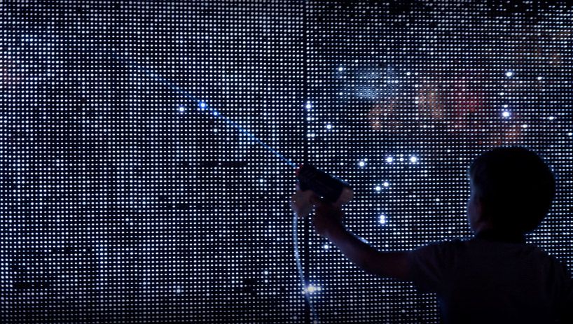
The project is an interactive public art work that earned huge success in Paris in 2012. The art work consists of a giant LED light wall which responds specifically to water. The public interact with the wall with brushes, water-guns, and hands (anything damp will do), creating their own paintings on the light wall. I like that the piece is responsive, dynamic, imaginative, and visually pleasing.
It is a successful art work that provides the public with great fun and possibilities for individual and collective creativity. The project was displayed in many other parts of the world in later years. The artist Antonin Fourneau designed and created this piece. When the water gets in touch with the light wall, electric bridge is created so the light bulbs under the surface of the wall will be powered up. I think the project may have employed machine learning. The designer uses commands to control the lightbulbs. The project is not only entertaining, but also educational in the future as it allows one to leave a message that can be displayed to the society without damaging any public facilities.
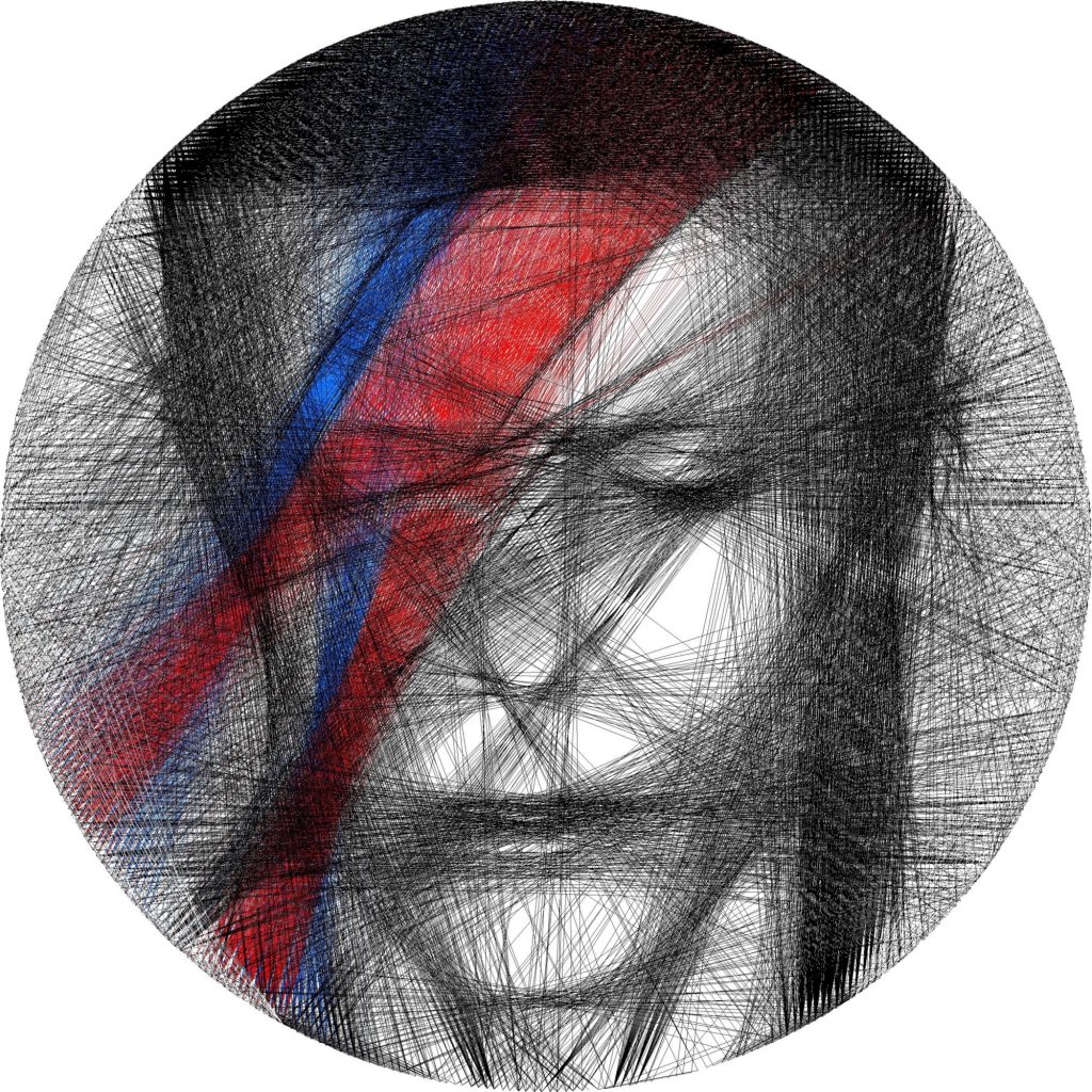
The artist of this David Bowie inspired piece is Callum McDougall. The software he decided to use was Jupyter Notebooks because of its flexibility and
his experience running the original algorithm on the software. McDougall used and improved the algorithm to render the image and also to create the lines seen in his art.
He mentions that he ran the algorithm for each color separately, with images he designed with GIMP. This project and the algorithm McDougall utilizes supports an art
theme where lines are used to create specific images and effects that sort of jump off a screen the same way that we transform 2d shapes into 3 dimensional objects. For art
it adds to the skill and methods of manipulation of geometric shapes for the eyes to see what the artists want them to see. He credits pieces from Petros Vrellis who also uses
lines to create images.
Before this course, one project that I found inspirational and left a significant impression on me was a 15-112 term project called “TRIPPLE: Live Audio Visualizer” for the semester of Spring 2018 by Minji Kim. Using previous knowledge and programming skills that she acquired through her course, Minji used Python to create such a project. With visualization through music speakers and general interactive design becoming increasingly popular, Minji’s project was inspired by her love of music as well as other aesthetic visualizers.
I believe that while this project was concluded at the elementary stages, continuation and further development will set the basics of audio visualizers and pave the way for improved and upgraded live visual presenters for all different types of fields.
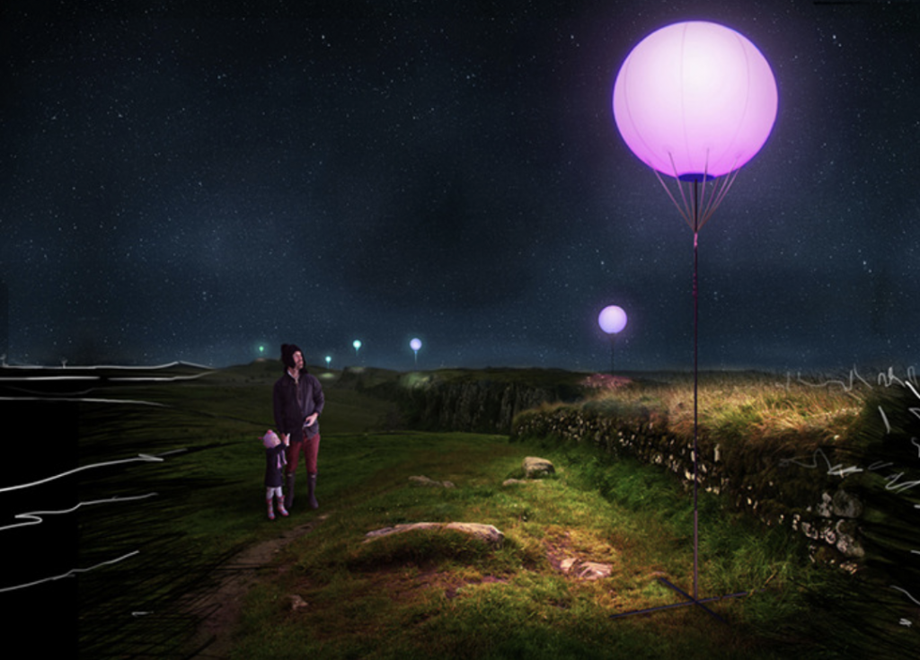
I am impressed by the Connecting Light project, which challenges the conventional feature of borders and connections using landscape art installation. It uses hundreds of six-foot-in-diameter balloons and LEDs to illuminate the Hadrian’s Wall World Heritage Site in Britain. It transmits messages from the audience by changing the color of those large balloons, which can be seen from miles away. I admire it because it extends for miles so it creates an extensive visual impact on viewers. Also, it can interact with the audience in an extremely beautiful way. It was created by a collective team called YESYESNO, which includes Marcela Godoy, Zach Lieberman, and Molmol Kuo. I was lucky to meet Ms. Godoy in person at NYU Shanghai where she talked a little bit more about this project. According to her, she joined the project when she used to work for a company that was invited by the UK Olympics committee to create a series of art installations to promote the idea of elaboration and connection. It took the team about a year to complete, and Ms. Godoy was mainly in charge of the physical parts of the project, like designing and fabricating customized 3D printed pieces, making drawings, and installing large balloons. To my knowledge, Ms. Godoy used Sketch for 3D printing.
Reference:
Godoy. M., Liberman Z., Kuo, M. (2012). Connecting Light. http://connectinglight.info
One artwork which immediately springs to mind when confronted with the term “interactive”, would be Pipilotti Rist’s installation, “Looking Through Pixel Forest.” This installation was shown as part as Rist’s retrospective solo show at the New Museum in 2016, and demonstrates her unique way of creating environments through light and sound. As you walk into the exhibition space, you are met with thousands of hanging LED light strings which gently pulsate soft shades of pink and blue and white. Against the wall, Rist’s immersive video works are projected, and the whole space is filled with the serenity of her sound pieces. For this installation, Rist collaborated with a lighting designer to develop custom scripts which ensure the LED lights would pulsate and change with the videos in a cohesive way.
What I admire about this work, is how Rist is able to create a sweeping environment by skillfully synthesizing visual, electronic, and sound elements. To work as a multimedia artist is challenging in and of itself, but to bring these elements together in a way which creates a new and one-off moment is impressive and will be a point of reference for light, video, and sound artists moving forward.
Pipilotti Rist is most known for her video works, many of which are inspired by the single-channel video artists of the 1980s, such as Nam June Paik. She was also a member of the performance art group, Les Reines prochaines. Perhaps Rist’s most famous video artwork, “Ever is Over All” shows a woman striding down a street and smashing in car windows with a flower-shaped hammer. This iconic video served as the inspiration for Beyonce’s “Hold Up” music video from her Lemonade album and a parody from the TV show, “The Unbreakable Kimmy Schmidt.”
Bennett Goeke
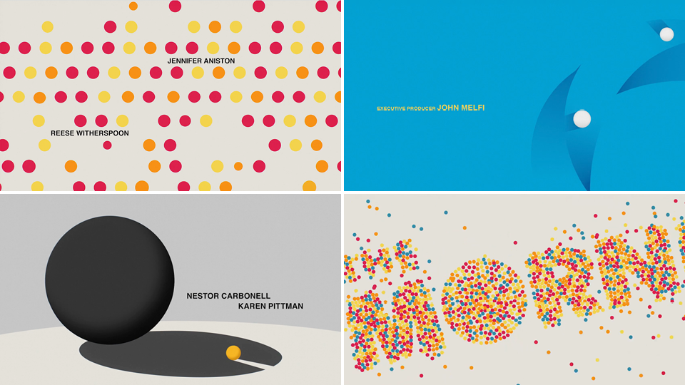
One of the projects I found admiring was from a recent show I started watching called “The Morning Show” on AppleTV. Particularly the intro animation that is mainly just many scenes of simple shapes interacting with each other and colliding into different scenes. The intro uses a mix of 3D and 2D graphics which interested me the most. The reason it’s so appealing to me is that I want to learn how to code things to interact and move with the laws of physics. The intro for the show was created by a design team called “Elastic” in which they organized the development by major themes. The intro also tells a deep story about the show depicted in very simple-form shapes. I think this project needed the development of custom software as the way the object move is so complex as they interact with each other so much. I think they might’ve been inspired by some of the projects of Piet Mondrian because they both use simple mediums within their work while also underlies a complex context.
“The Morning Show” – Design Team: Elastic
