This is where your blog would go.
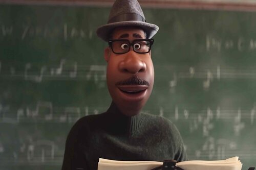
Disney’s Pixar really excites my imagination.

[OLD FALL 2020] 15-104 • Introduction to Computing for Creative Practice
Professor Tom Cortina • Fall 2020 • Introduction to Computing for Creative Practice
This is where your blog would go.
Disney’s Pixar really excites my imagination.

Prior to starting this course, I was not familiar with any computational projects. I am working toward my master’s degree in music performance and I have never been very familiar with computers. In looking for a project, however, I found John Maeda and his work. I am especially interested in “Commute” (2003) because of the colors and textures that are present. Maeda used jello in real life to create layers of color. He then developed his own custom program to correct the order of the colors of the jello layers. He wanted the work to emcompass all colors in the rainbow and for the colors to be in spectral order.
Maeda selected jello because he did not like the layers of plastic that many artists were using to create colorscapes. While he does not reference a specific artist or project, Jill Nathanson is an example of a contemporary artist who uses layers of plastic for her work.
This project shows the opportunity to continue using both studio and computational techniques to create a work. Is is not that the artist is creating a studio work and using a computer to edit or improve their mistakes, rather, they are using both as separate techinques that give the project a unique result.
https://maedastudio.com/2004/desktop/jello1.jpg
Commute (2003), John Maeda
A project that influenced me to take this class was programmed by a former student of 15-104. They decided to create a code to indicate when 60 seconds have gone by. He was able to visualize the amount of time that’s increased through the opacity/intensity of rings of light that pulse every second. It was a project done individually, and he looked at alternatives to time and sound in the world to gain an idea of what direction to go. It seems as though he developed a custom code for this function. Digital tools have created an accommodating environment for multiple users, so the fact that this student looked at how we can use technology to form a better experience and understanding, makes it stand out to me. I know that the creator of this project has been interested in using different senses to change or enhance things, which was most likely a reason for them deciding to develop this project. It was a simple look into the impact of computational design.
The interactive fashion couture work by Iris Van Herpen is one of the most eye opening project for me among the field of technological art. Employing smart textiles, garments are able to move with the movement of the model and the movement of the environment. For the one of the runway show “Hypnosis”, it is realized by a team of collaborating artists to achieve the final production who are active in the technological art field, such as the multi-disciplinary architect Philip Beesley. A total of 20 looks took six months for the concepts to turn into physical work. The development of the work are made by both custom software and commercial software. For example, the 3d twisted vortex structure are constructed in Rhino and Grasshopper while the e-textile from certain pieces are build with custom scripts.
Iris Van Herpen writes in her show notes that the first thread of inspiration comes from the Spanish neuroanatomist Ramón y Cajal, who translated the symptoms captured from the neural systems to sophisticated graphics. The projected guide to the forthcoming explorations on how human senses are able to influence the functions of wearable textiles.
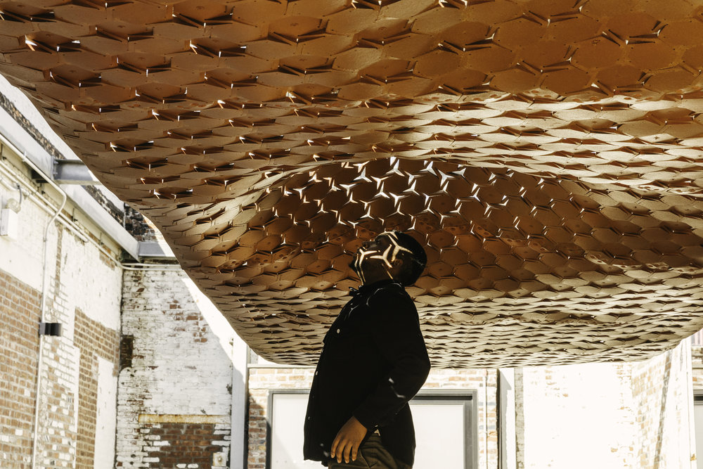
Urban Imprints by STUDIO INI was an interactive piece that aimed to fight the preconception of rigid urban ‘walls’ that restrict human expression and individuality. The piece was created through a system of pulleys and flexible custom shaped wooden mesh surface that responded to human movement. When movement was detected towards the surface, it would retract and move away from the person, in effect, acting as a living organism celebrating human interaction instead of restricting it. The use of a custom piece of code is not confirmed, but I assume some sort of program must have been created in order for this level of interaction to take place. This work enables a new way for designers to consider interactive elements as part of a feasible options and could be used in new and innovative ways.

http://www.nassia-inglessis.com/works-recent#/urban-imprint-1/
When I think of inspirational art involving technology, the use of lights always comes to mind. For example, one of my favorite things about Carnegie Mellon University, are the lights used as art at the Hunt Library and the lights on the Pausch Memorial Bridge. One piece of artwork that comes to mind and is similar to these is the “Final Response” in London. The lights in this piece of art interact with people’s movement as they walk by. The artwork consists of invisible sensing technology which was created by Software Programming and Electrical Engineering company, White Wing Logic Ltd. I imagine they created custom software for this project, although not much is released about the work put into this project. Along with them, a structural engineering company, installation company, assembly and fabrication company, and a concept and design company (Cinimod Studio) helped make this possible. Cinimod Studio says to have gotten their inspiration from Soho’s evolution of the media district. These changing lights offer something new and futuristic (at least it was at the time, in my opinion), with the opportunity to evolve just as the media district has. While I have never been to London, I feel it would be very peaceful to walk by here and would give me just as much joy as the lights displayed at CMU do. Here’s the link for a more in-depth description, https://www.cinimodstudio.com/experiential/projects/finial-response, unfortunately, I wasn’t able to find much information about the project itself.
One work that I have found inspirational is the installation made by Nader Tehrani at the Moma in 1998. It is a sculptural piece,
essentially just an orthogonal grid push thru and projected across a distorted plane. The work is made of intricately folded metal, and
was completely custom fabricated. It was one of the first explorations in computational design in architecture aside from the work of
Frank Gehry. I was fascinated at how small the margin of error in the construction was due to the precision of the computational work
and its inherent intricacy. One can look at the work and only see the orthogonal grid, but as the move around the work, it begins to
distort from that shape heavily.
The technological design that has inspired me is the new Burberry logo drawn by Peter Saville. The logo is created by him but Ricardo Tisci, the chief creative officer of Burberry, also had a discussion with Saville over what brand value should be included. He first tried to learn about the main objectives of the business by getting to know its brand culture and history. After talking to Ricardo, Saville realized that he needed to find a signature that can either be a logo on chiffon blouse and be inside the trench coat. He also considered how Burberry contains two Bs and three Rs. Saville attempted to gather the capital letters of Thomas Burberry and what the consumers like together. This has encouraged me to think of how to put different elements in one logo and bring such influence to the world. I think Saville has definitely used custom softwares due to the orderly arrangements of the monograms. Saville might not be inspired by others, but he surely had compared his previous experience on monogram design for Calvin Klein to this design for Burberry, which he found a difference between refocus/reorientate for Calvin Klein and represent the values of Burberry. By contrasting their specific needs for a new logo, Saville was able to design a monogram that represents Burberry for its 150-year-long history.
Wray, Adam, et al. How to Rebrand a Fashion Label.Vogue Business, 31 Jan. 2019 www.voguebusiness.com/companies/peter-saville-fashion-logo-design-burberry.
“Cellular Complexity” is a project designed by Julia Koerner in collaboration with Marie Boltenstern and Kais AL-Rawi. In summary, this project looks to cellular systems as inspiration to generate performative and complex geometries that respond to spatial and structural constraints. I find this project inspiring because it harnesses the power of computational tools in order to create a structural solution in architecture that also has an aesthetic agenda. This type of project could lead to customizable, and therefore more effective, structural solutions in the building industry. As this project is listed as a dissertation, I would assume the timeline of the project to be two semesters. This project probably did not require the development of custom software, as it was likely created with Rhinoceros 3D in conjunction with the plug-in Grasshopper. However, the creators most likely generated custom scripts within Grasshopper using Javascript. These scripts allowed for the creators to parametrically control various characteristics, such as porosity, and number and size of the cellular aggregates.
Box by bot and dolly is a shortfilm that treads the line between visual effects, practical effects, robotics and projection mapping.
Bot and Dolly is a boutique design studio that creates pieces of art work that deal with human computer interactions. Often utilizing
various digital fabrication techniques to achieve their effects. In this case they are utilizing robotic arms and large flatscreens to
create a truly visually spectacular feat.
Inspired by magic shows the creators sought to use technology to capture the sense of awe and illusion magicians demonstrate on stage.
The illusions in reality are created by the precise calculation of the moving graphics, the moving robotic arms and 3D space. Although 3D
motion tracking has already been a thing and used in the film industry for visual effects for ages, the precise combination of graphics, moving
screens and a performer, as demonstrated in the Box shortfilm can really prove to be a new phase for not just the movie industry but for the
performing arts as a whole. Set no longer need to be a static piece sitting lifelessly on stage, or large scale constructions in teh middle of
universal studios, they can simple be pre-rendered VFX scenes that are tracked in 3 dimensions.