One 3D computer graphics artist I find interesting is Omar Aqil, who creates 3D abstract portraits inspired by Picasso’s work. My favorite work that he created is his “Figurative Portraits” collection, which is inspired by Picasso’s artwork. He uses different 3D textures and forms inspired by Salvador Dali’s work to emulate facial expressions. I find it really cool how he can make the shadows and forms look so realistic. For example, some objects in his pieces are shiny and can reflect other objects in the piece. The way Agil uses light in his work is really interesting because it reflects and absorbs in different textures and surfaces.
Category: LookingOutwards-05
LookingOutwards-05
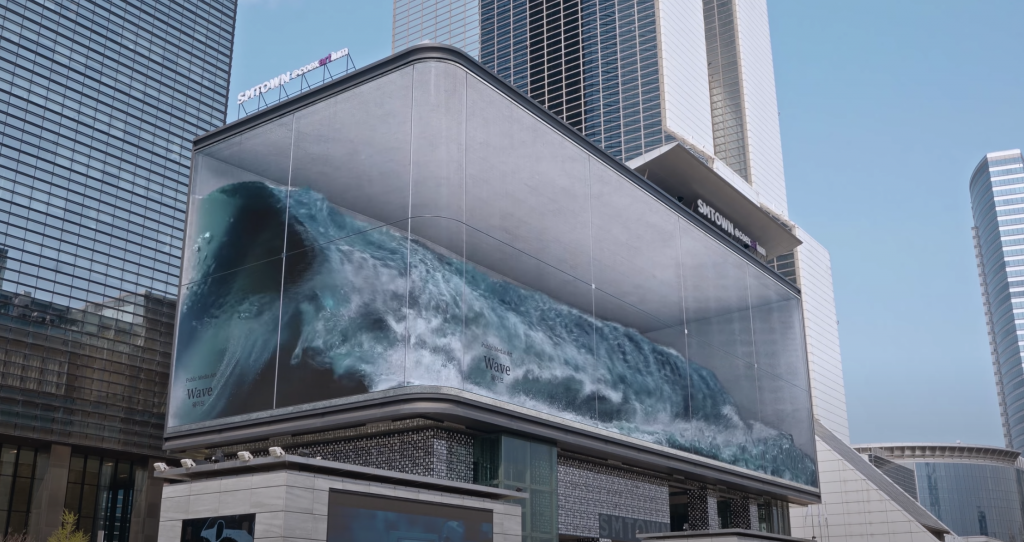
The project I want to discuss is a piece of public media art, “WAVE”, created by a Korean design company called d’strict. “WAVE” is an anamorphic illusion of water surging in a giant glass jar revealed on a magnificent DOOH of COEX K-POP SQUARE, the largest & high-definition outdoor advertising screen in S.Korea at 80.1m (w) x 20.1M (h).
Needless to say, the astonishing visual effect attracts me. I admire how modern technology and art as well as the natural and artificial are perfectly integrated to maximize people’s sensual experience. Yes, besides visuals, “WAVE” also provides acoustic effect to enhance the realistic impression of the art.
I know that fluids are probably the hardest thing to simulate in 3D rendering software because its movements are complex and hard to predict. I suppose the creators simulated water flow using 3ds Max Fluids and the Motion Field space warp. The algorithm might have helped them to customize the dimension of video according to the size and geometry of the LED screen to create an anamorphic illusion.
The creators’ artistic sensibilities are manifest through the creative concept of manipulating sight to create a realiztic 3D effect on 2D media.
Looking Outwards 05 – 3D Computer Graphics
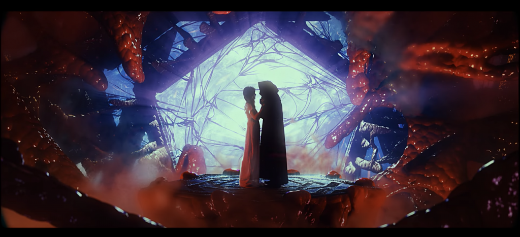
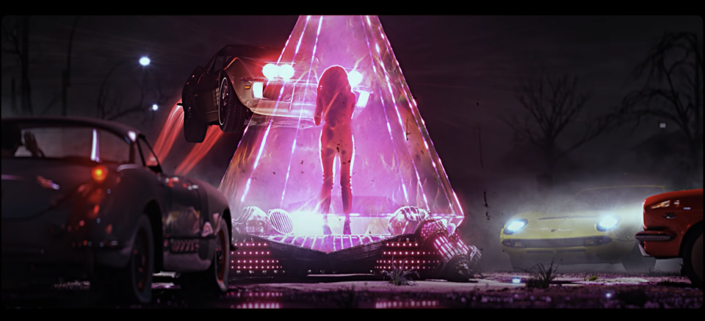
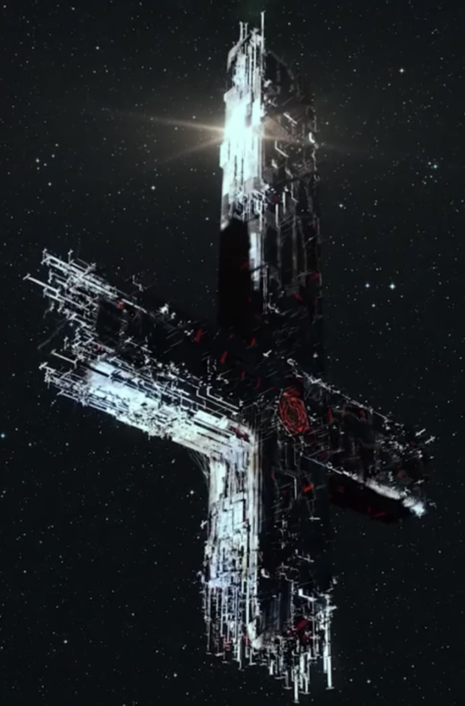
One of my favorite musical artists, Carpenter Brut, released a music video about 4 years ago for his song “Turbo Killer”. The basic premise of the video was a world where machines were living (and hence called “blood machines”) and due to their power were highly coveted and fought over. The video was directed and written by Seth Ickerman, a Paris-based CGI artist whose goal was to capture the over-the-top 80s feel of Carpenter Brut’s heavy synth music.
The video features a myriad of special effects that synergize to create this 80s atmosphere, of which 3D graphics plays a major role. Most of the video was comprised of CGI in some form, with only close-up shots of real actors shot live and superimposed onto a CGI set. Some of the CGI models used in the video are detailed to an extreme amount, leading me to believe they were not all modeled manually by hand. Generative design in certain scenes and models seem to help Ickerman model faster as well as depicting a more organic feel to these machines.
LO – 05
When hearing about the topic I immediately thought about @liliquela on instagram.
This account is an influencer account but the difference here is that the “person” Miquela is actual created with AI.
One of the first instances where I remember seeing this technology happening is during the Fast and Furious seventh movie when they utilized CGI to make Paul Walker’s face for the end scene.
It is crazy to think how graphic art has evolved so muc hso that now there is actually Miquela who is entirely created by AI working as a fashion influencer, essentially she is an AI model.
Not only is she attracting attention and followers but also recognition as she graces the pages of multiple magazines wearing the latest fashions.
This is super intriguing to me as the fashion industry is something Ilove and it’s crazy to see how much tech has developed where it is even permating the model industry.
Looking Outwards-05
https://www.behance.net/gallery/40600473/FREE-BIRD
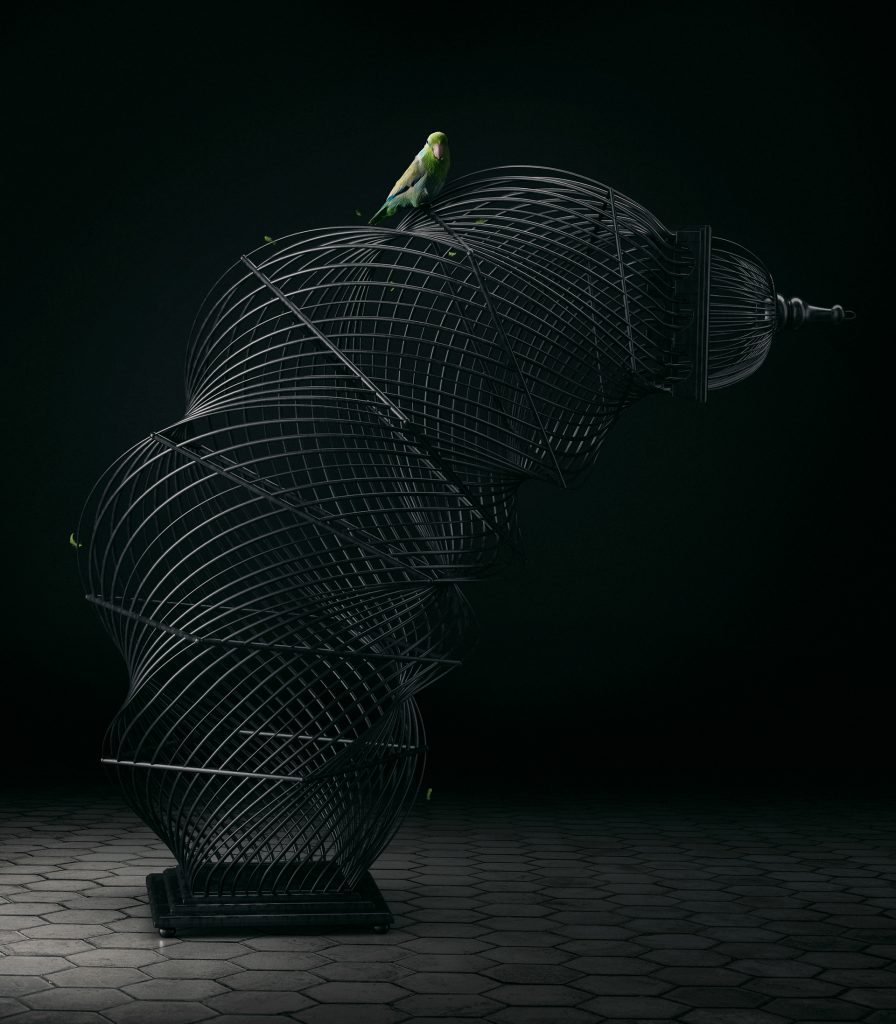
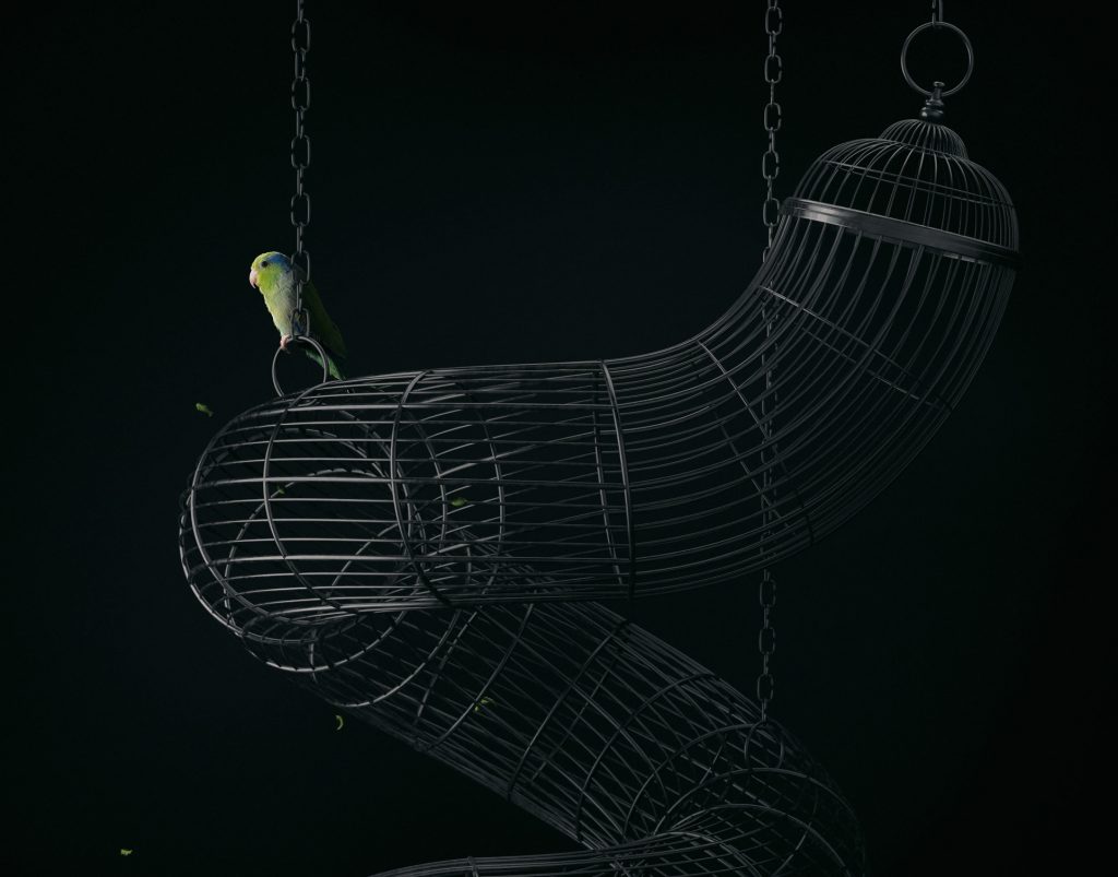
This collection is named “Free Bird” and is by Mike Campau. He’s a photographer who uses CGI to distort components of reality. Normally, he makes commercial art/graphics for companies like Beats by Dre, Under Armour, Nike, etc., but he also does personal projects like the one shown. In this collection, I like the way that he distorted that he used CGI to distort the bird cages. The statement included with it is “an escape from the odd and dark world we live in… and sometimes there are no doors to get out.” I think that the distortion of the cages helps convey the complexity of the problems people try to escape and creates a very somber and imposing mood. I don’t understand where the doors come in to play though. I’m guessing we are supposed to question how the bird managed to get out of the cage in the first place and wonder why the bird is still sitting on the cage if it managed to get out which I find interesting. He says that he made this in Photoshop to make this. I know that you can make 3D models and texture them in Photoshop, but I’ve never done it before so I couldn’t say exactly how he did it. Also, the bird a real bird and not a 3D model.
Looking Outwards 05 – 3D Computer Graphics
Miquela Sousa, also known as Lil Miquela, is a computer-generated imagery (CGI) instagram model created by Trevor McFedries and Sara DeCou. She is an active model marketing a variety of brands, primarily in fashion. When I first heard about Lil Miquela, I was amazed by the idea of creating a fictional instagram model out of computer graphics. In fact, it is stunning to see how much she grew up as a model, featuring in product endorsements for famous brands like Prada and Calvin Klein. Not only is she a model, but she is also a virtual musician. The quality of the computer graphics on Lil Miquela is more than shocking. She looks very similar to other instagram influencers, but just with a bit more filter. If you look closely at her photos on instagram, you can see the individual strokes of her hair, wrinkles, clothes, and eyelashes. Lil Miquela is a pre-rendered, computer-generated snapshots. In other words, she is a computer graphic created through photography and rendering, raxet codes and futuristic software. It is clear that the artists of Lil Miquela are very sensitive to details and realism. The fact that they use photography to create the CGI explains how precise they are to create the final form.
Lil Miquela’s Instagram: https://www.instagram.com/lilmiquela/?hl=en
Brud (AI and robotics company that creates Lil Miquela) Instagram: https://www.instagram.com/brud.fyi/?hl=en
LO-05 (3d computer graphics)
For todays looking outwards I want to focus on a specific 3D graphics artist, Randy Cano. He is a self taught 3D computer graphics artist and animator that uses 3D software to create unique and “trippy” scenes. His work varys from explosions, to paint spilling on a specific object, to fury humanoid figures dancing to strange music. Randy morphs our reality by using his personal style of morphing humanoid figures with unconventional materials and textures. In one of his works, a soft rubbery head is pushed through a dense field of equally rubbery heads, and that is the entire work: heads pushing through heads. Although all of his works are short clips of rendered videos on instagram, which is where I consume most of his content, it provides an interesting escape from reality in a 3-5 seconds video.
Looking Outwards – 05: 3D Art
One two dimensional digital representation that I greatly admire is Stepan Ryabchenko’s “Power Pump,” (2011) a piece of artwork from the Computer Virus Series. I am intriguied by the thoughtfulness put into the work both in its actual physicality as well as its intention and general concept. Essentially Ryabchenko compiled data on major catastrophic viruses that have occurred since the inception of the computer, and gave them an identity be revisualizing them as actual, biological viruses. In the words of art critic Natalia Matsenko, this work renders the virtual nature of the virus which effectively overcomes the “limit between the figurative and the abstract.” It appears as the artist utilized generative modelling as well as parametric modelling in his design, with the shape of the image ebbing and flowing in deliberate ripples. I particularly like this specific piece out of his series because “Power Pump”, while still looking foreboding, further takes on an aesthetic quality that is reflective of the artist’s crossroads of sensibilities as a visual artist, architect, and programmer. The realistic rendering and materiality adds another level of dimension that seems to appear even more than just 3-D in a 2-D representation.
LO-05
Pixar is known as one of the first studios to produce high quality 3D animated feature-length films.
Their process is similar to the creation of any digital media which includes storyboard, voice acting, art design, music. I admire the drive and vision of the studio in creating a feature-length film with 3D rendering.
There are important steps and processes that take advantage of the computers, namely 3D rendering.
I imagine the algorithms create the 2D product from the 3D models by capturing the animations from a specific angle.
Pixar movies always have an indescribable quality that no other early studio was able to recreate. By viewing the final product, it is abundantly clear that every department cares deeply about their work and the project as a whole.
The models are created by artists using computers then called by the animators to create scenes for the movie. Pixar developed out of an older rendering software, Renderman, which played a pivotal role in the creation of movies like Jurassic Park and Toy Story. This software is used to put the final touches on the project, like textures and lighting, creating the final 2D product after a few days of rendering.
Toy Story (1995)
Walt Disney Pictures
Pixar Animation Studios
LO 5
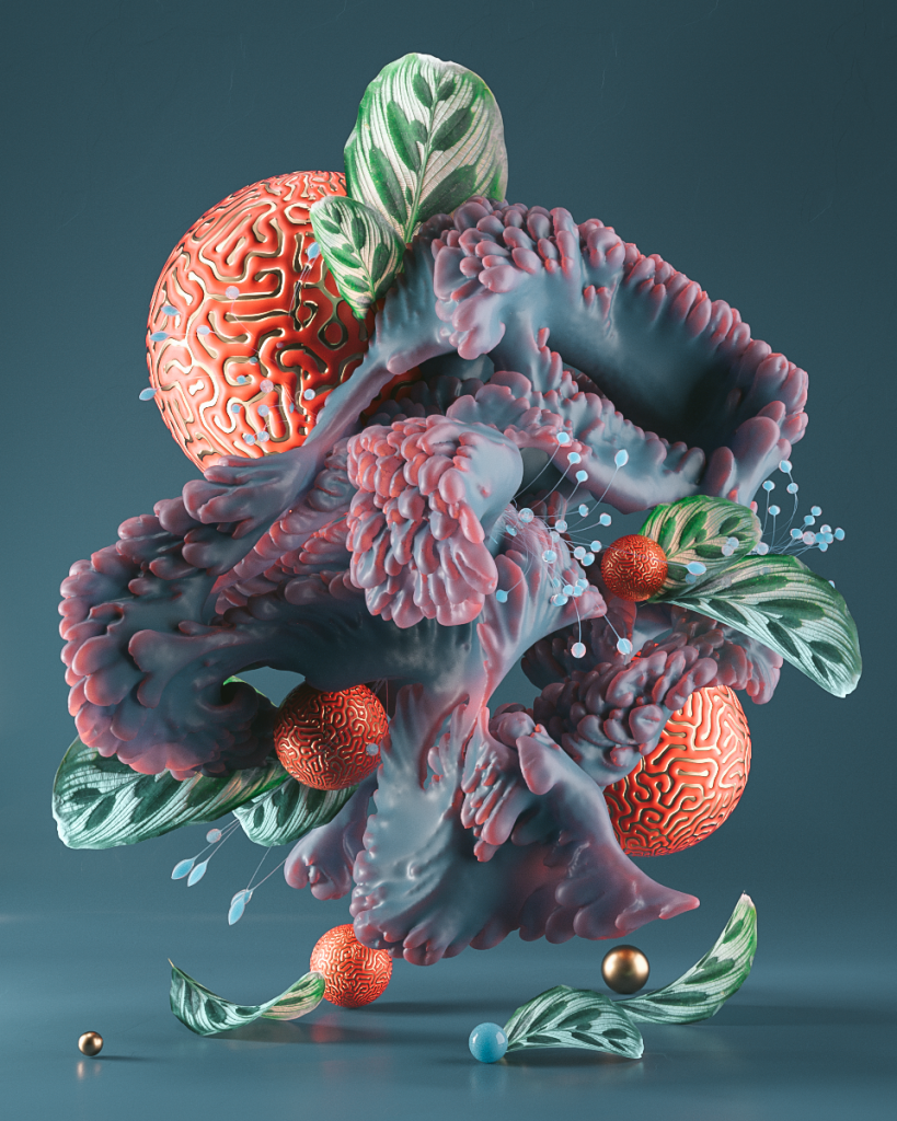
One of my favorite places to explore and browse art is on Behance, an Adobe site that’s partially a job search site, partially a portfolio site, and an all-around great place to find great art. One of my favorite artists is Roman Bratschi, a 3D designer whose rendered art is filed with textures and materials that captivate the eye.
I think because I am a materially oriented person, anything with strong texture, even if it’s just the image of it, captivate my eye. Bratschi creates amazing textures in his renders that I can’t even begin to describe, and his use of vibrant and contrasting colors gives a lot of appeal to the images a well. As far as I am aware, the renders are generated through 3D software that allows for the user to tweak and adjust the form, texture, color, the density of said texture, almost anything imaginable to create renders. In its final form, Bratschi dictates the composition and generation of the art, even though he is using pre-programmed tools to help him create the images.