LO 5

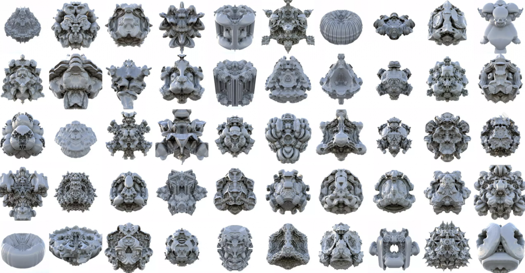
“Platonic solids” by Michael Hansmeyer explores generated geometric 3D shapes that complete a complex form. He has created multiple different final forms which all stem from the same single process with a simple change in variables. I admire how such a subtle change can create a huge different in the final patterns of this 3D design. It influences the branching, fractalization, and build up of the geometric shapes. It’s also worth noting that this system can be applied to multiple scales. The processes at the core of this project have two parts: topological rules and weighting rules. Hansmeyer states that these rules specify how the positions of these vertices are based from the combinations of the vertices and the shapes edges and faces. By introducing parameters that allow for variation, the final result encapsulates a rounded and highly diverse attributes in its body.
Platonic Solids by Michael Hansmeyer

http://www.michael-hansmeyer.com/platonic-solids#:~:text=Platonic%20Solids%20(2008),primitive%20given%20an%20appropriate%20process.

LO-05

Tesla by Toni Bratincevic uses V-Ray to produce its 3D graphics. The project is dedicated to Nikola Tesla and presents a man (Tesla), standing on the control board with the Tesla coil in an arch above him. I originally picked the project because I did not know what it was depicting, but thought it was humorous. Once I found the creator’s description, the image made more sense.
When creating this image, the author knew that he wanted to depict Tesla and the Tesla coil in the image, but that was all that he started with. The rest of the creation, including how the coil and the Tesla figure are displayed, was up to artistic sense.

Tesla (2014) by Toni Bratincevic

Looking Outwards-05

Air Max Campaign for Nike by ManvsMachine.

Graphic by ManvsMachine.

In this campaign, ManvsMachine created a series of 3d computer graphics that abstracted Nike’s Air Max sneaker into a layered composition. This project is admirable in its use of different textures to create variation between the abstracted shoes. Shading, transparency, and texture all help the graphics appear 3d. The textures he uses communicates the message of the shoe campaign as they demonstrate the airiness and lightness of the shoe, while his render of the shoe form composed from stones communicates a different aspect of the shoe’s performance. 

The shadows casted on the graphics are what truly help make it appear 3d. It gives dimension to the illustration and generates surfaces that bend, fold, and capture the light differently. In the campaign video linked below, ManvsMachine animates the graphics in a way that responds to the textures of the graphics which additionally helps make them appear 3d and have qualities that are bound to the physics of our world like gravity. 

Overall this project creatively uses all these methods to simulate the 3d experience of the graphic. 

Looking Outwards-05

https://alteredqualia.com/three/examples/webgl_pasta.html

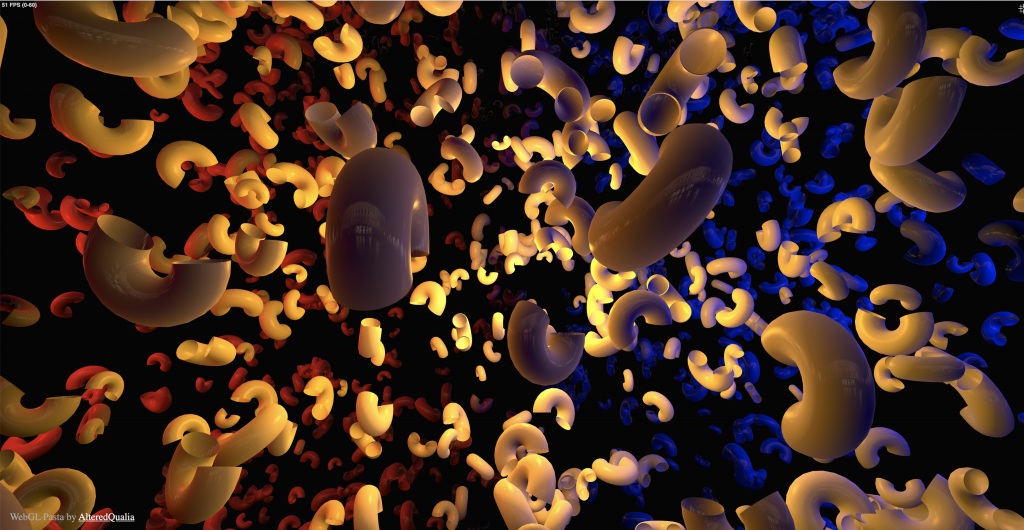
When looking for examples of 3D computer graphics, I found AlteredQualia’s website. This one project called WebGL Pasta caught my attention. It is a 3D rendering of pasta floating through space. The site is interactive, so if you move your mouse, you can explore the space and get it to move in different directions. What I find fascinating about this project, is the amount of depth they were able to achieve through the use of shadow, color, and movement. They were able to create this vast looking environment on a two-dimensional computer screen.

This project was built using WebGL (Web Graphics Library) which is a javascript API. WebGL allows for graphics to be rendered on the web, and it is something I’ve been quite interested in. This WebGL Pasta project seems to have been a creative exploration. I can see the artist’s attention to detail and ability to imagine vast environments. In a lot of their work they use this contrast of red and blue. I’m not quite sure why, but I would love to know their reasoning behind it.

Looking Outwards 05

A piece I found particularly interesting was the work Glasses, Pitcher, Ashtray, and Dice by Gilles Tran. In a blog post about the image, he described the process of making it, where he used ray tracing and radiosity to generate photorealistic images of the objects. It reflects a very somber mood, and keeps an audience uncertain as to whether the piece is to be reflective or dark. It seems as though Tran intended the piece to be ambiguous due to the quality of the elements drawn but also the hues of lighting, which imply a sunny day but a dark room. It is a very high-quality image despite being amateur work and over twelve years old. I find it very interesting how Tran manipulates color and focus to emphasize certain aspects of the work. Lines and edges are crisp and clear, but the whole piece can be seen as dated due to subtle outlines and a lack of warp when looking through the glasses.

http://www.oyonale.com/modeles.php?lang=en&page=40

Looking Outwards – 05

Strawberry by Wagner de Souza

For this week’s Looking Outwards on the topic of 3D computer graphics, I chose to look at the artwork titled Strawberry (https://www.behance.net/gallery/4114195/Strawberry) by the artist Wagner de Souza. I came across his work looking on Pinterest, and I found it really unique and interesting because he 3D mapped the proportions and form of the strawberry, then deconstructed it and created additional graphics. I like the aspect of how the strawberry almost “unravels” and reveals the chocolate, and it gives me a sense of how a strawberry might look if its outer layer were peeled. In terms of the algorithms, I think that de Souza used mapping techniques to plot coordinates in space. He also used the seeds on the strawberry as guiding coordinates. Additionally, I like how he incorporated shadows in the final strawberry rendering to give the effect of it realistically twisting, which was probably generated by creating a drop shadow or gradient. I think the artist would have thought about a strawberry and ways to deconstruct the form, and this led him to produce what he envisioned. He brought out his creativity with the chocolate added to it, and it dripping off the spiraling strawberry layers. While this overall image isn’t actually a believable thing that could happen, it is interesting to me to think of the process of imagining this in 3D, and using code to produce it.

Looking outwards 05: 3D graphcis

Industrial light and Magic is a seminal american visual effects company that pioneered many computer graphic techiniques used in major movies, games and 3d graphics. The 1 project that they completed recently that will have a lasting effect on TV production is the Star Wars show, The Mandalorian. Having it’s founding roots in the original star wars movies, Industrial Light and Magic yet again pioneered another visual effects technique for the the new show. The filming of The Mandalorian was one of the first times real time rendering was used in filming. The desolate alien planets on the Mandalorian, where not real earthly locations but instead, real time, computer generated terrain designed by the 3D artists at ILM. These virtual sets were then cast onto “the Volume” a large circular stage with its floors ceilings and walls covered in high def LED screens for camera capture with the actors acting on them. What’s interesting about this is that the real time rendering engine ILM used was the Unreal engine, a 3d graphics software developed by the company Epic games with a focus on 3D video games. This feat, breaks several boundaries in that, not only does it prove that video game engines now have the capacity to perform at a level of photorealism but it also breaks the boundary of a simulated reality, in that in order for this technique to work, there needs to be real time 3D location and space tracking for the camera work to actually make sense in capturing the footage. Although 3D motion capturing was already a thing, it always required more post processing from the artists but in this case, it was good enough to be captured directly on camera.

LO – 3D Rendered Project

A 3D rendered project I admire is Nike’s 2017 campaign for their Air Max shoes. Nike created a promotional video that uses 3D rendered simulations to give the viewer an impression of how their new Air Max shoes feel and perform. I admire how this project takes advantage of the limitless creative possibilities of 3D rendering to not just show the product, but to leave the viewer with a visceral impression of the product. The gravity simulations of the varied materials definitely rely on different algorithms that calculate the effect of things like tension, gravity, torsion, etc. according to material-specific parameters.

I believe the use of sound, timing, and color are very important in further illustrating the specific qualities of each material presented. The combination of the creative direction of the ad and the suburb rendering quality results in a convincing, persuasive, and practically tangible experience that challenges what 2D advertisement can mean.

LO-05 3D Graphics

Iris Yip iyip
15-104 Section D
LO-05

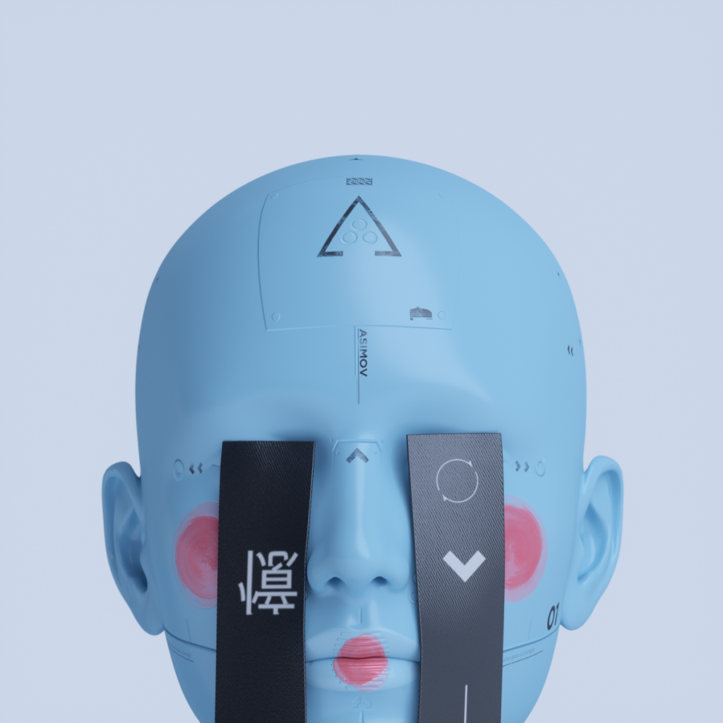
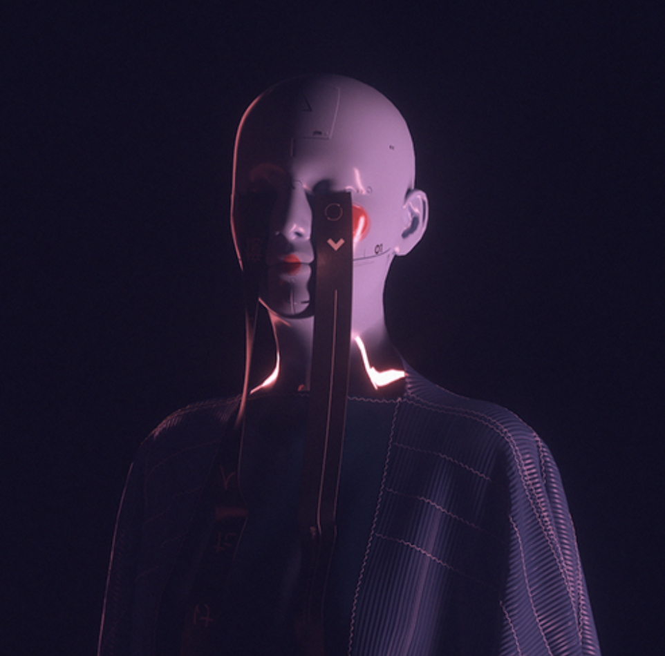
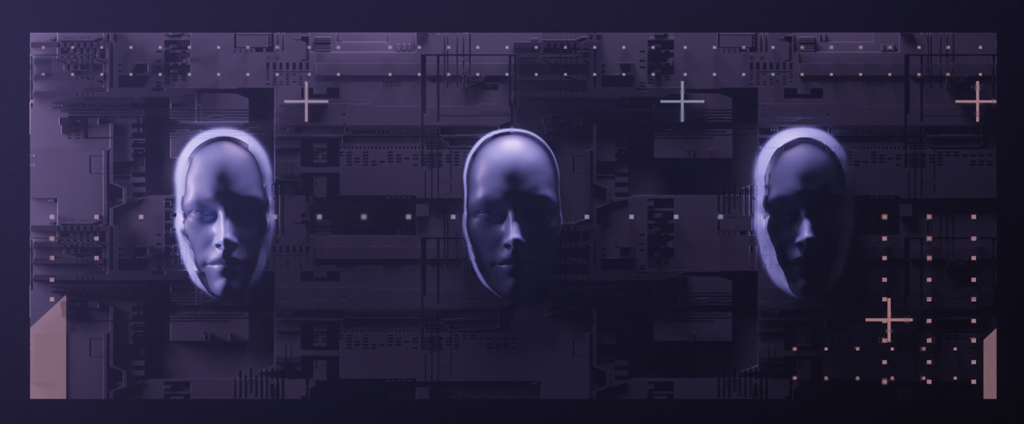
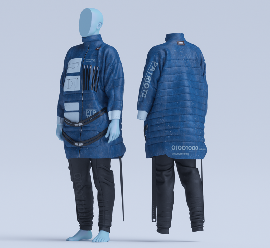
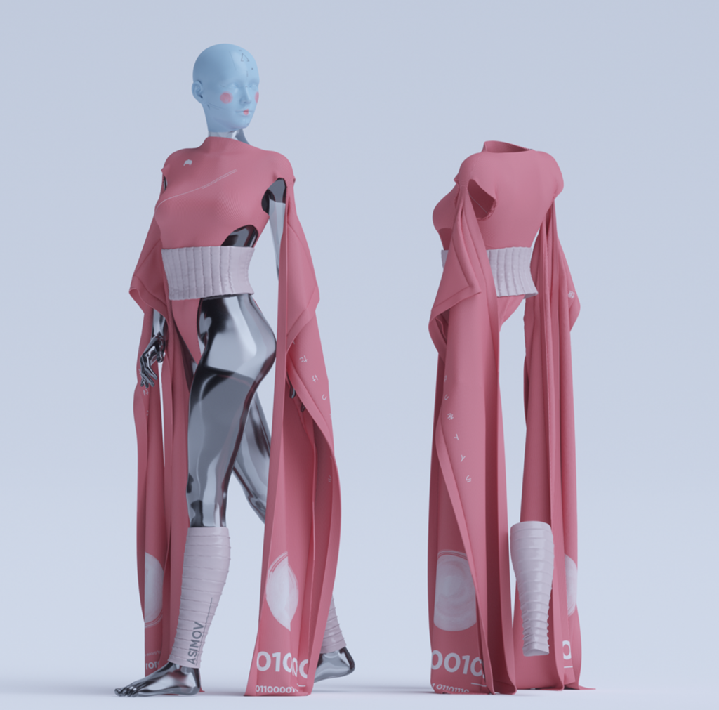
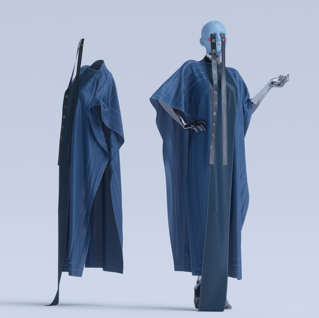
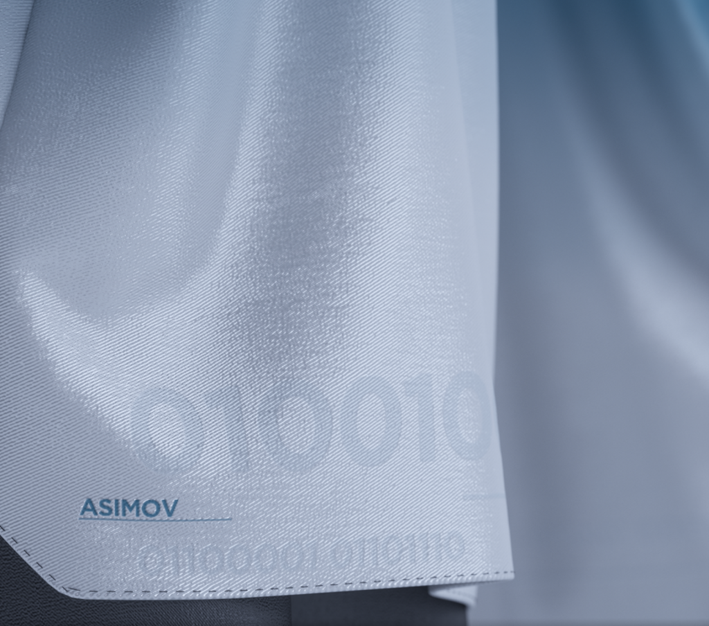
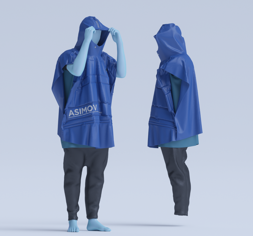
A 3D graphics project I feel particularly drawn to is Catello Gragnaniello‘s ‘Asimov’, a project combining 2D graphics with fashion. I enjoy the combination of realistic textures with foreign-looking materials that give the overall work a futuristic and weightless feeling. The ways that the artist plays around with the same models/figures in different environments is a really fascinating feature that traditional forms of digital art may not afford.

While it doesn’t specify what software the artist uses, a lot of individuals online speculate it being Cinema4D or Maya based on the rendering and motion graphics/animation that the artist showcases in the project.

‘Asimov’ is a really interesting look into the potential future of clothing design, as it is possible to simulate realistic materials and therefore achieve a likeness to an actual product, while simultaneously going outside of the box to create something that may not be possible in real life, asking questions like whether or not the design has to be reproducible, or even real, in order for it to be considered fashion design. With rising cases of 3D-generated models, a lot of people are beginning to question the modern definition of fashion, and ‘Asimov’ explores that idea in a fun and understated way.

Looking Outwards 05: 3D Computer Graphics

The 3D computer graphics project I am interested in is Andy Lomas’ “Aggregation” series. Lomas takes inspiration from famous scientists and mathematicians who studied nature’s processes of building and rebuilding. He uses the Diffusion Limited Aggregation to simulate a growing object; this object is built by random particles moving through the space and interacting in novel ways to form unique and complex objects.

A video depicting some of the variations of the Aggregation series by Andy Lomas (2005).

The algorithm can also be modified in order to represent different features or changes within the imagined environment, creating very different digital simulations. These works are quite interesting as they visualize the natural principles seen in coral reef growth or sediment erosion while also being generative and aesthetically pleasing. I think this series is a very satisfying synthesis of natural phenomena and technology, by using computer graphics as the vessel for and visual representation of them.