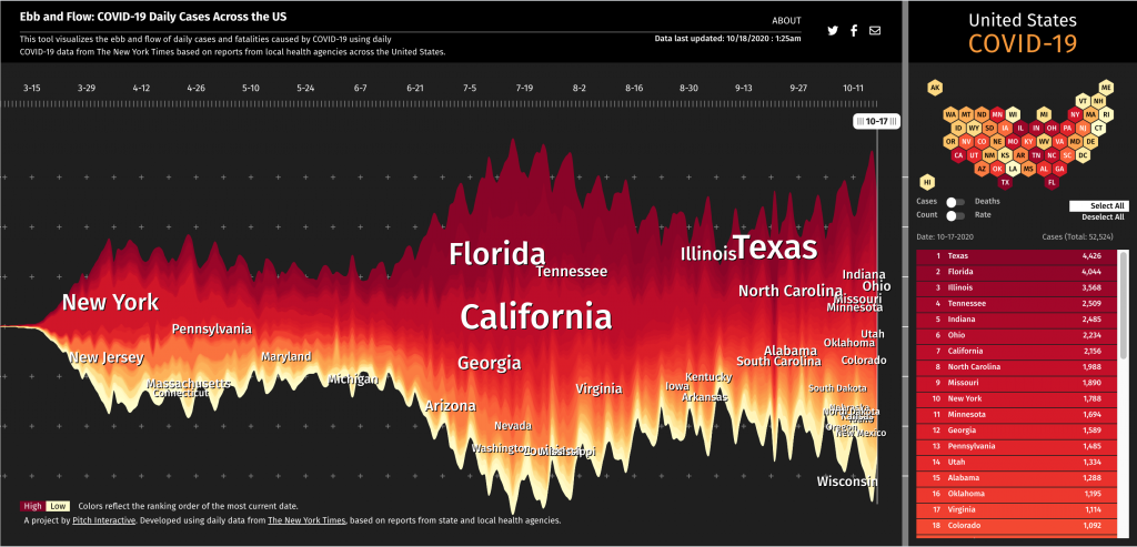
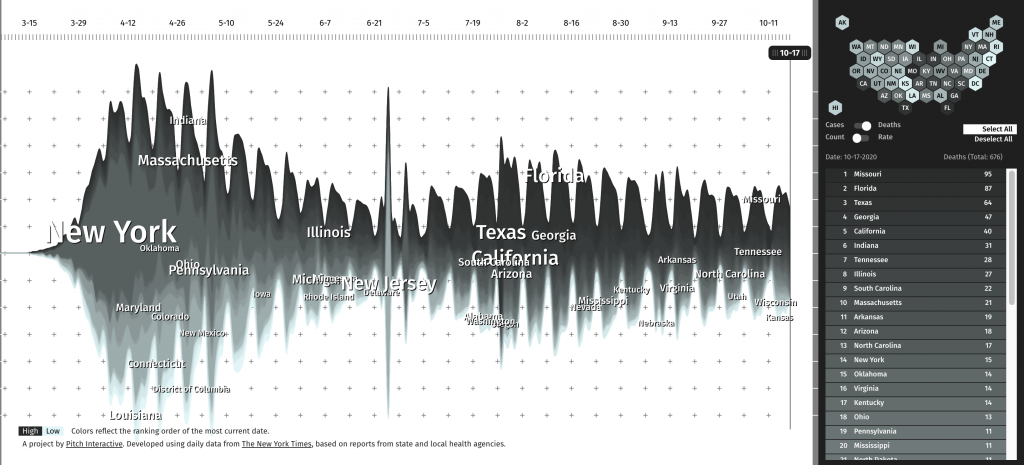
I found Pitch Interactive Inc.’s Ebb and Flow: COVID-19 Daily Cases Across the US a very effective data visualization tool, not to mention very relevant during the pandemic. The tool plots the daily cases and fatalities of each state in the U.S. in relation to each other over the course of the entire pandemic. I think the use of color and the visual nature of the graph effectively instills alertness and demonstrates the severity of the pandemic. As we enter the 7th month of dealing with this public health crisis, the inclusion of all states on the map is essential for the public to access to inspire better community action. People living in states that are doing worse in the current moment will feel a greater sense of responsibility to do better, as they can see their state “called out,” their performance directly plotted against “better” states, and how it affects the holistic curve of the United States. With our country becoming increasingly divided, a tool like this is not only scientifically representative, but has the potential to inspire social and political unity. I find it more effective than the largely achromatic COVID-19 graph provided by Google that forces users to choose their state from a drop-down menu.
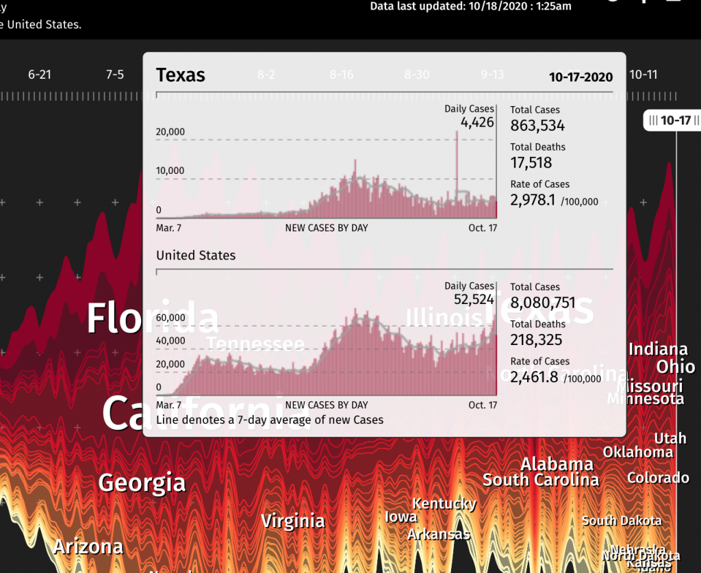
I believe the algorithm is largely determined by some of the functions that made the “stock market tracker” from the last lab, like arrays and array methods like push. Instead of using the noise function to generate the data values, real COVID data from The New York Times would determine the “marketvalue” array. A loop will also hold the array so that it updates daily without manual input. I wouldn’t consider this project to have a lot of artistic considerations, but I do believe the color and other visual decision made make this a good form of communication design made functional with code.
![[OLD FALL 2020] 15-104 • Introduction to Computing for Creative Practice](../../../../wp-content/uploads/2021/09/stop-banner.png)
