Project 09 – Computational Portrait

sketch
/*
 * Eric Zhao
 * ezhao2
 *
 * Computational portrait that "draws" an image using
 * an existing image. Clicking the mouse changes the 
 * orientation of the randomly drawn rectangles in 
 * relation to the center.
 */

let img;
let smallPoint, largePoint;
let rotated = false;

function preload() {
    img = loadImage("https://i.imgur.com/uwh5nXO.jpg");
}

function setup() {
    createCanvas(400, 600);
    axisShort = 10;
    axisLong = 30;
    imageMode(CENTER);
    rectMode(CENTER);
    noStroke();
    background(255);
    img.loadPixels();
}

function draw() {
    push();
    cursorX = constrain(mouseX, 0, width);
    cursorY = constrain(mouseY, 0, height);
    let pointillizeX = map(mouseX, 0, width, axisLong/2, axisLong);
    let pointillizeY = map(mouseX, 0, width, axisShort/2, axisShort);
    //changes width and length of rectangles drawn based on mouse position
    let x = floor(random(img.width));
    let y = floor(random(img.height));
    let pix = img.get(x, y);
    fill(pix, 128);

    //orients rectangles around center of canvas
    translate(width/2, height/2);
    x = x-width/2;
    y = y-height/2;
    rotate(atan2(y, x));
    if(rotated == true){
        rect(dist(x, y, 0, 0), 0,
            pointillizeY, pointillizeX, pointillizeY/2);
    } else {
        rect(dist(x, y, 0, 0), 0, 50,
                pointillizeY, pointillizeY/2);
    }
    pop();
}

function mousePressed(){
    //slightly greys out existing composition 
    push();
    fill(255, 192);
    rect(width/2, height/2, width, height);
    pop();
    //changes rectangle orientation b/t parallel and perpendicular
    switch(rotated){
        case true:
            rotated = false;
            print(rotated);
            break;
        case false:
            rotated = true;
            print(rotated);
            break;
    }
}

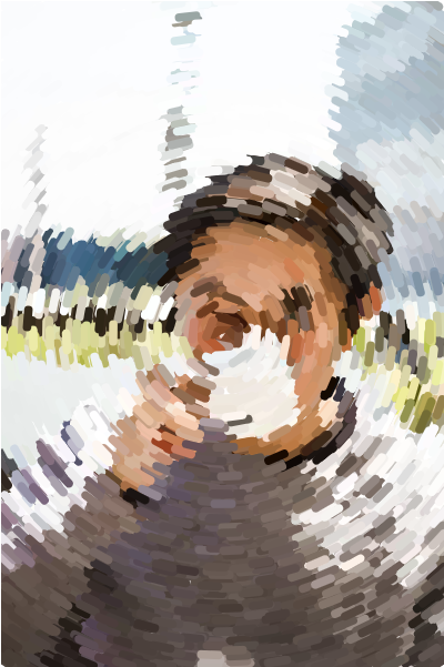
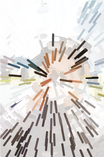
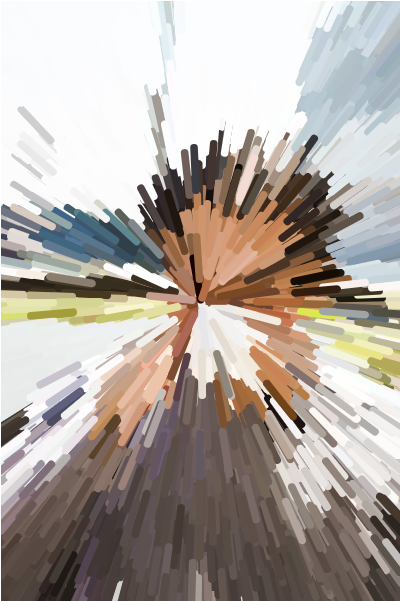
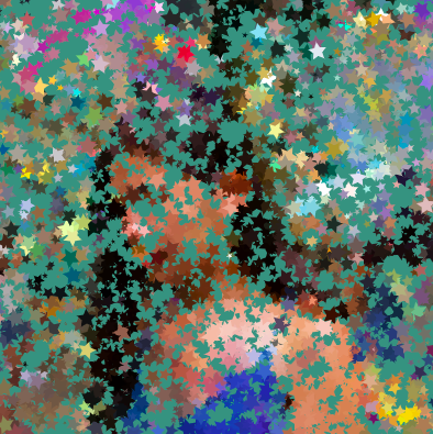
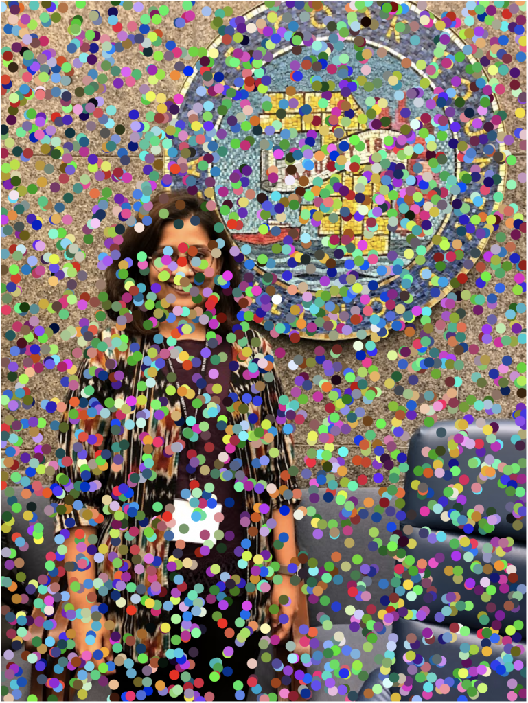
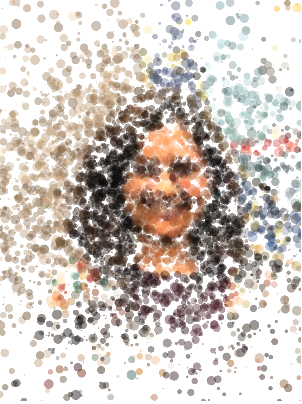
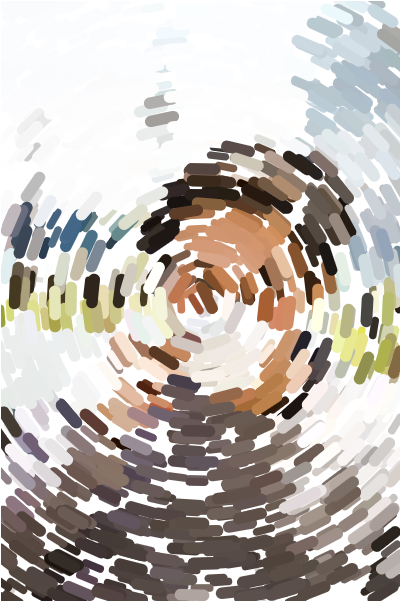
I wanted to see if there was a way to unify the pointillism example code to make the developing composition feel more cohesive. My portrait draws random strokes (rounded rectangles) of varying width and height based on the mouse position, all oriented towards the center of the canvas. Clicking on the canvas causes the underlying content to be slightly greyed out and the orientation of the rectangles will change (from the short side facing the center to the long side facing the center and vice versa).

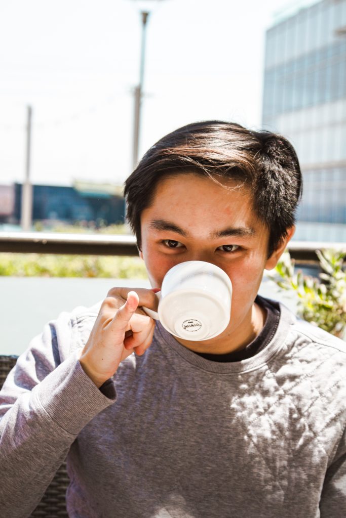
Picture is of my friend trying to be fancy while drinking bagged Earl Grey tea, a very unfancy beverage.
Looking Outward 09

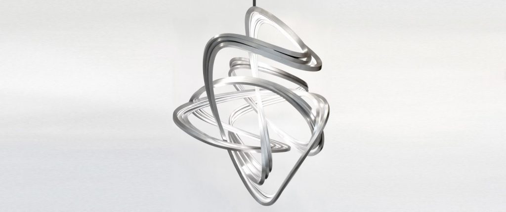
Jubbies’s Looking Outwards Post on Joris Laarman piqued my interest. Joris Laarman is a Dutch artist who utilizes emerging technologies in his work and founded a self-named experimental design lab in the Netherlands. 

The work being discussed was his “Strange Attractor Lamp” made in 2016: this was a dynamic piece of random-looking, sweeping metal elements woven together that had the ability to function as a lightning element. 

Jubbies mentions that they enjoy the “blend of digital and organic” within this work and I feel similarly. I love how Joris Laarman is able to turn a material that most people think of as hard, cold, and industrial, and infuse an organic form onto it. 

Project 9: Portrait

portrait-cb
var myImg;

function preload() {
    var ImgURL = "https://i.imgur.com/6nqYPHi.jpg";
    myImg = loadImage(ImgURL);
}

function setup() {
    createCanvas(400, 400);
    background(0);
    myImg.resize(400, 400);
    myImg.loadPixels();
}

function draw() {
    //randomize positions of pixels and get color from image
    var x = floor(random(myImg.width));
    var y = floor(random(myImg.height));
    fill(myImg.get(x, y));
    pixel(x, y);

    //also draw pixels following mouse movement
    fill(myImg.get(mouseX, mouseY));
    pixel(mouseX, mouseY);
}

function pixel(x, y) {
    //custom star pixel
    push();
    noStroke();
    translate(x, y);
    //add random scale and rotation to each pixel drawn
    scale(random(.15, 1.85));
    rotate(random(radians(-90, 90)));
    beginShape();
    vertex(0, -5.39);
    vertex(1.55, -2.26);
    vertex(5, -1.75);
    vertex(2.5, 0.68);
    vertex(3.09, 4.12);
    vertex(0, 2.5);
    vertex(-3.09, 4.12);
    vertex(-2.5, 0.68);
    vertex(-5, -1.75);
    vertex(-1.55, -2.26);
    endShape(CLOSE);
    pop();
}

function mousePressed() {
    //reset the canvas to random color
    background(color(random(255), random(255), random(255)));
}

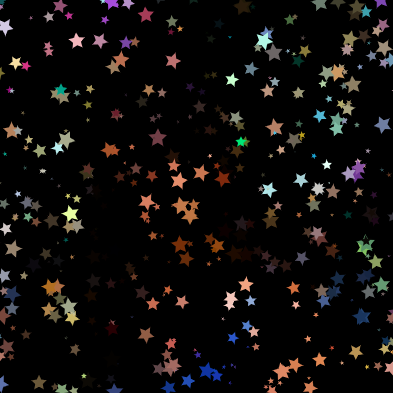
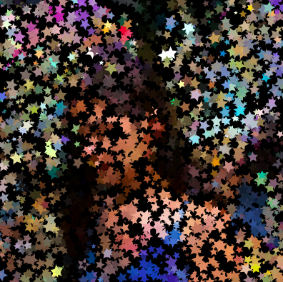
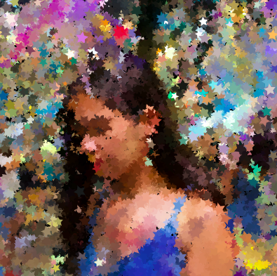
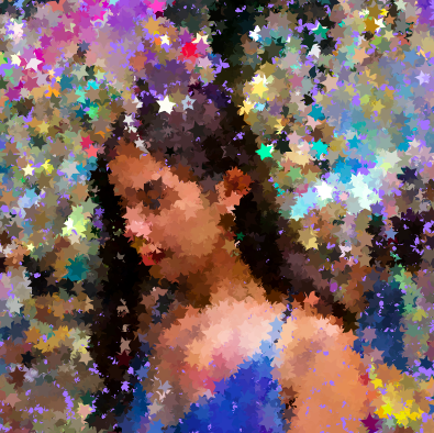
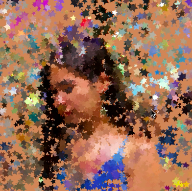
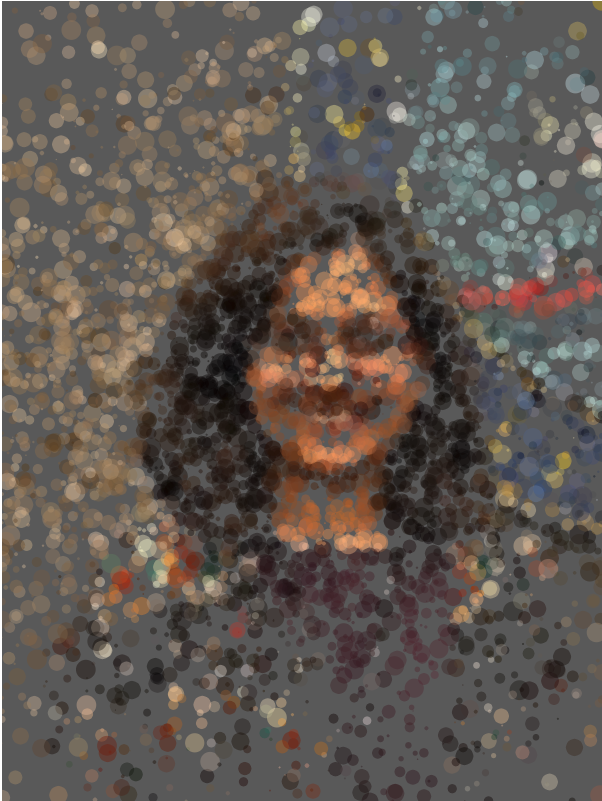
For my project, I chose a photo that my friend took of me at an art gallery installation called “Paraiso” in New York City. The installation consisted of a room with mirrors and many strings of stars hanging from the ceiling. I enjoyed seeing this artwork and wanted to reflect the stars and range of colors in the photo in my portrait, so I practiced using custom shapes to create a star-shaped pixel. To make the portrait more dynamic, I made the pixels to be randomly scaled and rotated. I also coded it so that the star pixels are drawn following the user’s mouse position. When the user clicks on the canvas, it resets to a random color.

LO 9 – On Looking Outwards

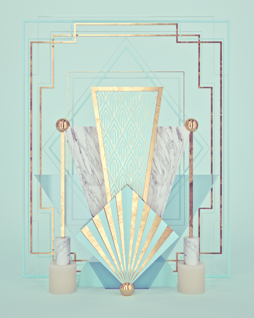
For this week’s LO, I looked at Holly’s Looking Outwards post from week 5 on 3D computer graphics. In this post, she examined the work of 3D designer Roman Bratschi, studying a piece from his “NONSENSE IN 3D N°191-200” collection from 2018. Similar to Holly, I am drawn to Bratschi’s work because of his highly detailed, realistic renders of complex textures. His strong sense of color is evident in his work, as he utilizes sophisticated color palettes to enhance his visual narratives. In addition to the elements that Holly pointed out in her post, I think that the compositions of his pieces play a significant role in their success, as they are quite dynamic and invite viewers to examine the intricacies of each render.

To learn more about Bratschi, I visited his website, where I read about his career path and past work. I was really intrigued by the way that although his work is extremely clean and polished, he is able to effectively manipulate texture, color, and composition to convey a range of emotions and narratives across the different pieces in his portfolio. While some renders come across as very elegant and satisfying, others feel dark and unsettling.

09: Dynamic Self-Portrait

https://editor.p5js.org/ssahasra/sketches/iaWwhg-Q2

The painting has a life of its own. I try to let it come through.It doesn’t make much difference how the paint is put on as long as something has been said. Technique is just a means of arriving at a statement.Every good painter paints what he is.

– Jackson Pollock

While this quote from Jackson Pollock’s celebrates a dynamic and ad-hoc approach to painting, this week’s Project was about understanding the technique even though the motion of particles and elements seems random. However, it is enjoyable to see how the code breathes life into the composition.portrait.

The project this week was an opportunity to merge different techniques from the p5.js toolkit. Mainly the two topics that I combined was “Particles” and “Images”.

I started off by experimenting with different parts of the Particles code from the in-class examples, to see how the behavior of particles changes and affects the composition. For reference, I set the image in the backdrop so that I could see the relative positions of the image in the canvas.

Merging Particles and image methods in p5.js

I used Daniel Shiffman’s tutorials to guide my process and used the steps he proposes to create code that gradually reveals the image through the scattering and random motion of particles. I used 200 particles, to create a play of “hide” and “reveal in the image.

One important thing I learnt is scaling the image correctly so that its scale aligns with the canvas created in the setup function.

Also, constraining the size of the particles and choosing the right variations contributes to a good computational portrait. For example, I ensured that the size of my particles lies between 1, 20 – if they were too big it would be harder to see what image is being rendered, but at the same time, they also do create a dramatic effect.

function Particle(x, y) {
this.x = x;
this.y = y;
this.r = random(1, 20);

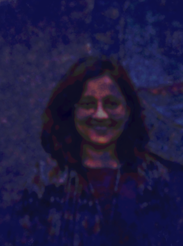
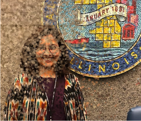
As you see in the images above, I played with color value, particle size and mouse Interactions to show different textures of grain, contrast and color value in the portrait. I also used mouse Interactions to change the background so a viewer can notice the particles and how the interact.

//code citation reference
//Daniel Shiffman's Painting with Pixels:
//https://www.youtube.com/watch?v=0V3uYA1hafk&ab_channel=TheCodingTrain

var p = 2000;

var particles = [];


function preload() {
  img = loadImage('https://i.imgur.com/yprs5DW.jpg');
}

function setup() {
  createCanvas(400, 400);
  pixelDensity(1);
  //image = createCapture(img); //??
  //image.size(width / vScale, height / vScale); //??
  for (var i = 0; i 


This portrait project taught me a lot, and I was able to strategize my process much better than before. With more time, I would like to experiment with this same image using Brownian motion and a random walk of a particle.

LO9: On Looking Outwards

Nike’s 2017 AirMax Campaign Video

One Looking Outwards that I am drawn to is Jubbies’s Looking Outward 5 on 3D computer graphics. Jubbies chose the Nike AirMax 2017 campaign created by the design studio ManvsMachine. I totally agree with Jubbies’s assessment of the video. The promotional video  was able to use sound and 3D renderings to convey the lightness and comfort of the Nike AirMax without having to render the literal shoes themself which I thought was really cool. I really enjoy the gravity simulation created. The application of computer-aid 3D rendering to something that I’m really interested in–running shoes– and an aspiring product designer is really eye-opening to me.

Creator: ManvsMachine

Year: 2017

Link: https://courses.ideate.cmu.edu/15-104/f2020/2020/10/03/lo-3d-rendered-project/

LO-09: Learning from Peers’ Blogs

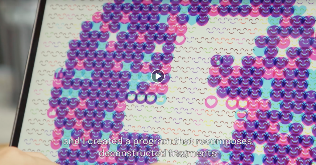
Emoji-inspired Artworks for Facebook, by Kyuha Shim

For Looking Outwards this week, I chose to review a blog from the one of the initial weeks of the course. Having joined this class late, I missed out on the first two weeks of work and that’s why I chose to use this week to review LO essays from those weeks written by peers.

I reviewed a post by Mark, where he talks about one of the artists who inspires him: Kyuha Shim. I chose this post to review because Shim, is not only a CMU professor, but also someone I had the chance to learn from, last year as I am a part of the Department of Design. Kyuha’s body of work is hugely inspired by what he calls computational design thinking.

While designers have several visual tools and software at their disposal to create and design interactions, experiences and interfaces, Kyuha’s work focuses on bringing computation into that design process and looking at computation as material. Kyuha was an artist-in-Residence at Facebook and he used computational methods to iterate graphic design compositions using deconstructed emojis.

In the process of iteration, he uses computation as material to create artworks/compositions at the frequency of “thousands of compositions in seconds” which expands the boundaries of thinking.

As a designer, this way of approaching code is inspiring. Rather than going in with an entire plan, going in with the right computational tools, can give rise to many visual design posibilities, which is true about p5.js as well as Processing

This is also a great example of an artist building up a particular practice or approach and using that approach for a versatile set of projects.

https://www.facebook.com/analoglab/videos/2163738493935595/?extid=GzpKGxeoSpyRbp7Q

LO 9

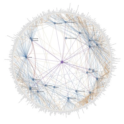
This week I am going to look at my good pal Jubbies’ blog post on Chris Harrison’s “Clusterball”. This data visualization uses the connections between different Wikipedia pages through a common denominator to create an almost woven ball of links. I too played many rounds of “Wikiracing” as a kid, so I can easily connect to Jubbies’ outlook on this project. I enjoy seeing the ways in which these structures of interconnections have been made and where these lines are drawn. While taking part in “Wikiracing” I never truly paused to think about what connects various words and articles (as my only care at that time was winning the game). I agree with Jubbies’ statement on how amazing it is to see how every word does its part to add to this organic system. I would be interested to see this directly applied to “wikiracing” and be able to give two wikipedia pages as inputs and see how you could navigate from one page to the other.

https://www.chrisharrison.net/index.php/Visualizations/ClusterBall

LookingOutwards-09

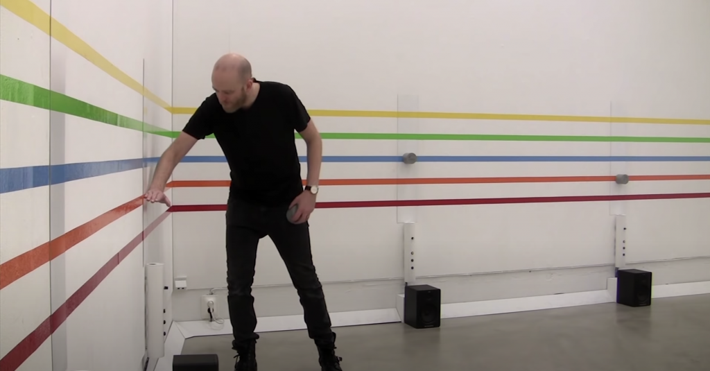
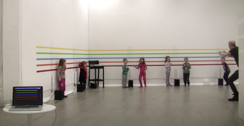
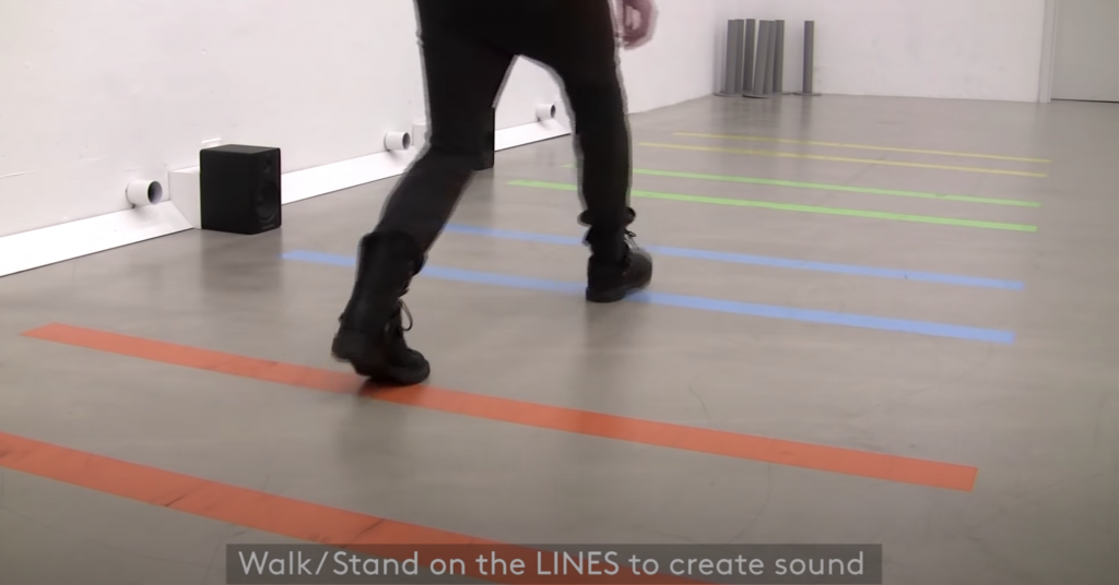
For today’s looking outwards, I’ve selected tian’s LO 4, Sound Art. It was a new approach for me to see how technology can collaborate and create musical interactions with people. As it allows people to interact with musical notes with their bodies, it was interesting, as a person who’s interested in music, to watch a video of creating a musical composition on the spot. Just like tian said, I also think it is such a great project(LINES) that people with no musical experiences can also participate and “bring novelty and inspiration” to the new world of music(using a very engaging method). By exploring this project, I also realized that people can find/learn new forms of musical interactions and expand the exploration of new artistic expressions.

LO 09 – on Looking Outwards

Bone Chair (2006)

Joris Laarman


Bone Chair (2006)

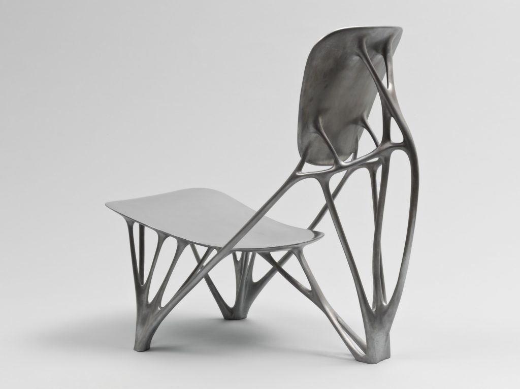
For this looking outwards post, I took a look at Jubbies’ post on Generative Art regarding Joris Laarman’s Bone Chair. In reading her response to Laarman’s work, I agree with what she said – As a design student myself, I find meaning and great appreciation for beautiful things, but something that embodies both form and function. As stated in her post, Laarman uses algorithms to mimic the natural growth of bones and trees to create a chair that has the most minimal structure to support the human body. I found this very intriguing because this piece represents the patterns of nature through a physical object that we interact with on a daily basis, yet still considering the form and function of the said object. From afar, this piece may seem like a “cool” surface level chair but the process of discovery and learning is required thus appreciating the chair even more.  

View original LO here

View portfolio here