Project 7 – Interactive Curve

sketch
//hollyl
//composition with curves
//section D
var nPoints = 150;

function setup(){
	createCanvas(480, 480);
}

function drawCartiod(){
	var x;
	var y;

	var a = 15;
	var b = a/2;
	var h = constrain(mouseY/50, 0, b);
	var ph = mouseX/50;

	fill(200, 255, 200);
	beginShape();
	for(var i=0; i<nPoints; i++){
		var t=map(i, 0, nPoints, 0, TWO_PI);

		x = (a+b)*cos(t) * (h-cos(ph+t*(a+b)/b));
		y = (a+b)*sin(t) * (h-cos(ph+t*(a+b)/b));
		vertex(x, y);
	}
	endShape(CLOSE);
}

function draw(){
	background(255);
	push();
	translate(width/2, height/2);
	drawCartiod();
	pop();
}


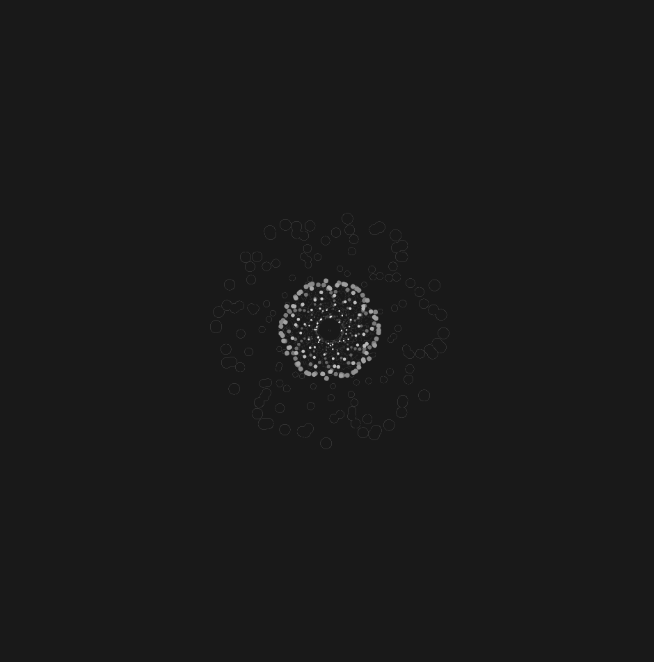
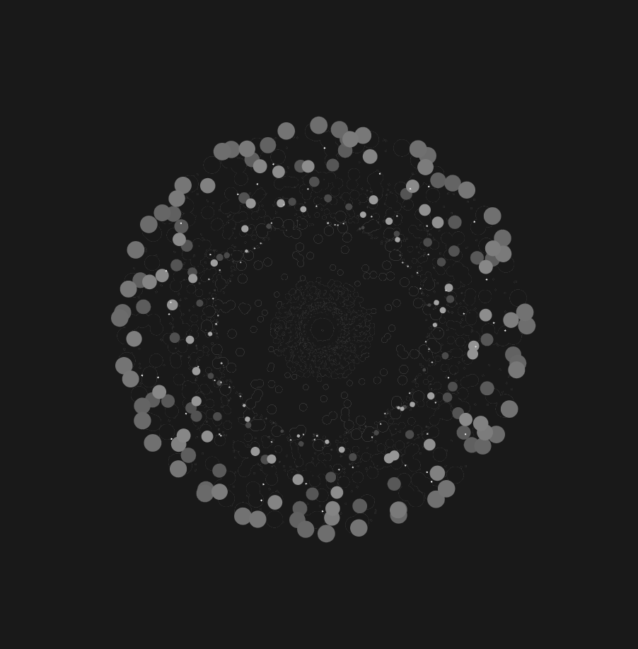
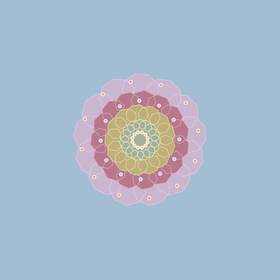
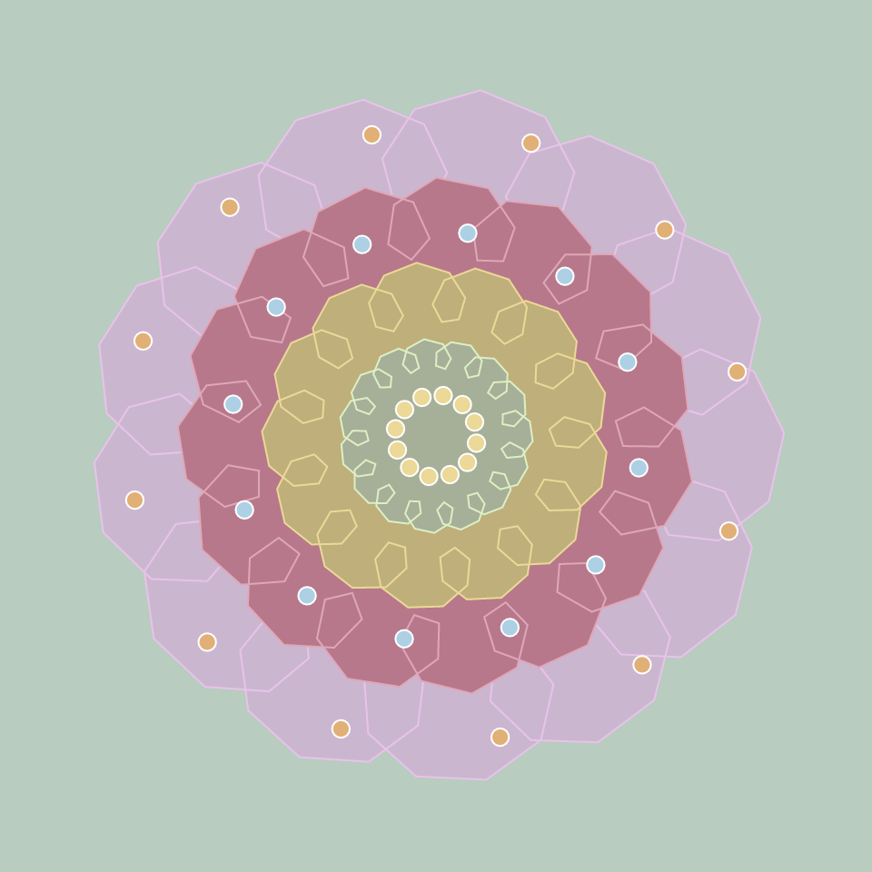
I really enjoyed the examples for this project, as they were very soothing to play with, so I decided to create a form that I enjoyed the most. I played around with epicycliod forms in desmos until I landed on one that I enjoyed that coded it.

LO 7

I particularly enjoyed the recommended Chris Harrison‘s ColorFlower project, where he ran 16,276 data points of known and named colors and organized them by their hue to create rainbow visualizations. Harrison had to play a hand in helping the algorithm determine the difference between brown and red, etc. He also used an aspect of randomization to make the visualizations seem more organic and textural.

Harrison’s ColorFlower render.

LO – 07

“Flight Patterns” by Aaron Koblin explores the cultural trends and relationships between humans and technology with the use of U.S. flight data. He used data from the U.S. Federal Aviation Administration which resulted in an animation that shows the frequent routes in popular western cities and traffic over certain geographical areas. I was initially drawn to this piece because I had initially thought it was randomly generated from its close up shots, but it was when the image zoomed out, did I see it in its entirety. This phantom like quality mixed with various colors and patterns illustrates a wide range of aircraft events and results in a mesmerizing depiction of our country. I enjoyed this time-lapse animation of the American air-traffic patterns because it parallels with our idea of what a recorded time lapse footage of these flight patterns may look like in real life.

Paths of air traffic over North America visualized in color and form.

Project 7 – Curves

For this project, I decided to create a psychedelic display of colors and lines. I played around with Epitrochoid Curves and created two different circular displays. This resulted in a busy display of lines and curves that almost seemed 3d. I took a screenshot of my favorite shape, which looked like a cell underneath a microscope.

sketchDownload
//Se A Kim
//seak
//Section D

var nPoints = 300;
var angle = 100;

function setup() {
    createCanvas(480, 480);
}

function draw() {
    background(0);
    translate(width/2, height/2);
    rotate(mouseX/20);
    drawEpitrochoidCurve1();
    drawEpitrochoidCurve2();
}
    //Draw Epitrochoid 1
function drawEpitrochoidCurve1() {
    var a = map(mouseX, 0, 480, 0, 100); 
    var b = map(mouseY, 0, 480, 0, 50); 
    var c = map(mouseY, 0, 480, 0, 50); 
    strokeWeight(1);
    stroke(200, 255, 226);
    fill(200, 100, 109); 

    beginShape(); 
    for (var i=0; i<nPoints; i++) {
        var angle = map(i, 0, 20, 0, PI);
        x = (a) * cos(angle) - c * cos((a+b) * angle);
        y = (b) * sin(angle) - c * sin((a+b) * angle);
        vertex(x, y);
    }
    endShape();
}

    //Draw Epitrochoid 2
function drawEpitrochoidCurve2() {
    var a = map(mouseX, 0, 1000, 0, 10); 
    var b = map(mouseY, 0, 1000, 0, 50); 
    var c = map(mouseX, 0, 1000, 0, 50); 
    strokeWeight(1);
    stroke(200, 20, 226);
    fill(100, 10, 120); 

    beginShape(); 
    for (var i=0; i<nPoints; i++) {
        var angle = map(i, 0, 20, 0, PI);
        x = (b) * cos(angle) - c * cos((a+b) * angle);
        y = (a) * sin(angle) - c * sin((a+b) * angle);
        vertex(x, y);
    }
    endShape();
}
A screen capture of my favorite shape

Project 07

curvy curves
var x;
var y;
var spread; // how far each bean is from one another	
var a; // scales the size of individual beans


function setup() {
    createCanvas(480, 480);
}

function draw() {
    background(0, 30, 50);	
	translate(width/2, height/2);
	push();
	for(var i = 0; i <= 24; i ++){
		beanWO();
		rotate(radians(15));
	} 
	pop();
    // arrangement of 24 beanWO functions 

	push();
    for(var j = 0; j <= 12; j++){ 
    	beanF();
    	rotate(radians(30));
    }
    pop();
    // arrangement of 12 beanF functions

    push();
    for(var k = 0; k <= 36; k++){
        beanScrib(); 
        rotate(radians(mouseX));	
    }
    pop();
    // arrangement of 36 scribble-like shapes that rotate based on the X position of the mouse

    push();
    for(var m = 0; m <= 3; m ++){
    	beanVar();
    	rotate(radians(120));
    }
    pop();
    // draws function beanVar in the middle of the canvas
} 


function beanWO(){ 
// draws beans with white outlines that move toward and away from the origin based on mouseX
    push();
    a = 100
    spread = mouseX/5;
	stroke(255);
	noFill();
	beginShape();
	for(var theta = 0; theta <= TWO_PI; theta += radians(1)){
        x = a * cos(theta) * (pow(sin(theta), 3) + pow(cos(theta), 3)) + spread; // 
        y = a * sin(theta) * (pow(sin(theta), 3) + pow(cos(theta), 3)) + spread; // y parameter of bean curve
        vertex(x, y)
	}
	endShape();
	pop();
}

function beanF(){ 
// draws translucent beans whose colors change with mouseY
	push();
	a = 200;
	spread = -mouseX/5; 
	var r = map(mouseY, 0, 480, 0, 255);
	noStroke();
	fill(r, 255, 231, 40);
	beginShape();
	for(var theta = 0; theta <= TWO_PI; theta += radians(1)){
        x = a * cos(theta) * (pow(sin(theta), 3) + pow(cos(theta), 3)) + spread; // x paremeter of bean curve
        y = a * sin(theta) * (pow(sin(theta), 3) + pow(cos(theta), 3)) + spread; // y parameter of bean curve
        vertex(x, y)
	}
	endShape();
	pop();	
}

function beanScrib(){ 
// draws a variation of the bean function that looks like a scribble
	push();
	a = mouseY;
	spread = mouseY/12
	noFill();
	stroke(214, 197, 255, 40);
	strokeWeight(3);
	beginShape();
	for(var theta = 0; theta <= radians(180); theta += radians(1)){
        x = a * cos(theta * .5) * (pow(sin(theta * .6), 3) + pow(cos(theta), 3)) + spread; 
        y = a * sin(theta * .5) * (pow(sin(theta * .6), 3) + pow(cos(theta), 3)) + spread; 
        vertex(x, y)
	}
	endShape();
	pop();	
}

function beanVar(){ 
// draws a variation of the bean function that changes with mouseY
	push();
	a = 50
	var b = map(mouseY, 0, height, 0, 5) // modifies an angle in the function with mouseY
	noFill();
	stroke(146, 255, 205);
	strokeWeight(5);
	beginShape();
	for(var theta = 0; theta <= radians(180); theta += radians(1)){
        x = a * cos(theta) * (pow(sin(theta * b), 3) + pow(cos(theta), 3));  
        y = a * sin(theta) * (pow(sin(theta * b), 3) + pow(cos(theta), 3)); 
        vertex(x, y)
	}
	endShape();
	pop();

}

For this project, I chose to explore the properties of the “Bean Curve,” essentially a curve shaped like a bean. After figuring out how to use the parametric equations, I experimented with implementing a series of beans that were arranged in a concentric shape and moved further apart with mouseX. From there, I tried plugging in different variables into this function to see what kinds of compositions I could create with different parameters.

LO – Info Visualization

Iris Yip
15-104 Section D
Looking-Outwards
Information Visualization

For this week I looked at nand.io and the way they synthesis information through custom data software. I took a look specifically at their project ‘Peak Spotting‘, which was a tool designed to visually manage Germany’s complex railroad network and its daily passengers.

Based on machine learning algorithms, it uses load and capacity prediction data heavily to allow traffic managers to look at data up to 100 days in advance so they can optimally calculate ticket prices and supply and service.

I was personally drawn to this project because of its amazing applications. Being able to predict data points up to 100 days in advance while being able to automatically generate concise and readable visual depictions of the data is a huge step in the automation of data visualization.

I also really enjoy the aesthetics of nand.io’s projects from a visual design perspective. The colors used are distinctive and readable yet aesthetically pleasing, making it functional and optimal for data visualization.

Project 7 – Compositions with Curves

For this project, I was inspired by an abstract interpretation of the human eye and wanted to include aspects of that into my project. It was sort of difficult getting my initial equation to work, but after adjusting it to cos/sin it worked a lot better. It also took me a long time to find ways of simplifying my code, since I wanted to work on keeping my code as concise as I can when possible, and to try to find the easiest way to create what I had in mind without extra steps.

sketch
//iris yip
//15-104 section D
//project 7

function setup() {
    createCanvas(480, 480); //canvas size
}

function draw() {
    background(0,5) //background opacity
    stroke(255)
    translate(240, 240); //position of interactive circle
    x = cos(frameCount / 30) * (4 * mouseX / 40 * (sin(frameCount / 30)) * 2 - frameCount / 30) //equation
    y = mouseY / 10; //Y position of mouse
    strokeWeight(x / 10)
    rotate(frameCount + x / 100); //action and framerate
  
  //coordinates (movement)
    point(x, y);
    point(y, x);
    point(-x, y);
    point(-y, -x);
}

LO 07

Title: Herald/Harbinger
Artists: Jer Thorpe & Ben Rubin

In the heart of Calgary, Alberta, an installation piece titled “Herald/Harbinger” brings to life the motion of Bow Glacier, demonstrating the connection between human activity and that of the melting glacier. A series of LED arrays installed at the entrance of a building use colored light to indicate real-time movements in the glacier; meanwhile, several speakers project the glacier’s subtle noises into the traffic-filled area. The lights and speakers are connected to the glacier via a seismic observatory and relayed via satellite, then put through an algorithm to visualize the data collected for display. Thousands of passersby feel the glacier’s presence every day, a reflection of how the glacier is an integral part of the city’s water source and history. However, the installation has a shelf life; it is a reminder that this glacier is melting, and there will be one day where the city sounds no longer duet those of Bow Glacier.

A video of the installation in action

LO: Information Visualization

Apricot Graph: Analysis of Apricot Trends from 2004 – 2016 (Rhythm of Food)

While I was looking through the list of recommended works, this one project by Moritz Stefaner stood out. Stefaner is an independent designer that specializes in data visualization. The project that stood out to me was “The Rhythm of Food,” which analyzes food seasonality. Using data from Google News Lab, they developed a new type of radial “year clock” graph that shows the seasonal trends of food. With the months spread evenly around the “clock”, viewers can easily distinguish when certain food items are popular in certain times of the year. We are able to see the general trend of any sort of food item and can search specifically for that item or browse food items based on seasonal popularity. The website “Rhythm of Food” showcase the findings and allow visitors to explore the data themselves. Personally, it was very fun and indulging to look through the numerous graphs. The project takes on food, an item very prominent in our lives and visualizes the data in a very appealing way.

Moritz Stefaner (Truth & Beauty): http://truth-and-beauty.net/projects/the-rhythm-of-food

Project 07: Curves

When looking through the curves, I thought it would be perfect to use them and create a flower with multiple layers. I decided to use the hypotrochoid and the epitrochoid curves with pastel-ish colors. As you move across x and y, the flower should grow in size relative to where mouseX and mouseY are. The background color also changes relative to the x and y positions of the mouse.

sketch
//Jessie Chen
//jessiech@andrew.cmu.edu
//D
//Project 07
//Curves

var nPoints = 100;
var angle = 0;
var radius = 200;
var r = 200;
var g = 170;
var b = 170;

function setup() {
    createCanvas(480, 480);
    frameRate(20);
}

function draw() {

    var xcolorchange = map(mouseX, 0, width, 0, 50);
    var ycolorchange = map(mouseY, 0, height, 0, 50);

    //slight change in the background as mouse moves across x and y
    background(r - ycolorchange, g + xcolorchange, b + ycolorchange);

    //origin at the center of the canvas
    translate(width/2, height/2);
    
    //purple layer of petals
    push(radians(angle));
    rotate(radians(-angle))
    angle += mouseX;
    stroke(240, 192, 236);
    //fill(152, 115, 148);
    fill(207, 181, 210)
    hypotrochoid(mouseX/2);
    pop()

    //pink layer of petals
    push();
    rotate(radians(angle));
    angle += mouseY;
    stroke(232, 164, 184);
    fill(193, 116, 139);
    epitrochoid(mouseX/3);
    pop(); 

    //yellow layer of petals
    push();
    rotate(radians(angle));
    angle += mouseX;
    stroke(239, 216, 142);
    fill(193, 175, 116);
    hypotrochoid(mouseX/4);
    pop();

    //green layer of petals
    push();
    rotate(radians(angle));
    angle += mouseY;
    stroke(216, 240, 192);
    fill(164, 176, 148);
    epitrochoid(mouseX/8);
    pop();

    //orange circles
    push();
    rotate(radians(angle));
    angle += mouseX;
    radius = mouseX/3;
    fill(164, 209, 232);
    circles(radius);
    pop();

    //blue circles
    push();
    rotate(radians(angle));
    angle += mouseY;
    radius = mouseX/2;
    fill (233, 175, 109);
    circles(radius);
    pop();

    //yellow circles
    push();
    rotate(radians(angle));
    angle += mouseX;
    radius = mouseX/15;
    fill(239, 216, 142);
    circles(radius);
    pop();
}


function epitrochoid(size) {
    var x;
    var y;
    var a = size;
    var b = a/15;
    var h = constrain(mouseY/30, a/5, b*5);

    beginShape();
    for(var i = 0; i<nPoints; i++) {
        var t = map(i, 0, nPoints, 0, TWO_PI);
        x = (a + b) * cos(t) + h * cos(((a + b) / b) * t);
        y = (a + b) * sin(t) + h * sin (((a + b) / b) * t);
        vertex(x, y);
    }
    endShape(CLOSE);
}

function hypotrochoid(size) {
    var x;
    var y;
    var a = size;
    var b = a/15;
    var h = constrain(mouseY/30, a/5, b*10);
    var ph = mouseX/60;

    beginShape();
    for (var i = 0; i < nPoints; i++) {
        var t = map(i, 0, nPoints, 0, TWO_PI);
        x = (a - b) * cos(t) + h * cos(((a - b) / b) * t);
        y = (a - b) * sin(t) + h * sin (((a - b) / b) * t);
        vertex(x, y);
    }
    endShape(CLOSE);
}

//array of circles
function circles(radius) {
    for (t = 0; t < 360; t = t + 30) {
        var x = radius * cos(radians(t));
        var y = radius * sin(radians(t));
        stroke(255);
        ellipse(x, y, mouseX/35, mouseX/35);
    }
}