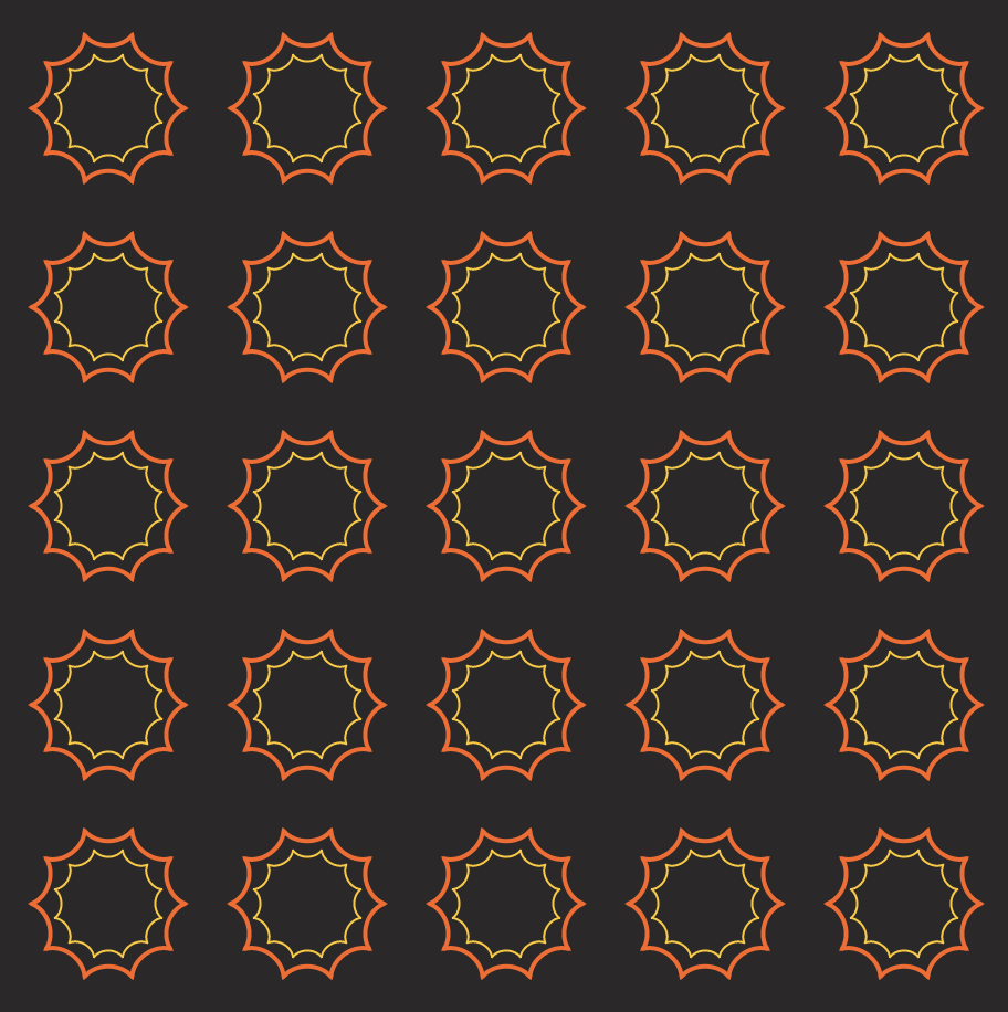
Project-07-Curves

sketch
//Ian Lippincott
//ilippinc
//Section D


//orange
//fill(240, 147, 109);
//blue
//fill(49, 57, 75);
//cream
//fill(255, 255, 226
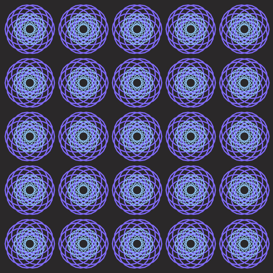
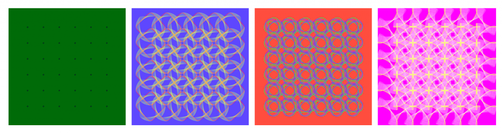
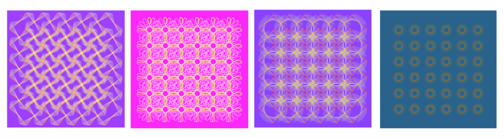

var nPoints = 500;
var angle = 30;

function setup() {
    createCanvas(480, 480);
}

function draw() {
    background(49, 57, 100);
    //draw 2 sets of 36 hypotrochoids 
    for (var x = 80; x <= 400; x += 64) {
        for (var y = 80; y <= 400; y += 64) {
            push();
            translate(x, y);
            rotate(mouseX/20);
            drawEpitrochoid();
            pop();
        }
    }
}

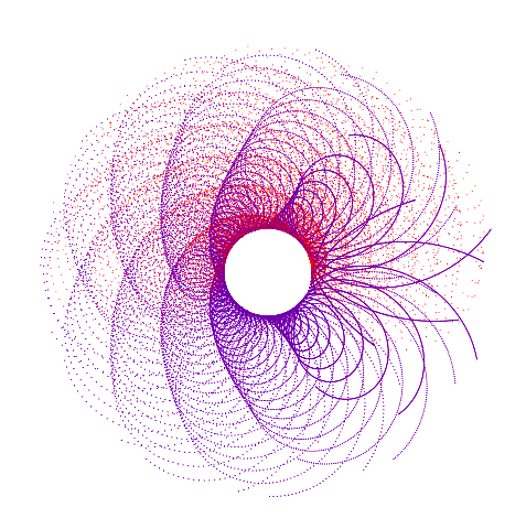
function drawEpitrochoid() {
    var a = map(mouseX, 0, 480, 0, 120); 
    var b = map(mouseX, 0, 480, 0, 40); 
    var h = map(mouseY, 0, 480, 0, 40); 
    strokeWeight(4);
    //Cream Stroke
    stroke(255, 255, 226);
    //Orange Fill
    fill(240, 147, 109); 
    //Draw Epitrochoid
    beginShape(); 
    for (var i=0; i<nPoints; i++) {
        var angle = map(i, 0, 80, 0, TWO_PI);
        x = (a+b) * cos(angle) - h * cos(((a+b)/b) * angle);
        y = (a+b) * sin(angle) - h * sin(((a+b)/b) * angle);
        vertex(x, y);
    }
    endShape();
}

Project-07-Curves

sketch

var angle=360;

function setup(){
  createCanvas(460,460);
  frameRate(5);
}

function draw(){
  background(43,40,41);
  for (var x = 50; x <= 430; x += 90) {       //curves repetition
    for (var y = 50; y <= 430; y += 90) {
      push();
      translate(x,y);
      stroke(mouseX,100,mouseY);
      curve1();
      stroke(mouseX,200,mouseY);
      curve2();
      pop();
    }
  }
}

function curve1(){     //outer curve
  var x;
  var y;
  var a = map(mouseX, 0, width, 0, 50); 
  var h = map(mouseY, 0, height, 0, 50); 
  var b = a / 10;
  beginShape();
  for (var i = 0; i < angle; i ++) {
    strokeWeight(2);
    noFill();
    var t = map(i, 0, 180, 0, TWO_PI)
    x = (a-b) * cos(t) + h * cos(((a-b)/b) * t);
    y = (a-b) * sin(t) - h * sin(((a-b)/b) * t);
    vertex (x, y)
  }
  endShape(CLOSE);
}

function curve2(){      //inner curve
  var x;
  var y;
  var a = map(mouseX, 0, width, 0, 30); 
  var h = map(mouseY, 0, height, 0, 30); 
  var b = a / 10;
  beginShape();
  for (var i = 0; i < angle; i++) {
    noFill();
    strokeWeight(1);
    var g = map(i, 0, 180, 0, TWO_PI);
    x = (a+b) * cos(g) - h * cos(g * (a+b)/b);
    y = (a+b) * sin(g) + h * sin(g * (a+b)/b);
    vertex(x, y);
  }
  endShape(CLOSE);
}

For this project, I wanted show how it would be possible to show diverse configurations only using two shapes. I tried to play around with the curves to create wallpaper-like patterns. For the interaction, when the mouseX/Y leads to top-right/bottom-left areas, it presents the simplest form while the curves show the most complicated form or nothing when the mouse is on the opposite areas. (color Blue and Orange also resembles the opposite tone of the ocean and the sun)

Project-07: Spirographs

Interactive Spirographs with the Heart Curve

{scroll to bottom for final p5.js embed}

https://editor.p5js.org/ssahasra/sketches/HZjqQv5Q2

To create my interactive spirograph for this week’s project, my first step was to review existing curves on the Wolfram website and pick one that is simple, but can also give me exciting visuals when I use the combination of mouseX, map(), and constrain() functions.

I chose the Heart Curve, not only because it is an iconic shape/symbol but it’s parametric function allowed me to tweak the shape on all three of it’s curves.

If you notice this image, the cusp or crevice, the tip and the two mirroring bulges are the three curves that can be manipulated.

Using the given starter code, I first replaced the parametric equations and explored different types of curves, including the eight curve and the bean curve.

Finally, after fixing on the heart curve, I used the following parametric equations for the value of x and y:

a1 = 16, a2 = 13 and so on.

In the draw function, I set a1, a2 and a3 as variables and then used the mouseX to control the bulge and cusp of the heart.

Furthermore, I also added the rotate() function to setup, to reveal how the shapes create a spirograph. The frameRate() was also used to control the speed, to see the interactions and mouseX induced changes more clearly.

Here, is a video of an intermediate stage of the program:

One more important aspect of this effect is that I activated the alpha value in the fill() function so the mouseX movement also adds dynamic transparencies similar to “onion layers” in flash.

LO 07 – Information Visualization

PENNY

By Stamen Design


Today, I will be talking about an AI Project called Penny done by Stamen Design. This simple tool is designed to help understand what wealth and poverty look like to a artificial intelligence built on machine learning using neural networks. Penny is built using income data from the U.S. Census Bureau, overlaid on DigitalGlobe satellite imagery. This information was then given to a neural network. Trained to predict the average household incomes in any area in the city using data from the census and the satellite. The AI looks for patterns in the imagery that correlate with the census data, and over time, users are able to ask the model what it thinks income levels are for a place just from a satellite image. This project is really interesting to me because this visualization and AI can be used to improve the quality of life, and physically see the imbalances within a neighborhood for better wealth distribution.

View project here

Project 7: Curves

curves cb
//global variables
var nPoints = 1000;
var angle = 0;

function setup() {
    createCanvas(480, 480);
}

function draw() {
    background(mouseY, 100, mouseX); //change background color
    //draw 2 sets of 36 hypotrochoids 
    for (var x = 80; x <= 400; x += 64) {
        for (var y = 80; y <= 400; y += 64) {
            push();
            translate(x, y);
            drawHypotrochoid1();
            drawHypotrochoid2();
            pop();
        }
    }
}

function drawHypotrochoid1() {
    var a = map(mouseX, 0, 480, 0, 80); //radius of outside circle
    var b = map(mouseX, 0, 480, 0, 20); //radius of inside circle
    var h = map(mouseY, 0, 480, 0, 40); //point distance from center of inner circle

    strokeWeight(.5);
    stroke(mouseX, mouseY, 100); //change stroke color
    noFill();
    beginShape(); //create hypotrochoid
    for (var i=0; i<nPoints; i++) {
        var angle = map(i, 0, 100, 0, TWO_PI);
        x = (a-b) * cos(angle) + h * cos(((a-b)/b) * angle);
        y = (a-b) * sin(angle) - h * sin(((a-b)/b) * angle);
        vertex(x, y);
    }
    endShape();
}

function drawHypotrochoid2() {
    var a = map(mouseX, 0, 480, 2, 80); //radius of outside circle
    var b = map(mouseX, 0, 480, 2, 20); //radius of inside circle
    var h = map(mouseY, 0, 480, 2, 40); //point distance from center of inner circle

    strokeWeight(.35);
    stroke(mouseX, mouseX, mouseY); //change stroke color
    noFill();
    beginShape(); //create hypotrochoid
    for (var i=0; i<nPoints; i++) {
        var angle = map(i, 0, 100, 0, TWO_PI);
        x = (a-b) * cos(angle) + h * cos(((a-b)/b) * angle);
        y = (a-b) * sin(angle) - h * sin(((a-b)/b) * angle);
        vertex(x, y);
    }
    endShape();
}

After exploring the WolframMathWorld site, I found hypotrochoids and thought that they were very dynamic and interesting. I decided to create my project with two sets of overlapping hypotrochoids to create a field of growing flower-like shapes. To make the composition interactive, I coded the mouse position to control the variables and colors of the hypotrochoids as well as the background color.

top left, top right, bottom left, bottom right
other screenshots

Looking Outwards 07 – Information Visualization

https://guns.periscopic.com/

On their website, Periscopic brands themselves as a “socially conscious data visualization firm”. They are a team of designers who bring light to societal issues through striking visualizations, such this one, the annual number of gun homicides in the US. 

This visualization represents the lives of those lost to a bullet through an arc of time. A victim’s arc starts as a bright orange line and fades to ash gray at the point they were killed, and the arc extends to the point of their expected natural life expectancy. Each arc can be clicked on providing more information about the homicide and expected lifespan. Periscopic mentions that the gun data was in ASCII format originally, making it difficult to extract the data for artists who had little coding experience. They have converted the data into CSV format and shared it freely.

This visualization struck me by how simple yet powerful its message is. Knowing the context of gun killings that this graphic conveys, the way the arcs turn from a passionate orange to lifeless gray is chilling, especially when seeing the vast number of lines form into a faded mass of death. And even if the 2018 death count of 11,356 doesn’t seem like much, the 472,332 lost years of human life makes it clear that gun homicides are a problem we must address.

Project 07 – Composition with Curves

I wasn’t really inspired by anything this time but I had an idea in mind of a rotating curve that had a trailing effect. I ended up with a variable epicycloid curve, formed by a point traced by a circle’s radius as it rotates around a larger circle. Clicking on the screen adds “petals” to the shape of the curve. At first, I wanted to experiment with a reuleaux triangle and make an animation similar to a rotary engine, but couldn’t figure out the math behind making the triangle follow an eccentric path.

sketch

/*
 * Eric Zhao
 * ezhao2@andrew.cmu.edu
 *
 * Interactive composition with epicycloid curves
 * that changes color with a gradient effect. Click
 * to increase the number of "petals" on the curves.
 *
 */
var numPoints = 75;
var thetaCanvas = 0;
var rotateSpeed = 2;
var multiplier = 2;
var totalScale;
var epicycloid = [];
var baseFill;

function setup() {
    createCanvas(480, 480);
    background(220);
    strokeWeight(2);
    fill(0);
    angleMode(DEGREES);
    colorMode(HSB);
}

function draw() {
        for (let i = 0; i < 10; i++){
        //creates series of nested epicycloid curve objects
        epicycloid[i] = new Object();
        epicycloid[i].shapeScale = 1 - i/10;
        epicycloid[i].a = epicycloid[i].shapeScale * 100;
        epicycloid[i].b = epicycloid[i].a / multiplier;
        epicycloid[i].theta = 0;
    }

    totalScale = map(sin(thetaCanvas), -1, 1, 0.33, 1);
    //makes composition zoom in and out smoothly
    background(0);

    push();
    translate(width/2, height/2);
    rotate(thetaCanvas);
    scale(totalScale);
    for (let i = 0; i < epicycloid.length; i++){
        //slightly offsets hue and rotation of each successive curve
        push();
        rotate(i*10);
        baseFill = ((thetaCanvas + i*10)*2) % 360;
        stroke(baseFill, 100, 100);
        epicycloidCurve(epicycloid[i]);
        pop();
    }
    pop();
    thetaCanvas += rotateSpeed;
}
function epicycloidCurve(e){
    //Epicycloid curve equation
    beginShape();
    for(let i = 0; i <= numPoints; i++){
        e.theta = map(i, 0, numPoints, 0, 360);
        e.x = ((e.a + e.b) * cos(e.theta) - e.b * cos(((e.a + e.b)/e.b) *
        e.theta));
        e.y = ((e.a + e.b) * sin(e.theta) - e.b * sin(((e.a + e.b)/e.b) *
        e.theta));
        curveVertex(e.x, e.y);
    }
    endShape(CLOSE);
}

function mousePressed(){
    //changes number of "petals" in the epicycloid
    multiplier++;
    if(multiplier > 5){
        multiplier = 2;
    }
}


LookingOutwards-07

Martin Wattenberg is a co-leader of the People + AI Research initiative at Google. My career has encompassed machine learning, visualization, journalism, and art. Asking a question to himself, “what does music look like?” made him create this art piece. According to him, The Shape of Song is an attempt to answer his paradoxical question. I admire how he related music with this “visualization method called an arc diagram that highlighted repeated sections of music–or of any sequence–with translucent arcs.” It is very interesting to see how arc diagrams shape different thicknesses, sizes, saturation, etc to express diverse kinds of music. Just like every music has its own sequence, all of these art pieces create their own unique components.

Project 07 – Curves

I chose to use the Epitrochoid Curve for my project this week. My code draws two curves—a blue and red one, and it’s pretty cool to see how and where they overlap with each other.

*because of the lag it’s really slow on WordPress ;(*

  • Refresh the page to start from center with white background.
  • Move the mouse back and forth to build contrast areas by changing the direction of the curve (inward or outward).
  • Control the speed of curve drawn with mouse position.
  • Click the mouse to change background to black.
  • Click and hold the mouse to erase all previous curve paths, and visualize the curve with stars that get brighter and dimmer with mouse position (brightest at lower right corner).
  • Release the mouse to draw the curve at various starting points.
Maggie – Curves
//Maggie Ma
//Section D

//variables for equation on https://mathworld.wolfram.com/Epitrochoid.html
var a = 30; //radius of small circle
var b = 10; //radius of rotating perimeter circle
var h = 0; //height of curve from the center of b
var t; //time
var x;
var y;
var speed; 


function setup() {
    createCanvas(500,500);
    background(255);
}

function draw() {
    noStroke();

	constrain(mouseX,0,width);
	constrain(mouseY, 0, height);

	//draws dots (without trail) when mouse is pressed
	//background changes to black
	//dots change in size with mouse position
    if (mouseIsPressed) { 
		background(0);
		for (t = 0; t <TWO_PI; t += 1) {
			fill(0,0,255);
	    	epCurve2(); }

   		for (t= 0; t<PI; t+= 1) {
   			fill(255,0,0);
	    	epCurve2(); }
	}

	speed=map(mouseX,0,width,.5,-.5); //changes the speed and size of curve as mouseX moves
    a+=speed; 
    h+=speed;
  	
  	fill(255,0,0); //drawing red curve
    for (t =-PI; t < TWO_PI; t += .08) {
    	epCurve();
    }

    fill(0,0,255); //drawing blue curve
    for (t= -PI; t<PI; t+= .08) {
	    epCurve();
    }
}

function epCurve() { //Epitrochoid Curve function
	push();
    translate(width/2, height/2); 
    //draw curve
    x=(a+b)*cos(t)-h*cos(((a+b)/b)*t); 
    y=(a+b)*sin(t)-h*sin(((a+b)/b)*t);
    ellipse(x,y,0.8,0.8); //draws dots on canvas
    pop();
}

function epCurve2() { //Dotted curve when mouse is pressed
	push();
   	translate(width/2, height/2); 
    //draw curve
    x=(a+b)*cos(t)-h*cos(((a+b)/b)*t); 
    y=(a+b)*sin(t)-h*sin(((a+b)/b)*t);
    ellipse(x,y,0.5+mouseX/100,0.5+mouseY/100); //draws dots on canvas that change size w/ mouse position
    pop(); 
}

LO 07 – Data Visualization

Wind Map (2012 – present)

Martin Wattenberg and Fernanda Viegas 

Wattenberg and Viegas’ Wind Map.

Martin Wattenberg and Fernanda Viegas’ Wind Map visualizes the tracery of wind flow over the United States in the most basic and familiar way—visual motion. On calm wind days, the artwork can be a “soothing meditation on the environment” (Wattenberg), whereas during hurricanes, the piece can become overwhelming and terrifying. Something that I found interesting was that bird watchers actually use the map to track migration patterns, and cyclists use it to prepare for trips. Even conspiracy theorists use the map to track mysterious air chemicals. Data for the wind map was collected from the National Digital Forecast Database, and Wattenberg took inspiration from Edmund Halley (1686), who developed the technique of using comet-like trails to visualize motion. Wattenberg used HTML and JavaScript. 

Images of the Wind Map during Hurricane Isaac (September 2012).