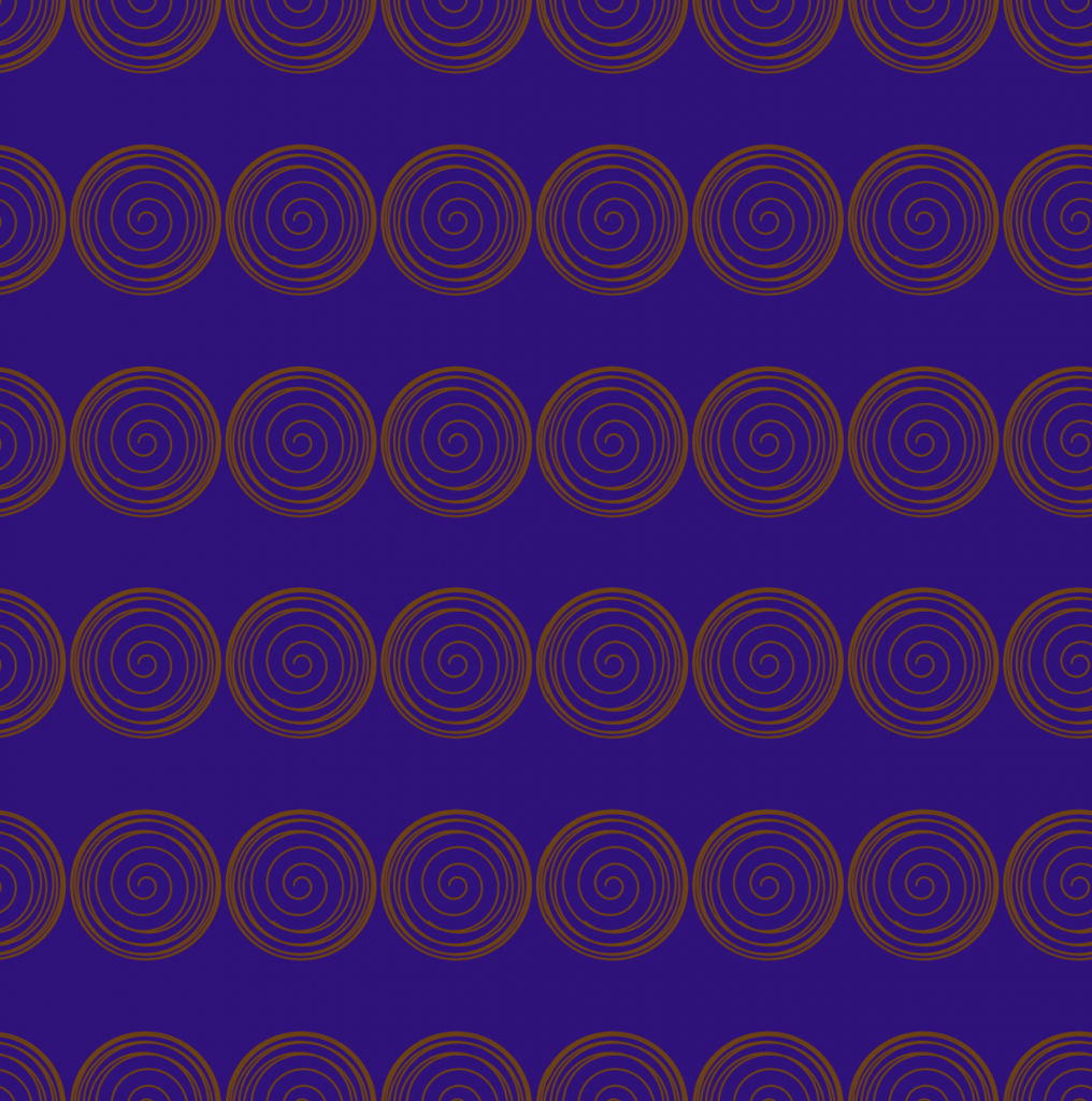
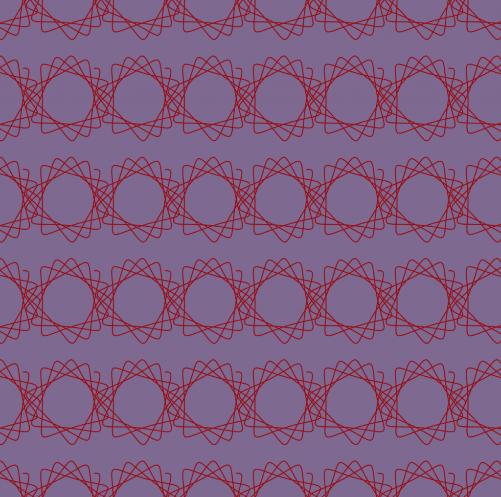
![[OLD FALL 2020] 15-104 • Introduction to Computing for Creative Practice](../../../../wp-content/uploads/2021/09/stop-banner.png)
sketchDownload
var a = 0; //radius of exterior circle
var b = 0; //radius of interior circle
var h = 0; //distance from center of interior circle
var r;
var g;
var b;
var theta = 0; //angle
function setup() {
createCanvas(500, 500);
background(220);
}
function draw() {
r = map(mouseX, 0, width, 45, 191);
g = map(mouseX, 0, width, 16, 175);
b = map(mouseY, 0, height, 105, 225);
background(r, g, b);
for (var x = 0; x <= width; x += 70) {
for (var y = 0; y <= height; y += height/5) {
push();
translate(x, y);
drawHypotrochoid();
pop();
}
}
}
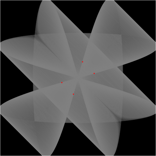
function drawHypotrochoid() {
noFill();
r = map(-mouseX, 0, width, 107, 24);
g = map(-mouseX, 0, width, 67, 162);
b = map(-mouseY, 0, height, 67, 162);
stroke(r, g, b);
a = map(mouseX, 0, width, 1, width/10);
b = 20;
h = map(mouseY, 0, height, 1, height/5);
beginShape();
for (var i = 0; i < 1000; i++) {
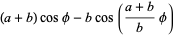
var x = ((a-b) * cos(theta)) + (h * cos((a-b)/b * theta));
var y = ((a-b) * sin(theta)) - (h * sin((a-b)/b * theta));
var theta = map(i, 0, 100, 0, TWO_PI);
vertex(x, y);
}
endShape();
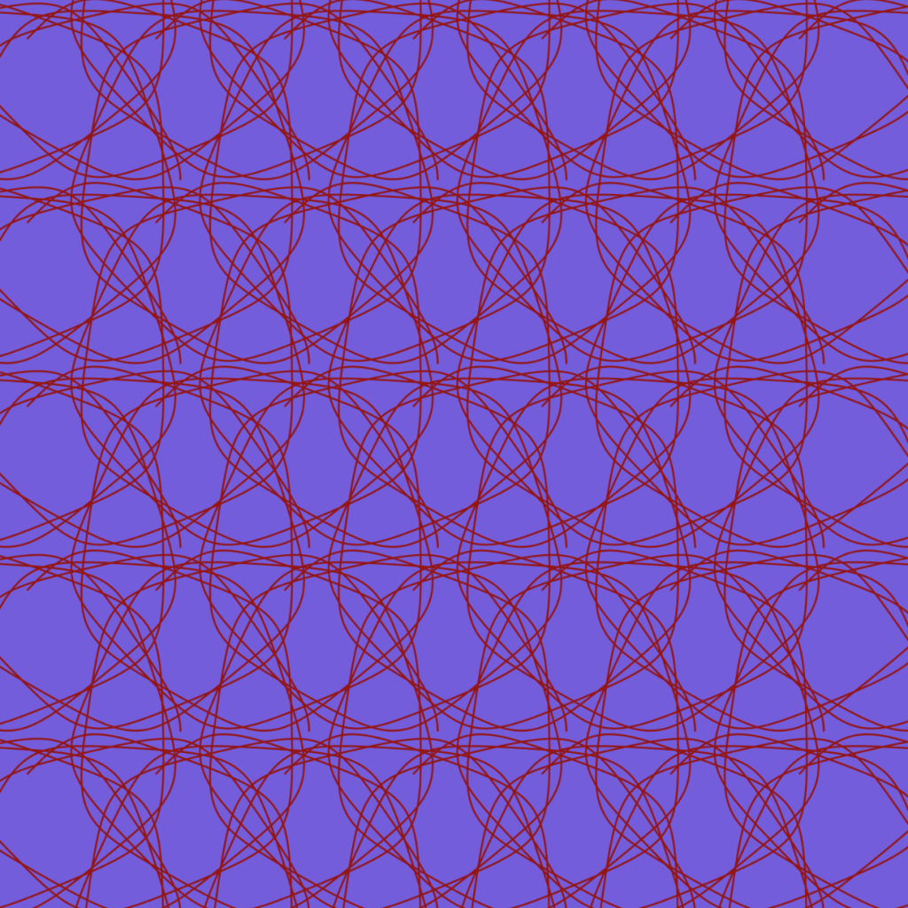
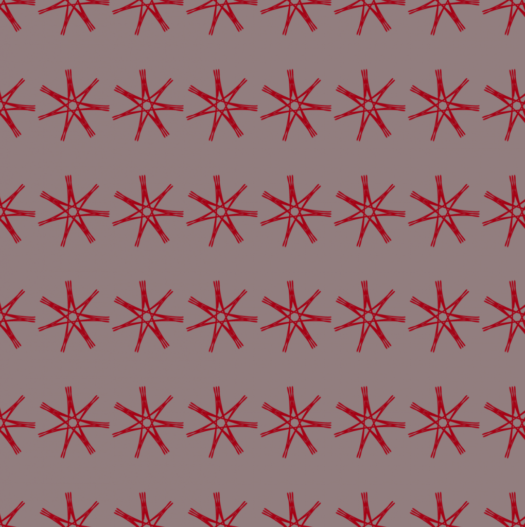
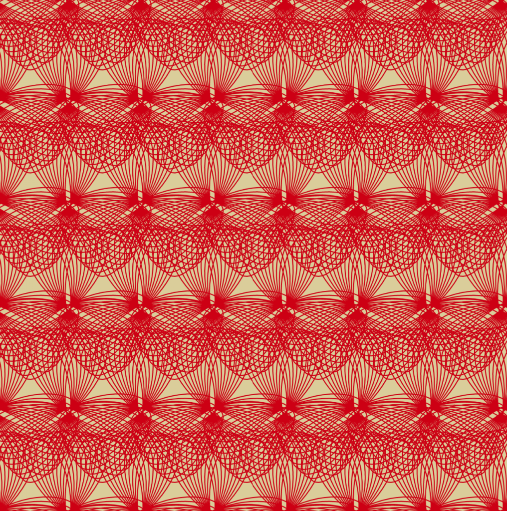
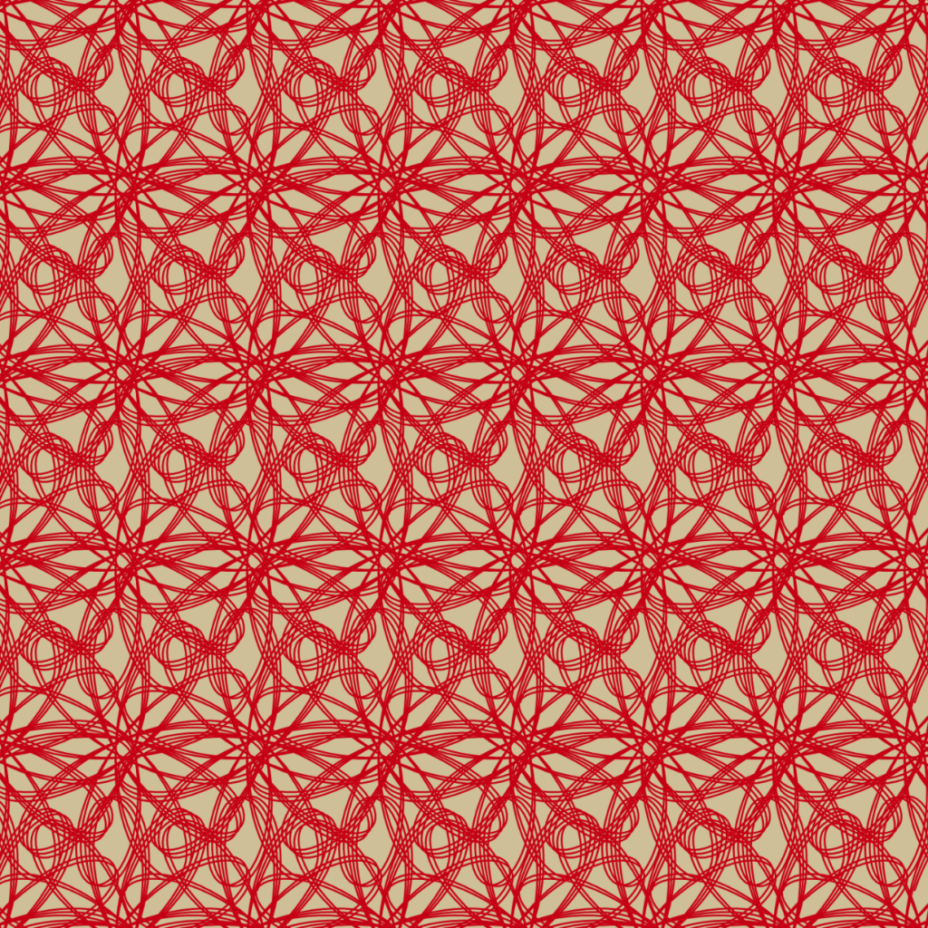
}I chose the hypotrochoid curve because when I was experimenting with it, so many different patterns came out of it and I wanted the result to have as many variations as possible. So as you move your mouse up, down, or diagonal, the curve patterns would change every few movements.