![[OLD FALL 2018] 15-104 • Introduction to Computing for Creative Practice](../../../../wp-content/uploads/2020/08/stop-banner.png)
The information visualization project I found is called the Drought Monitor. It is a project by Pitch Interactive, an data visualization studio that presents data using the latest technology interactively. Their clients include some of the most acclaimed companies from multiple industries like Dow Jones, Wall Street Journal, Facebook and General Motors.
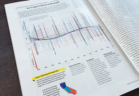
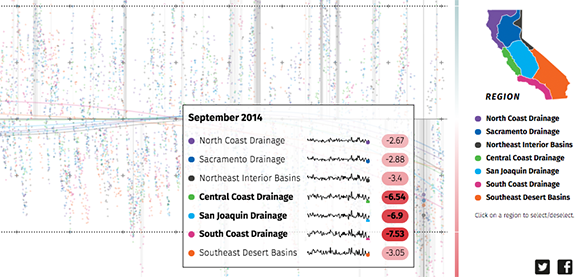
The Drought Monitor was first started as a commissioned project paid by Scientific American in 2015. In that one of year’s issues, there was a graph of the frequency of unprecedented droughts in California. The graph plots data from the Palmer Hydrological Drought Index and highlights outlying points outside the general trend lines so the overall amount of unprecedented climates was clearly presented. In 2018, Pitch Interactive recreated the website and put data of California air moisture from 1895 to 2018. The graph follows the same design as the one in 2015 but becomes very interactive with viewers. Just by moving the cursor along the axis, data of general trend lines of each California region and specific data location is clearly presented. I am very impressed by the skillful application of information visualization by Pitch Interactive as it has made complex data instantly readable to any kinds of audience.